How to Choose Paint Colors That Flow Between Rooms
Ever walked into someone’s house and felt like you just teleported through a rainbow?
Yeah, same. One minute you’re in a soft, serene living room, and then BAM—you step into a fire-engine red kitchen that slaps your eyeballs.
No shade if that’s your thing (ok, maybe a little), but if you’re like most people trying to make your home feel cohesive, picking paint colors that flow seamlessly between rooms is kind of a big deal.
Lucky for you, I’ve been there. I once painted my hallway a weird shade of seafoam green because it “looked cool in the store.” Spoiler alert: it did not look cool in my house.
So now I’m here to save you from your own potential seafoam disaster.
Let’s talk about how to choose paint colors that actually flow from room to room—without making your space feel like a circus.
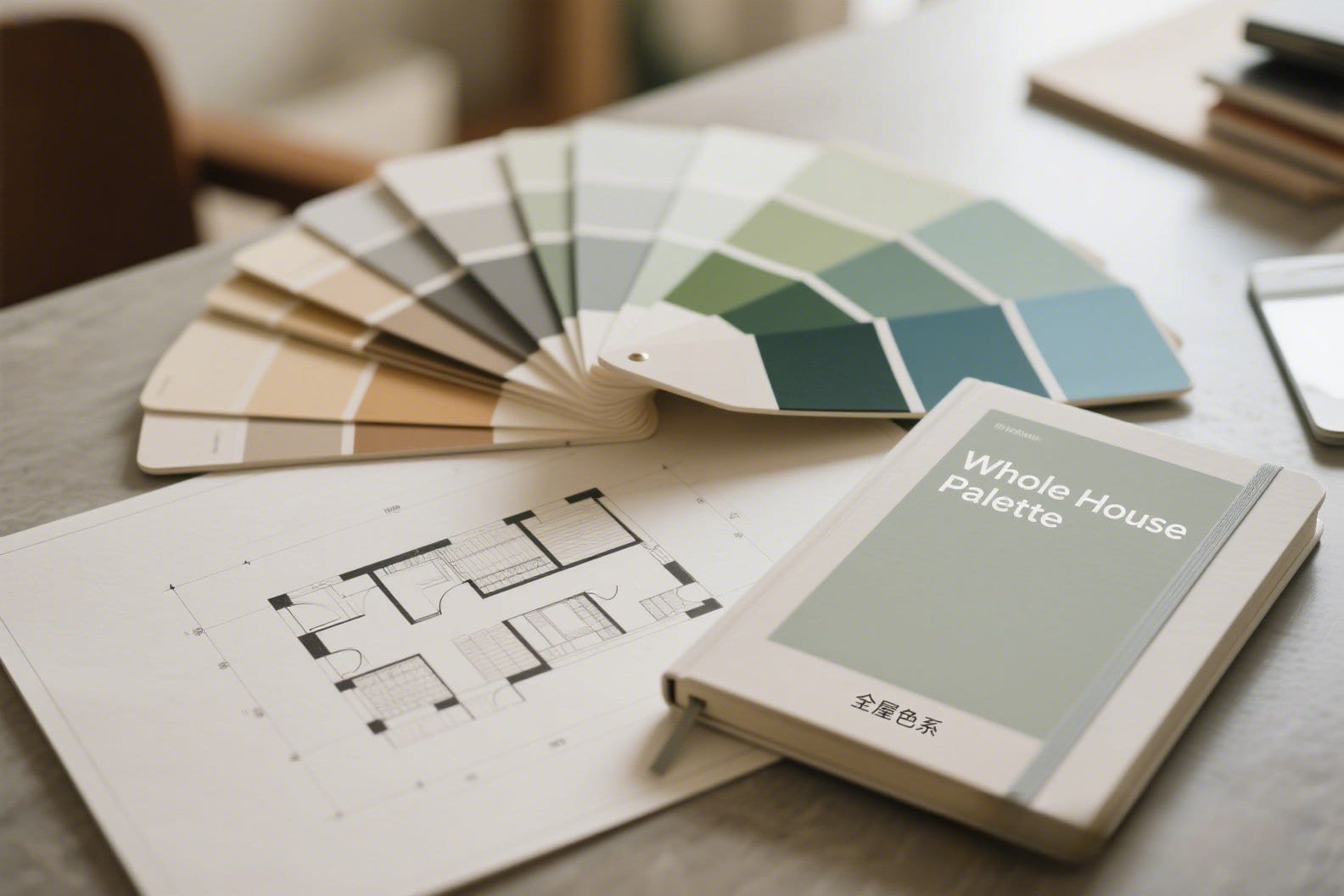
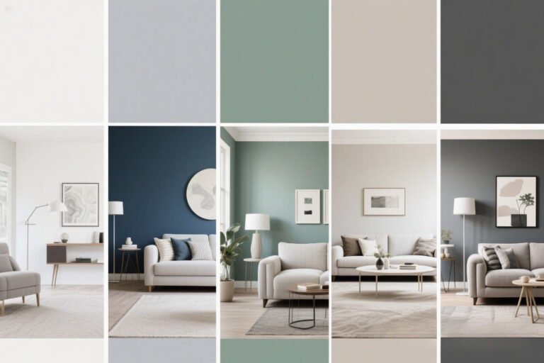
Start With a Whole-House Color Palette
Yes, your home deserves a wardrobe too.
Choosing paint colors room-by-room without a master plan is like picking outfits blindfolded. You might get lucky… or you might end up wearing plaid with polka dots. Not cute.
Here’s what you need to do:
- Pick 3–5 main colors that you love and can commit to. This includes neutrals, accent colors, and maybe one wild card for fun. (You rebel, you.)
- Choose a base neutral like white, beige, greige (yes, it’s a thing), or soft gray to anchor everything.
- Stick to the same undertone family. If your neutral is warm, don’t go tossing in cool blue accents like you’re in a beach house. It’ll clash, and not in a trendy way.
FYI: A cohesive palette doesn’t mean boring. It means your colors relate to each other—kind of like cousins who get along at family gatherings. 🙂
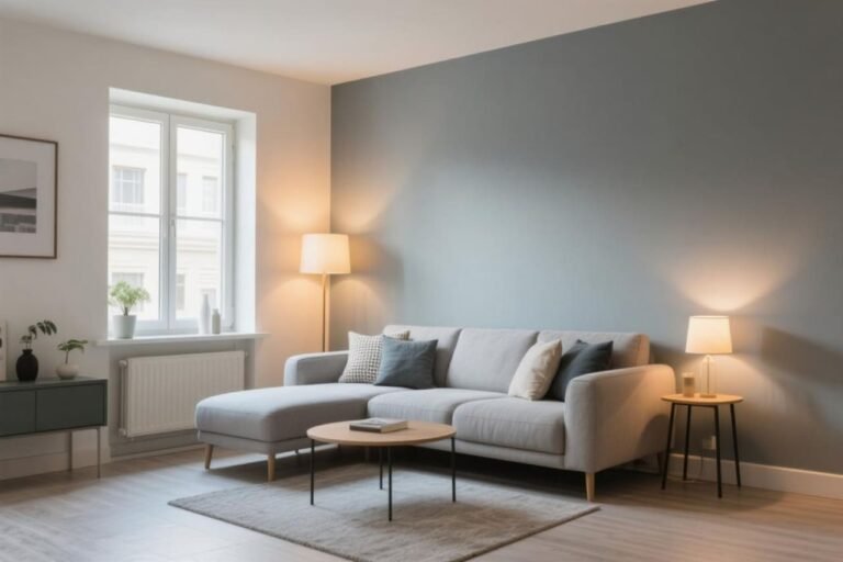
Consider the Lighting
Because your beautiful taupe might turn into “dirty dishwater” under yellow bulbs.
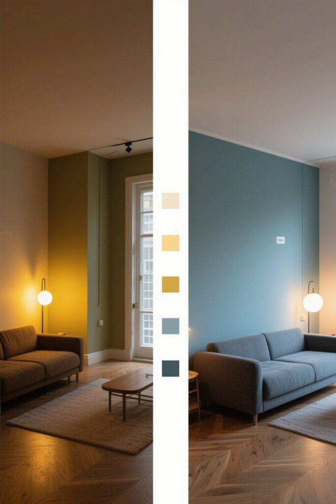
Lighting dramatically changes how paint colors look—like, totally different personalities. (We’re talking “cute on Tinder, meh in person” levels of betrayal.)
Ask yourself:
- How much natural light does the room get? South-facing rooms pull warm. North-facing ones lean cool.
- Are you using warm or cool bulbs? Because lighting can either boost your paint’s vibe—or totally murder it.
- What time of day do you use the room most? A dusty rose might feel cozy in the morning but borderline spooky at night.
Pro Tip: Always test paint samples in each room and check them at different times of the day. Trust me, it’s worth the effort. Unless you like surprises. (In which case, why are you here?)
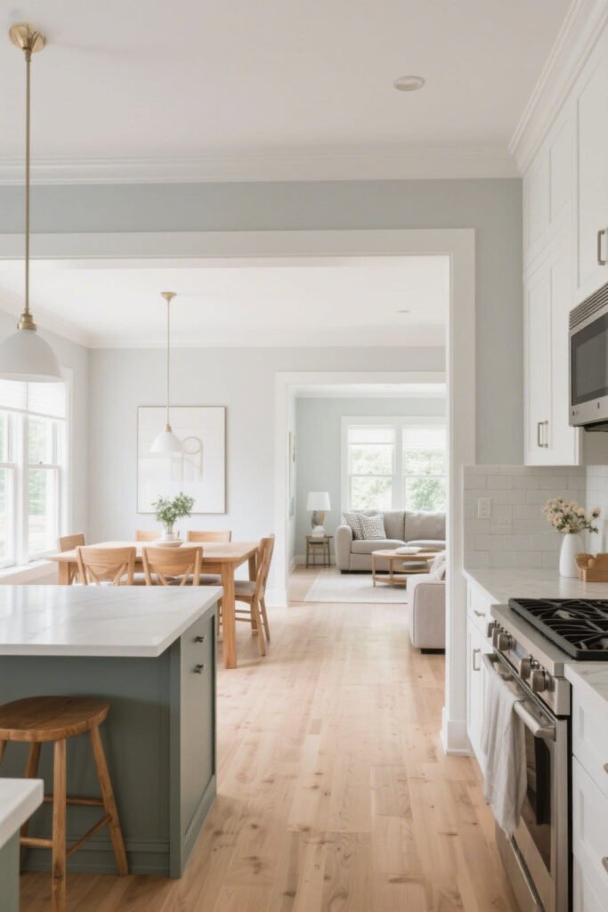
Use Transition Spaces Strategically
Hallways, entryways, staircases—they’re not just boring walk-through zones.
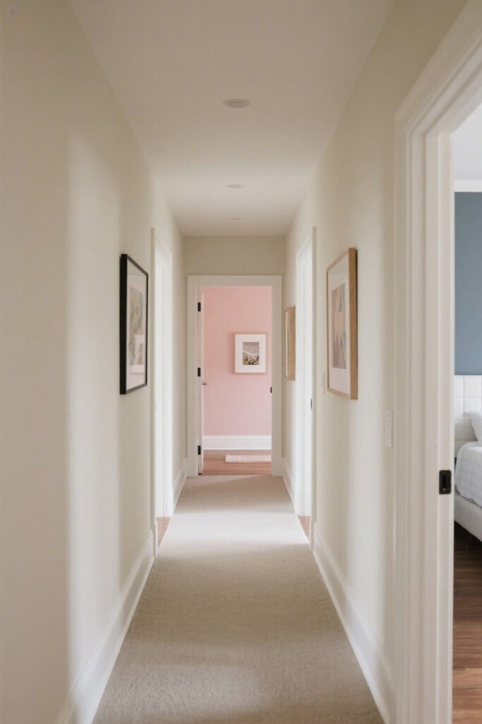
These areas are your secret weapons for creating flow. They’re like the bridges between your rooms, so use them to blend one color into the next.
How?
- Paint them a neutral tone from your main palette to tie everything together.
- Or go wild (controlled wild) with wallpaper or a bold accent that incorporates multiple colors from adjacent rooms.
- Use trim, doors, and ceilings to echo colors and build continuity.
Ever noticed how a white trim throughout the house makes everything feel connected? That’s not magic—that’s just smart design.
Repeat Colors, But Don’t Clone Rooms
Consistency = good. Copy-paste = yawn.
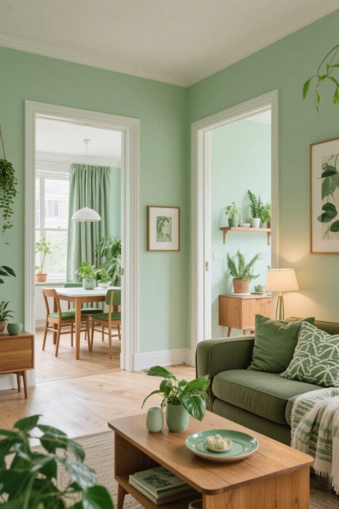
You don’t need to use the exact same paint color in every room (unless you’re going for that minimalist monastery vibe). But repeating certain tones or accents creates a visual rhythm.
Here’s how to do it without becoming a robot:
- Use the same wall color in multiple rooms, but change up the accessories or textures.
- Flip roles. Use the wall color from your living room as an accent in your dining room, and vice versa.
- Stick to similar saturation levels. If your kitchen is pale blue, don’t jump to deep burgundy in the next room. That’s… a lot.
IMO: Repeating colors feels intentional. Random new color every 10 feet? Not so much.
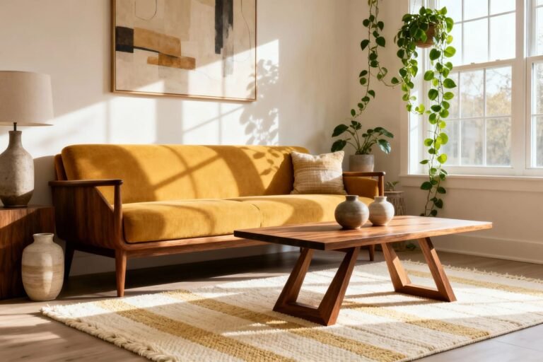
Let Flooring and Furniture Guide You
Your walls shouldn’t feel like the odd one out.

Look down (yes, right now). What color are your floors? That’s going to influence every paint choice you make. Same goes for your couch, rugs, cabinets, and that one quirky vintage armchair you can’t part with.
Keep these in mind:
- Wood floors have undertones. Are they warm (reddish, golden) or cool (gray, taupe)?
- Match or contrast—on purpose. Don’t pick wall colors that kinda clash with your sofa. It’s like inviting two exes to the same party and hoping for the best. 😬
- Anchor with neutrals. If your furniture’s bold, go easy on the wall color. If your furniture’s neutral, walls can go a little more “look at me!”
Embrace Color Flow Through Open Concepts
You’ve got no walls. Cool. But also: challenge accepted.
If your home is open-concept (aka, no obvious division between rooms), color flow becomes even more important. You can’t just stop a color halfway across a wall. (Unless you’re into awkward paint lines. No judgment. OK, some judgment.)
Your best bet?
- Choose one main color and use it throughout the space.
- Add subtle variation by adjusting the shade. Go one tone lighter or darker in different zones.
- Create visual zones with texture, not just color. Think rugs, lighting, or wall paneling to separate areas without throwing in a random new color.
Hot take: Open concept doesn’t mean one giant beige box. It means intentional cohesion.
Don’t Be Afraid to Break the Rules (Once You Know Them)
Because design is part art, part “whatever makes you happy.”
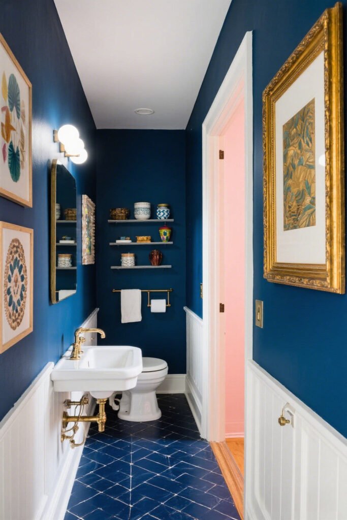
Listen, I love a good guideline. But at the end of the day, your home is your space. Want a navy powder room right next to a pale peach hallway? Go for it—just maybe tie them together with art or accessories.
Some fun ways to be bold and balanced:
- Paint the ceiling a color that connects two rooms.
- Add matching throw pillows or art in rooms with different wall colors.
- Use one “theme” color (like a deep green or soft coral) that shows up in small doses all around your house.
Remember: You’re not locked into one boring palette. You’re just making sure the party guests (aka your colors) get along.
Final Thoughts: Flow Is a Feeling
…And trust me, your eyeballs know when it’s missing.
Creating color flow between rooms isn’t about being matchy-matchy or playing it safe. It’s about making your space feel intentional, calm, and yes—even a little bit stylish. When the transition from one room to the next feels seamless, your home becomes more than just a bunch of rooms. It becomes an experience.
So take your time. Sample those swatches. Hold them up in the weirdest lighting. Sit with the colors. Trust your gut.
And for the love of all things design—step away from the seafoam green unless you’re 100% sure.
Ready to start painting like a pro?
Drop your fave color combos in a note to yourself, play with samples, and just have fun with it. Your home’s personality should reflect you, and a well-planned color flow is the perfect backdrop for everything else you love.
👍 Happy painting!
One Comment