Paint Color Mistakes Everyone Makes (And How to Avoid Them)
Ever painted a room thinking “Yup, this is going to look amazing!”… only to step back and think, “Oh no. What have I done?” Yeah, we’ve all been there.
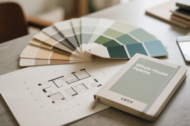
Picking the perfect paint color sounds easy—until you’re three swatches deep, knee-deep in regret, and wondering how the lighting suddenly turned evil.
But don’t worry. I’ve made the mistakes (so you don’t have to), and in this article, I’m walking you through the most common paint color mistakes everyone makes—and how to avoid them like a pro.
Grab your painter’s tape and let’s get into it.
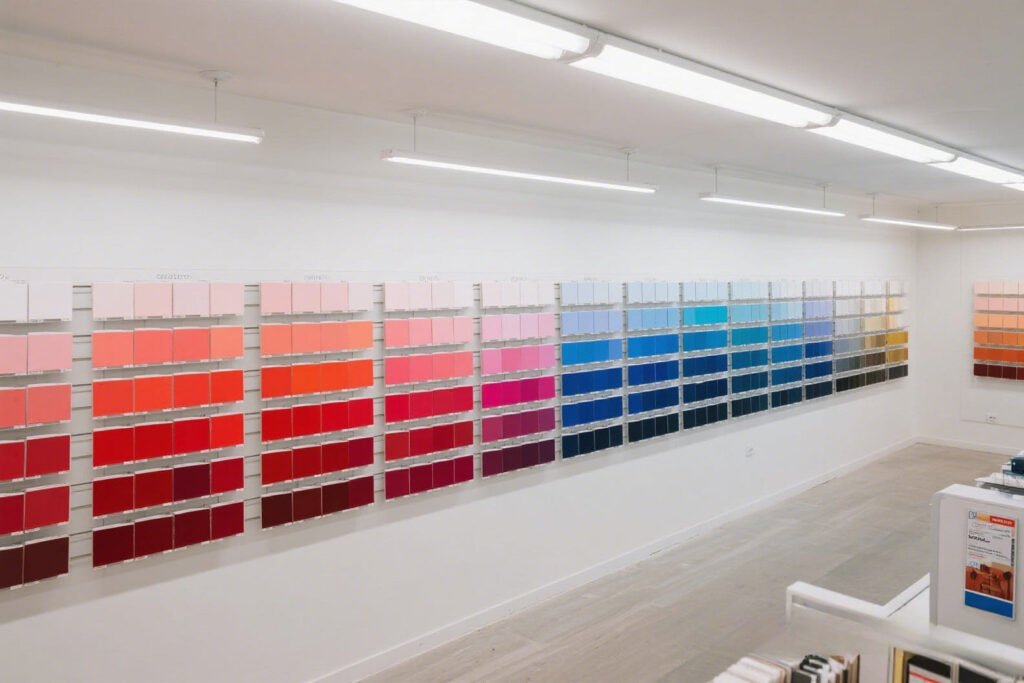
Choosing Paint Colors in the Store (Without Testing at Home)
Let’s start with the classic rookie mistake: falling in love with a color under fluorescent lights in the store. Those lights are liars. They distort color in ways your cozy living room never will.
Here’s the problem:
- Store lighting ≠ home lighting.
- Your home’s natural light shifts throughout the day.
- Wall texture and decor change how color appears.
Avoid it like this:
- Get samples, not full gallons.
- Paint swatches directly on the wall, or on large poster boards you can move around.
- Check them in morning, afternoon, and night light—trust me, you’ll be surprised.
Ever seen a “warm beige” turn into a sickly green at sunset? Yeah… don’t skip this step.
Ignoring Undertones (AKA Why Your “Gray” Looks Purple)
You picked a nice neutral gray. Should’ve been safe, right? But now your walls are giving major Barney the Dinosaur vibes.
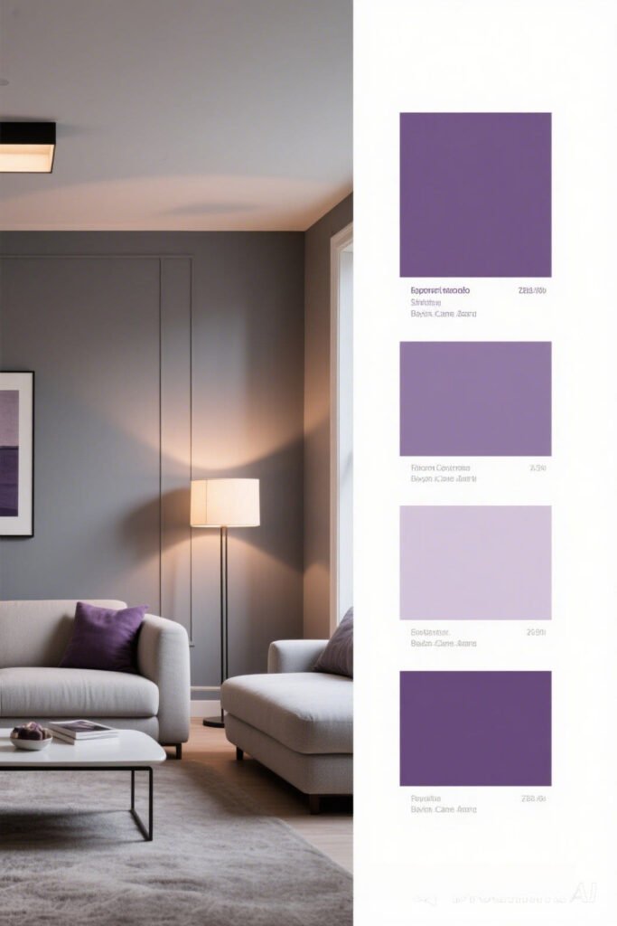
Why this happens:
- Every color has undertones—subtle hints of red, blue, green, etc.
- Your lighting, flooring, and furniture pull out these undertones in weird ways.
How to avoid it:
- Don’t just look at the paint chip—compare it to other similar shades to see what undertones pop.
- If you’re not sure, hold the swatch next to a pure white sheet of paper—it’ll expose any secret hues hiding underneath.
- Think about the surroundings—cool undertones clash with warm decor (and vice versa).
FYI: That “greige” you loved online? Might look taupe on your walls if your lighting’s warm. Test. Always test.
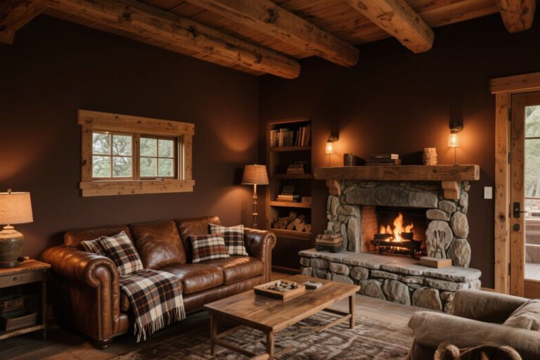
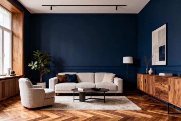
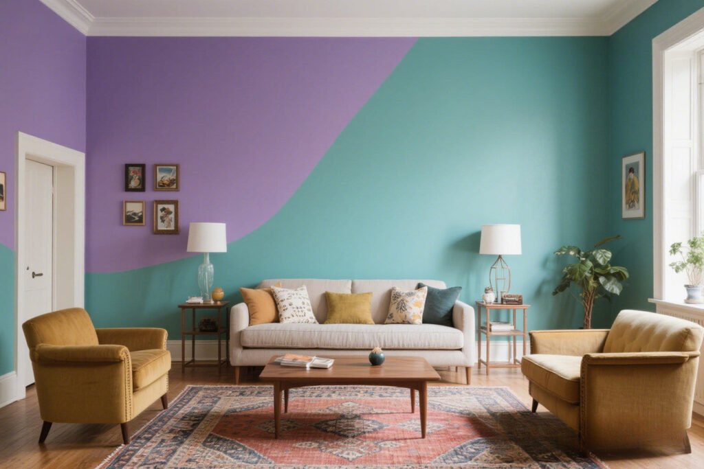
Going Full-Throttle with Bold Colors (Without a Plan)
Listen, I love a bold accent wall. I really do. But going all in with fire-engine red in your tiny guest bathroom? That’s a choice. A loud, echo-y, “what were we thinking?” kind of choice.

Where it goes wrong:
- Bright or dark colors can shrink a space and make it feel heavy.
- Using bold colors everywhere = sensory overload.
Avoid this chaos:
- Use bold colors strategically: think accent walls, niches, or behind bookshelves.
- Pair them with neutral tones to balance things out.
- Try it in small doses first—even painting a single wall can totally change the vibe.
You want drama, not trauma.
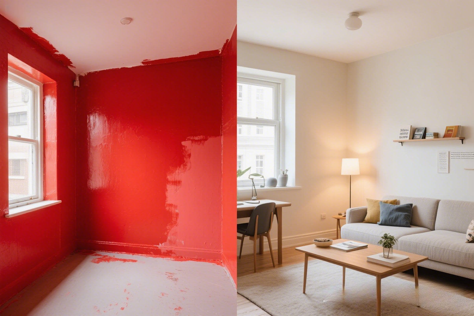
Forgetting About Lighting (Natural & Artificial)
You know how a photo looks different with a filter? Paint colors work the same way—lighting is the ultimate filter.
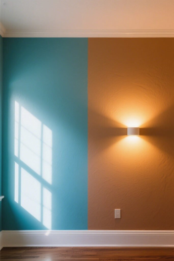
Lighting types and what they do:
- Natural sunlight: shows the truest color, but changes during the day.
- Incandescent bulbs: warm things up—can turn whites creamy or yellows golden.
- LEDs and fluorescents: cool or stark light that can drain warmth from colors.
What to do:
- Pay attention to where the light comes in—north-facing rooms tend to be cooler; south-facing get lots of warm light.
- Check the paint in both daylight and artificial light before you commit.
IMO, lighting is the paint whisperer. Ignore it, and you’ll regret it faster than you can say “eggshell finish.”
Choosing the Wrong Finish (Hello, Wall Imperfections)
Let’s talk paint finishes. This one’s sneaky. You pick your perfect color, slap it on in a high-gloss sheen… and suddenly, your walls are a mirror reflecting every bump, crack, and childhood crayon incident.

Paint finish 101:
- Flat/Matte: great at hiding flaws, but not very washable.
- Eggshell: slightly more durable, still hides imperfections.
- Satin: durable and a bit glossy—ideal for kitchens and hallways.
- Semi-Gloss & Gloss: super shiny, very washable… but shows everything.
Rule of thumb:
Shinier = more durable, but less forgiving. Choose based on the room’s use and the state of your walls.
Your builder-grade drywall will thank you later.
Painting Without Considering the Rest of the Room
So, you’ve picked a lovely sage green. Looks amazing. Until you realize your couch, rug, and art are all clashing like a bad Tinder date.
The issue:
- People often choose a paint color first, then try to match everything else.
- Newsflash: That’s backwards.
Do this instead:
- Build your palette around your existing furniture, floors, or artwork.
- Bring fabric swatches and photos to the paint store.
- Create a mood board (Pinterest is your BFF for this).
Paint is relatively easy to change. A $3,000 sectional? Not so much.
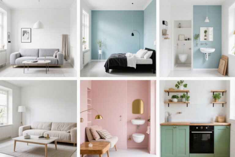
Going All White (Without Considering Tone)
White’s safe, right? Kinda. But here’s the thing: not all whites are created equal. Some are cool, others warm, and some… just look like hospital walls.

Common white pitfalls:
- Using a cool white in a warm room = sterile vibes.
- Warm white in a cool-toned room = yellow-y disaster.
- Glossy white everywhere? You’re basically living in a lightbox.
How to fix it:
- Compare several whites side by side to see their undertones.
- Pair warm whites with beige, taupe, or soft earthy colors.
- Use cooler whites with grays, blues, and sleek modern decor.
Pro tip: Pure white only looks good in ultra-modern, high-light spaces. Otherwise, it’s kinda blah.
Relying Too Much on Trends
We’ve all been tempted. That “Color of the Year” looks stunning on Instagram. But just because everyone is painting their kitchen terracotta doesn’t mean you should too.
Why this backfires:
- Trends come and go—fast.
- You might get sick of it in six months.
- It might not suit your space or your personality.
What to do:
- Use trends as inspiration, not gospel.
- Try trendy shades in small, easy-to-repaint areas like a powder room or entryway.
- If you love it, go for it! But don’t feel like you have to.
IMO, timeless > trendy. Always.
Skipping the Prep Work (AKA the Lazy Painter’s Regret)
I get it. You’re excited. You just want to crack open the can and start rolling. But skipping prep? That’s how paint nightmares happen.
What happens when you skip it:
- Uneven coverage.
- Paint bleeding under tape.
- Dust bumps, peeling, and flaking.
Do yourself a favor:
- Clean the walls. Seriously.
- Fill holes and sand rough patches.
- Prime, especially if you’re covering dark colors or painting over glossy finishes.
- Use painter’s tape and press it down firmly.
Yes, it’s boring. But it makes the difference between “Did you hire someone?” and “Did your toddler do this?”
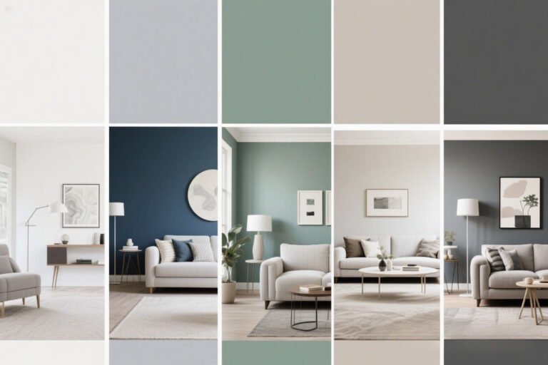
Using Too Many Colors in One Space
Unless you’re running a preschool, your walls don’t need to be a rainbow. Too many competing colors can make your home feel chaotic.
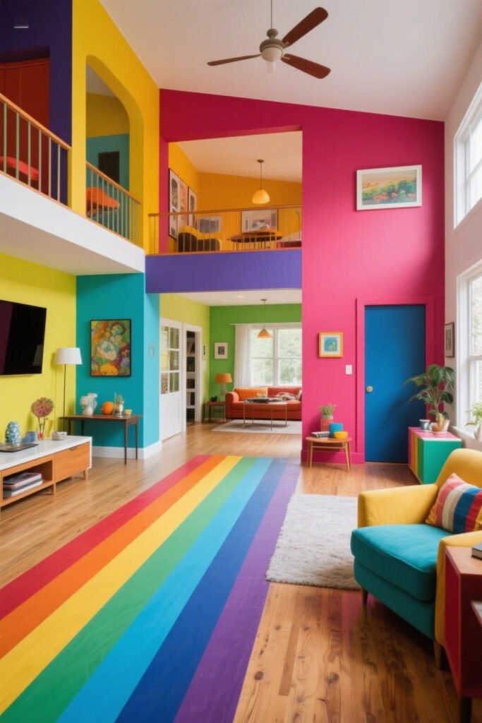
Color chaos looks like:
- Each room painted a drastically different color.
- No visual flow from space to space.
- Clashing undertones that fight for attention.
Fix it like this:
- Choose a cohesive color palette for your whole home.
- Use one or two base neutrals, then add color in layers.
- Let accents (pillows, art, rugs) do the talking.
Your future self (and your guests) will thank you.
Final Thoughts: You’re Not Alone in This
Picking paint isn’t easy. It’s a weird mix of science, psychology, and sheer guesswork. And sure, you might still mess up once or twice. But at least now, you’ll mess up smart. 😉
TL;DR
Here’s how to avoid the most common paint color disasters:
- Test at home.
- Watch out for undertones.
- Light matters more than you think.
- Don’t ignore your decor.
- And prep like your walls’ lives depend on it.
At the end of the day, paint should bring joy—not panic attacks. So slow down, trust your gut, and don’t let a little thing like 547 white swatches stress you out. You’ve got this.