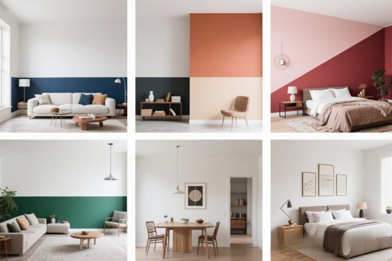
Neutral Paint Colors That Aren’t Boring (15 Ideas)
Let’s be real—neutral paint colors have a bad rap.
People hear “neutral” and instantly picture a dull beige rental wall from 1998. Yawn.
But here’s the thing: neutrals don’t have to be boring. In fact, they can be rich, moody, chic, and downright stunning when done right.
I’ve been through enough paint swatch meltdowns (and “why did I choose that beige?” regrets) to know the magic lies in picking the right shade—and pairing it with the right vibe.
So, if you’re ready to upgrade from meh to wow, here are 15 neutral paint colors that will make your walls the star of the room.
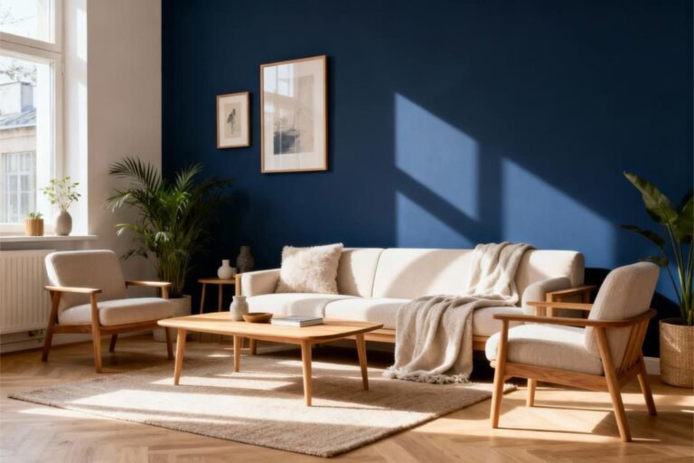
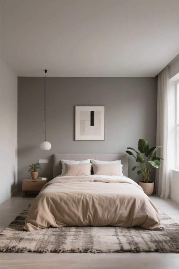
1. Warm Greige (Gray + Beige)
Why it works: Greige is like the Switzerland of paint colors—peaceful, friendly, and works with everything.
It’s warmer than gray but fresher than beige, which means it flatters both modern and classic spaces.
Pro tip: Pair it with crisp white trim to make it pop. Or go full-on cozy with deep wood accents.
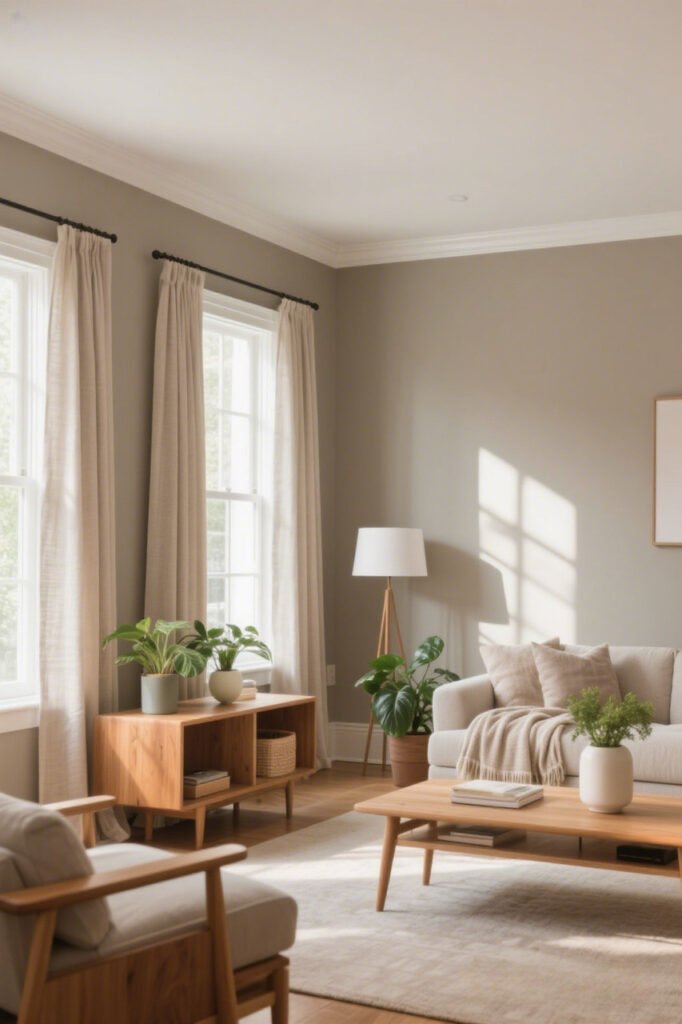
2. Soft Taupe
Taupe is beige’s older, cooler cousin who studied art in Paris.
It’s grounded, sophisticated, and looks gorgeous in both natural and artificial light.
Best for: Bedrooms, dining rooms, or anywhere you want a warm-but-not-too-warm backdrop.
3. Mushroom Gray
No, it’s not as weird as it sounds. Mushroom gray is a soft, earthy mix of gray and brown—basically a hug for your walls.
Why it’s great: It adds depth without overpowering the space, and it pairs beautifully with greenery.
4. Pale Sage
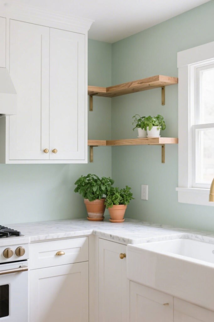
Technically a green, but a neutral at heart. Pale sage is calming, timeless, and works especially well in kitchens and bathrooms.
Hot tip: Add brushed brass hardware for that “designer magazine” look.
5. Warm White
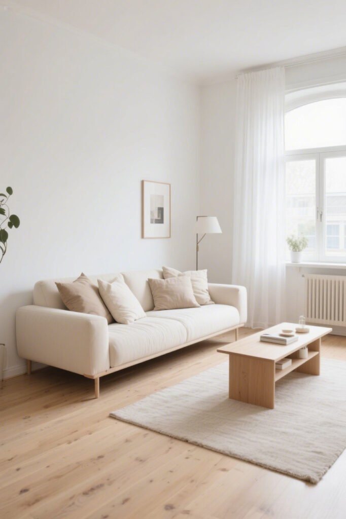
Before you roll your eyes—no, I don’t mean “landlord white.” Warm whites have creamy undertones that make a space feel inviting instead of sterile.
Example shades: Benjamin Moore’s White Dove or Sherwin-Williams Alabaster.
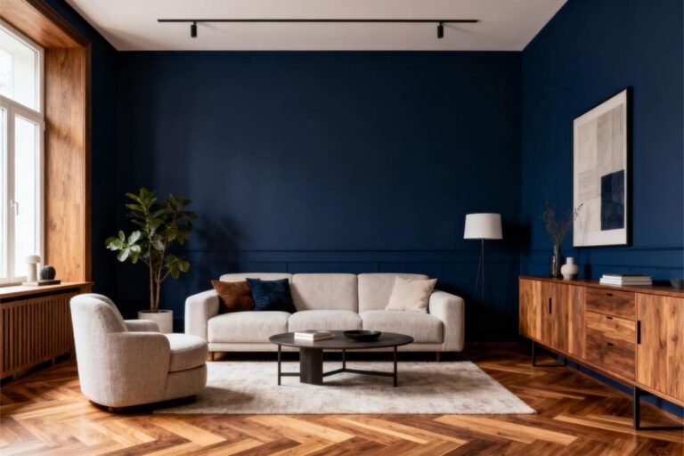
6. Charcoal Gray
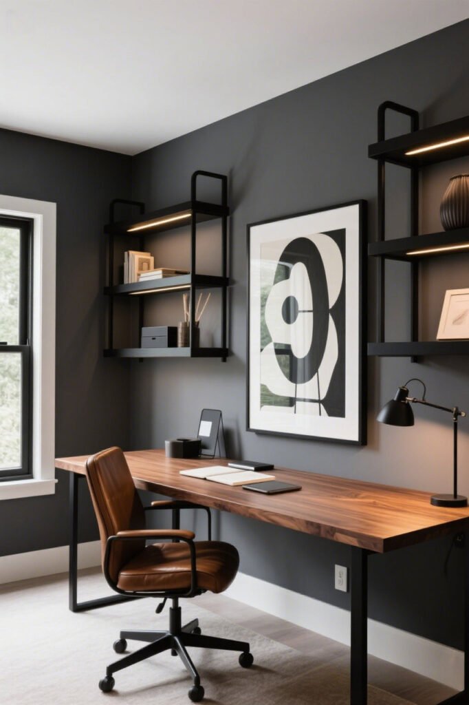
Dramatic? Yes. Boring? Absolutely not.
Charcoal gray adds instant sophistication and makes lighter furniture or art pop.
IMO: This one’s perfect for accent walls if you’re scared to go all in.
7. Greige with a Hint of Green
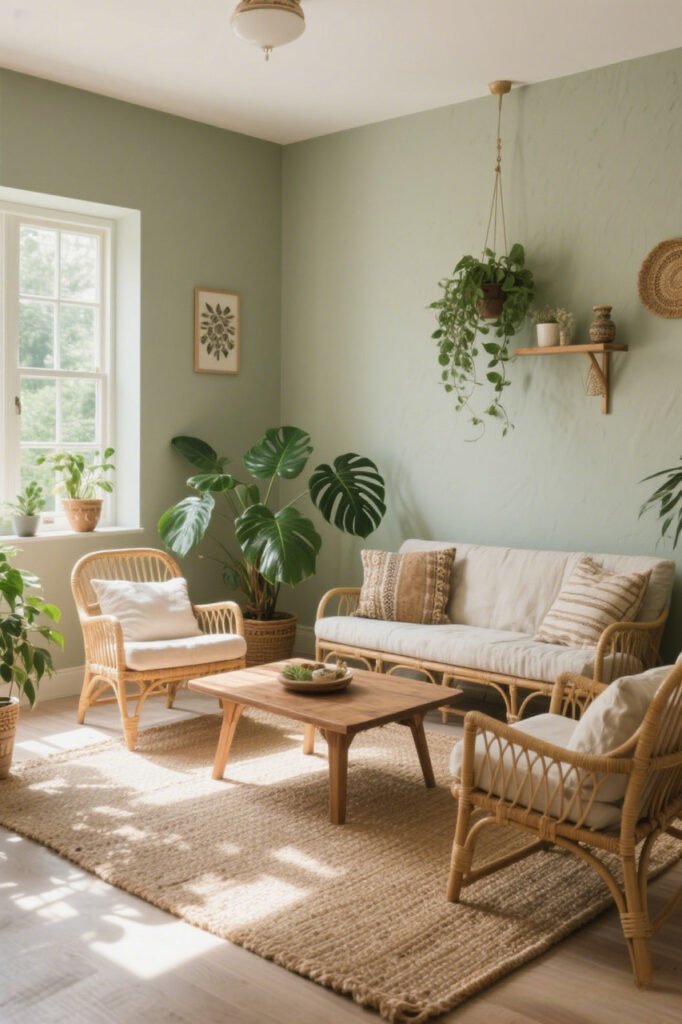
This subtle twist keeps your greige from looking too safe. The green undertone plays beautifully with plants and natural textures.
Pro styling idea: Rattan furniture, linen curtains, and woven rugs for an earthy, boho feel.
8. Warm Clay
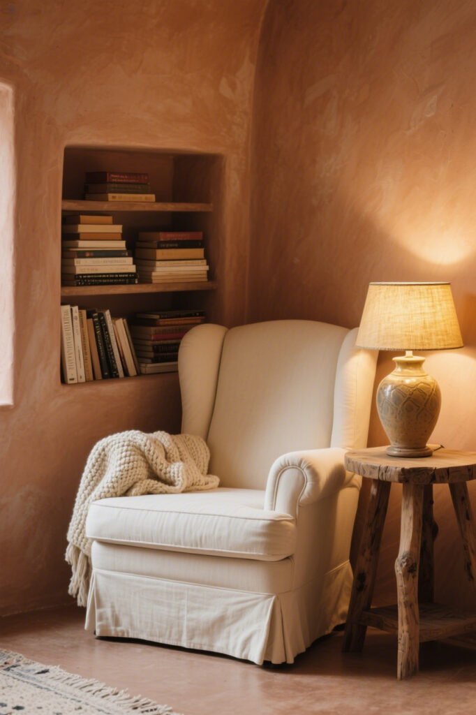
Somewhere between terracotta and beige, warm clay brings a cozy, sun-baked vibe to your space.
Why you’ll love it: It works year-round—warm in winter, bright in summer.
9. Dusty Blue-Gray
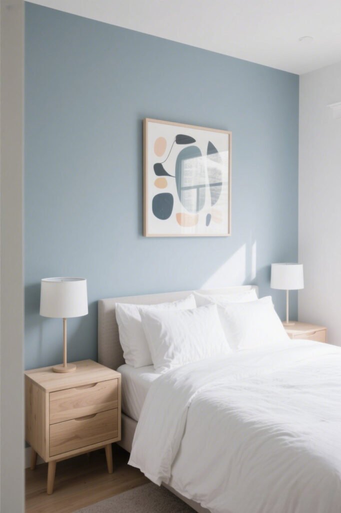
Yes, blue can be neutral—when it’s muted enough. Dusty blue-gray is peaceful and airy, without screaming “beach house.”
Where it shines: Bedrooms, offices, or living rooms that need a calming touch.
10. Creamy Latte

If your walls could give you a hug, this would be it.
Creamy latte shades make a space feel cozy, and they pair beautifully with black or navy accents for contrast.
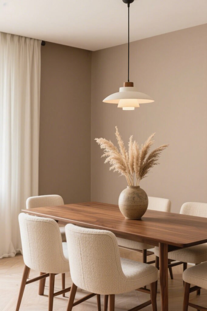
11. Oatmeal Beige

The updated version of plain beige—softer, warmer, and way more stylish.
Why it’s better: It has just enough depth to avoid looking flat, and it plays nice with pretty much every color palette.
12. Stone Gray

A cool, modern gray with subtle brown undertones that keep it from feeling cold.
Designer tip: Works great with concrete, glass, and steel for that urban loft vibe.
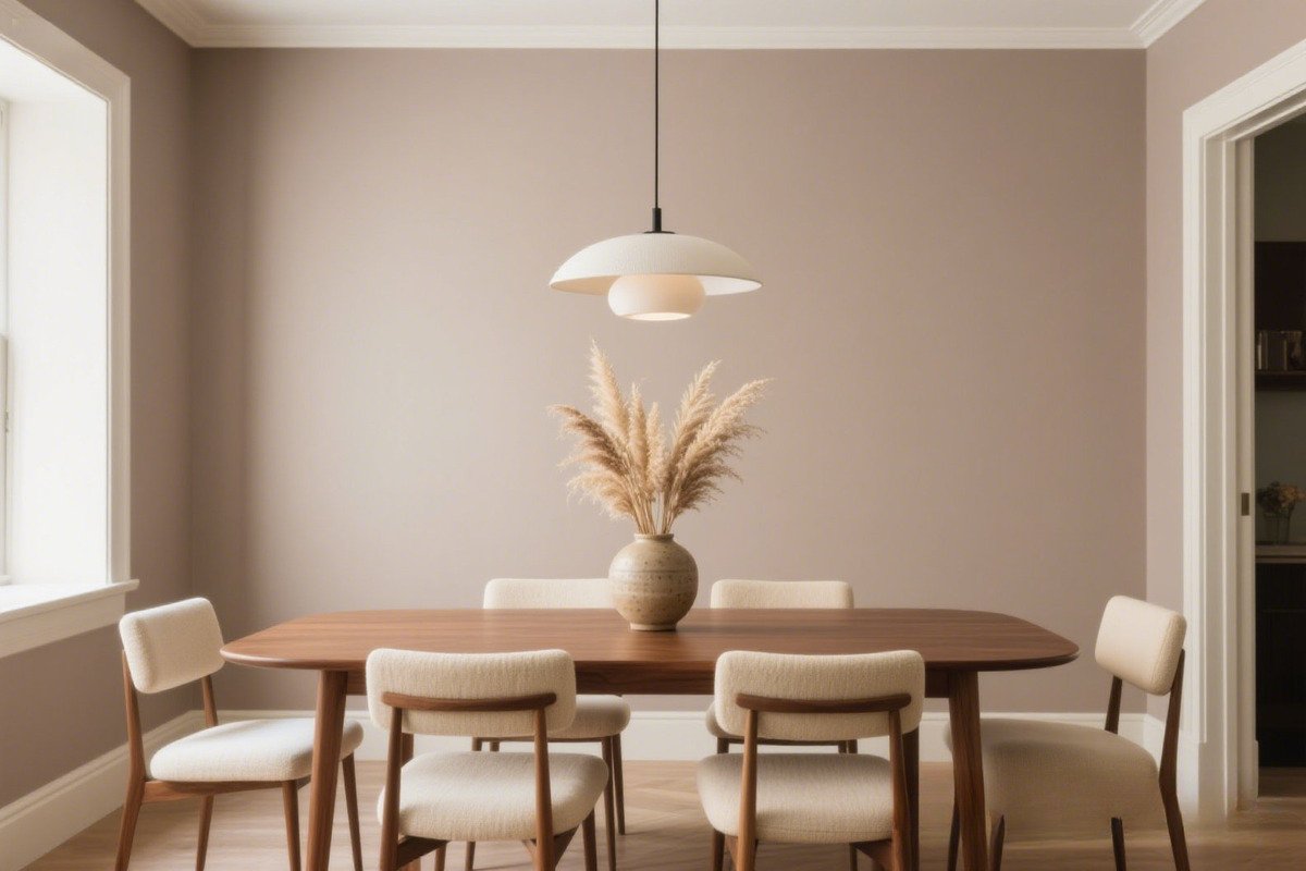
13. Soft Blush Beige
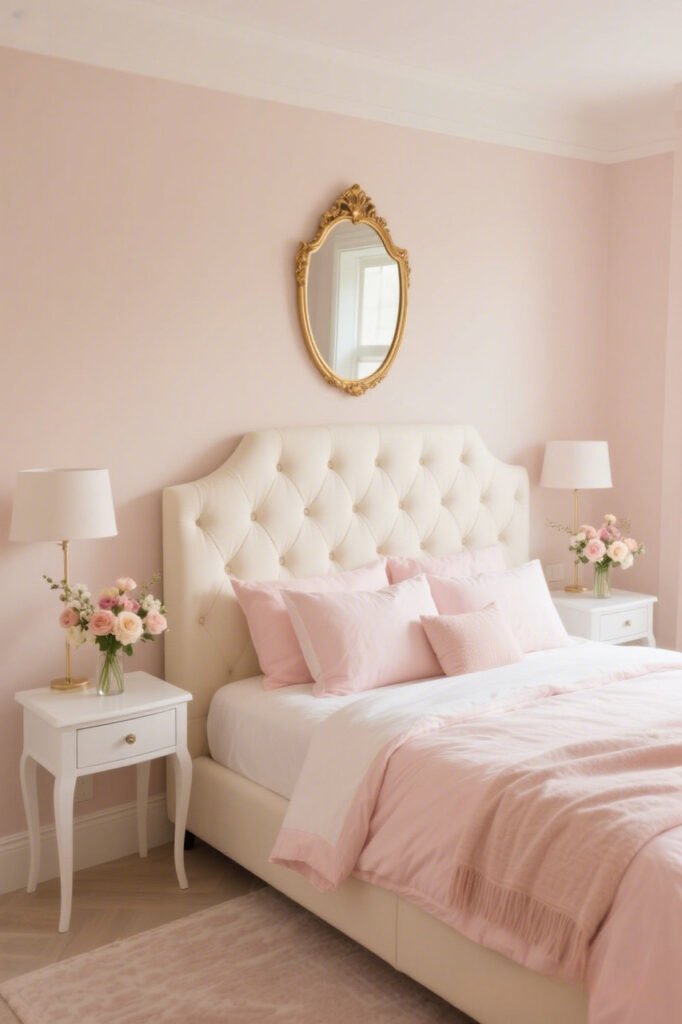
It’s not pink-pink—it’s beige with a whisper of blush. Adds warmth and elegance without feeling girly.
Best for: Dining rooms or cozy living areas.
14. Mocha

Rich, warm, and coffee-inspired (yes, please). Mocha walls can feel luxurious and grounded, especially when paired with gold or bronze accents.
15. Smoky Olive

Dark enough to feel sophisticated, but still earthy and grounding. Smoky olive is a mood in the best way possible.
Pair it with: Cream textiles, matte black fixtures, and warm wood tones.
How to Make Neutral Walls Pop (Without Losing the Chill)
Okay, so you’ve picked your favorite neutral—now what?
Here’s how to make sure it doesn’t fade into the background:
- Add texture: Think linen curtains, chunky knit throws, or jute rugs.
- Play with contrast: Pair warm walls with cool-toned decor (or vice versa).
- Layer in greenery: Plants make any neutral feel alive.
- Mix metals: Brushed brass, matte black, and polished chrome all look amazing against neutrals.
Why Neutrals Are Actually the Smart Choice
Here’s the deal—neutral walls give you freedom.
They let you switch up your furniture, art, or seasonal decor without committing to a color you’ll get sick of in six months.
Plus, they tend to photograph beautifully (hello, Instagram-worthy shots). And let’s not forget—if you ever sell your place, buyers usually love a neutral backdrop.
My Two Cents
I’ve painted more rooms than I can count, and every time I go bold, I love it… for about a year. Then I’m itching to repaint. But my neutral-painted rooms? They still look fresh years later. That’s the real magic—neutrals are timeless when done right.
So no, they’re not boring. Unless you choose that beige from the early 2000s. (You know the one.)
Final Takeaway
Neutral paint colors are like a great pair of jeans—they go with everything, they work in any season, and when you find the right fit, you never want to change.
Whether you go for warm greige, smoky olive, or creamy latte, the trick is picking a shade with depth and personality. Add the right textures, lighting, and accents, and you’ll have a space that feels anything but bland.
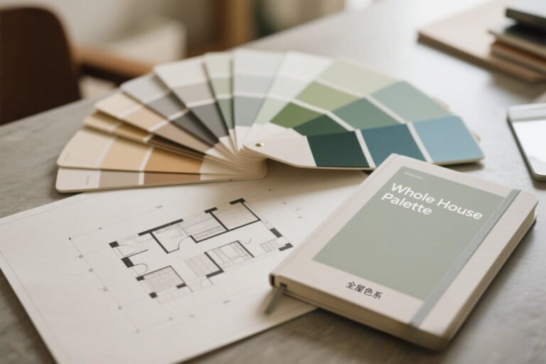
So grab a few swatches, test them out on your wall, and see how they look morning, noon, and night. And remember: if your “neutral” feels boring, it’s not the wall’s fault—it’s the wrong neutral. 😉