The Best Paint Colors for Home Offices (Boost Focus & Creativity)
Okay, let’s be honest—working from home is awesome and a little dangerous.
One minute you’re writing that report, and the next, you’re staring at your beige walls wondering if you should repaint them, rearrange your furniture, or maybe just take a nap. Sound familiar? 🙂
Here’s the truth: the paint color in your home office can make or break your productivity.
Yep, color psychology is real, and if your office currently looks like a beige graveyard, it’s probably not doing you any favors.
I’ve tested different shades in my own space (yes, even a regrettable neon green phase), and I can tell you—the right paint color changes everything.
So, let’s talk about the best paint colors for home offices that actually help you focus, feel creative, and stay sane.
Why Paint Colors Matter for Productivity
Ever noticed how a bright red room makes you feel energized (or, let’s be real, slightly aggressive)? Or how a soft blue feels like a spa day? That’s color psychology at work.
Colors affect your mood, energy, and even how long you can sit at your desk without wanting to throw your laptop out the window.
Think of your office walls as a secret productivity hack—cheaper than buying a new desk and way less annoying than downloading another time-tracking app.
Best Paint Colors for Focus
When you need laser-sharp concentration, some shades just work better than others.
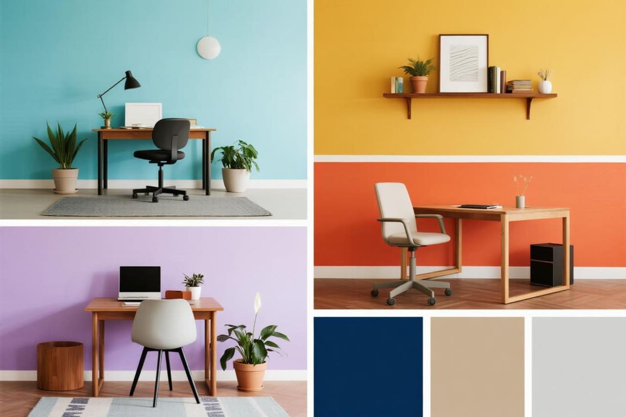
1. Soft Blue
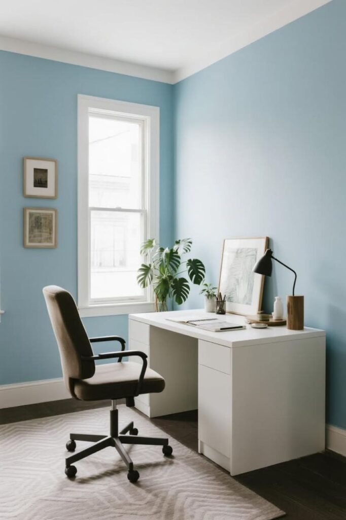
Blue is the king of focus and calm. A light or muted blue lowers stress, keeps your brain steady, and makes you feel grounded.
Ever wondered why so many tech offices paint their walls blue? It’s not because they got a bulk discount—it’s because blue keeps people working without wanting to scream.
Pro tip: Pair soft blue walls with white trim for a clean, crisp vibe that screams “organized genius.”
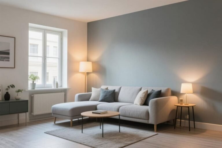
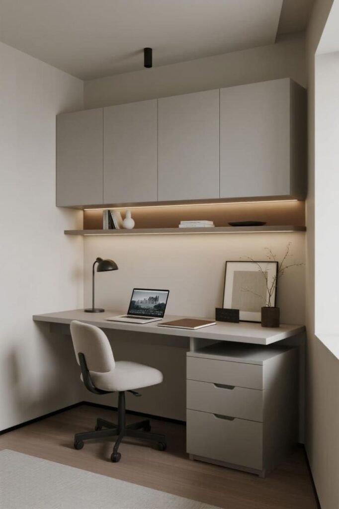
2. Cool Gray
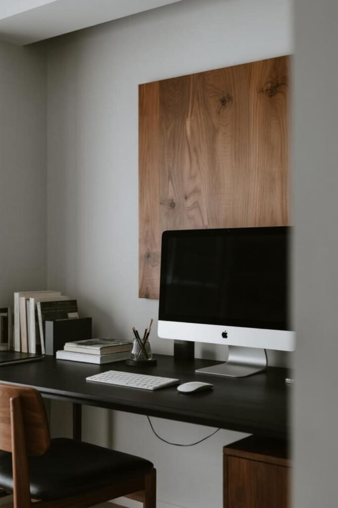
If you love minimalism (but don’t want your office to feel like a prison), cool gray is a winner. It keeps distractions low, goes with literally everything, and adds a modern, professional touch.
But heads up: Too much gray can feel dull. Balance it with warm wood furniture or pops of color in your decor.
3. Muted Green
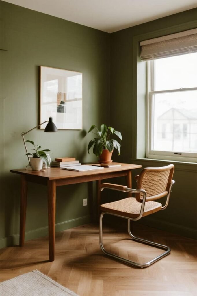
Green = balance and harmony. It’s the color of nature, money, and all those leafy plants you keep forgetting to water.
A muted sage or olive green reduces eye strain (super helpful if you stare at screens all day).
Best Paint Colors for Creativity
Need to brainstorm? Come up with fresh ideas? Or maybe just make that Zoom background look less boring? These shades will kick your creativity into gear.
1. Warm Yellow
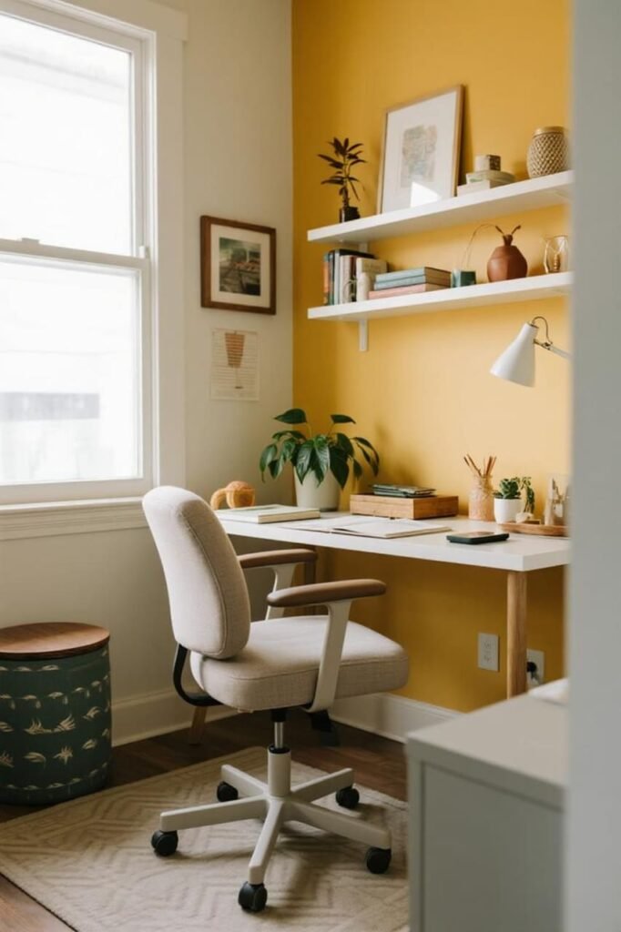
Yellow sparks energy and optimism. It’s basically sunshine on your walls. A buttery yellow or soft golden shade helps ideas flow and makes your office feel welcoming.
Caution: Don’t go full highlighter yellow unless you want headaches. Keep it soft and subtle.
2. Coral or Terracotta
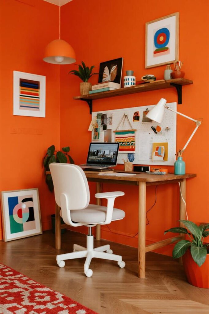
These shades feel bold but cozy. Coral adds vibrancy, while terracotta brings warmth without overwhelming you. They’re perfect for creative fields where you want inspiration but not chaos.
FYI: Coral pairs beautifully with white furniture, while terracotta loves natural wood.
3. Soft Lavender
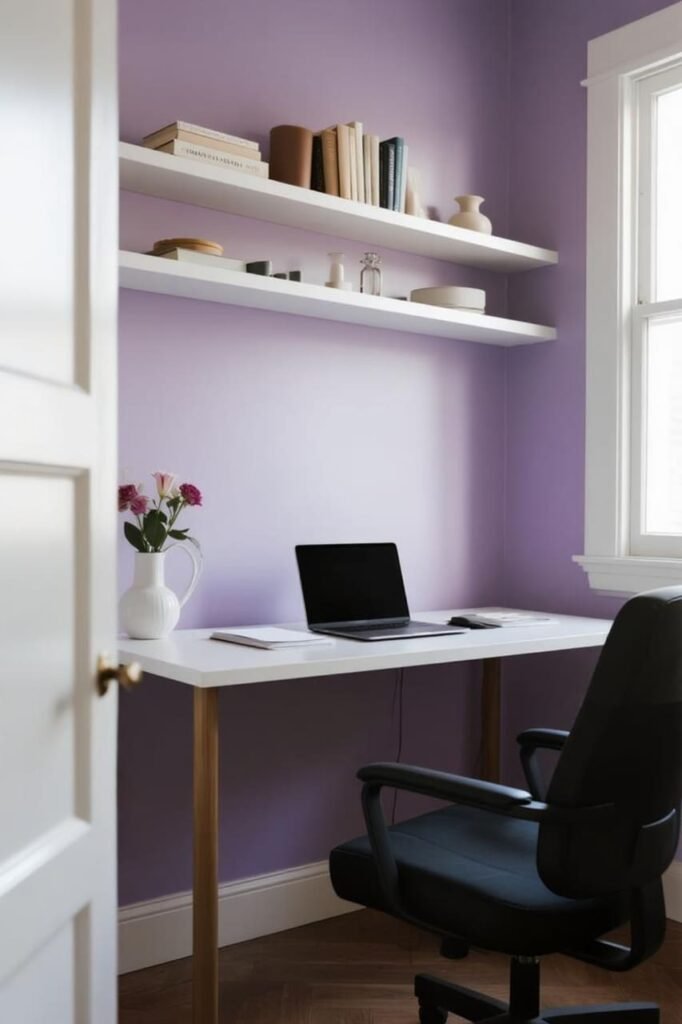
Lavender is like a creative whisper. It’s soothing but still playful enough to keep your imagination alive.
IMO, it’s one of the most underrated office colors—it gives you that dreamy, inspired vibe without making your space feel like a teenager’s bedroom.
Neutral Paint Colors (With a Twist)
Not into bold colors? No problem. Neutrals can be far from boring if you choose wisely.
1. Off-White with Warm Undertones
Plain white feels sterile, but off-white with a hint of cream or beige feels inviting. It gives you a blank canvas that works with any decor, plus it bounces light beautifully—perfect if your office is tiny.
2. Greige (Gray + Beige)
Greige is the “cool kid” of neutrals. It’s versatile, modern, and adds just enough warmth to avoid that cold corporate vibe. Think of it as the perfect middle ground—professional but not stiff.
Bold Choices (For the Brave)
If you’re not afraid to make a statement, go bold. Just remember, bold colors work best in small doses or accent walls, unless you want your office to feel like a carnival ride.
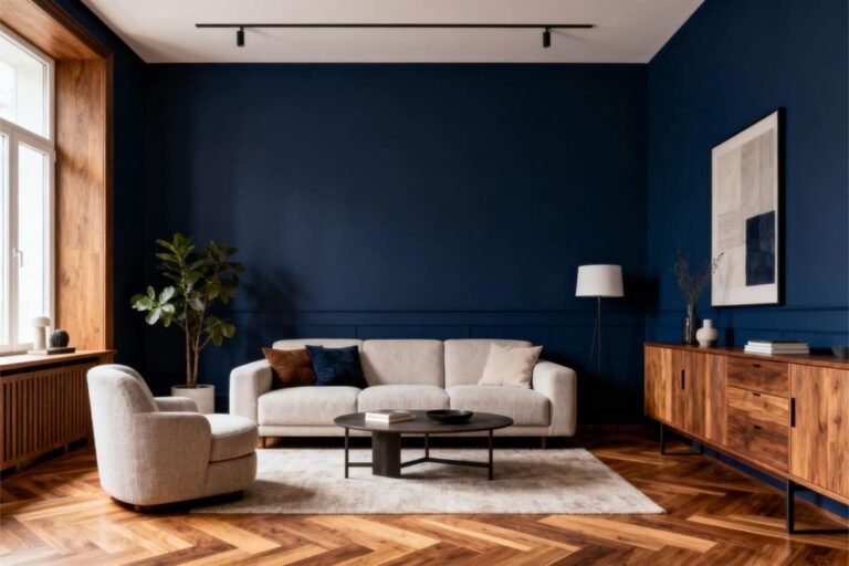
1. Navy Blue
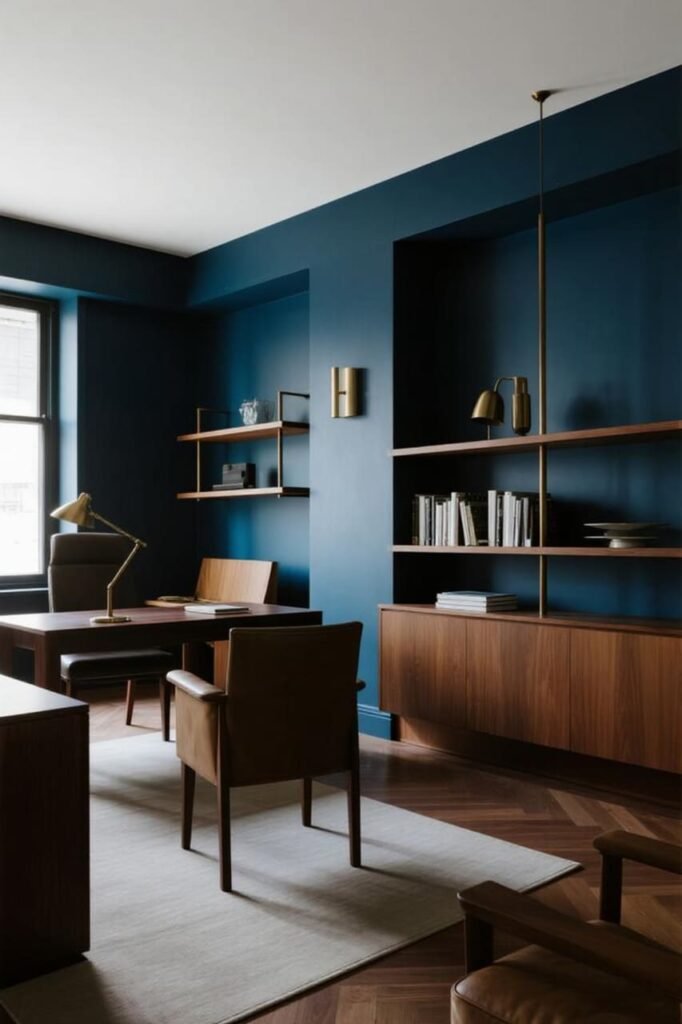
Navy is deep, dramatic, and oh-so-sophisticated. It’s amazing for making a space feel powerful and grounded. Pair it with brass or gold accents, and you’ve got yourself a CEO-level office.
2. Forest Green
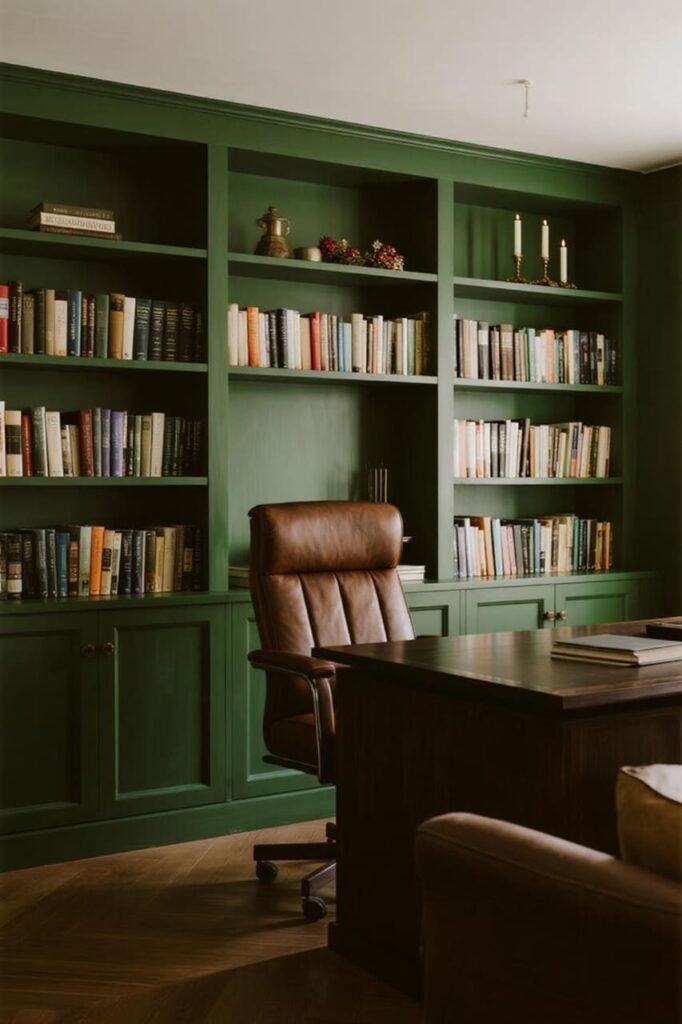
Want a “library with leather chairs and big ideas” vibe? Go with a rich forest green. It’s moody, intellectual, and makes you feel like you should be writing the next great novel.
3. Charcoal Black
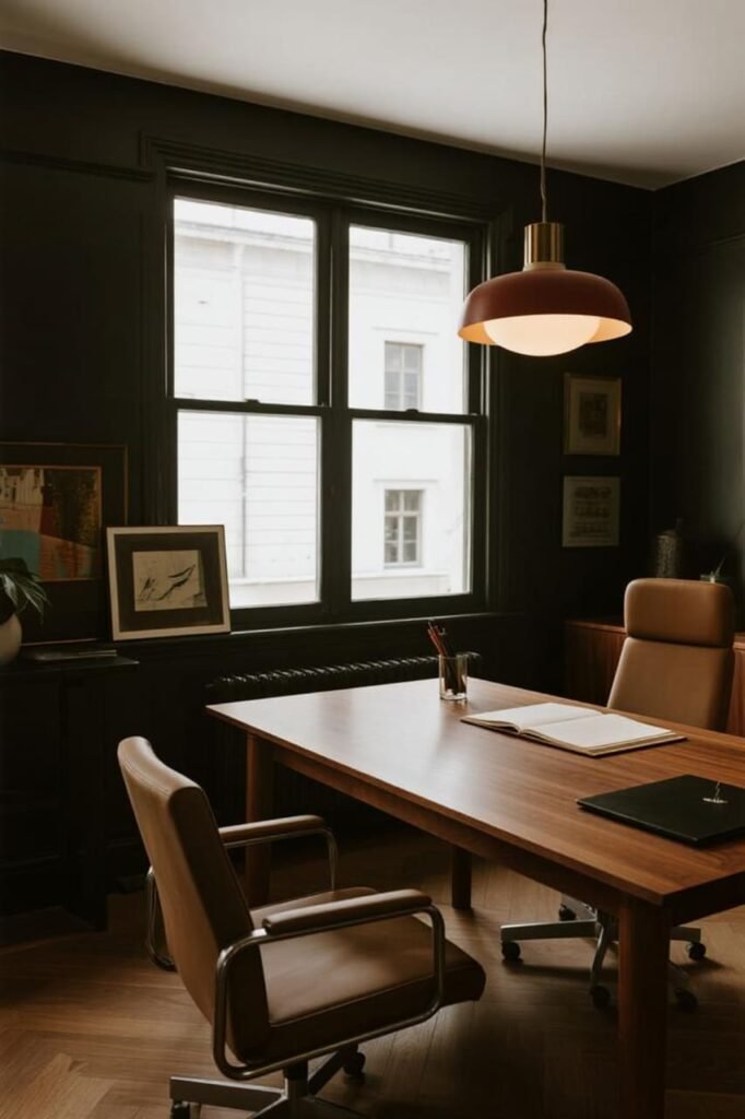
Yes, black walls. Hear me out: with the right lighting and decor, charcoal black feels modern and sleek, not gloomy. It’s bold, but it can actually help you block out distractions and focus.
How to Choose the Right Color for Your Home Office
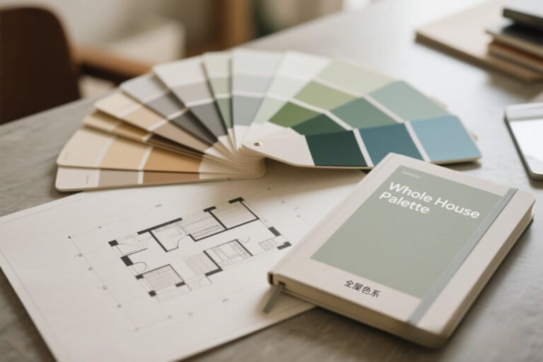
Okay, so now you know the options. But how do you pick the perfect shade without painting your walls ten times? (Been there, done that.)
Here’s a simple checklist:
- Think about your work style. Need calm focus? Go blue or gray. Want energy and inspiration? Try yellow or coral.
- Check your lighting. Natural light makes colors brighter; dim spaces need warmer shades to avoid looking dull.
- Match your personality. If bold colors make you anxious, skip them. If neutrals bore you, go wild with a statement wall.
- Test samples first. Paint a small section and live with it for a few days. Colors look different at 8 AM vs. 8 PM.
- Don’t forget decor. Your wall color should complement your furniture, art, and vibe—not fight with it.
Quick Paint Pairing Ideas
Want inspiration without overthinking? Try these combos:
- Soft blue walls + white desk + wood shelves = calm and crisp
- Sage green + natural wood + rattan accents = earthy and balanced
- Warm yellow accent wall + neutral furniture = cheerful but not overwhelming
- Navy blue + brass lamp + dark wood = bold and sophisticated
My Personal Favorites
I’ve tried a lot of paint colors (again, neon green was a mistake). Out of all of them, these three win every time:
- Soft Blue for focus—clean, refreshing, and stress-free.
- Terracotta for creativity—warm, earthy, and super cozy.
- Greige for flexibility—it looks amazing with everything and never feels boring.
If I had to pick just one? Soft blue. It’s like a productivity cheat code.
Conclusion
Your home office doesn’t need to be boring. In fact, the best paint colors for home offices can completely transform how you feel and work every single day.
Whether you want calm focus (hello, soft blue), sparks of creativity (hey there, coral), or a bold statement (looking at you, navy blue), the right shade sets the tone for everything you do.
So grab some paint samples, test them out, and give your office the glow-up it deserves.
Who knows? That perfect wall color might be the secret weapon that finally gets you through your to-do list without scrolling TikTok for “just five minutes” (we’ve all been there).