How Lighting Changes the Way Paint Colors Look
Ever painted a wall, stepped back, and thought, “Wait… did I just buy the wrong color, or is my house trolling me?” Yeah, been there.
Paint samples can look dreamy at the store, but once you slap that color on your living room wall—under your lighting—it suddenly looks… off.
Sometimes it’s too dark, sometimes too bright, and sometimes it just feels like the color belongs in another galaxy.
Here’s the thing: lighting changes the way paint colors look. Big time. And unless you want to spend your weekend repainting (again), understanding how light affects color is a total game-changer.
So grab your mental paintbrush, because we’re diving into how light and paint work together (or sometimes, against each other).
Why Lighting Matters More Than the Paint Can
Paint doesn’t live in a vacuum (well, unless you’re an astronaut decorator—which honestly sounds kinda cool).
Every color reacts to light. That’s why the same paint swatch looks totally different in your kitchen at 9 AM versus your bedroom at 9 PM.
Think of paint like your friend who changes outfits depending on the vibe. Bright lights? They’re all sparkly and bold. Low lights? Suddenly they’re giving mysterious, moody energy. Same friend, different look.
So, before you commit to “Cozy Beige #57,” remember: what you see in the store isn’t always what you’ll get at home.
The Science-y Bit (But Don’t Worry, It’s Fun)
Light comes in two main flavors: natural light and artificial light. Both can completely change how your paint color shows up.
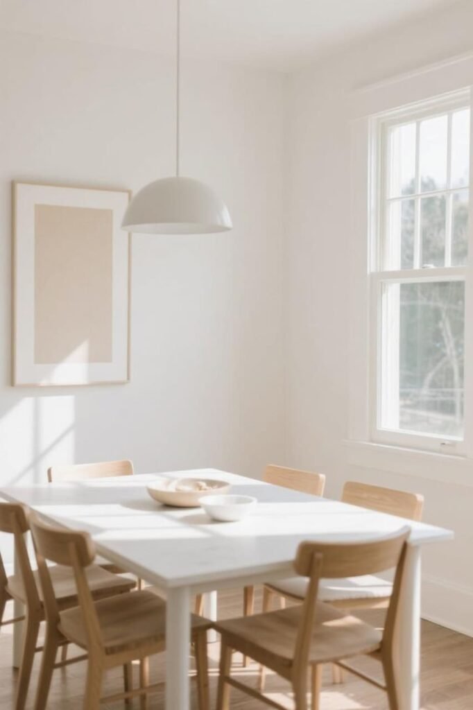
Natural Light: The OG Influencer
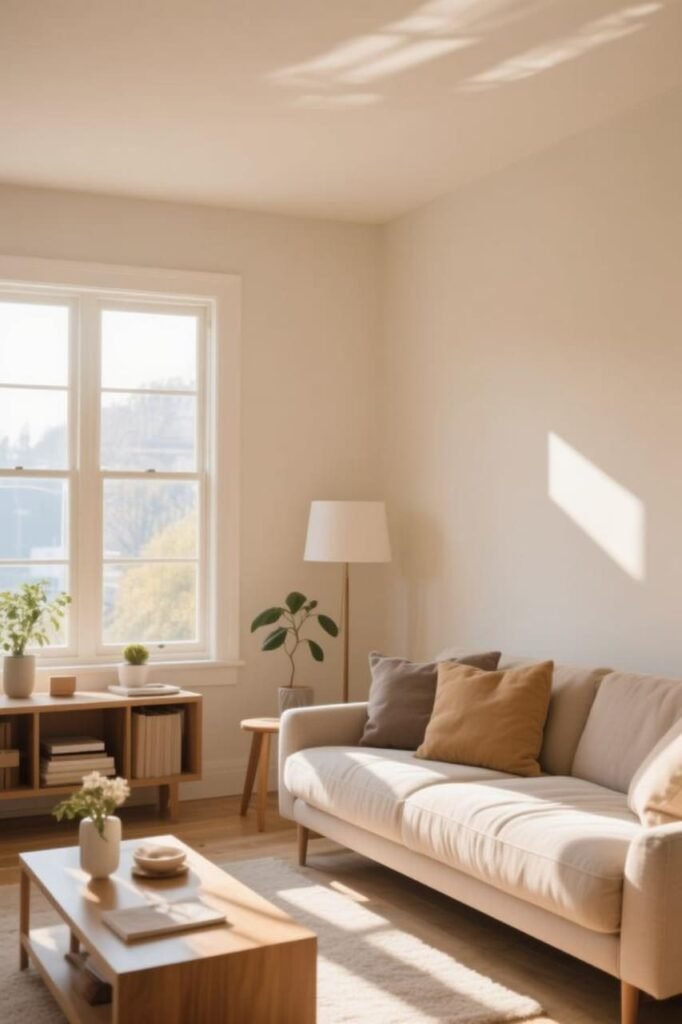
- Morning light (east-facing rooms): Cool, soft, and slightly blue. Your “warm cream” may look a little icier here.
- Afternoon light (west-facing rooms): Warm, golden, and rich. Colors pop and feel cozier.
- North-facing rooms: Often grayish and dim. Colors lean cooler and muted.
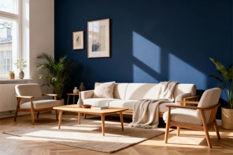
- South-facing rooms: Jackpot! You get bright, consistent light all day, which makes colors look more accurate.
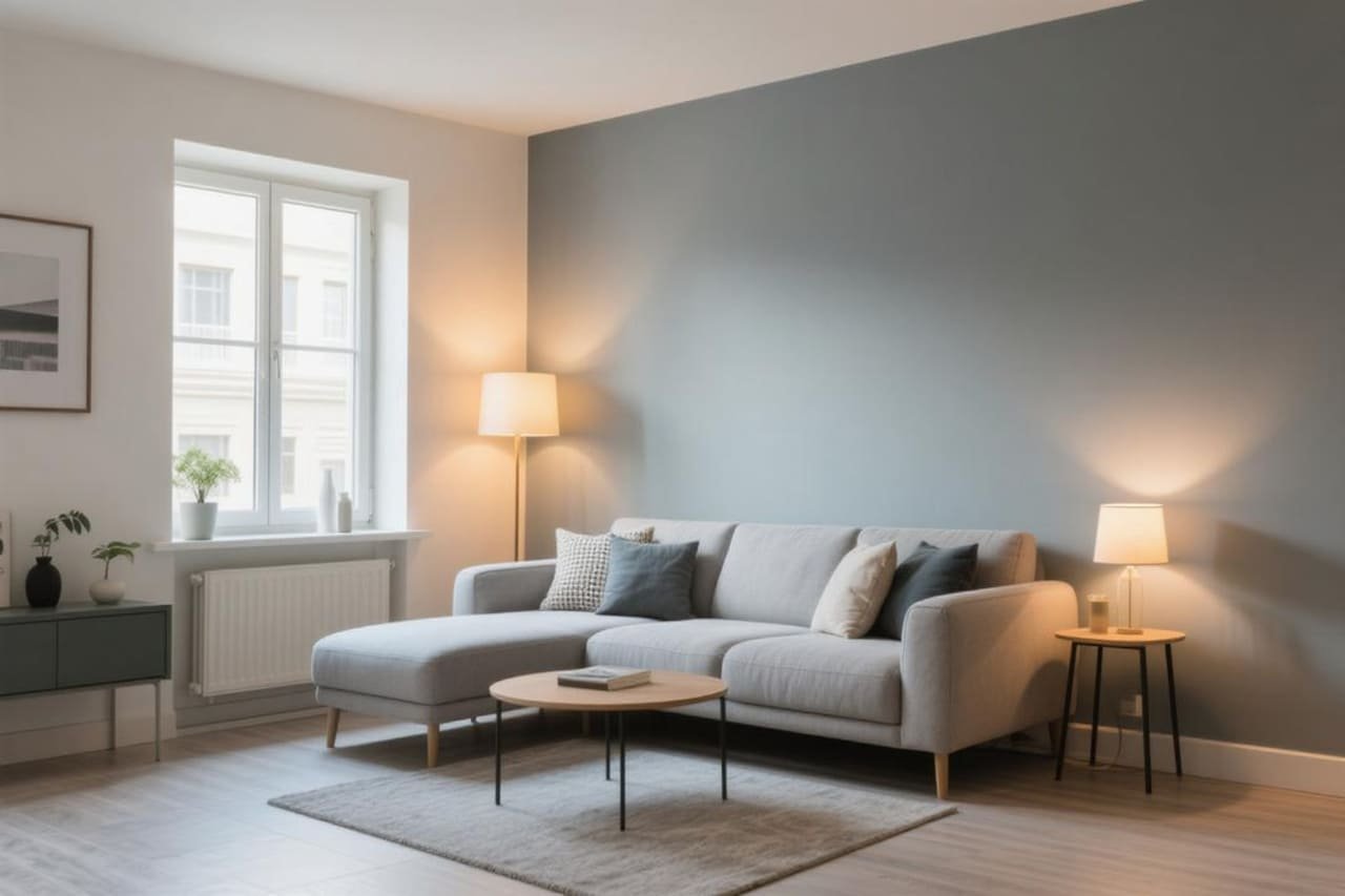
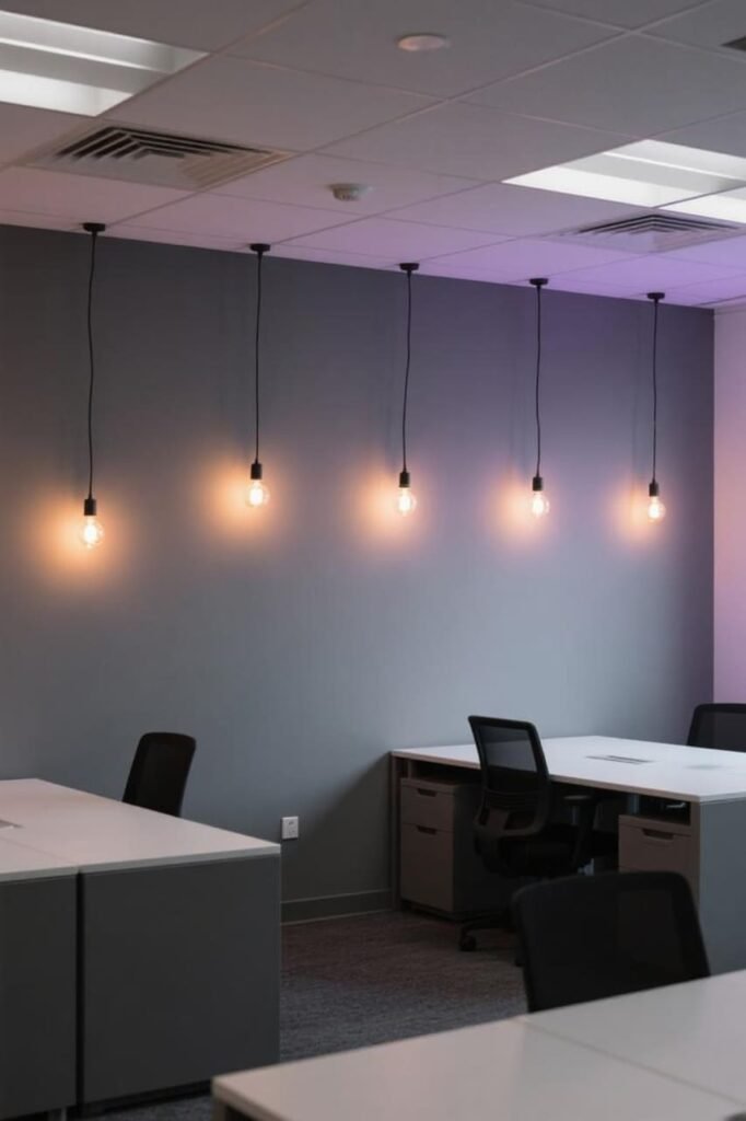
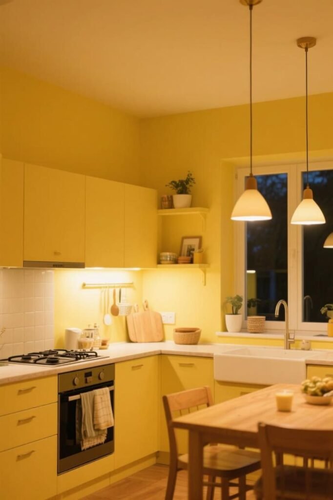
Artificial Light: The Drama Queen
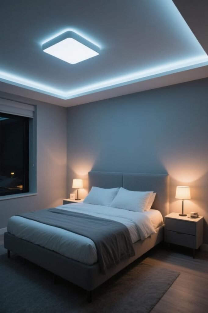
Different bulbs = different moods.
- Incandescent bulbs: Warm and yellowish. They make reds, oranges, and yellows glow but can muddy blues and greens.
- Fluorescent bulbs: Cool and bluish. They bring out greens but can make warm tones look dull.
- LED bulbs: The chameleons. They come in warm, cool, and daylight versions, so you can fine-tune the vibe.
How Warm vs. Cool Light Shifts Color

Here’s where it gets fun (and slightly frustrating). The same wall color can look like two entirely different paints depending on the light.
- Warm light (yellow/orange glow): Makes warm paint colors (reds, yellows, beiges) look richer but can wash out cool colors (like blue or gray).
- Cool light (bluish glow): Boosts blues and greens but makes warm tones look a bit flat.
- Daylight-balanced light (neutral white): Shows paint colors closer to their “true” shade—what you probably thought you were getting from that sample.
Ever notice how a “soft gray” suddenly looks lilac at night? That’s not your eyes playing tricks—it’s the lighting.
Real-Life Example (AKA My Personal Paint Fail)
I once painted my bedroom a gorgeous gray—at least, it looked gorgeous in the store. But at home, under my warm bedside lamp, it turned purple. Like, Barney-the-dinosaur purple. Not the vibe I was going for.
Moral of the story? Always test your paint in your own lighting. What works in the showroom might not work in your space.
Tips for Choosing Paint Colors Based on Lighting
Want to avoid your own Barney situation? Here’s how to outsmart tricky lighting:
- Sample, sample, sample. Paint big swatches (not those tiny sticker-sized ones) on different walls. Check them morning, noon, and night.
- Know your room’s direction. North-facing = cooler, south-facing = warmer, etc. Plan your colors accordingly.
- Test with your actual lighting. Turn on the lamps, ceiling lights, and whatever else you’ll use daily.
- Think about bulb type. If you use warm bulbs, lean toward warm-friendly paints. If you’re a cool-light fan, pick colors that thrive in that environment.
- Don’t forget sheen. Matte absorbs light and looks softer, while gloss bounces light and makes colors feel brighter.
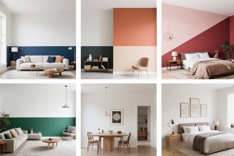
How Different Colors Behave in Different Lighting
Not all paints are equal when it comes to playing nice with light. Here’s a quick breakdown:
Whites and Neutrals
- In natural light: Crisp and fresh.
- In artificial light: Can shift warm or cool depending on bulb. Some whites even look yellow at night (ugh).
Grays
- In natural light: Often show undertones (blue, green, purple).
- In artificial light: Warm bulbs bring out purple/red undertones; cool bulbs make them lean icy.
Blues and Greens
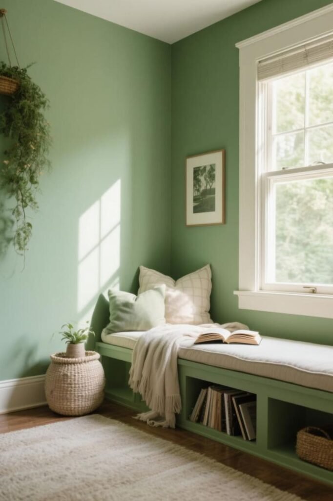
- In natural light: Bright and calming.
- In artificial light: Can look darker or duller under warm lights, but they pop under cooler bulbs.
Reds, Oranges, and Yellows
- In natural light: Bold and cheerful.
- In artificial light: Glow beautifully under warm light but may look muddy under fluorescent or cool LEDs.
Tricks Designers Swear By
If you want pro-level results, borrow a few tricks from designers:
- Layer your lighting. Mix ambient, task, and accent lighting so your paint looks good in all scenarios.
- Use dimmers. Total lifesaver. They let you control brightness and mood, so your walls never feel “off.”
- Match paint undertones with light warmth. Cool gray + cool bulb = harmony. Warm beige + warm bulb = cozy. Mix them wrong, and chaos ensues.
- Consider reflective surfaces. Mirrors, shiny floors, and even glossy furniture can bounce light around and mess with how your paint looks.
Common Mistakes People Make
Let’s call out the classics:
- Skipping the test swatches. (Seriously, just do it. It saves you money and headaches.)
- Choosing paint under store lighting. Those lights are designed to flatter everything. Sneaky, right?
- Ignoring undertones. That “neutral gray” probably has a secret blue or purple lurking.
- Forgetting night lighting. Your walls live 24/7, not just during daylight hours.
So… What’s the Best Light for Paint Colors?
Short answer: daylight bulbs. They give the most balanced, natural look. But IMO, it depends on your vibe. Want cozy? Go warm. Want modern and crisp? Go cool.
At the end of the day, your paint should work with your lifestyle, not against it. If you only use your living room at night, test your colors under your actual lamps.
If your kitchen gets tons of natural light, pick a color that looks great in sunshine.
Conclusion
Lighting is basically the ultimate paint wingman—or enemy, depending on how you use it.
The same paint can look completely different depending on the light source, time of day, and even bulb type.
If you want walls that always look amazing, don’t just pick a pretty color in the store. Test it in your own home, under your own lights, and at different times of day.
Because trust me, nothing feels worse than thinking you picked a classy gray and ending up with “mystery lavender.” 😉
So go ahead—grab those paint samples, flip on the lights, and see how your walls transform.
Once you get the hang of how lighting changes the way paint colors look, you’ll never make a paint-choice regret again.