How to Build a Gallery Wall Around a TV Without Clutter
Let’s be real for a second — a big black TV sitting on your wall can look like a sad, lonely rectangle sucking the life out of your living room décor. Been there.
I used to stare at my TV wall thinking, “This needs something… anything.” Then it hit me: gallery wall around the TV.
Sounds fancy, right? But if you’re not careful, it can also scream chaotic flea market explosion. Luckily, you don’t have to choose between chic and clutter.
I’ve done the trial-and-error (so you don’t have to), and I’m here to spill everything I’ve learned about building a gallery wall around a TV without clutter — and actually making it look intentional and cool.
Why Even Build a Gallery Wall Around a TV?
Let’s start with the obvious: TVs dominate your living room visually. They’re massive and not exactly cute.
Adding art around the TV softens its presence and creates a focal point that feels curated instead of purely functional.
Plus:
- It hides the black void. The TV blends into the décor instead of sticking out like a sore thumb.
- It shows personality. You can display your favorite prints, photos, or quirky items.
- It balances the room. Especially helpful in open-concept spaces.
Ever noticed how Pinterest makes TV walls look like art galleries? Yep, it’s intentional.
Step 1: Plan Like a Pro (Trust Me on This One)
Map It Out Before You Touch a Nail
I once jumped straight into hanging frames without planning. Spoiler alert: disaster. Now I always plan layouts first.
- Measure the TV and wall space. You’ll thank yourself later.
- Sketch your layout on paper or use a free online tool.
- Create a frame template using brown paper or painter’s tape on the wall to visualize the arrangement.
Pro tip: Leave at least 2–3 inches between the TV frame and your artwork. This breathing room prevents the area from looking crammed.
Decide on a “Mood” or Theme
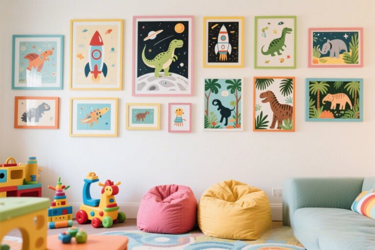
Do you want it sleek and modern? Cozy and eclectic? Vintage grandma chic? (Hey, no judgment.) Defining a vibe up front keeps your wall cohesive instead of chaotic.
Step 2: Pick the Right Frames and Artwork
Match or Mix?
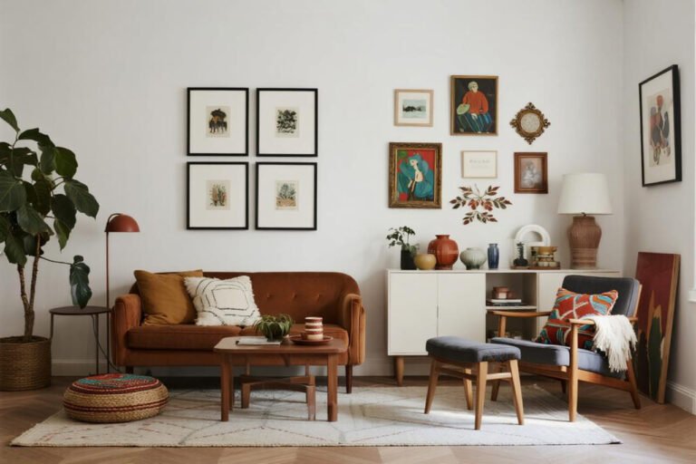
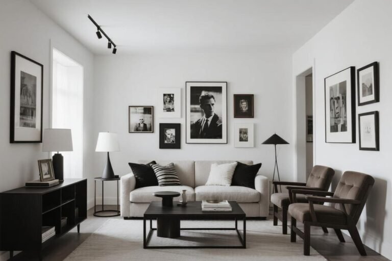
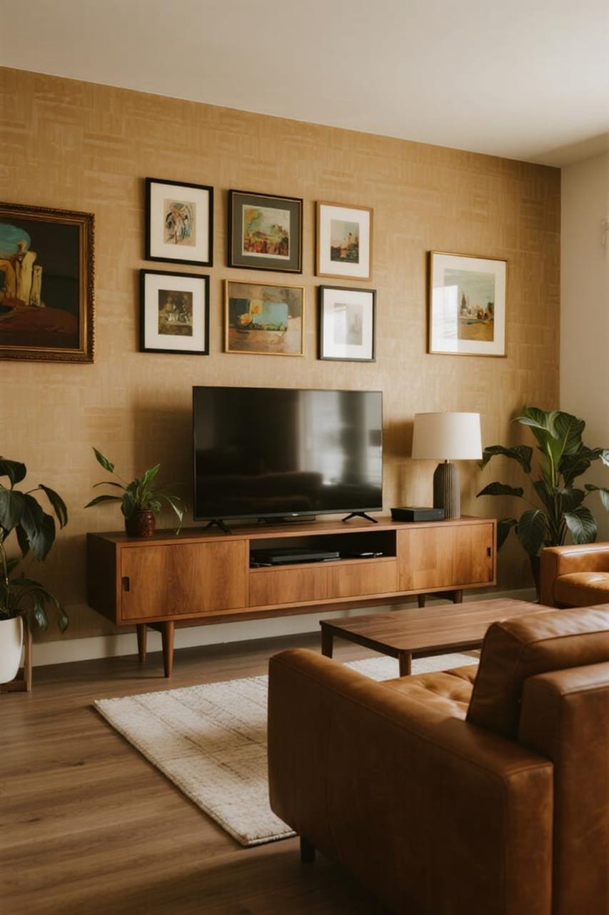
If you crave order, use matching frames in the same color — black, white, or wood are classic. This creates a symmetrical, clean vibe that complements the TV’s rectangular shape.
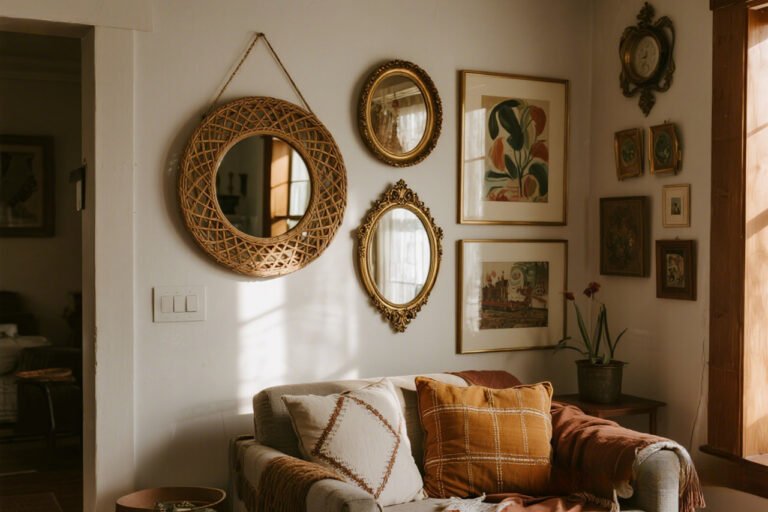
If you’re more eclectic (aka my default mode), mix frame styles but keep one element consistent — like all white mats or similar wood tones — to tie it together.
Artwork Ideas That Won’t Overwhelm
You’re not limited to traditional art prints. Try:
- Family photos in black-and-white (instant cohesion).
- Line drawings or minimalist prints to balance the TV’s boldness.
- Floating shelves with small décor pieces for depth.
- Textured pieces like woven hangings to soften the techy feel.
Bold tip: Avoid busy, super-bright prints right next to the TV. They compete for attention instead of complementing it.
Step 3: Symmetry vs. Eclectic — Pick Your Fighter
Symmetry (The Calm Option)
Want order? Arrange frames evenly on both sides of the TV. This museum-like vibe makes your space look intentional and polished.
Benefits:
- Easier to plan and execute.
- Creates balance around a large screen.
- Works well with minimalistic décor.
Eclectic (The Fun Option)
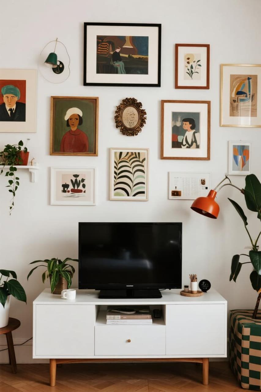
Feeling adventurous? Stagger frames at different heights for a more organic feel. Think art gallery meets cool coffee shop.
Benefits:
- Adds personality and depth.
- Lets you mix media — photos, art, 3D objects.
- Easier to add new pieces over time.
IMO, eclectic feels more “lived-in,” but symmetrical can be stunning when done right. Which side are you on?
Step 4: Consider Color Palettes Like a Designer
I once used random frames I already owned, and the result? Let’s just say it looked like a thrift store explosion. Color palettes matter.
- Match the tones in your room. If your sofa is cool gray, choose frames in similar hues.
- Use neutral mats to unify mixed artworks.
- Limit your palette to 2–3 main colors for frames and art combined.
Rhetorical question: Would you wear clashing neon shoes with a tux? Same logic applies to your gallery wall.
Step 5: Layering and Depth Without Clutter

Mix Wall Art with Small Decor Pieces
A gallery wall doesn’t need to be flat. Add:
- Small floating shelves for plants or candles.
- A sculptural wall sconce for extra light.
- A basket or woven tray hung on the wall for texture.
Space Is Your Friend
Don’t cram every inch. Negative space lets the TV breathe. Group 2–3 items close together and leave gaps between clusters.
Use Scale Wisely
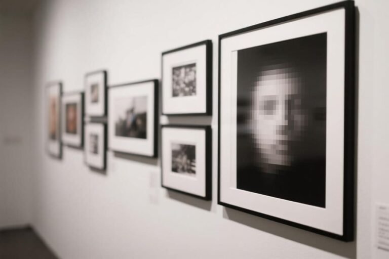
Balance large and small frames. For example, anchor the layout with one big print above the TV and surround it with smaller pieces. It keeps the eye moving without feeling chaotic.
Step 6: Cable Management (Because Wires Ruin Everything)
You can create the most gorgeous gallery wall, but if a snake pit of wires dangles underneath? Ugh.
Options:
- Conceal wires inside the wall with a simple DIY kit.
- Use cord covers painted the same color as your wall.
- Hide the TV box and gadgets in a floating cabinet or console.
Nothing says “not cluttered” like a clean cable situation.
Step 7: Lighting Matters — Don’t Skip This

Lighting makes or breaks your gallery wall. Spotlighting a symmetrical wall adds a chic, museum-like glow.
Meanwhile, soft, scattered lighting flatters eclectic walls by highlighting their texture and depth.
Ideas:
- Install slim picture lights above key frames.
- Add ambient floor lamps nearby for soft glow.
- Use smart bulbs to adjust warmth depending on the vibe.
Ever noticed how art galleries never use harsh overhead light? Same concept here.
Step 8: Keep It Flexible
Start Small, Build Over Time
You don’t need to hang 15 frames in one day. Start with a few anchor pieces and expand later. This keeps your wall from looking forced.
Swap Art Seasonally
Rotate prints or photos for a fresh vibe without adding more clutter. I swap mine out during the holidays — it’s like a free mini makeover.
Use Removable Hooks
Command Strips are your BFF here. They let you rearrange without Swiss-cheesing your walls. FYI, your future self will thank you.
Common Mistakes to Avoid (AKA My Wall of Shame)

- Hanging art too close to the TV. Always leave breathing room.
- Ignoring scale. Tiny frames next to a massive TV look like afterthoughts.
- Overloading the wall. White space is not your enemy.
- Clashing colors and styles. Pick a unifying element.
- Forgetting about the room’s overall vibe. Your gallery wall shouldn’t look like it belongs in a completely different house.
Personal Touch: My Favorite Hack
Here’s my secret sauce: print art in black-and-white first. Even if you plan to go colorful later, starting monochrome lets you nail the layout without feeling overwhelmed.
Once the spacing looks good, swap in color prints. It’s basically a free mockup IRL.
Wrapping It All Up
So there you have it — how to build a gallery wall around a TV without clutter and without losing your mind. The key? Planning, cohesion, and breathing room.
Whether you go symmetrical and sleek or eclectic and playful, a gallery wall can transform that boring TV area into the heart of your living room.
I always tell friends: “Your TV shouldn’t boss your décor around — you should boss it.” Once you’ve got your frames up, your cables hidden, and your lighting dialed in, sit back, binge your favorite show, and bask in the glow of your perfectly styled wall.
Ready to give your TV wall the glow-up it deserves? Grab some painter’s tape, map it out, and start experimenting.
Trust me — once you see the difference, you’ll never look at your TV wall the same way again.