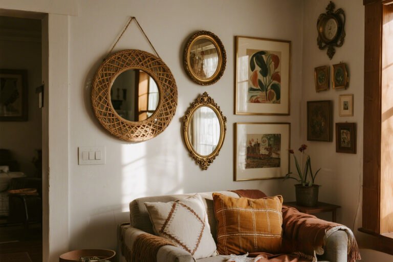
Black-and-White Gallery Walls That Make a Bold Statement
Why Everyone’s Obsessed with Black-and-White Walls
Let’s be real — color can be tricky. One day you’re in love with sage green, and the next it feels like your grandma’s bathroom. But black-and-white gallery walls? They never ghost you.
They’re classic, bold, and always on-trend. Whether you’re styling a studio apartment or a sprawling loft, this combo hits the sweet spot between drama and minimalism.
I’ve been a long-time fan of monochrome setups. My first attempt was a DIY black-and-white photo grid in my college dorm (let’s just say it looked more like a ransom note than art).
Since then, I’ve learned a few tricks to make black-and-white gallery walls look intentional, not like a random Pinterest board gone rogue.
Ever wondered why this look pulls so much weight? Stick around — we’re breaking down how to nail the black-and-white vibe while keeping your walls from feeling like an art museum on a budget.
The Magic Behind Black-and-White Gallery Walls
🡆 The Psychology of Monochrome
Black and white never argue. They complement each other like peanut butter and jelly — minus the sticky cleanup.
Black anchors the space; white keeps it light and airy. Together, they create instant contrast that draws the eye, even if your art isn’t priceless.
Ever walked into a room with too many colors fighting for attention? It’s chaos. Monochrome cuts through that noise and makes your wall art the star.
FYI, this approach works in both minimalist and maximalist homes (yes, really).
🡆 Built-In Sophistication
No matter your design style — modern farmhouse, mid-century, or straight-up Scandi — black and white give your gallery wall an automatic sense of sophistication.
Even your $5 thrift-store prints look like curated art pieces when framed right.
Picking the Right Pieces
🡆 Photographs, Prints, or Abstracts?
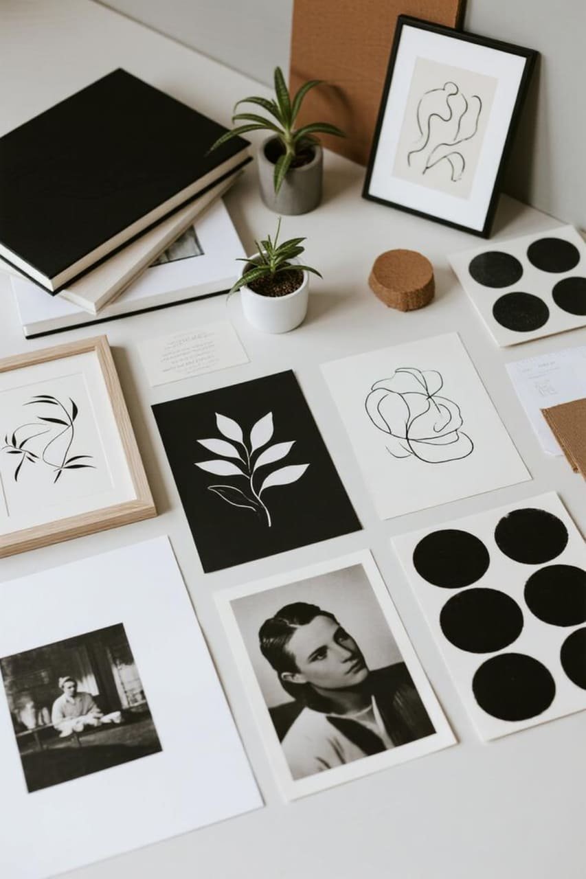
Here’s the beauty: anything looks good in black and white when styled thoughtfully. Consider:
- Black-and-white photography for a timeless, classy vibe (think Ansel Adams, but cheaper).
- Minimalist line art for a Scandinavian, clean aesthetic.
- Bold abstract prints for a more dramatic and artsy feel.
- Personal snapshots in monochrome filters — instant nostalgia.
When in doubt, mix mediums. I like to pair a moody black-and-white photo with a quirky minimalist print to keep the wall from feeling too serious.
Because IMO, no one wants a “funeral chic” vibe in their living room.
🡆 Size Matters (Yes, Really)
Mix large statement pieces with smaller ones. Big frames create visual anchors, while smaller pieces fill gaps without cluttering.
This combo gives your gallery wall rhythm — like a playlist with both bangers and slow jams.
Frames: The Secret Sauce
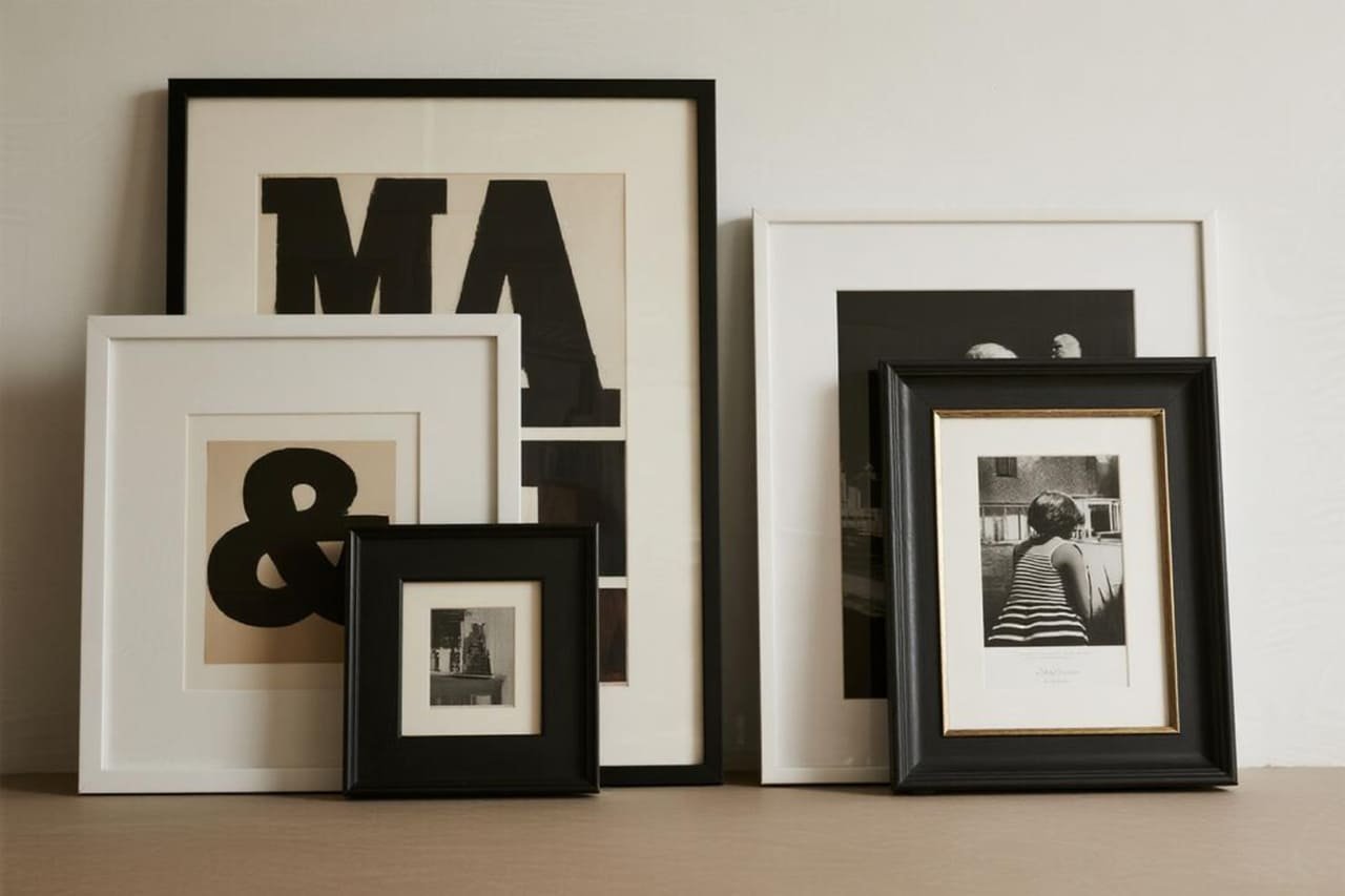
🡆 Black Frames vs. White Frames vs. Mixed
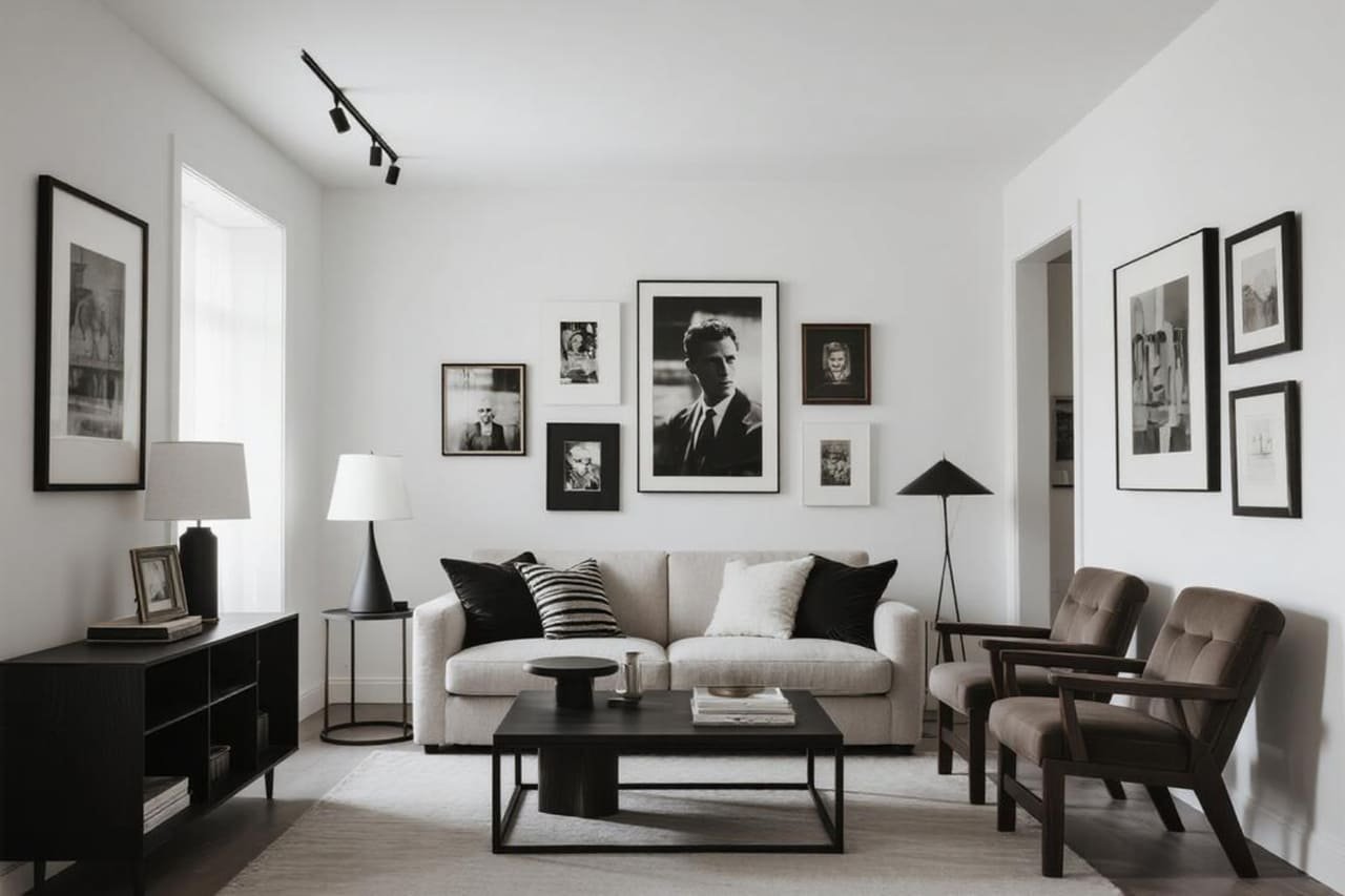
- All-black frames: Clean, dramatic, modern.
- All-white frames: Airy, fresh, perfect for small spaces.
- Mixed black-and-white frames: Edgy and eclectic.
Personally, I go mixed when I’m feeling rebellious. It adds personality and keeps the wall from looking like a corporate office hallway.
🡆 Matte Magic
Always use a matte or no-glare finish for your frames. Glossy reflections can kill the mood faster than a bad date.
Layout Ideas That Actually Work
Symmetrical Grid
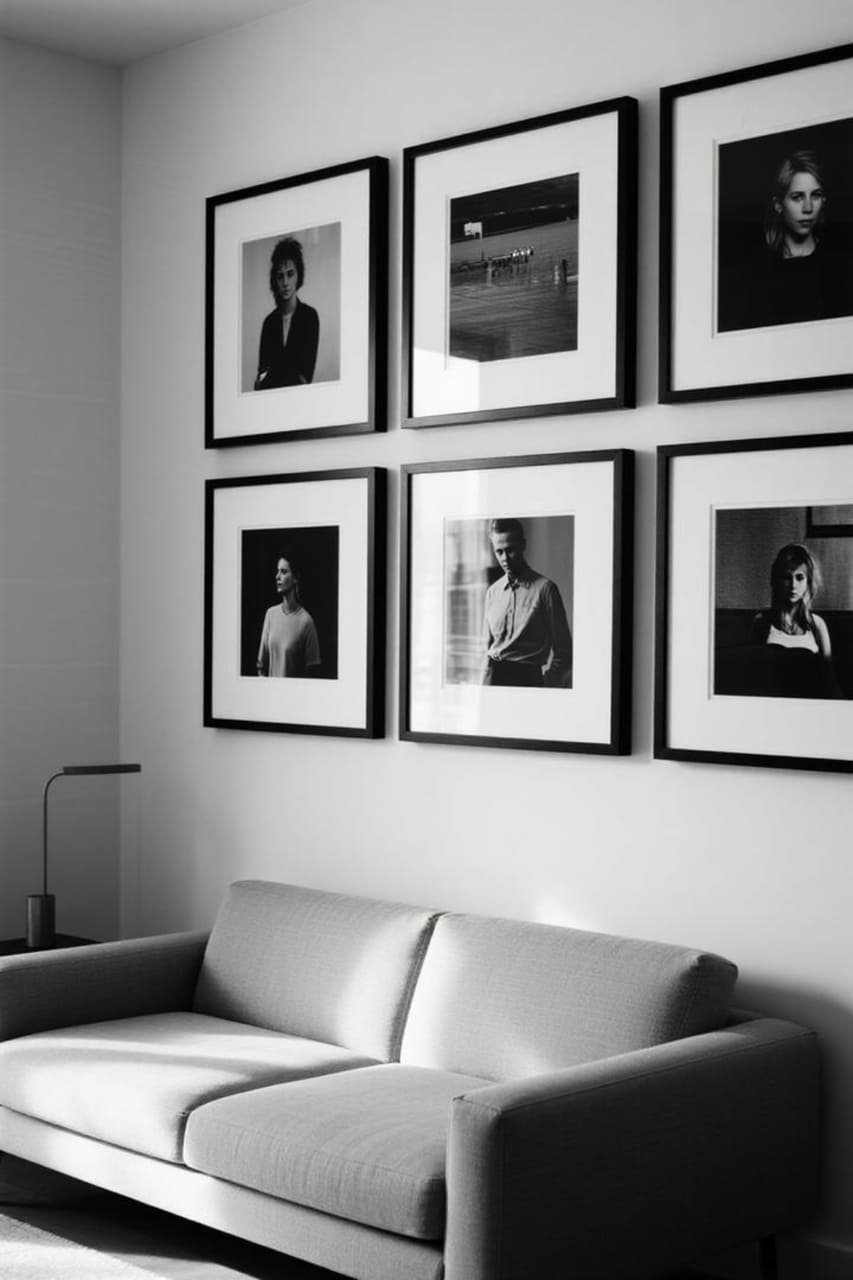
This one’s for my fellow perfectionists. A grid layout — equal spacing, equal frame size — screams order and sophistication.
It’s like a gallery wall with its act together. Perfect if you crave a “high-end” look without high-end prices.
Eclectic Cluster
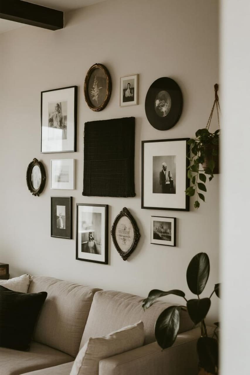
Not into straight lines? Go for an organic cluster layout. Start with a central piece and build outward like you’re playing Tetris. Varying frame sizes add depth and personality.
Statement Strip
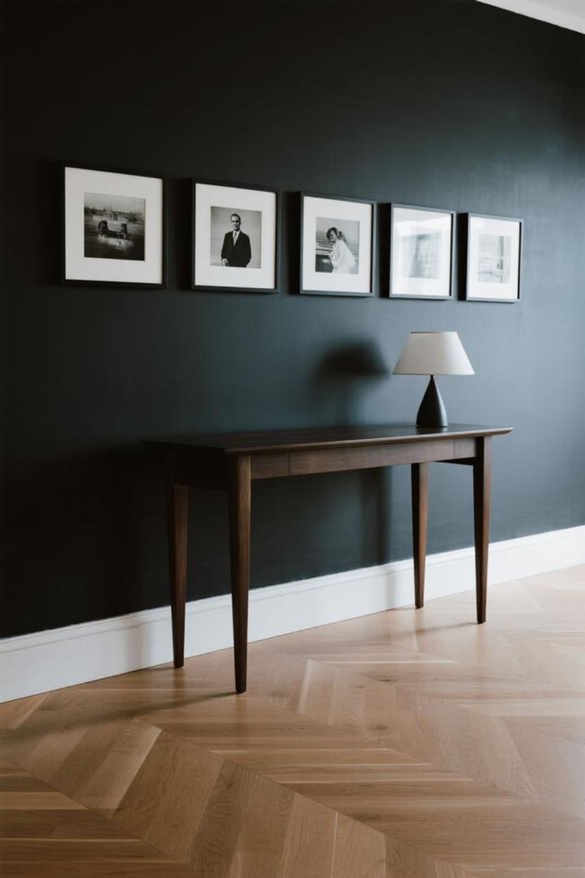
Try a horizontal row of black-and-white frames over a sofa or console. It’s sleek, modern, and ideal for renters who can’t swiss-cheese their walls with nails.
Styling Tips for a Bold Statement
Play with Negative Space
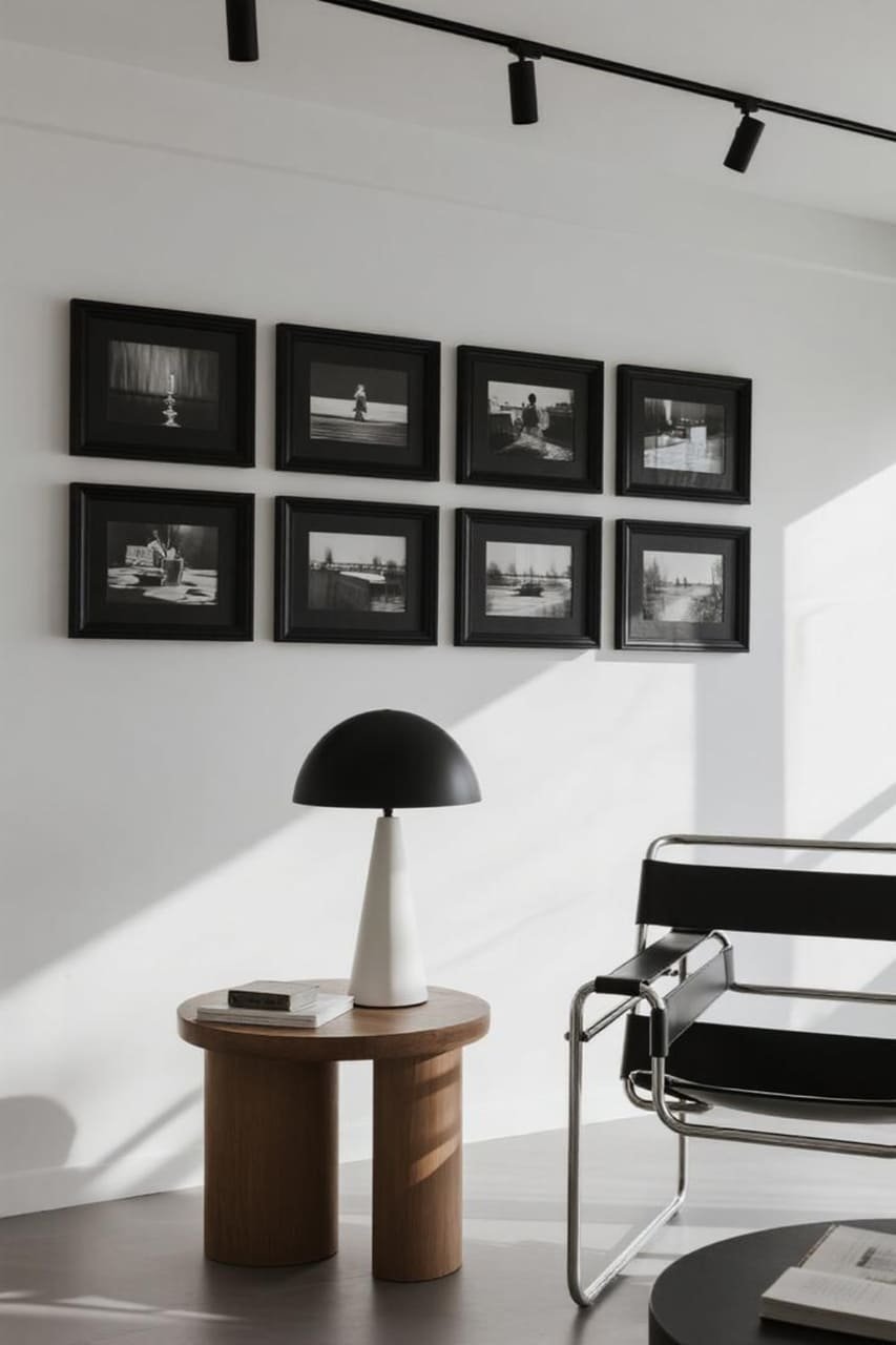
Don’t overcrowd. White space around your frames makes everything pop. Cramming frames together can feel chaotic, while strategic spacing creates impact.
Mix in 3D Elements
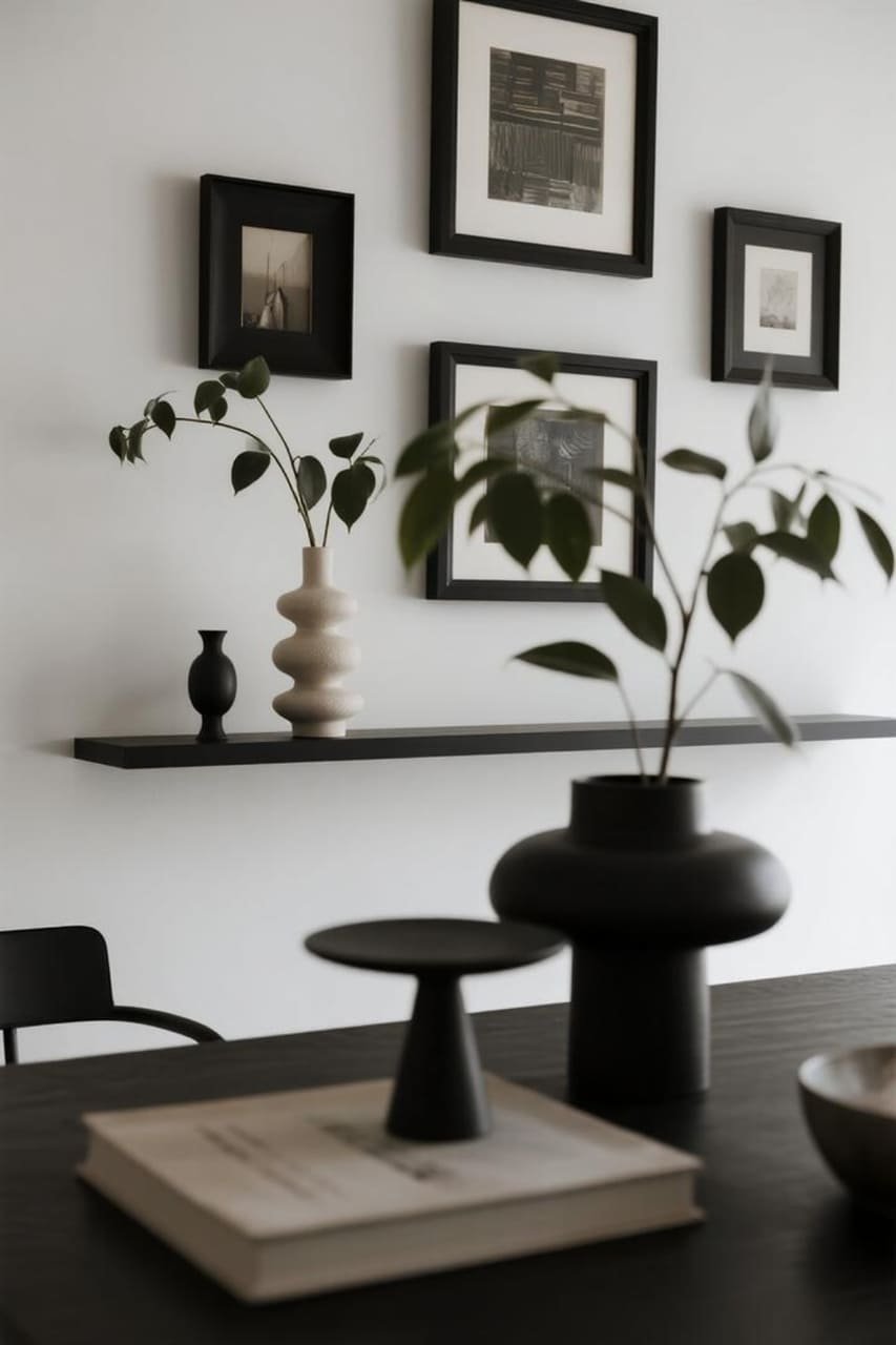
Want bonus points? Add objects like small shelves, sculptures, or wall-mounted plants in neutral tones. This adds texture and breaks up the flatness of frames.
Lighting Makes or Breaks It
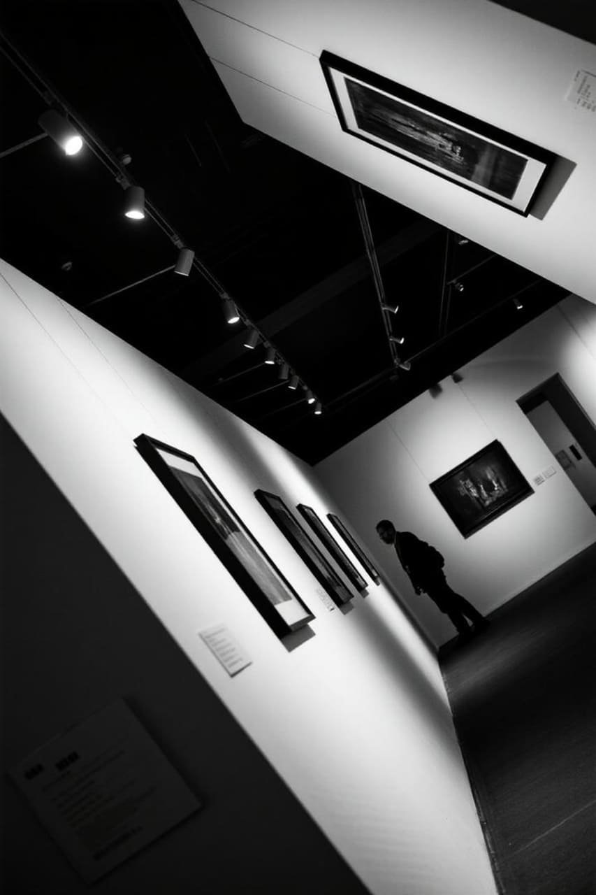
Spotlighting your gallery wall creates a museum-like vibe. Soft, diffused lighting adds warmth and makes textures stand out.
IMO, a couple of well-placed picture lights or track lights can transform your wall from “meh” to “wow.”
Pro-Level Tricks for Cohesion
🡆 Use a Unifying Theme
Even with different art styles, keep one thing consistent — frame color, matting style, or subject matter. This ties everything together visually.
🡆 Test Before You Hang
Lay everything on the floor first. Rearrange until it feels right. This saves you from hammer regret (and unnecessary holes).
🡆 Balance Dark and Light
Alternate darker prints with lighter ones to keep your wall from feeling bottom-heavy. This little trick keeps the eye moving across your display.
My Personal Faves: Black-and-White Wall Combos
Photography + Quotes
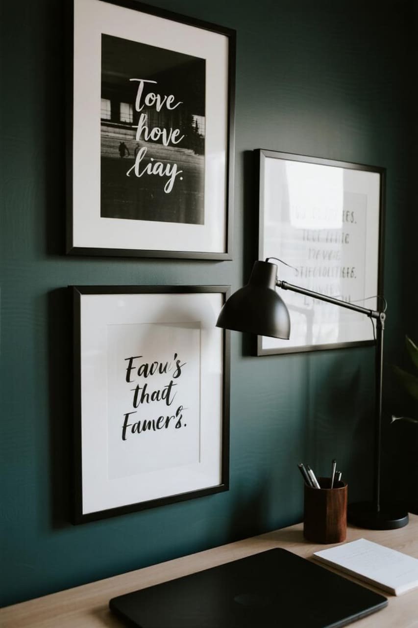
Pair moody black-and-white photography with crisp typography prints. The contrast between images and text creates a dynamic story on your wall.
Abstract + Line Drawings
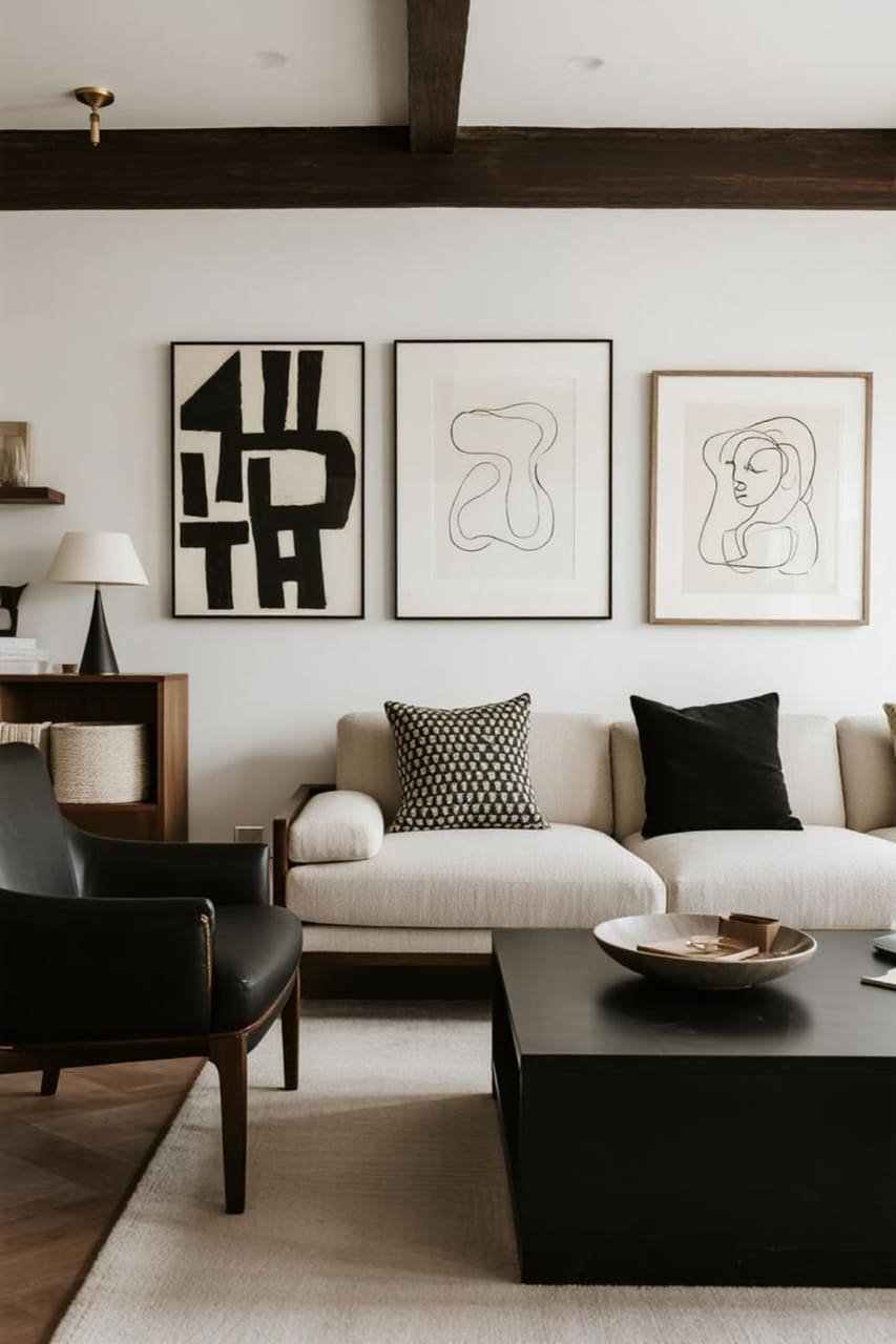
Mix bold, expressive abstract art with delicate line drawings. It’s the yin and yang of the gallery wall world.
Vintage + Modern
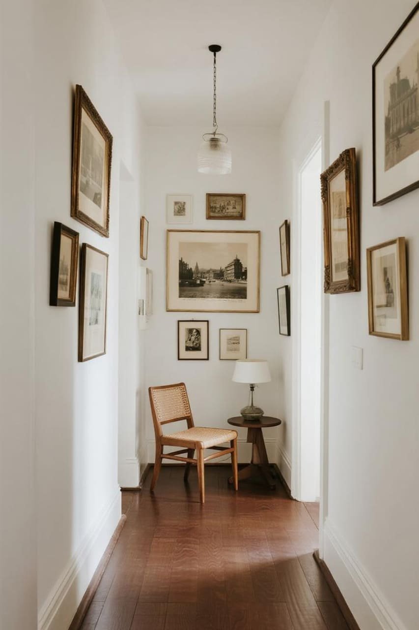
Combine old black-and-white postcards with contemporary graphic prints. This adds depth and a sense of collected history.
Common Mistakes (and How to Avoid Them)
🡆 Going Too Matchy-Matchy
Uniform frames and identical prints can look sterile. Break it up with at least one unexpected piece.
🡆 Ignoring Scale
Tiny frames on a massive wall look lost. Always size up when in doubt.
🡆 Skipping the Level
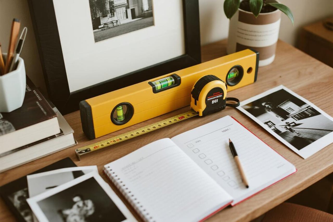
Nothing kills a gallery wall vibe faster than crooked frames. Grab a level or a laser tool — trust me, your future self will thank you.
Quick Checklist for a Bold Black-and-White Gallery Wall
- Choose a theme or unifying element.
- Mix frame sizes for depth.
- Balance dark and light prints.
- Leave breathing room (negative space is your friend).
- Light it up for drama.
- Experiment on the floor first.
This list lives on my phone because, let’s be honest, gallery walls look deceptively simple until you’re knee-deep in picture hooks.
The Budget-Friendly Angle
Black-and-white gallery walls don’t have to cost a fortune. Some tips:
- Print your own photos in black and white.
- Use thrift-store frames and spray paint them black or white.
- Download free public-domain art from museums (The Met has a treasure trove).
I’ve pulled together entire gallery walls for under $100 using these tricks. And yes, people still assume it’s all from some fancy design store.
Why This Look Works in Any Space
🡆 Small Spaces Love Monochrome
Black-and-white keeps things simple and visually expands small rooms. White frames fade into the wall, while black adds crisp edges.
🡆 Big Rooms Need Drama
Large open spaces can feel cold. A bold black-and-white gallery wall instantly adds warmth and personality without cluttering the space.
Bringing It All Together
🡆 Maintenance Matters
Dust frames regularly and update prints occasionally. Rotating your art keeps the wall fresh and gives you an excuse to redecorate.
🡆 Seasonal Swaps
Swap in holiday or seasonal prints for a quick refresh. Black-and-white still feels cohesive even when themes change.
Conclusion: Your Bold Statement Starts Now
Black-and-white gallery walls never go out of style because they blend drama with simplicity.
They’re flexible, affordable, and endlessly customizable. Whether you love a clean grid or a quirky cluster, the secret lies in contrast, cohesion, and personal touches.
So grab your frames, pick your prints, and start laying things out. Don’t overthink it — your wall should tell your story, not a catalog’s. And hey, if your first try looks a little off, just call it “experimental.”
Ready to create your own black-and-white gallery wall that makes a bold statement? Go for it. Your walls deserve better than beige.

