Small-Space Gallery Wall Ideas That Don’t Feel Crowded
Ever tried hanging up a few frames in a small apartment and ended up feeling like the walls were closing in on you? Yeah… been there.
Creating a gallery wall in a small space sounds like a design nightmare waiting to happen — but trust me, it doesn’t have to be.
With a few smart tricks (and a dash of restraint, because we both know how tempting “just one more frame” can be), you can pull off a gallery wall that feels curated, not chaotic.
So grab your coffee (or wine, no judgment), and let’s talk about how to make your small-space gallery wall look effortlessly cool — and not like a cluttered Pinterest fail.
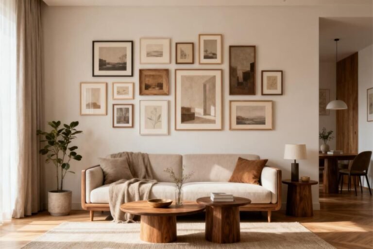
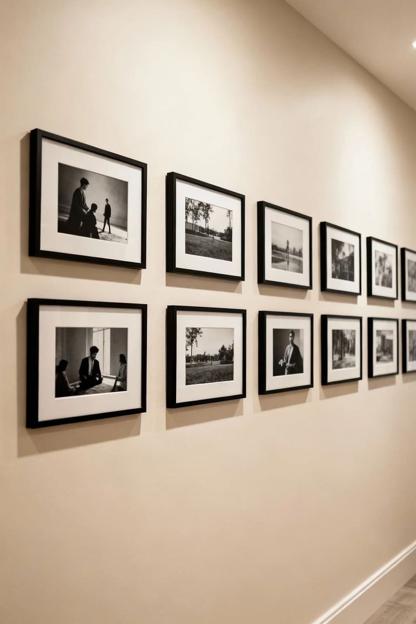
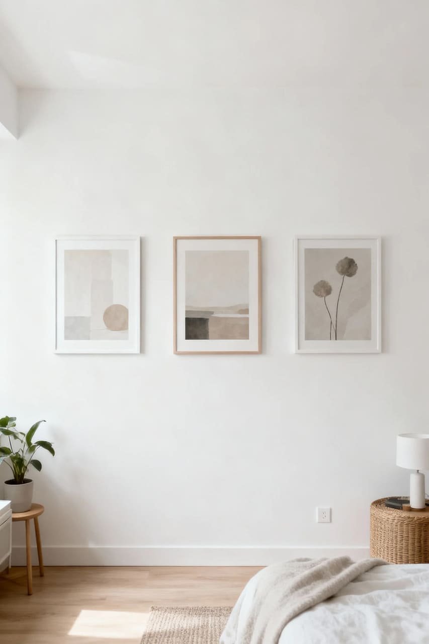
1. Start Small — Literally
Here’s the deal: you don’t need to cover an entire wall to make a statement. In fact, smaller groupings often look more intentional in compact spaces.
Why smaller is smarter
Ever walked into a tiny room with wall-to-wall art and thought, “Wow, I can finally breathe”? Nope, didn’t think so. Small spaces thrive on breathing room, and that includes your walls.
Start with:
- Three to five pieces max (especially if your wall is under 8 feet wide)
- A consistent color palette — think black and white photos or soft pastels
- Mix of sizes but within a range (no giant 24×36 print next to a 4×6 photo, please)
Pro tip: Leave at least 2–3 inches between frames. That tiny gap makes a huge difference in how “airy” your gallery feels.
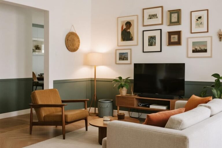
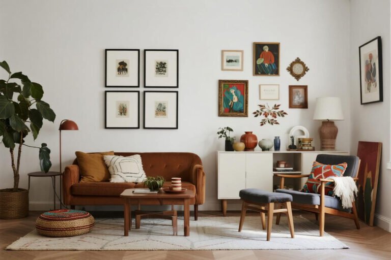
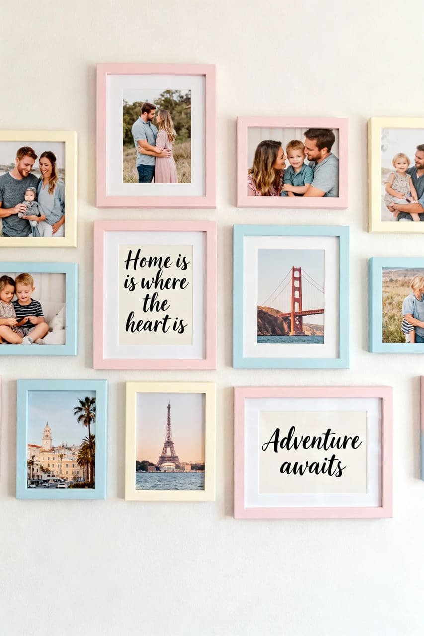
2. Pick a Theme (And Stick With It)
I get it — you love your vintage travel prints, your family photos, and that random abstract you found at a thrift store. But when your space is small, visual cohesion is your BFF.
Themes that work like magic:
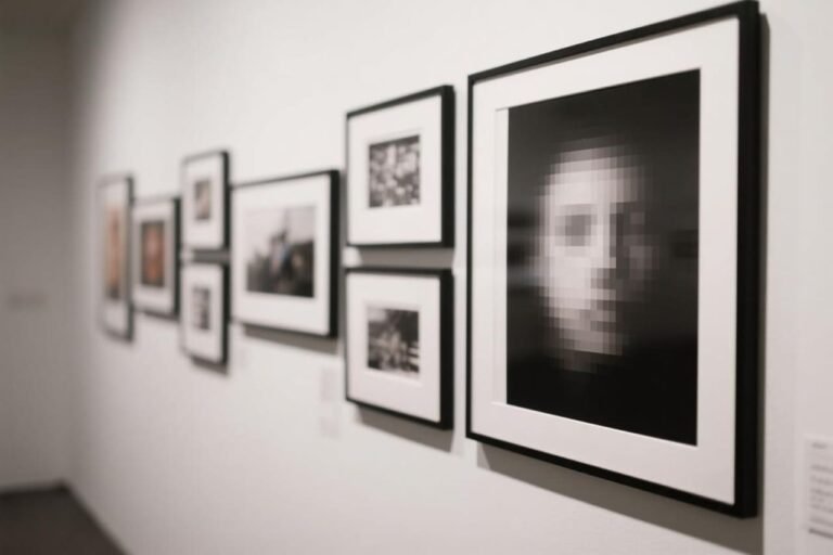
- Monochrome: Black-and-white photography never fails.
- Botanical vibes: Soft greens, plants, and nature sketches give a calming feel.
- Geometric or minimalist art: Keeps things modern and light.
- Personal photo wall: Stick to the same frame color and print tone for consistency.
Ever noticed how chaos hides in “eclectic” when there’s no clear theme? Yeah, that’s not the kind of energy we’re going for here.
You can mix styles, but keep at least one consistent element — like color, frame style, or subject matter — to tie it all together.
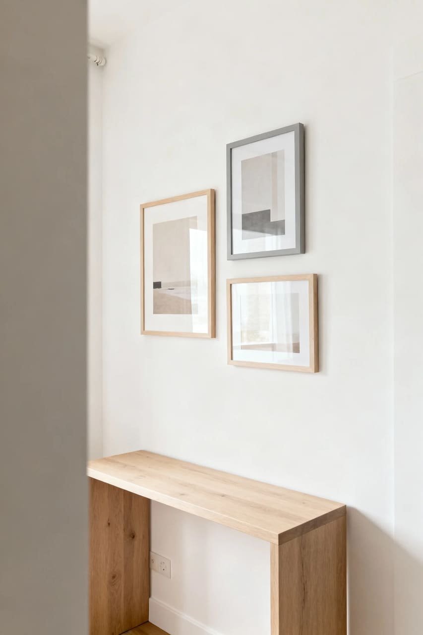
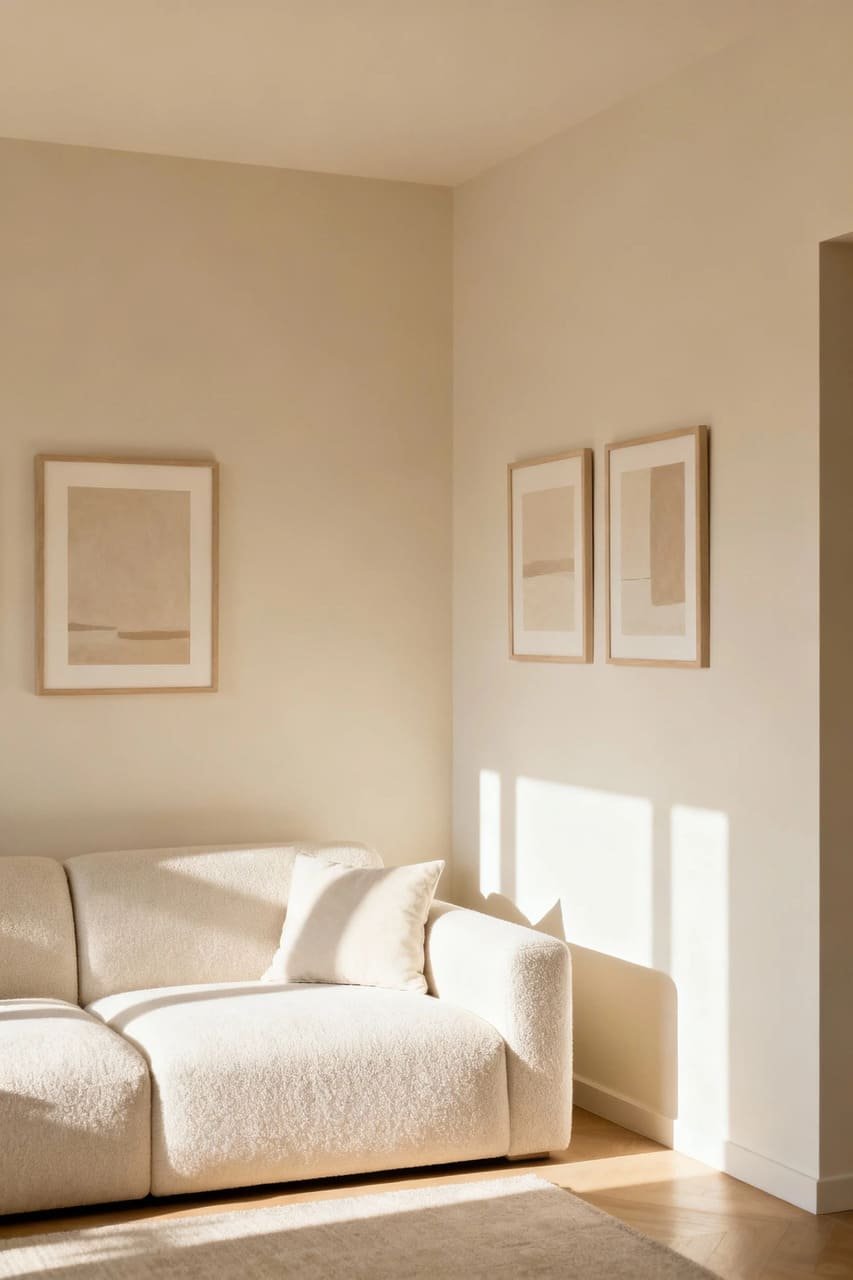
3. Go Vertical, Not Horizontal
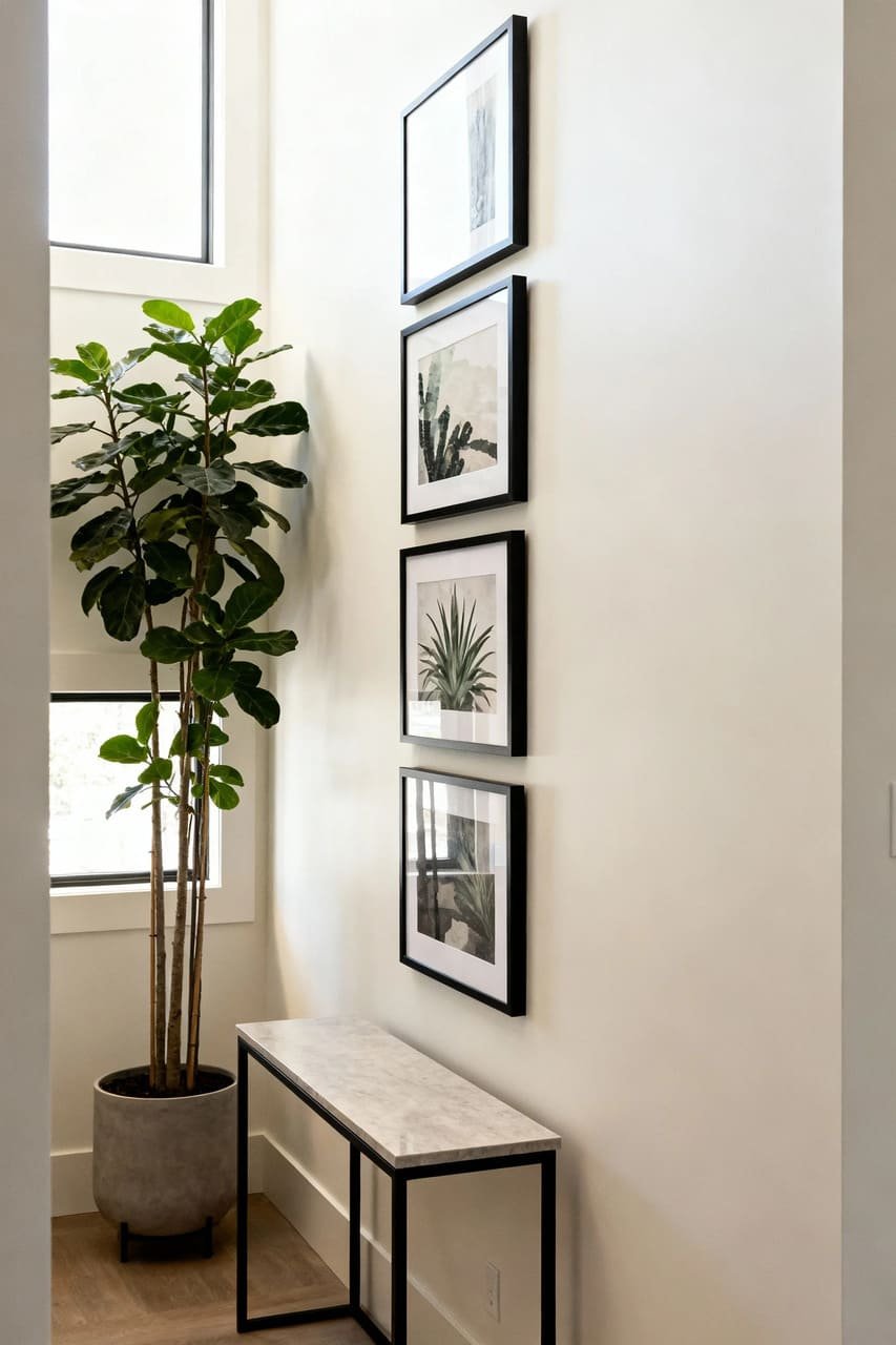
Small space = limited wall width. So, instead of stretching your layout like a flat pancake, build upward.
Think of your gallery wall as a column of personality. Arrange your pieces in a tight vertical cluster, leaving space on both sides of the wall to make it feel balanced.
This trick draws the eye up and makes your room look taller (and who doesn’t want that illusion of more space?).
Bonus idea: Try hanging frames above a console table or narrow shelf. It anchors the gallery without overwhelming the area.
FYI, it’s also a sneaky way to store stuff underneath without it looking cluttered. Win-win. 🙂
4. Use Floating Shelves or Ledges
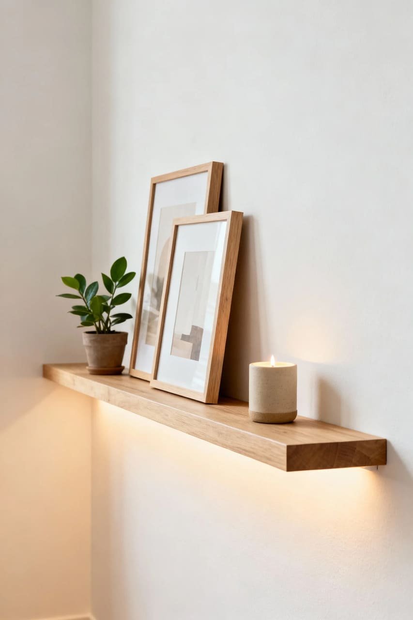
Okay, so here’s a hack I swear by: floating ledges. Instead of hammering a dozen holes in your wall (and regretting it later), use a slim shelf to layer and lean your frames.
Why this works:
- You can easily swap out art without re-measuring or patching holes.
- It creates a casual, lived-in look — like, “Oh, I just threw this together, no big deal.”
- You can mix art with objects, like small plants or candles, to break up the layout.
Choose narrow shelves (3–4 inches deep) and keep the color light so they blend into the wall.
And here’s the golden rule: don’t overload them. Two layers of art max — any more, and you’re entering “grandma’s attic” territory.
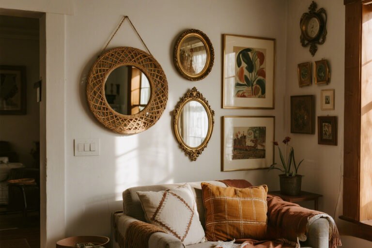
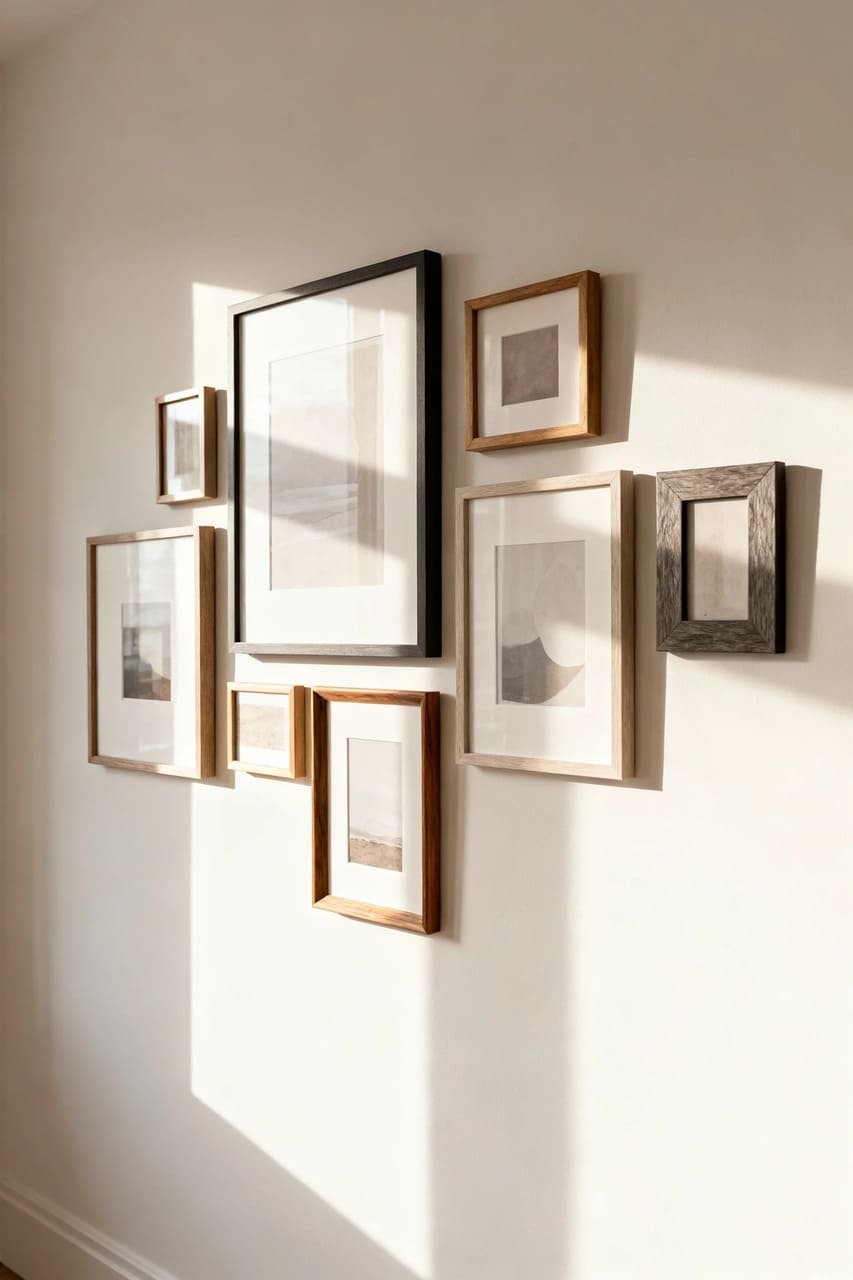
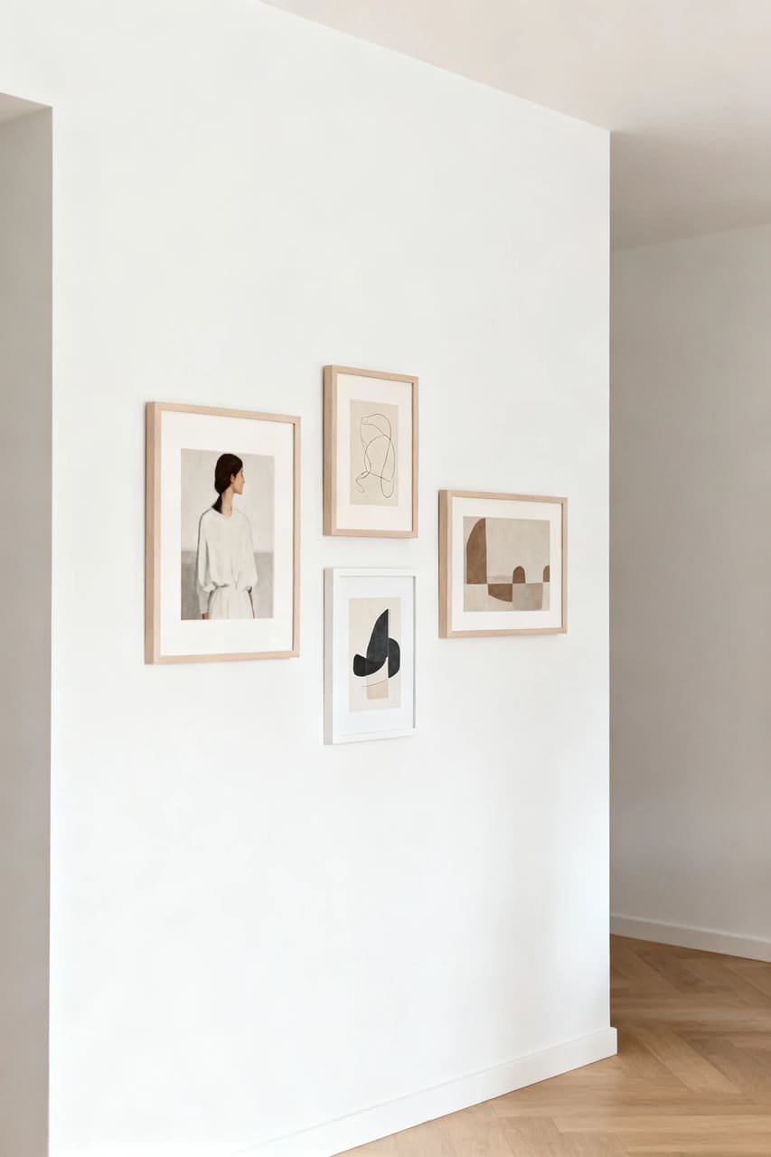
5. Play with Frame Styles (But Keep Balance in Mind)
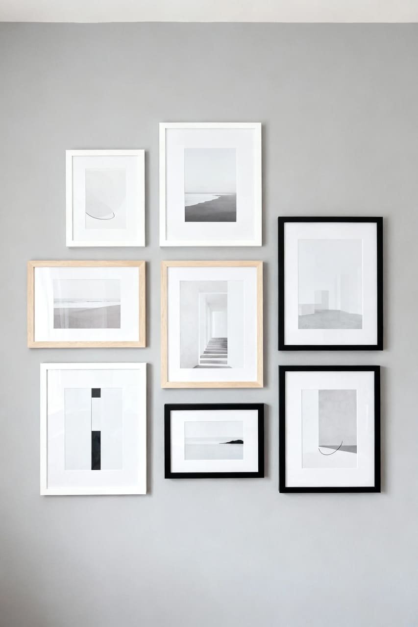
Mixing frame styles adds character, but in small spaces, balance is key. Think of it like mixing patterns — there’s a fine line between “eclectic chic” and “what on earth happened here?”
Frame combos that work:
- Same color, different thickness: All white frames in varied widths = subtle texture.
- Natural wood + white: Soft contrast, perfect for cozy or Scandinavian interiors.
- Thin black metal: Sleek and modern, ideal for tight spaces.
Avoid bulky, ornate frames unless you’re going for “mini art museum” vibes (IMO, not the best choice for a studio apartment). Keep the focus on the art, not the frames.
6. Use Negative Space Like a Pro
Here’s where most people mess up: they fill every inch of wall space like it’s a competition. The trick to a gallery wall that breathes is all in the negative space — the blank areas that make the artwork pop.
Give each piece its moment. Step back (literally) and ask yourself, “Can my eyes rest anywhere?” If the answer’s no, pull something down. Empty space isn’t boring — it’s balance.
Think of negative space as your wall’s version of white noise: calming, necessary, and totally underrated.
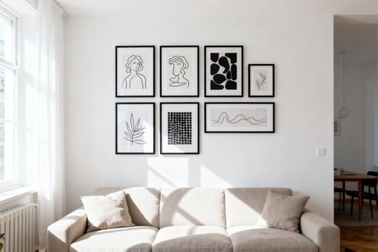
7. Experiment with Shapes and Layouts
Who said a gallery wall has to be a perfect grid? (Not me!) Small spaces actually benefit from organic layouts, where art flows in a way that feels natural and less rigid.
A few layout ideas to try:
- The Grid: Clean and uniform — perfect if you love symmetry.
- The Cluster: A mix of different sizes, arranged around a central anchor piece.
- The Line: A horizontal or vertical row of similar-sized frames — great for narrow spaces.
- The Salon Style: Controlled chaos — mismatched frames arranged by instinct (risky but rewarding).
Play around on the floor first before committing to nails. And take photos as you go — that way, you can remember your layout (because trust me, you’ll forget which frame went where five minutes later).
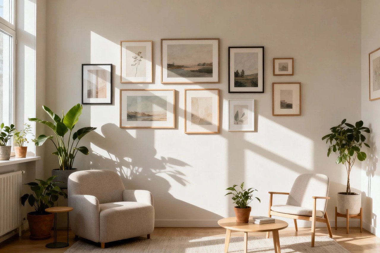
8. Stick to a Light Color Palette
Color has this weird power to either expand or shrink a space. In small rooms, light and airy tones keep things open.
Dark walls can look dramatic, sure, but they also close in faster than your friend who insists on hugging you mid-summer.
If you love bold color, limit it to the artwork itself, not the background. For example, a pop of mustard or navy in the prints looks stunning against white or pale gray walls.
Quick palette ideas:
- White walls + black frames + neutral art = timeless and modern.
- Soft beige walls + wooden frames + botanical art = cozy and warm.
- Light gray + mixed metallic frames = subtle glam without the flash.
9. Add Depth with Texture
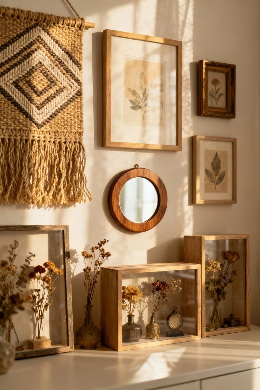
You don’t have to stick to just framed prints. Mix in textured or 3D elements to make your gallery wall stand out — without making it feel overcrowded.
Try:
- Woven wall hangings
- Mini mirrors
- Shadow boxes with small keepsakes
- Framed fabric swatches or pressed flowers
The trick is to balance flat art with just a few tactile pieces. You’re aiming for “curated charm,” not “I raided a craft store.”
10. Lighting: The Secret Weapon
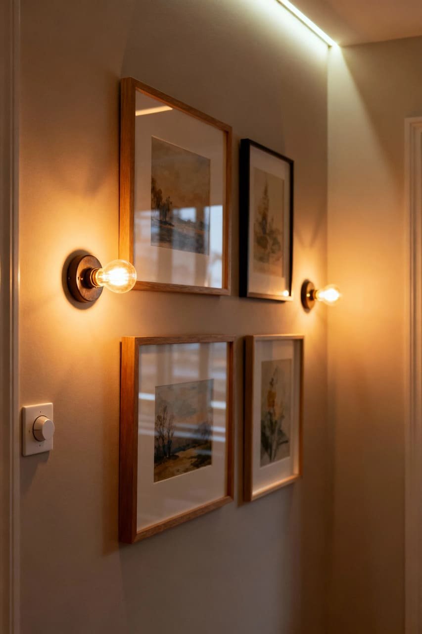
Let’s talk lighting, because even the most perfectly arranged gallery wall looks meh in bad lighting. Small rooms often have limited natural light, so you’ll want to add a few strategic glow-ups.
Lighting options that make your art shine:
- Picture lights: Clip-on or wall-mounted versions highlight individual pieces.
- LED strip lights: Subtle, energy-efficient, and perfect for shelves.
- Soft table lamps: Add warmth and depth without overpowering the space.
Avoid harsh overhead lights — they’ll wash everything out. Instead, layer your lighting so your art feels like it’s basking in that “golden hour” glow 24/7. 😉
11. Incorporate Personal Touches
This one’s my favorite part. A gallery wall shouldn’t look like it came straight from a catalog (no shade, IKEA). It should reflect you — your travels, your memories, your quirks.
Add:
- A photo from your favorite trip
- A ticket stub from a concert you’ll never forget
- A quote that always makes you smile (or roll your eyes)
These details turn your wall from “Pinterest-inspired” to “that’s so you.” Because, honestly, what’s the point of a gallery wall if it doesn’t tell your story?
12. Less Really Is More
I know, I know — restraint is hard when there are so many beautiful prints out there. But here’s the thing: editing is everything. Just because you can hang ten frames doesn’t mean you should.
When in doubt, remove one piece. Your gallery will instantly feel lighter, cleaner, and more cohesive. Remember, the goal is impact without overwhelm.
Take a step back and trust your gut. If it feels crowded, it probably is.
Conclusion: Your Walls, Your Story
So there you have it — small-space gallery wall ideas that don’t make your room feel like an art storage closet. The secret? Balance, cohesion, and a little bit of breathing room.
Don’t be afraid to break a few rules and make the wall your own. The best gallery walls aren’t perfect — they’re personal.
And honestly, if it makes you smile every time you walk by, that’s all the design validation you need.
Now, go grab that hammer (carefully), pick your favorite prints, and start creating. Just, you know, maybe lay them out on the floor first.