How to Choose a Wallpaper That Won’t Look Dated in 5 Years
Let’s be honest—choosing wallpaper feels like a commitment-level decision, almost like deciding whether bangs are a good idea.
You want the result to feel timeless, stylish, and flattering… not something you regret when you walk past it at 7 AM with your first cup of coffee.
If you’re here, you’re probably trying to avoid that moment five years from now where you think, “Oh no… this used to be trendy, didn’t it?” Been there.
I once wallpapered a room with a bold geometric pattern because it felt edgy and “design forward.” Two years later, it felt more like a fever dream. Lesson learned.
So if you want wallpaper that still looks intentional, elevated, and fresh years from now, keep reading.
I’ve gathered the smartest strategies, patterns, and finish considerations to help you pick something classic—without feeling boring.
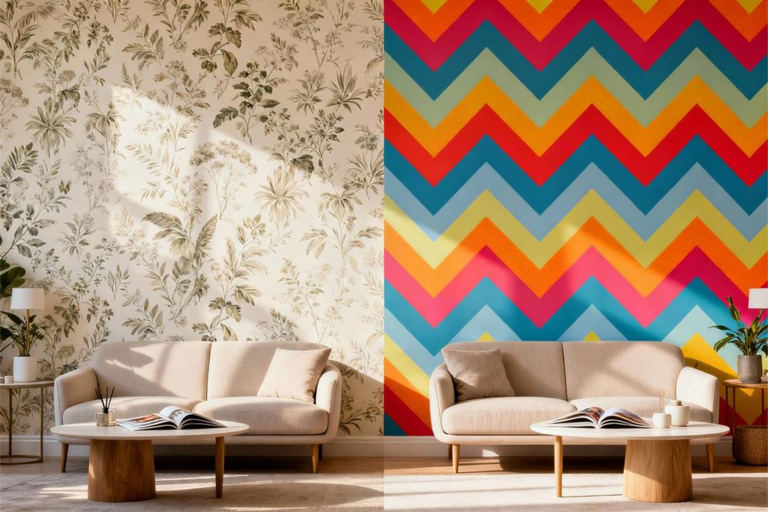
Why Wallpaper Feels Dated (and How to Avoid That)
If you’ve ever seen a mustard floral print from the 1970s or a shiny silver damask from the early 2000s, you already know: certain trends have expiration dates.
So what makes a wallpaper feel dated?
Usually one of these things:
- Overly trendy patterns (chevron, anyone?)
- Extreme bold colors with no neutrals
- Materials that scream a specific era
- Themes that age fast (like flamingos… unless you live in Miami)
So the goal isn’t to avoid personality. It’s to choose something that holds up as styles shift.
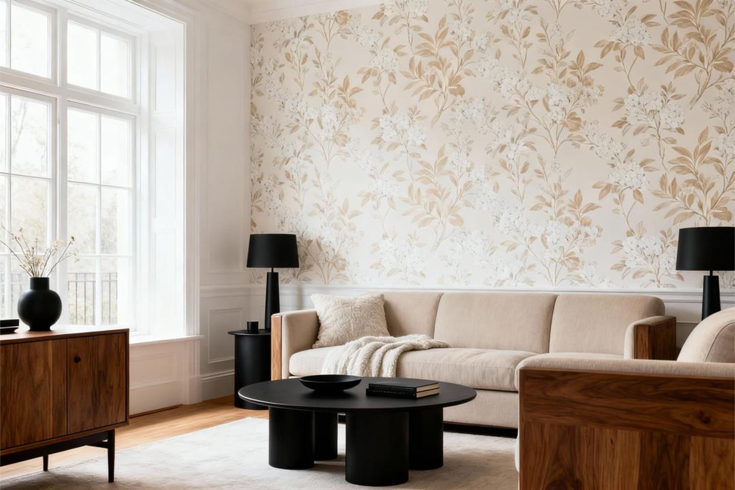
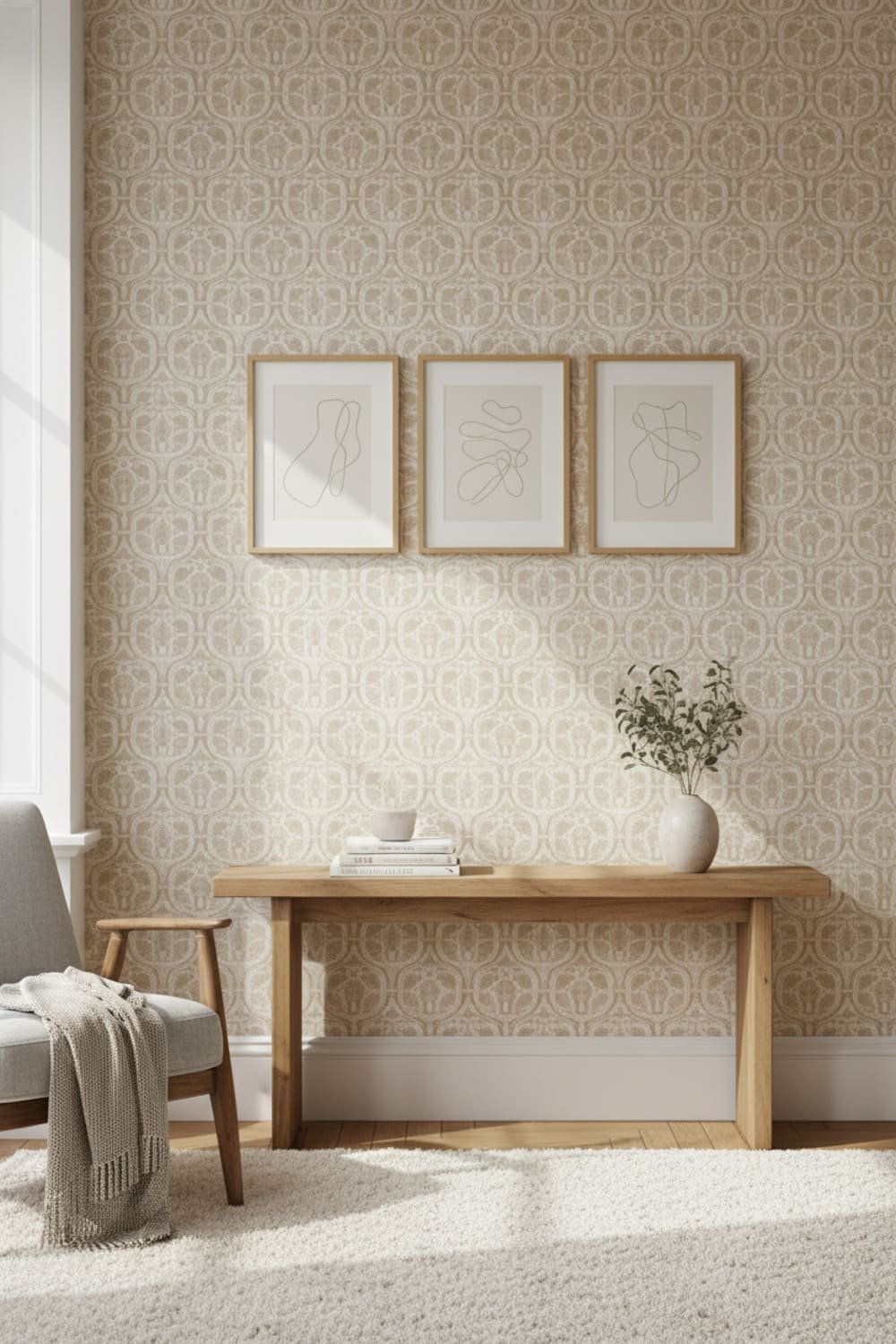
Choose a Timeless Style Over a Temporary Trend
Ever wonder why classic interior design never looks tired? Because classics don’t try too hard.
If you want wallpaper that lasts, stick to these evergreen categories:
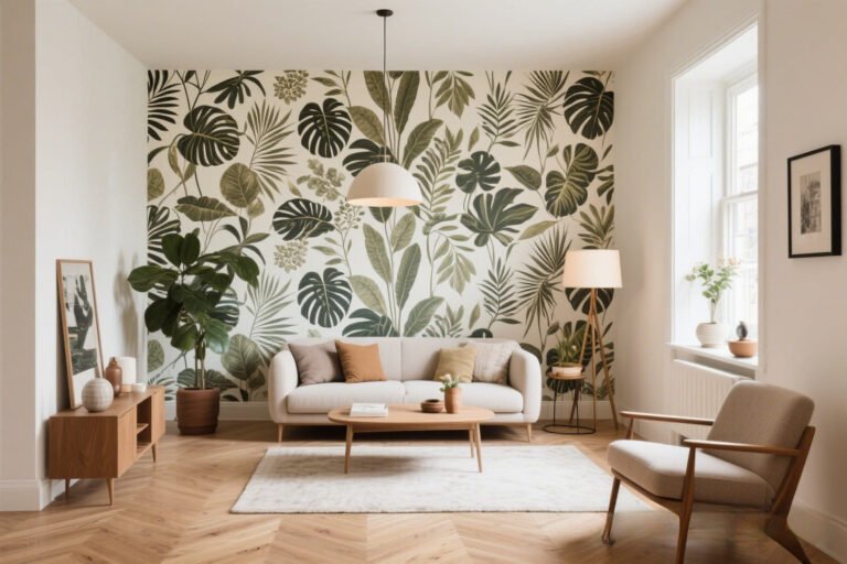
- Botanicals and nature-inspired prints
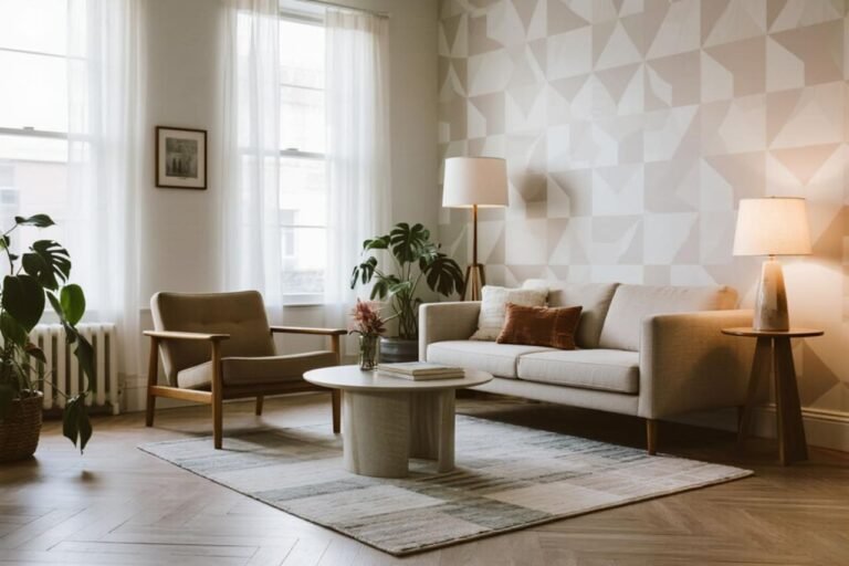
- Soft geometric patterns (not chaotic ones)
- Texture-focused designs
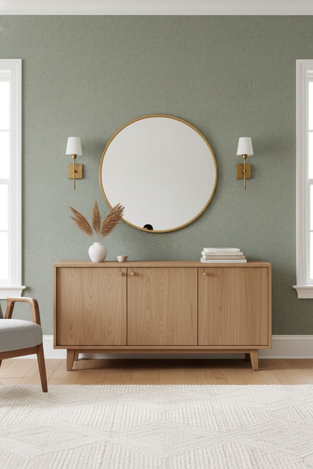
- Tone-on-tone prints
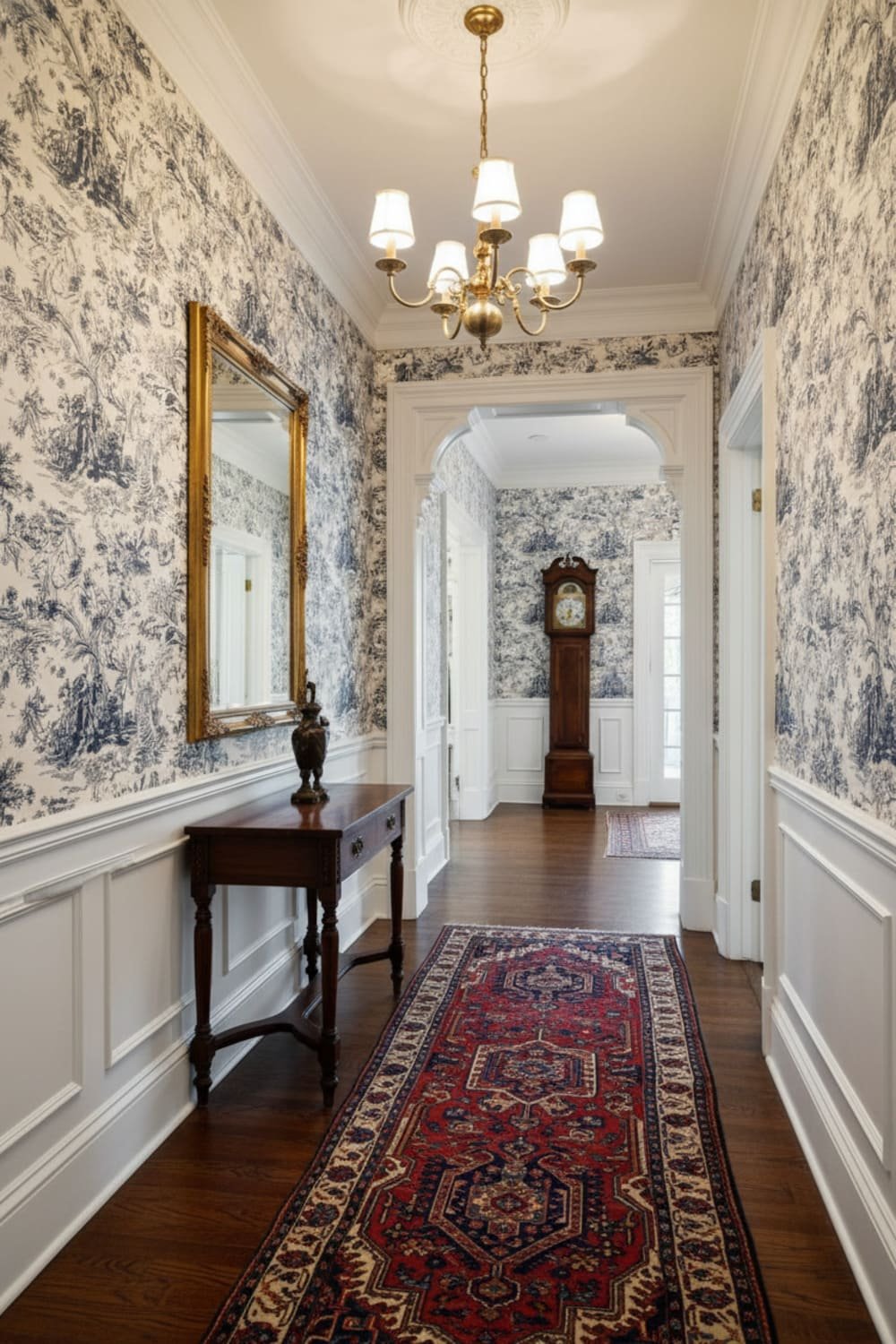
- Historical motifs (stripes, plaids, toile)
These styles stay relevant because they feel grounded—not gimmicky.
And before you ask: yes, you can go bold. Just make sure the boldness comes from intentional design, not TikTok hype.
Color: The Real Make-or-Break Factor
Patterns get blamed for dating rooms, but honestly—color ages faster than design.
Think back to:
- Teal + brown (mid-2000s)
- Sage + cranberry (1990s)
- Harvest gold + avocado (1970s)
Color palettes tie wallpaper to moments in time, so if you want something with staying power, choose a palette that leans neutral or classic.
The most timeless wallpaper colors include:
- Soft whites
- Warm taupes
- Muted greens
- Dusty blues
- Charcoal or soft black
If you love color, cool—just avoid neon or ultra-saturated tones that scream energy drink branding.
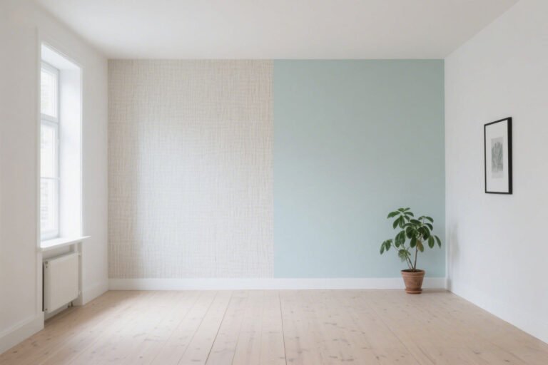
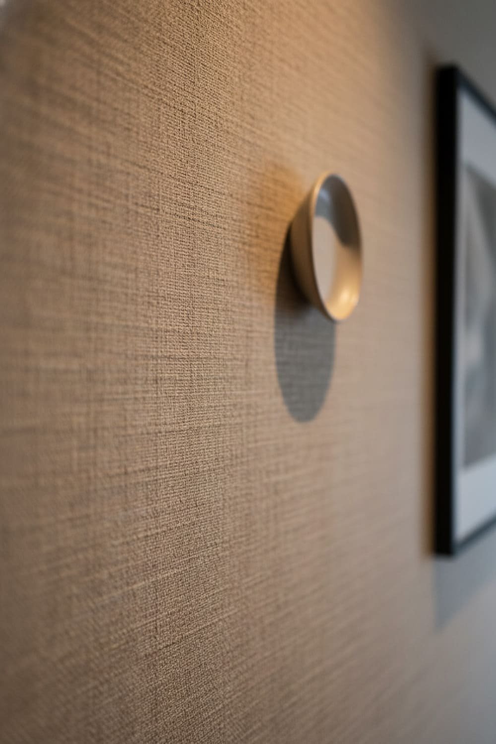
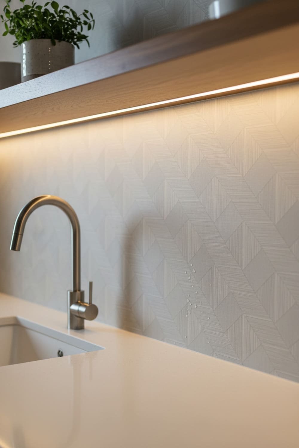
Texture: The Secret to a Long-Lasting Look
Texture adds dimension without overwhelming your space. It creates interest but not noise.
The most timeless textures include:
- Linen weave
- Grasscloth
- Subtle plaster-effect
- Woven fibers
- Faux textile patterns
Wallpaper with texture ages well because it feels more like a wall finish than a pattern. It blends. It enhances. It doesn’t overpower.
And IMO, grasscloth might be one of the safest bets out there—unless your pets think it’s a snack (yes, that happened).
Match Wallpaper to Your Architecture (Seriously)
This step gets skipped all the time.
Wallpaper doesn’t exist by itself—it interacts with:
- Trim and molding
- Ceiling height
- Furniture style
- Overall architecture
Here’s a quick cheat sheet:
| House Style | Best Wallpaper Styles |
|---|---|
| Modern farmhouse | Textures, soft geometrics, botanicals |
| Mid-century | Minimal patterns, soft abstract shapes |
| Traditional | Toile, florals, stripes |
| Coastal | Texture, soft blues, botanicals |
| Contemporary | Minimal patterns, tone-on-tone |
If your wallpaper doesn’t match the bones of your space, it’ll date faster than a first-gen iPhone.
Start Small and Work Up
Ever thought about doing wallpaper on every wall and then panicked halfway through the roll? Same.
If you’re nervous, start here:
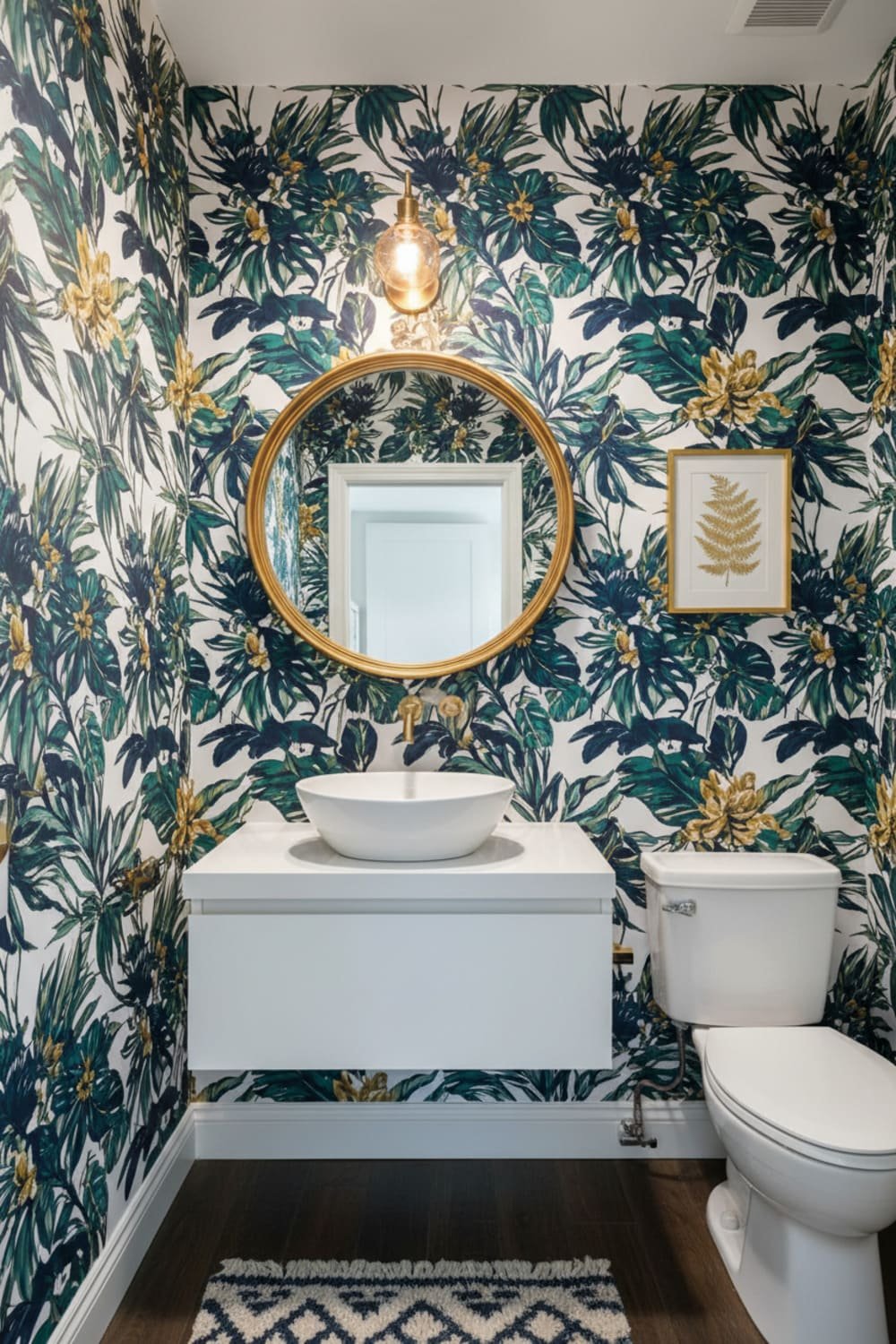
- Powder bathrooms
- Accent walls
- Closets (yes, it’s a thing)
- Entry hall niches
- Behind built-in shelves
If you still love it after a few months? Boom. Commit. If not, at least you didn’t paper an entire living room like my aunt did with leopard print in the early 2010s.
Think About Longevity Beyond Style
Wallpaper comes in different finishes and qualities, and durability matters. No one wants peeling seams or weird discoloration after two summers of sunlight.
Look for:
- Washable or scrubbable finish
- UV-resistant print
- Quality adhesives
- Removable or peel-and-stick only if temporary
Peel-and-stick sounds tempting, but FYI—it doesn’t always last longer than 3–5 years, especially in humidity. If you want something that feels permanent and timeless, go with traditional installation.
Scale Matters More Than You Think
Pattern scale changes everything.
Large bold prints work well in:
- Powder rooms
- Feature walls
- Tall ceiling spaces
But put them in a small hallway and the energy can shift from “stylish” to “crushing wallpaper vortex.”
Medium-scale patterns feel safe and classic.
Small-scale patterns feel cottage-core sweet and vintage—but can occasionally border on grandma chic (unless you style it intentionally).
When in doubt? Choose medium scale.
Consider Pattern Repeat & Movement
Patterns with calm, slow repeats age better than chaotic ones.
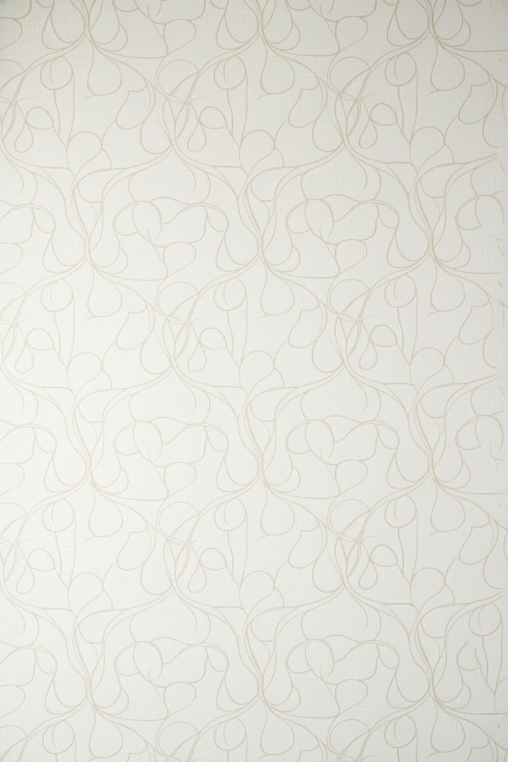
Ask yourself:
- Does this feel calm or busy?
- Does my eye rest, or does it run laps?
Wallpaper that feels visually peaceful stays stylish longer because it supports the space rather than dominating it.
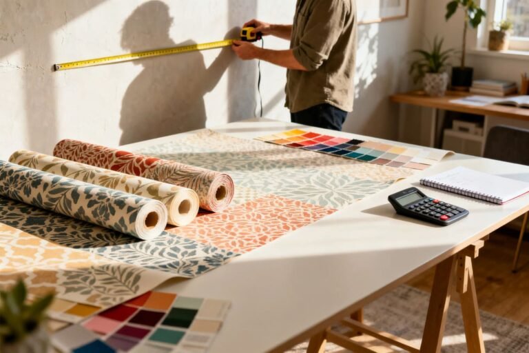
Sample. Always Sample.
I know ordering samples feels annoying. But wallpaper changes dramatically depending on:
- Lighting
- Room size
- Paint color pairing
- Texture of wall
- Time of day
Tape samples to the wall and observe them for a few days. Yes, like test-driving flooring or deciding whether bangs were actually a mistake (again).
Timeless Doesn’t Mean Boring
You don’t need to sacrifice personality.
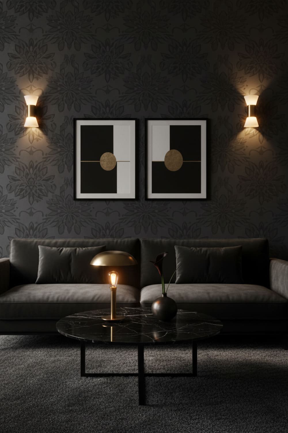
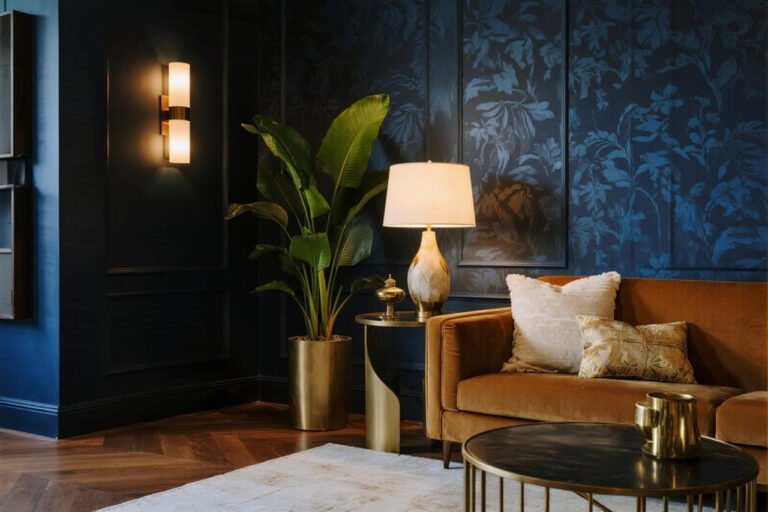
If you want something with more drama but want it aging gracefully, try:
- Moody florals
- Tone-on-tone dark patterns
- Subtle metallic details
- Organic lines or watercolor patterns
These carry mood rather than trend, and mood lasts longer.
A Quick Cheat Checklist (Save This):
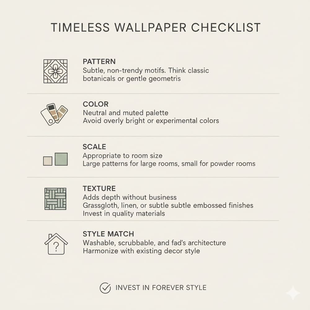
When choosing wallpaper, aim for:
- Classic pattern or theme
- Muted or timeless color palette
- Texture or subtle print
- Scale that matches the room
- Architectural alignment
- Durability and washability
- A style that feels personal
If the wallpaper checks at least 5 out of 7 points, you’re golden.
Conclusion: Choose What You’ll Still Love—Not What’s Trending
Here’s the truth: trends fade, but intentional design lasts.
Choosing wallpaper that won’t look dated in five years isn’t about being boring—it’s about being smart. And honestly, it’s about choosing something that feels like your style, not something algorithm-approved.
So take your time. Order samples. Trust your instincts. And if you’re still torn, remember this rule:
👉 If you love it now and it calms you, not just excites you? It’ll age well.
Now go find that wallpaper that Future You will thank Present You for choosing. And if you do accidentally wallpaper your bathroom in neon flamingos? No judgment… but also… good luck