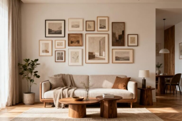
Scandi-Inspired Gallery Walls with Neutral Tones
Let’s be real—nothing transforms a blank wall faster than a good gallery setup. And when you mix that with the calm, quiet confidence of Scandi-inspired design, you get something that feels both stylish and soothing.
Ever walked into someone’s home and instantly thought, “Okay, this person definitely has their life together”? Yeah… a Scandi gallery wall with neutral tones does exactly that.
I started experimenting with these setups after I got tired of staring at my too-white living room wall every morning while drinking coffee.
IMO, it worked so well that now the gallery wall is the only thing in my home that actually sparks joy (Marie Kondo would be proud :)).
If you want that same warm, minimalist, soft-aesthetic magic, let’s talk. I promise—this is easier than assembling that flat-pack dresser you pretended not to struggle with.
Why Scandi-Inspired Gallery Walls Just Work
Ever wondered why neutral-toned Scandinavian gallery walls show up everywhere—from Instagram to your friend’s Pinterest board that they swear is “not that curated”? The answer is simple: they just feel good.
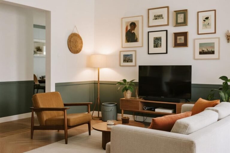
These walls blend warmth, simplicity, and personality. No drama, no chaos, no neon signs yelling “Live, Laugh, Love.” Just clean lines, airiness, and textures that whisper instead of shout.
The Power of Neutral Tones
Neutral tones carry the Scandi aesthetic.
They make your space feel cohesive without trying too hard. Think colors like:
- Warm whites
- Muted taupes
- Soft greiges
- Sandy beiges
- Warm charcoal accents
- Textured naturals (oak, linen, cotton)
They instantly tell your brain, “Hey, calm down.” And honestly, who couldn’t use that reminder?
Why Scandi Gallery Walls Stay Timeless
Trends come and go—remember when everything had a chevron pattern? Yeah… let’s not do that again.
Scandi gallery walls stay timeless because they rely on simplicity, natural materials, and balanced forms. You can rearrange things, swap prints, or tweak frames without losing the vibe.
Choosing the Perfect Neutral Palette
Selecting the right tones sets the foundation for your whole gallery wall. Get this wrong and the space looks mismatched.
Get it right, and everything looks curated—even if you secretly rushed the arrangement before guests arrived.
Warm or Cool Neutrals?
Before you pick artwork or frames, ask yourself: Does my room lean warm or cool?
Warm Neutrals (Cozy + inviting)
Use these if your space features oak wood, beige rugs, or cream walls.
Examples:
- Cream
- Sand
- Caramel
- Clay
They make your wall feel comfortable and lived-in.
Cool Neutrals (Calm + modern)
Use these with gray furniture, marble surfaces, or crisp white walls.
Examples:
- Fog gray
- Pebble
- Charcoal
- Stone
They help your gallery wall feel sleek and modern.
Ever noticed how a gray-toned print looks weird next to a yellow-toned frame? That’s why sticking to a family of tones helps your wall look intentional instead of “I grabbed whatever was on sale.”
Picking Artwork Without Losing Your Mind
Choosing art feels intimidating, but trust me—you don’t need an art degree or a bank account that screams “collector.”
You just need pieces that fit your style, and yes, I fully support mixing affordable prints with personal photos.
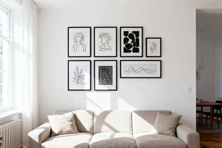
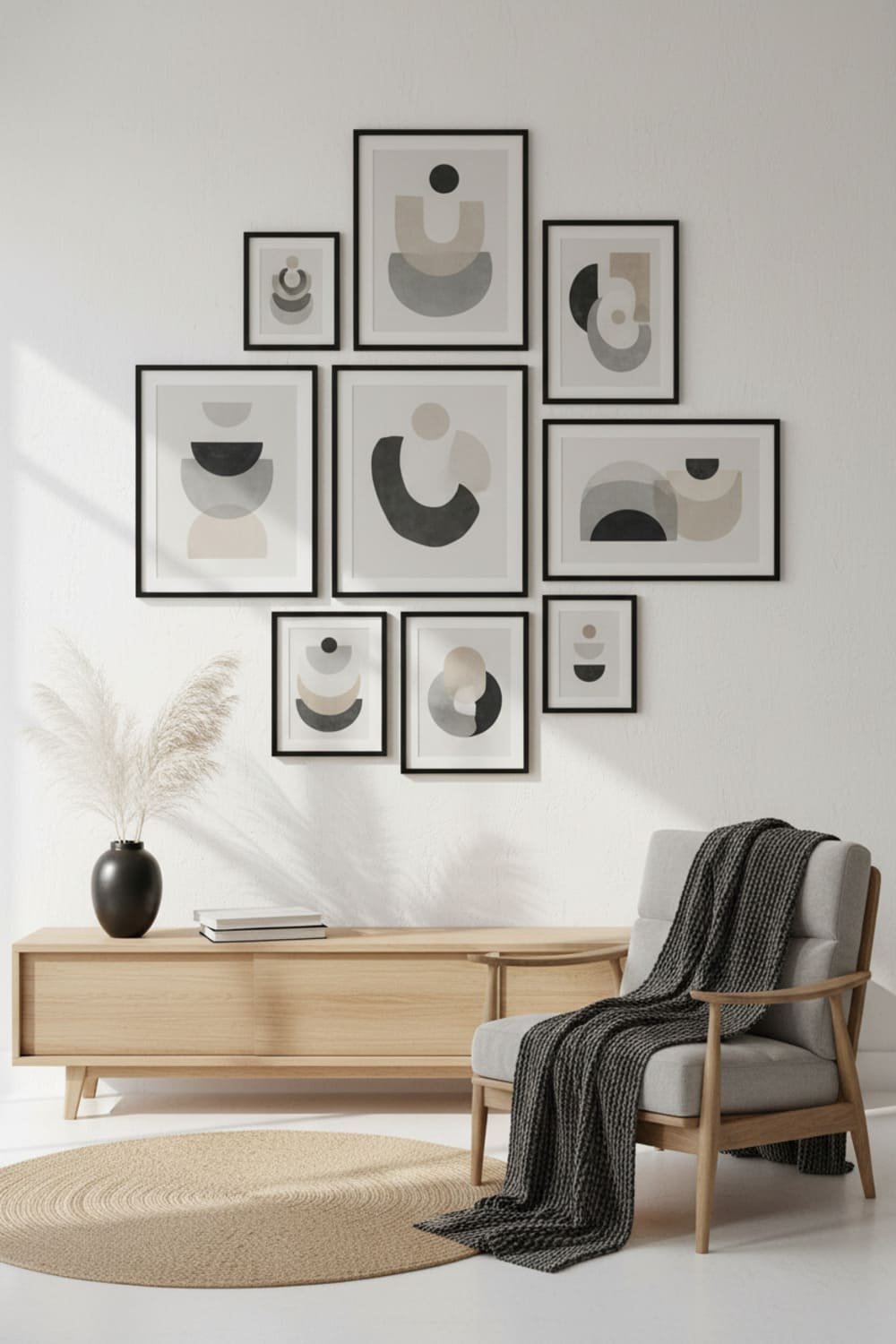
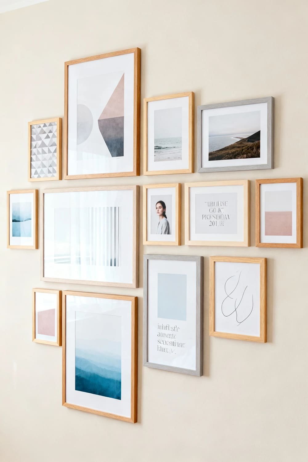
What Types of Art Fit the Scandi Look?
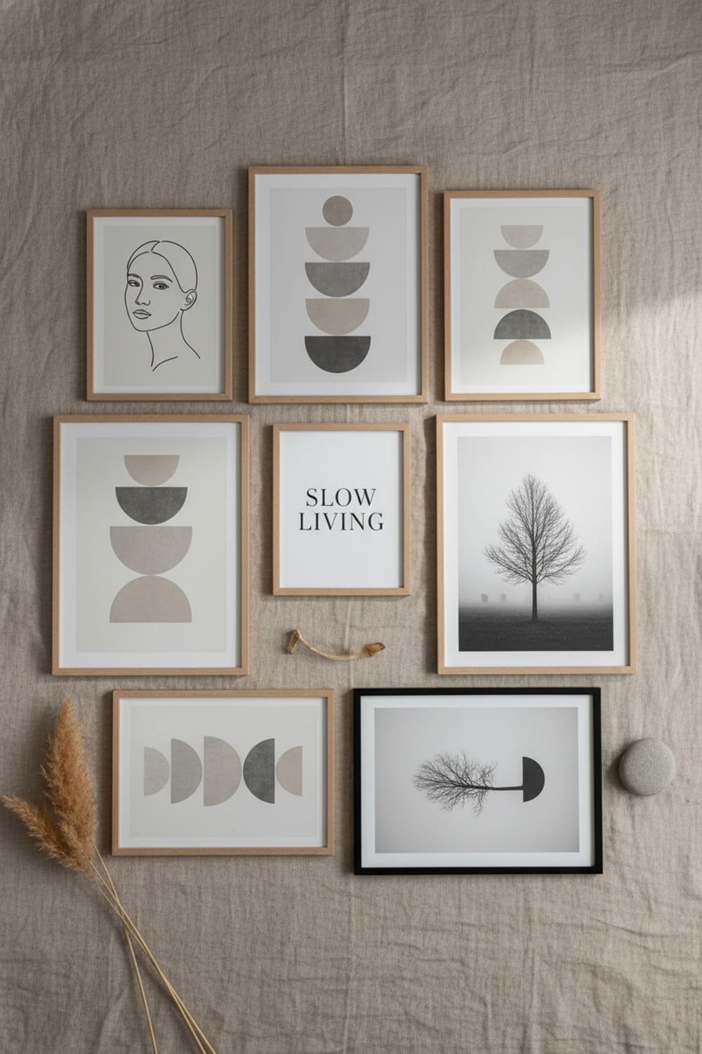
Here are tried-and-true categories for Scandi-inspired galleries:
- Minimal line drawings
- Soft abstract forms
- Nature-inspired prints (leaves, mountains, beach textures)
- Monochrome photography
- Muted geometric shapes
- Typography with clean sans-serif fonts
Ever seen someone try to squeeze neon pop art into a Scandi gallery setup? Yeah… don’t do that unless you want your wall to look slightly confused.
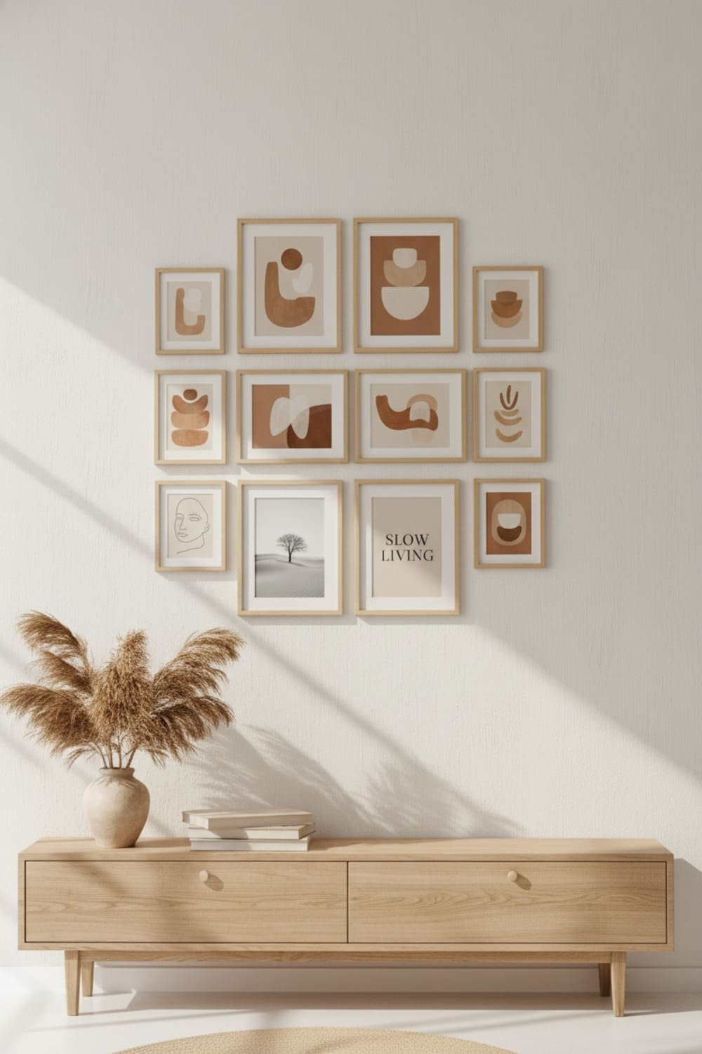
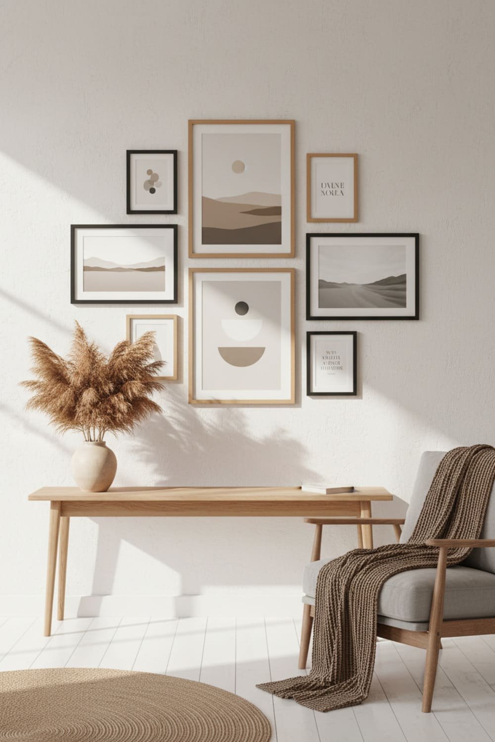
Keep the Mix Balanced
To avoid chaos, use a ratio like this:
- 60% abstract or textured art
- 20% photography
- 20% typography or line drawings
This combination keeps your gallery visually interesting without making your guests wonder what mood you’re going for.
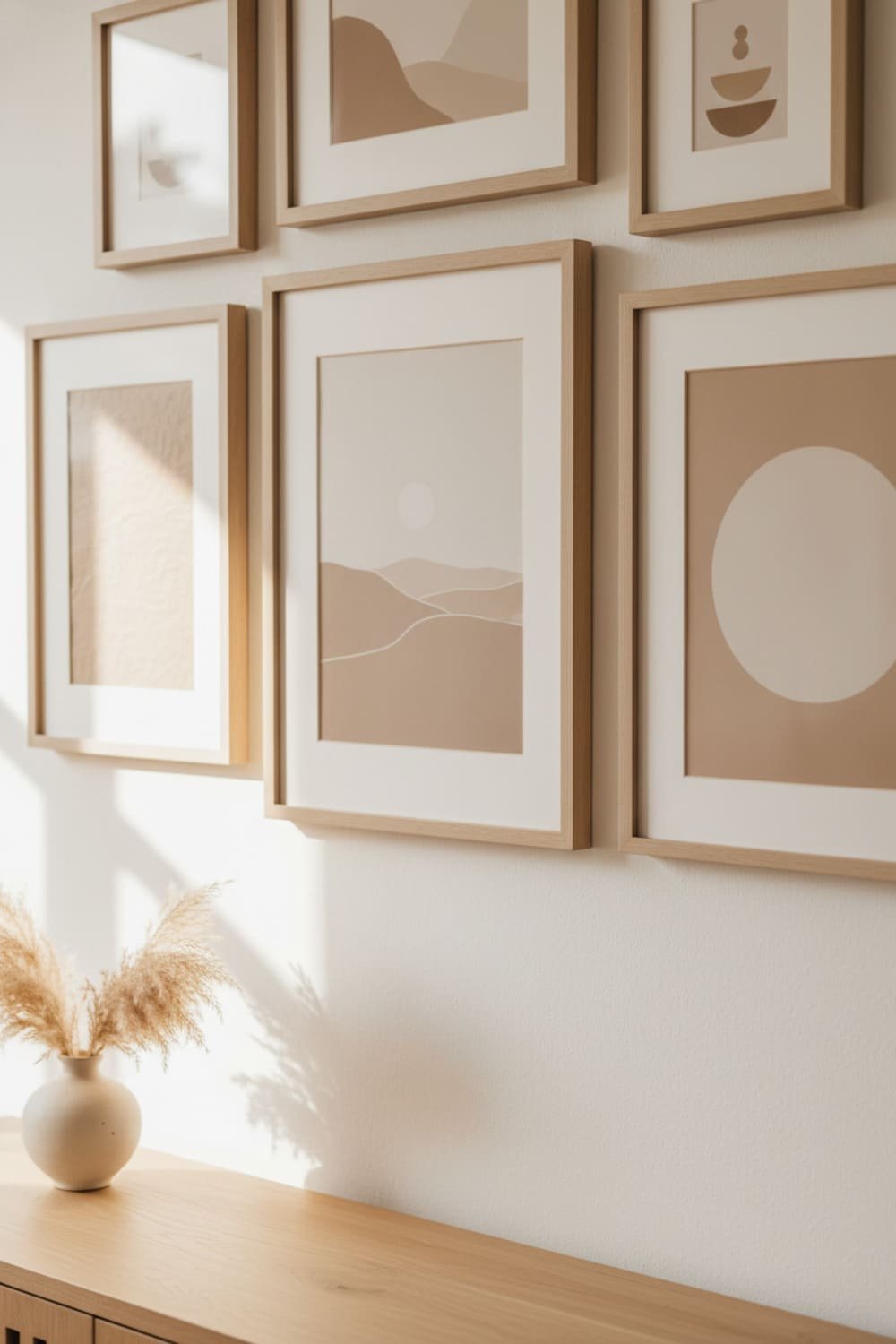
Frame Selection: The Secret Weapon
Frames matter more than people admit. You could hang the most beautiful print in a mismatched, glossy-red frame and instantly ruin the whole vibe (sorry but true).
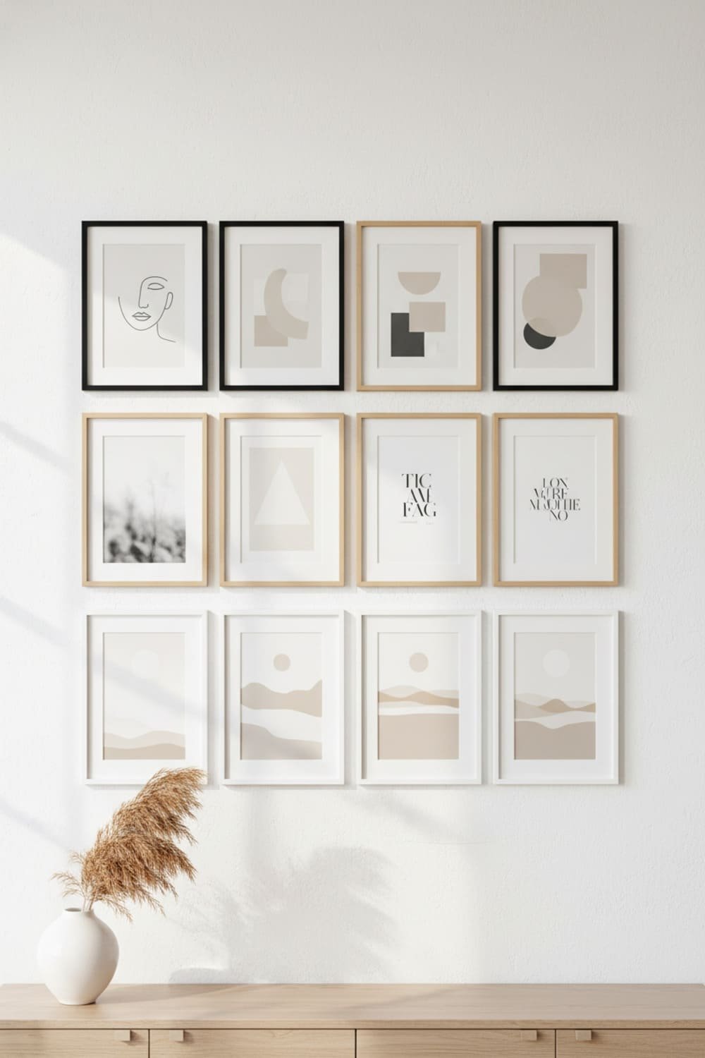
Best Frame Styles for Scandi Walls
Stick with simple, clean, and natural choices:
- Light wood (oak or ash)
- Matte black for contrast
- White frames for an airy look
- Metal frames in champagne or matte gold (but use sparingly)
Avoid anything shiny, overly ornate, or chunky. Scandi design thrives on subtlety.
Matting or No Matting?
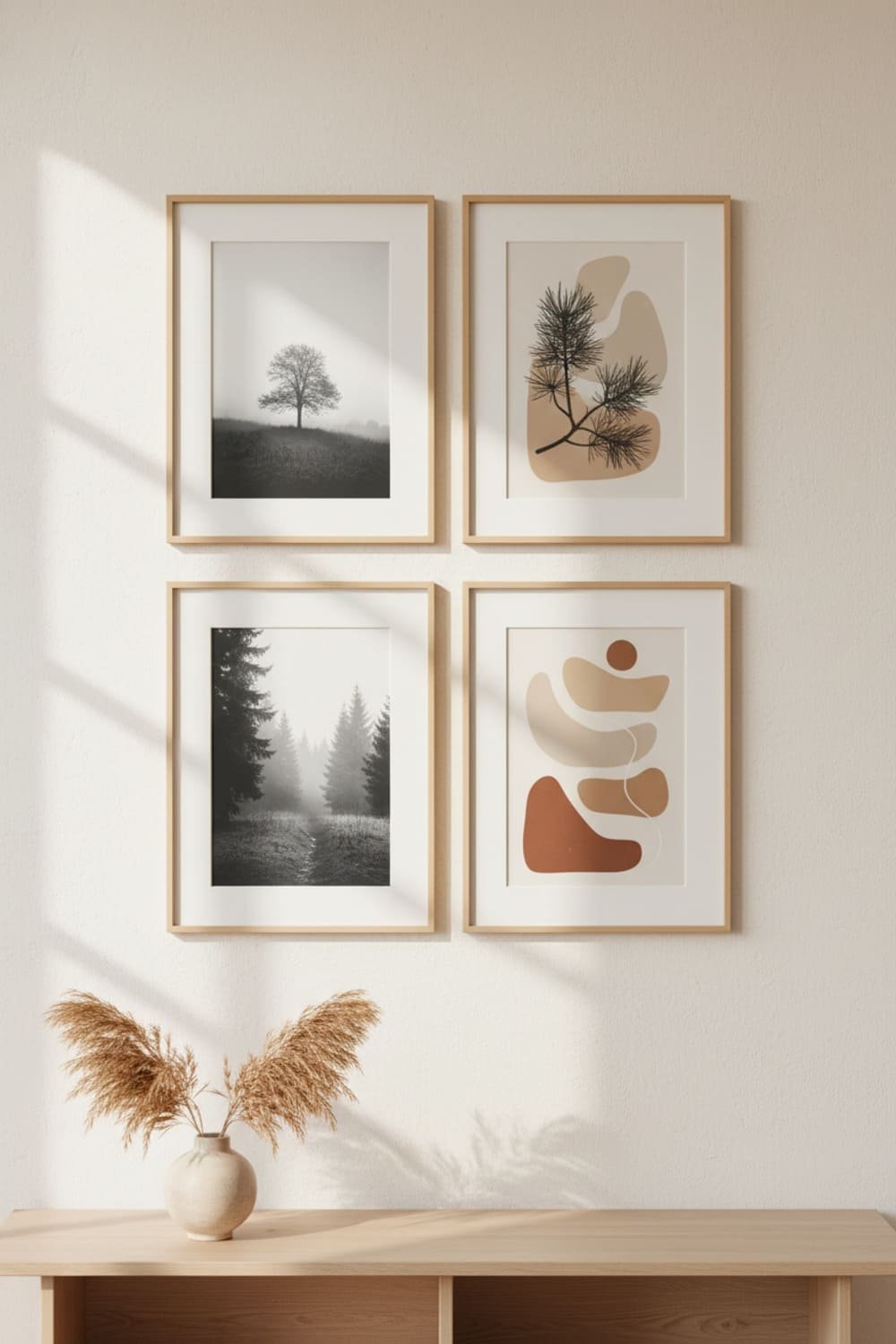
I always choose a white or cream matboard for:
- Photography
- Line drawings
- Minimal illustrations
It adds breathing room and makes your wall feel more curated. No matting works better for:
- Full-bleed prints
- Abstract art
- Bold compositions
Think of matboards like eyeliner—use them when you want definition.
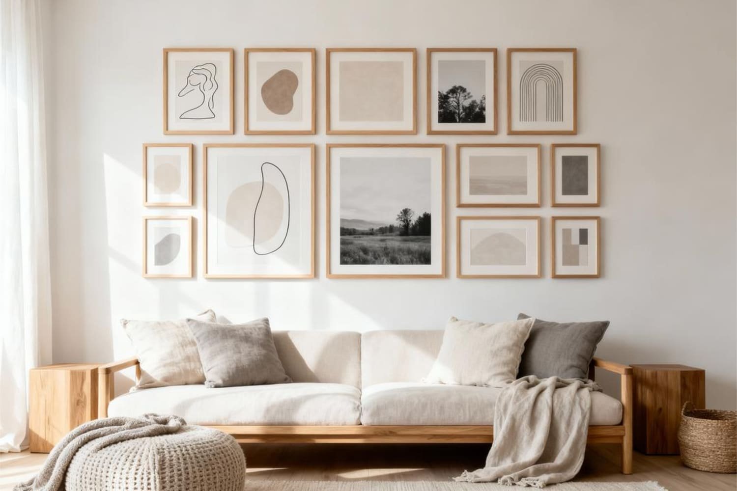
How to Arrange Your Scandi Gallery Wall (Without Losing Patience)
Now the fun part: making your wall look like the ones you see in magazines—without the stylist, lighting crew, and editing team.
Start With the Largest Piece
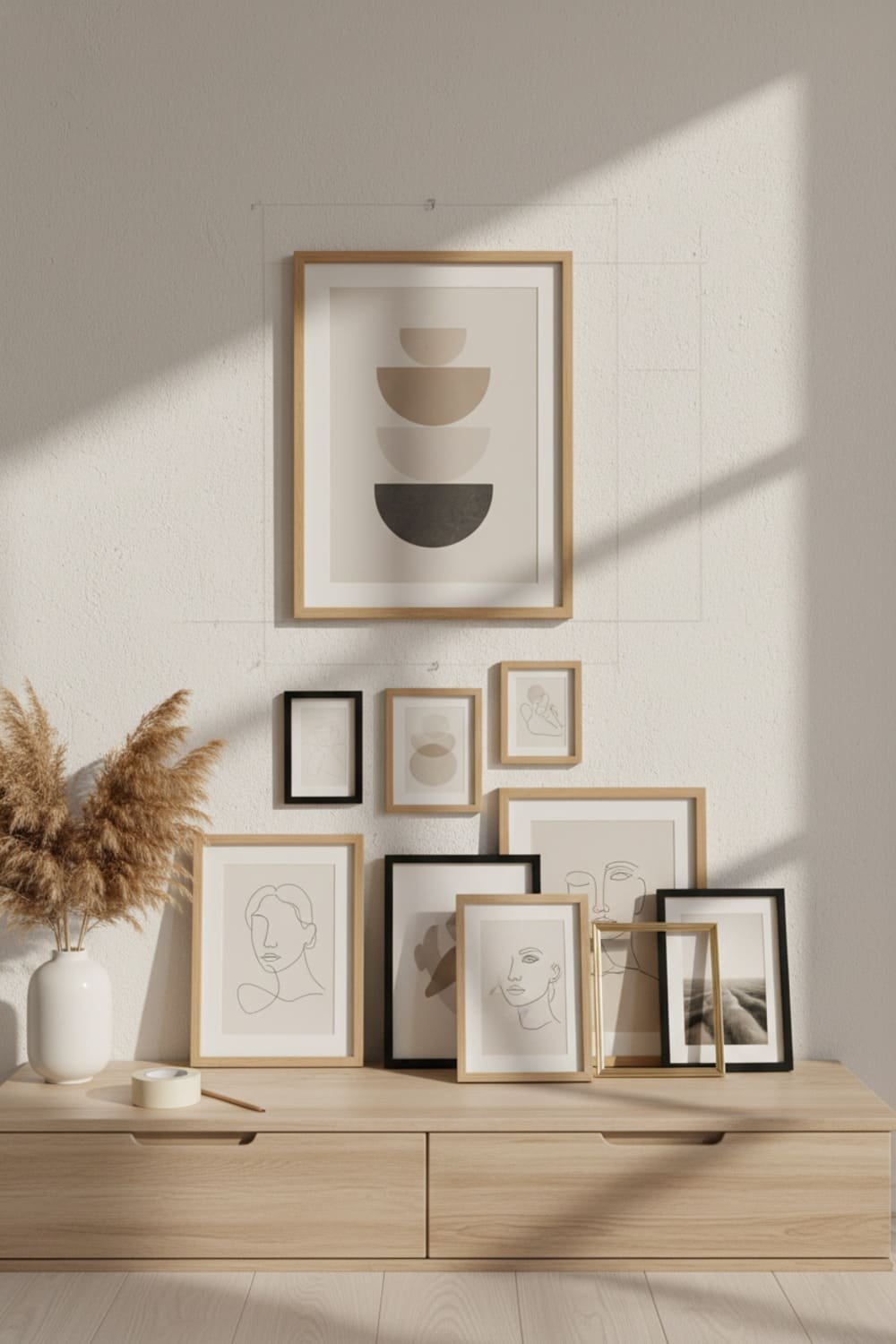
Place your biggest frame slightly off-center. This keeps the wall feeling natural and unforced.
Ever tried centering everything perfectly? Yeah, it ends up looking like a corporate hallway.
Use Consistent Spacing
Leave 1.5–2 inches between frames.
Consistent spacing = instant polish.
Mix Horizontal and Vertical Frames
This keeps your wall dynamic. When everything faces the same direction, it looks stiff… like a school photo line.
Layout Ideas to Copy
If you don’t know where to start, try these:
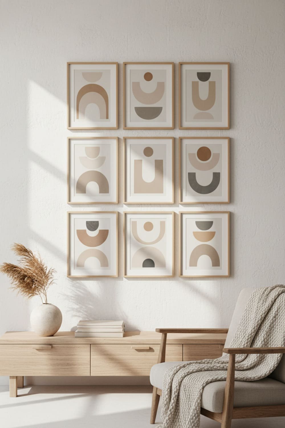
1. Soft Grid
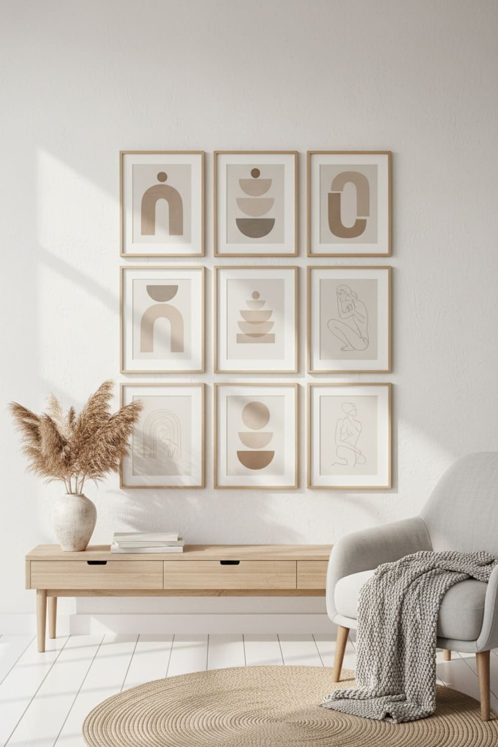
Organized but not too perfect. Works great for minimalists.
2. Organic Cluster
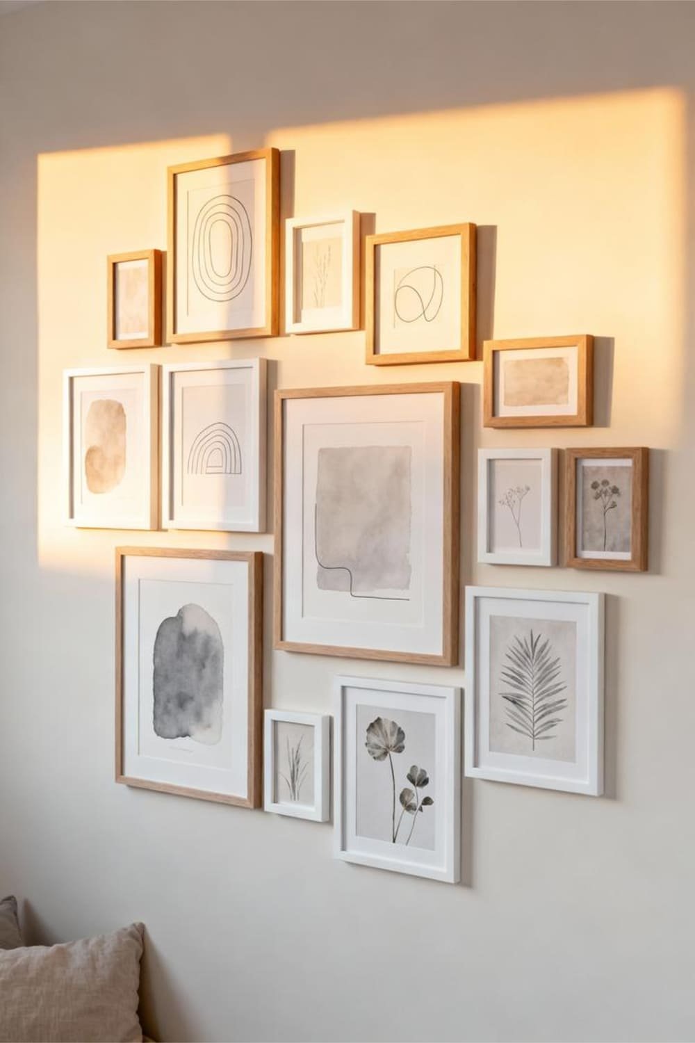
No strict boundaries. Looks cozy and effortless.
3. Anchored Trio
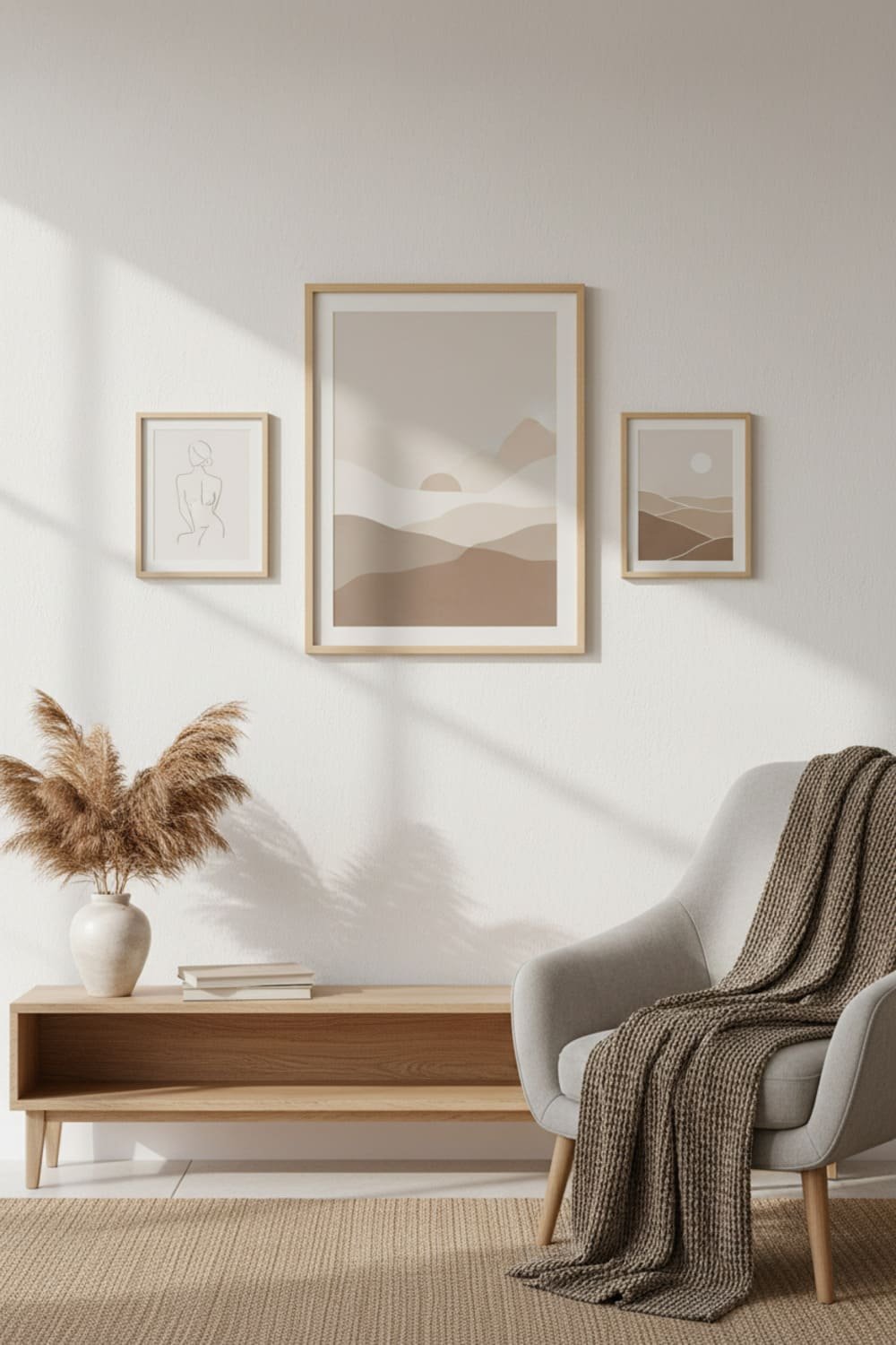
Use one large frame and pair it with two smaller ones.
4. Scandinavian Symmetry
Simple pairs repeated across the wall.
Each layout has its own vibe. Choose the one that feels natural for your space.
Textures: The Missing Ingredient You Didn’t Know You Needed
Neutral tones shine best when paired with textures. Otherwise, everything feels flat.
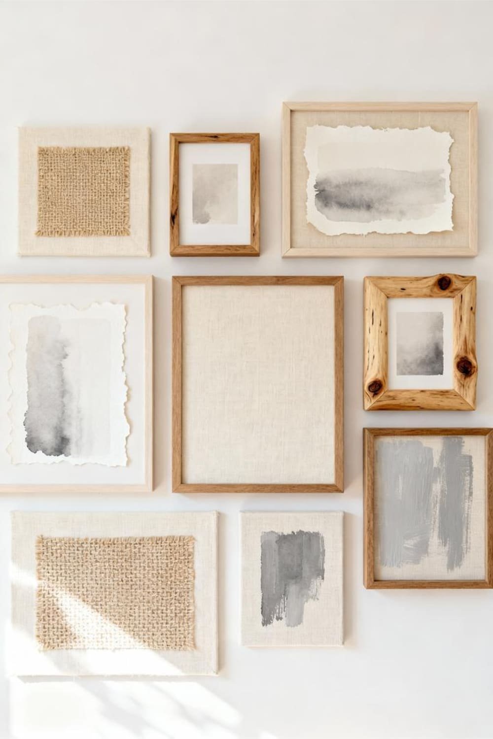
Mix These Textures for a Rich Look:
- Raw wood
- Linen mats
- Canvas prints
- Matte frames
- Handmade paper
- Soft fabric tapestries
Ever noticed how a wall looks “done” once you add just one linen-textured frame? Textures add quiet depth, and Scandi design loves layers (just not the cluttered kind).
Adding Personal Touches (Without Ruining the Aesthetic)
A Scandi gallery wall shouldn’t feel like a museum. It should feel like you.
But there’s a fine line between “personal” and “I found this in my junk drawer.”
Subtle Personal Additions That Still Look Scandi
- A monochrome photo from your travels
- A small frame with handwritten notes
- A simple map or architectural drawing
- A soft-toned family photo (nothing with neon birthday decorations, please)
I once tried adding a random bright-red concert ticket to my gallery wall. FYI, it lasted 20 minutes before I ripped it down in existential regret.
Lighting: The Quiet MVP
Good lighting makes your gallery wall glow without feeling staged.
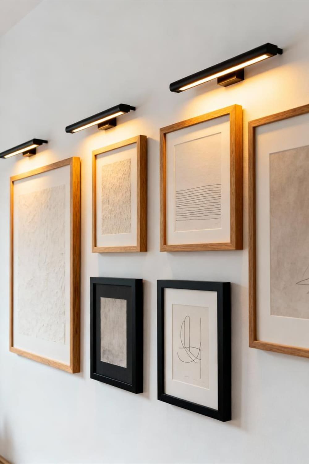
Best Lighting Options
- Minimal sconces
Clean lines, warm tones. - Slim picture lights
Perfect for longer frames. - Soft warm LED strips
Hide them behind floating shelves.
Avoid harsh white light unless you want your living room to feel like a dentist’s office.
Keeping the Look Fresh Over Time
Design evolves, and so will your tastes. Luckily, Scandi gallery walls make refreshing your space super easy.
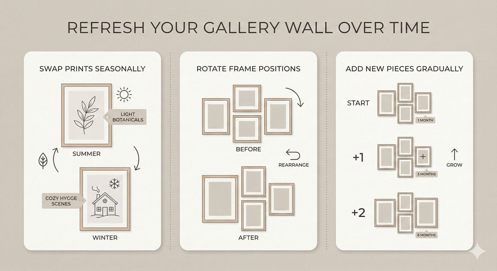
Swap Prints Seasonally
Try warm browns in fall, airy beiges in spring, cool grays in winter. You don’t need to overhaul the whole wall—just replacing two or three prints changes everything.
Rotate Frames
Switch frame positions every few months. It keeps your wall interesting without buying anything new.
Add One New Piece at a Time
This prevents accidental clutter. Your gallery wall should feel intentional, not like a scrapbook explosion.
Common Mistakes to Avoid
Let’s save you from the heartbreak I learned the hard way.
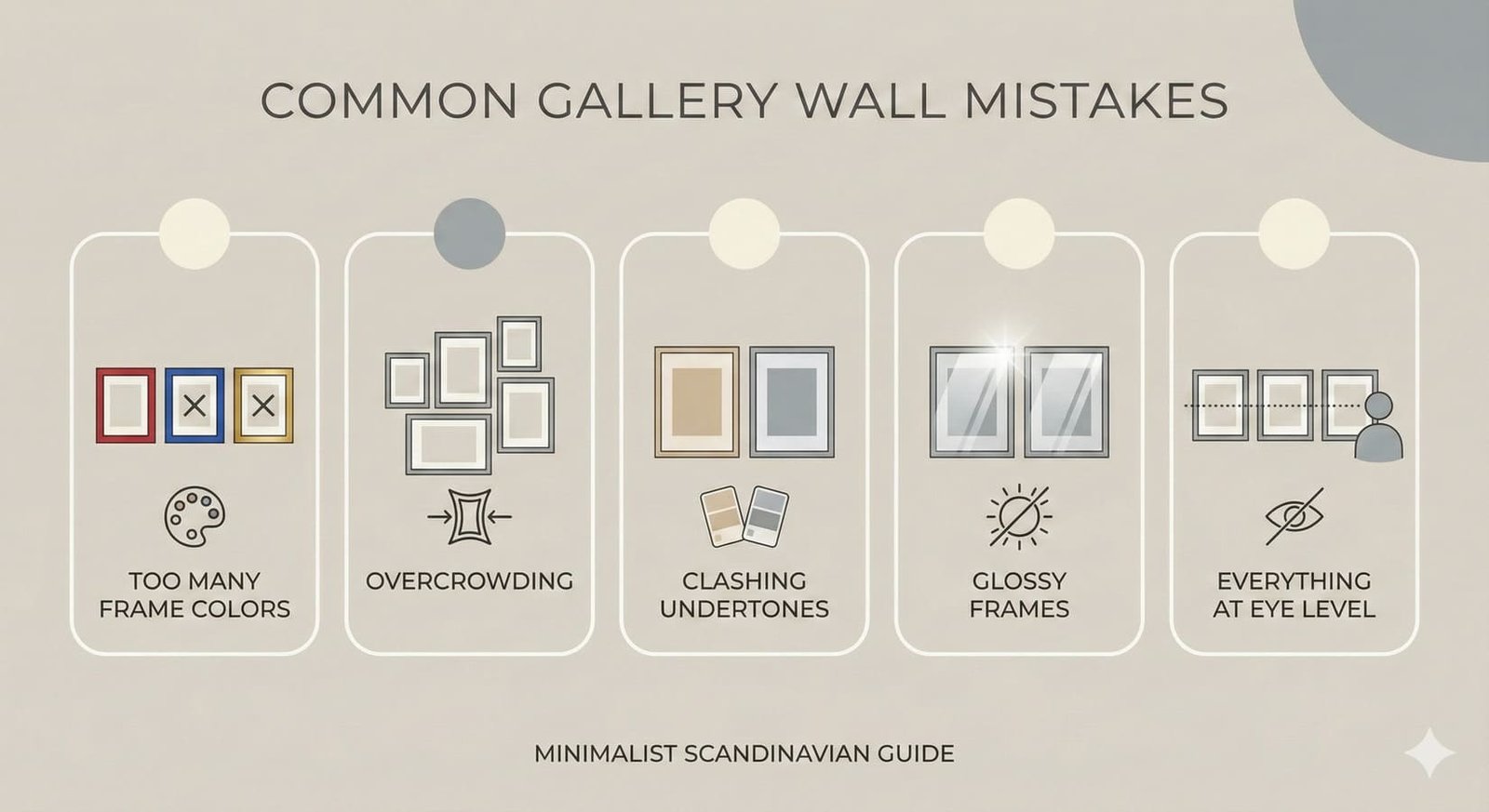
1. Mixing Too Many Frame Colors
Stick to two, max three.
2. Overcrowding the Wall
Your pieces need breathing room.
3. Choosing Prints With Clashing Undertones
Warm + cool without a plan = chaos.
4. Using Glossy Frames
They reflect light and distract the eye.
5. Placing Everything at Eye Level Only
Play with height variation for interest.
Ever hung everything at the same height and wondered why it looks painfully formal? Yeah, same.
Conclusion
A Scandi-inspired gallery wall with neutral tones doesn’t just decorate your home—it elevates it. It brings calm energy, balanced design, and quiet warmth into your daily life.
And the best part? You don’t need to be an interior designer to pull it off.
Start simple. Pick a neutral palette that speaks to you. Choose art that you love. Arrange it in a way that feels natural. Add textures, lighting, and a few personal touches.
And if you end up obsessing over spacing or swapping frames like I do… well, welcome to the club.
So go ahead—grab those prints, pick your frames, and build a wall that feels like a soft exhale every time you look at it. Your future self will thank you.