How to Pick Paint Colors That Match Your Furniture & Decor
You know that moment when you finally decide to repaint your room… only to realize your gorgeous sofa suddenly looks like it got into a fight with the wall? Yeah, I’ve been there.
Picking the right paint color that actually matches your furniture and decor shouldn’t feel like defusing a bomb, but it often does.
I’ve made enough paint mistakes to last a lifetime (FYI, neon green in a bedroom = instant regret).
So today, I’m breaking down exactly how I choose wall colors that make a room feel intentional, stylish, and pulled together—even when your decor came from a mix of sales, hand-me-downs, and late-night “Add to Cart” decisions.
Ready to make your paint and furniture finally stop arguing with each other?
Why Matching Paint With Furniture Matters More Than You Think
Matching your paint with your furniture isn’t about being overly coordinated. It’s about creating a space that feels balanced, cozy, and not like a chaotic Pinterest board gone wrong.
Ever walked into a room and immediately felt relaxed? That’s because the colors actually get along. Wild concept, right?
Matching colors sets the tone, affects the mood, and makes everything look intentional—even if your “design plan” was more like “I just really liked that chair.”
Start With the Items You Can’t Change
Let’s be honest—you probably can’t replace your couch just because your new paint color looks weird next to it. Unless you can… in which case, please adopt me.
Focus on Your Anchor Pieces
Anchor pieces are the big stuff:
- Couch
- Rugs
- Bed frames
- Dining tables
- Large cabinets
These items already dictate the room’s vibe, so picking a paint color that complements them makes your life 100x easier.
Find the Dominant Tones
Look at your anchor pieces and ask:
- Are they warm (beige, brown, terracotta, gold)?
- Are they cool (gray, black, navy, green)?
- Or do they completely ignore the rules and land somewhere in between?
Once you know the undertone, you can aim for a matching or contrasting paint color that doesn’t fight with it.
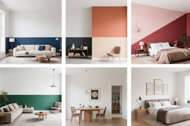
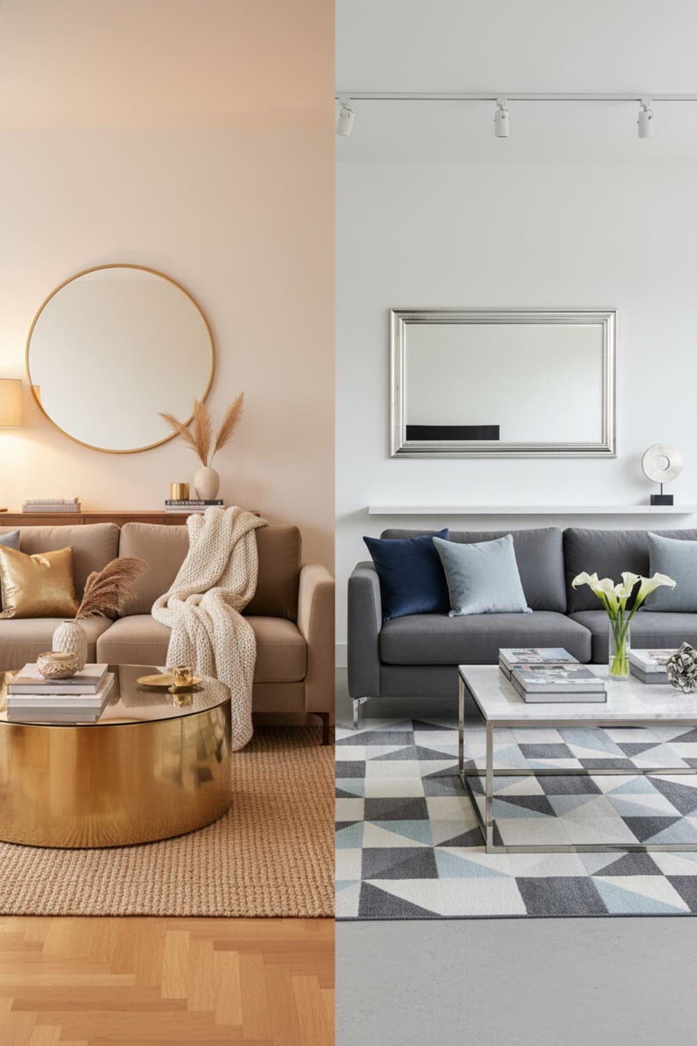
Warm vs. Cool Undertones: The Trick Everyone Forgets
You know how sometimes a white wall looks yellow next to your couch? Or a gray looks unexpectedly blue? Undertones do that.
Undertones are sneaky little things—basically the silent troublemakers of paint picking.
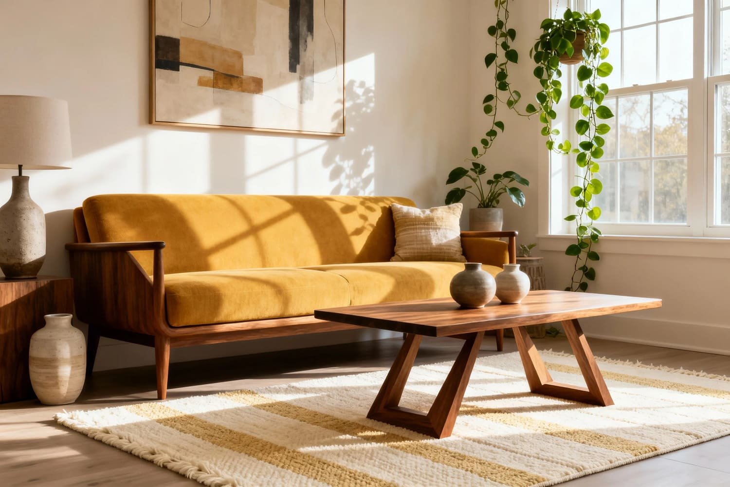
Warm Furniture? Try These Shades
If your furniture pulls warm, go with:
- Creamy whites
- Soft taupes
- Warm grays
- Earthy greens
- Muted clay tones
These colors hug warm furniture instead of wrestling with it.
Cool Furniture? These Work Better
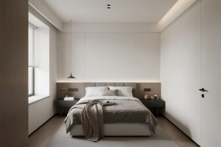
Cool pieces love:
- Crisp whites
- Icy grays
- Blue-greens
- Slate blue
- Charcoal
Cool furniture plus cool paint creates a calm, clean vibe—great for modern or minimalist spaces.
What if Your Decor Is a Mix?
If your home is a “warm meets cool” mash-up, don’t panic. Pick a neutral paint color with a balanced undertone like greige. It behaves like the peacekeeper of the paint world.
Ever wonder why greige became such a design celebrity? Because it literally goes with everything.
Match or Contrast? Both Work—If You Know How
Some people think matching furniture and paint means everything needs to be the same color. Bestie, no. That’s how you accidentally create a beige blob of sadness.
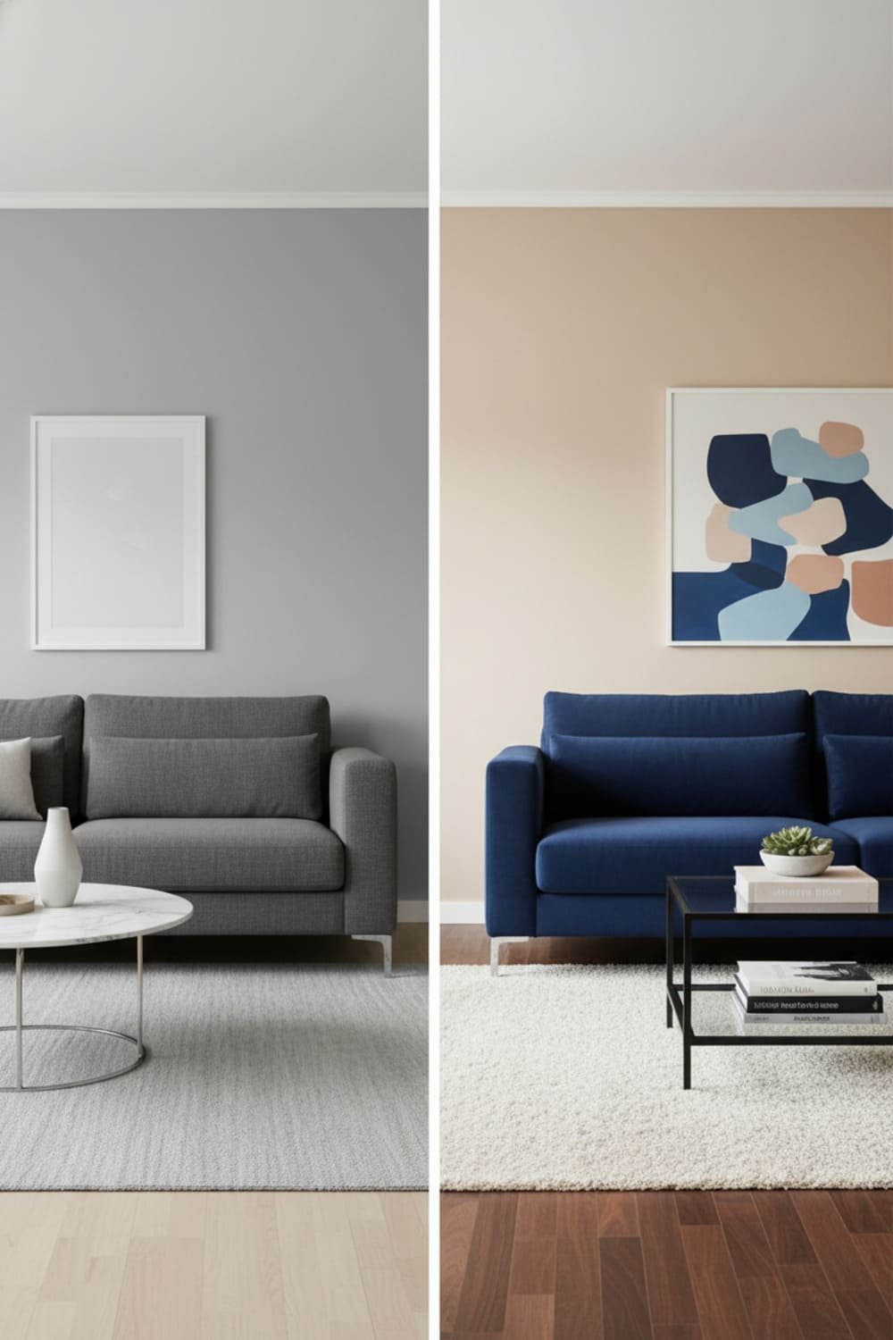
When Matching Works
Matching looks great when:
- You want a soft, cohesive feel.
- Your decor has subtle or muted colors.
- You like a room that feels peaceful rather than high-energy.
Example: gray sofa + matching gray walls (but slightly darker or lighter). Chic. Calm. Mature. IMO, it’s a fool-proof combo.
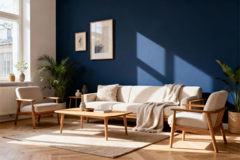
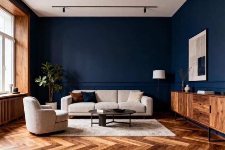
When Contrast Works Better
Contrast adds personality and makes furniture pop.
Try contrast if you want:
- High visual interest
- Bold vibes
- A spotlight effect on key furniture
Examples:
- Blue sofa + warm beige walls
- Dark wood furniture + sage green walls
- White decor + charcoal walls
Ever noticed how boutique hotels always nail this? That’s because they play with light and dark like it’s their job—which, okay, it literally is.
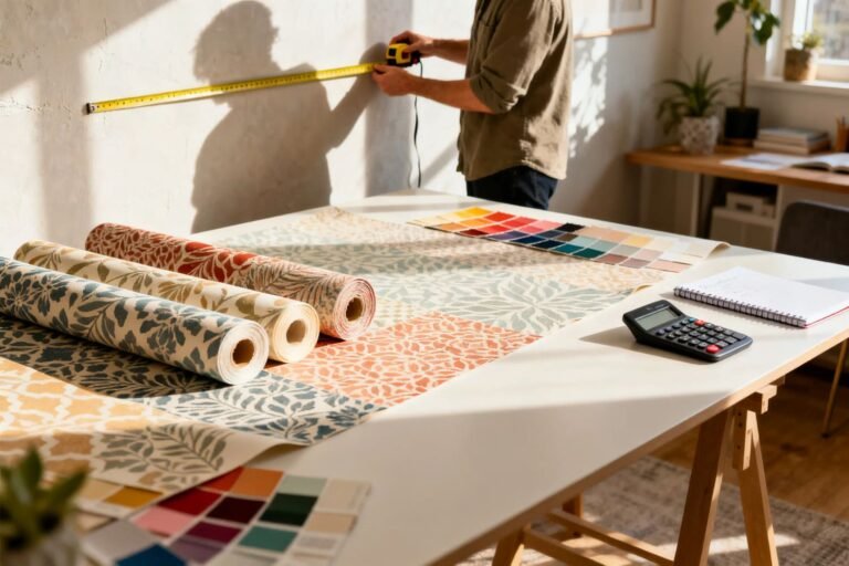
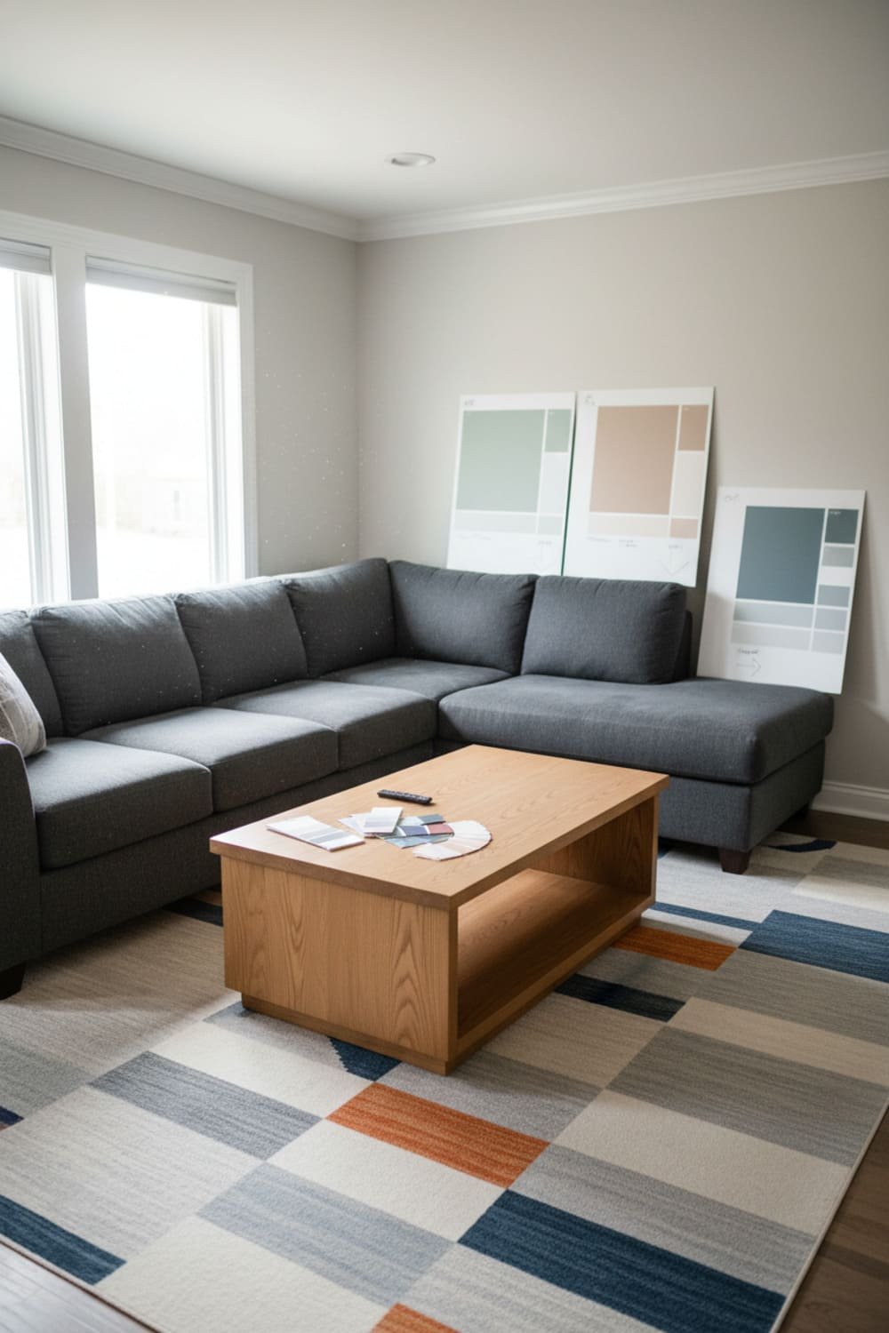
Use Your Rug as a Color Bible
If your room has a rug, treat it like your sacred color guide. Rugs often have multiple tones, which give you instant paint color options.
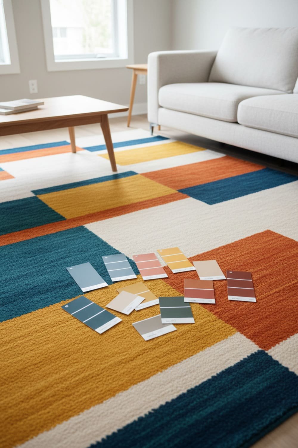
Here’s How I Do It
- Pick out 2–3 colors from the rug.
- Choose one shade that feels less dominant—that’s usually the best paint color.
- Choose a tint that’s one or two shades lighter on the paint swatch for your walls.
Boom. Your room now looks designed on purpose.
Ever tried painting your walls a color from your rug and watched everything magically click? It’s pure serotonin.
Let Your Decor Set the Mood
Your decor—pillows, vases, curtains, art—carries personality. Your paint should support that personality, not steal the spotlight.

Soft Decor = Soft Paint
If your decor leans soft or romantic:
- Blush
- Cream
- Faded greens
- Dusty blues
These feel calm and cozy.
Bold Decor = Neutral or Moody Paint
If your decor screams for attention (hello neon artwork):
- Pure white
- Charcoal
- Inky blue
- Greige
- Olive
These colors frame your decor without making the room look loud.
Check Your Lighting Before You Commit
Lighting changes everything. EVERTHING.
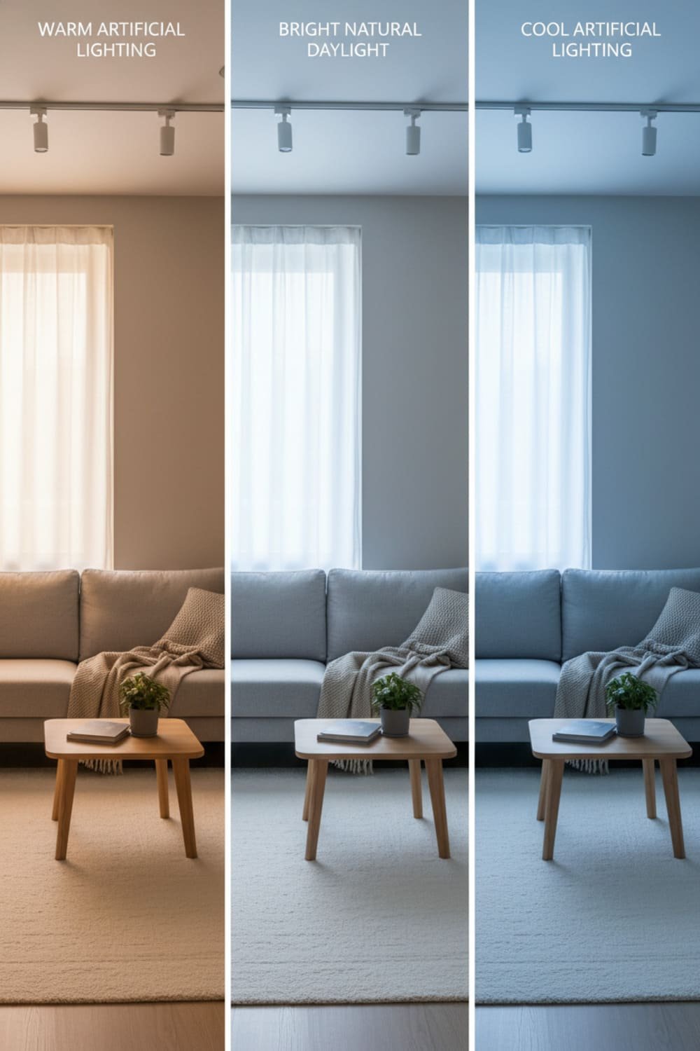
Natural Light
Got tons of sunlight? Lucky you. Your paint will look brighter and warmer.
Low Light Rooms
Low light eats color. You’ll see grayer, duller versions—sometimes even muddy ones.
Low light rooms thrive with:
- Whites
- Pale grays
- Soft greens
- Warm neutrals
Artificial Lighting
Yellow bulbs warm up colors.
White bulbs cool them down.
Want to know why your “perfect beige” turned orange at night? Blame the bulb, not the paint.
Test Before You Paint (Seriously)
I used to skip sample testing because I thought I had “an eye for color.” Spoiler: I did not.
Always Test:
- On multiple walls
- At different times of day
- Next to your actual furniture
If you test a sample once at 3 p.m. and call it a day, you’re basically gambling with your walls. And unless you like repainting, don’t do that.
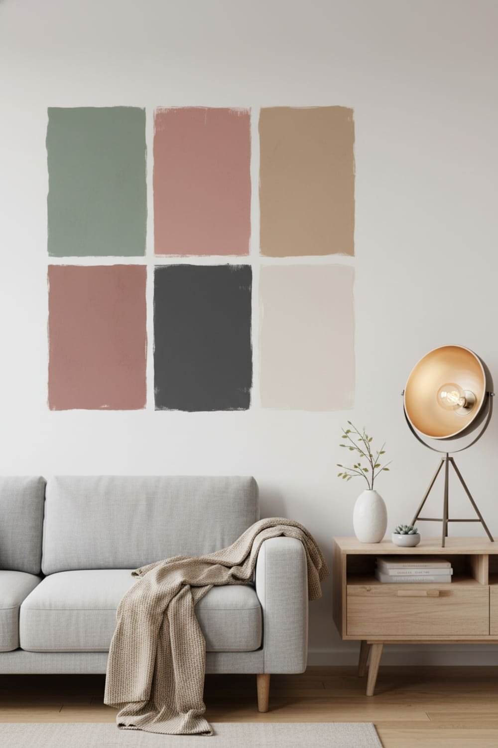
Find Your Room’s Color Palette
To make everything play nicely, you need a simple color palette.
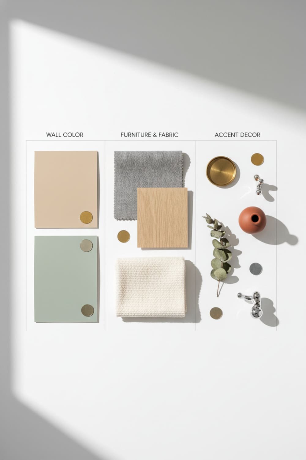
Use this handy breakdown:
1. Your Dominant Color (60%)
Usually your wall color.
2. Your Secondary Color (30%)
Furniture and large decor.
3. Your Accent Color (10%)
Throw pillows, art, accessories.
A palette keeps your room from looking chaotic—because “eclectic” is cute, “random” is not.
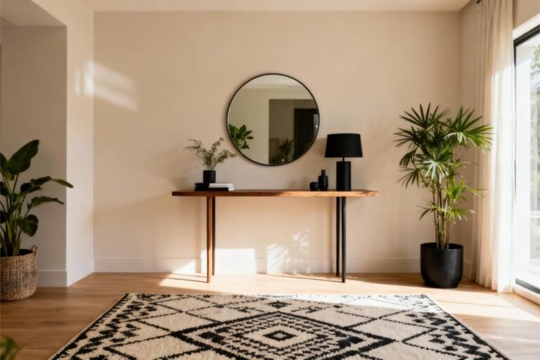
Neutrals: The Secret Weapon That Saves Every Room
I swear by neutrals. When in doubt, they save the day.

Top Neutrals That Work With Almost Anything
- Greige
- Warm white
- Soft taupe
- Light gray
- Muted sage
Neutrals act like your room’s supportive best friend—they help everyone else shine.
Use Color Psychology (It Works, I Promise)
Colors shape mood. Why not use that to your advantage?
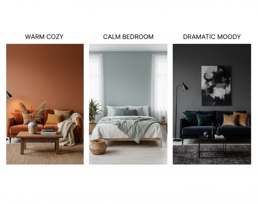
Warm Colors = Cozy
Reds, oranges, golds
Perfect for living rooms or dining rooms.
Cool Colors = Calm
Blues, greens, soft grays
Great for bedrooms, offices, bathrooms.
Dark Colors = Dramatic
Charcoals, deep greens, navy
Amazing for accent walls or moody spaces.
Ever wonder why spas always go for muted greens and soft whites? Because calming colors literally tell your brain to chill.
Don’t Ignore Your Metal Finishes
Your metal tones also matter. Crazy, right?

Warm Metals
Gold, brass, bronze
Pair beautifully with warm paints.
Cool Metals
Chrome, nickel, silver
Glow next to cool paints.
Mixing metals is allowed, BTW—just keep one dominant tone so the room doesn’t feel confused.
How to Combine Patterns With Paint Like a Pro
Patterns can be intimidating, especially when they’re bold.
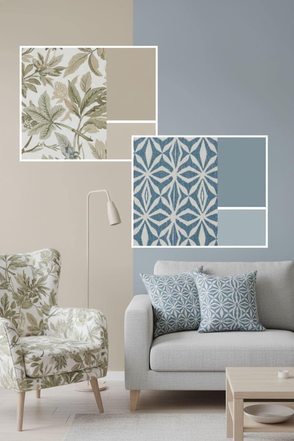
Here’s the trick:
Match your paint to the background color of your patterned item, not the boldest color.
Example?
Floral pillow with navy, mustard, and blush? Go with the blush. It softens the look and doesn’t steal focus.
Patterns play nicer when the wall color feels grounded.
Trust Your Gut (Your Brain Gets It Right More Often Than You Think)
Ever looked at a color and instantly felt like, “Yep, that’s the one”? Trust that. Your instincts already understand what vibe you want.
If a color gives you “meh” vibes now, it’ll give you full “I need to repaint this” energy later.
And IMO, repainting ranks right up there with assembling IKEA furniture.
Final Tips Before You Paint
Here’s the speed-round cheat sheet:
- Match undertones
- Sample test before committing
- Let furniture lead the color palette
- Lighting changes everything
- Aim for harmony—not a perfect match
- Use neutrals when stuck
- Trust your gut 🙂
Your room should feel like you, not like a sterile showroom.
Conclusion
Picking paint colors that actually match your furniture and decor doesn’t need to feel overwhelming.
When you pay attention to undertones, use your anchor pieces as guides, and test your samples like a responsible adult (I’m working on it), choosing the perfect shade becomes way easier.
Your home should feel lived-in, warm, and personal—not like you copied a stranger’s Pinterest board.
So play with color, trust your instincts, and create a space that makes you smile the moment you walk in.
Now go grab those paint samples before you talk yourself out of it.