Gallery Walls Above the Sofa: Perfect Layouts to Try
If you’ve ever stared at that huge blank space above your sofa and thought, “Wow… this wall is judging me,” trust me, you’re not alone.
That empty rectangle feels like a challenge, right? I’ve battled it myself more times than I’d like to admit.
The good news? Creating a gallery wall above the sofa doesn’t require an art degree or superpowers—just a few smart layouts and a little courage.
And maybe a few extra nails, because let’s be real… we always mis-measure something.
So let’s talk about layouts that look amazing, actually work in real life, and won’t leave you rethinking your fingerprints on your landlord’s wall (FYI: they never notice).
Why Gallery Walls Above the Sofa Matter (More Than You Think)
That giant wall behind your sofa is prime real estate. It’s basically the Times Square of your living room.
People look at it first, whether you want them to or not. So why not give it something worth staring at?
You create personality, height, balance, and a focal point all in one go. And IMO, no décor trick works harder for you with so little effort.
Ever wondered why designers obsess over gallery walls? Because they’re the fastest way to make a room feel done—but still personal.
Layouts That Never Fail Above the Sofa
Let me walk you through the gallery wall layouts that always deliver. Think of these as the “cheat codes” for decorating that giant space without losing your mind.
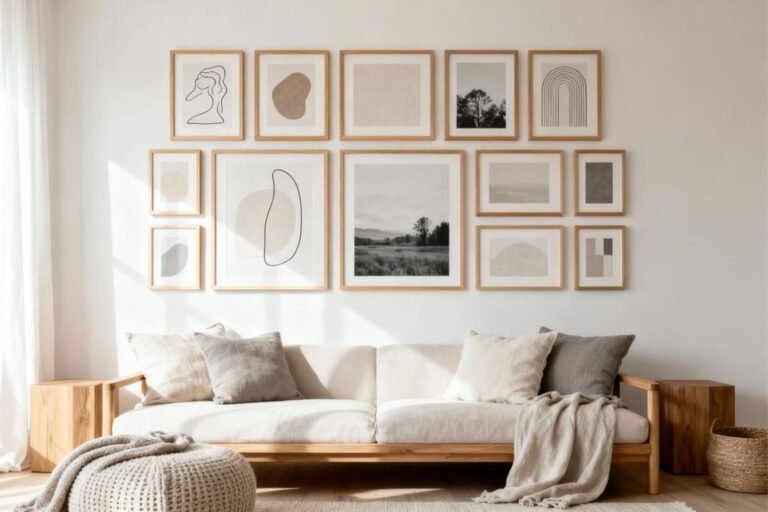
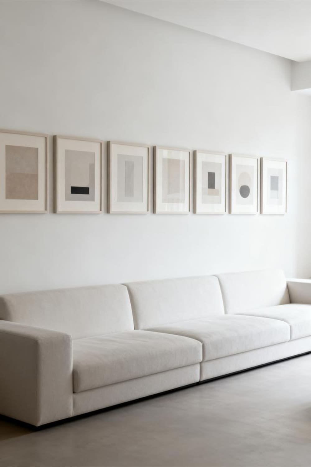
1. The Classic Grid Layout
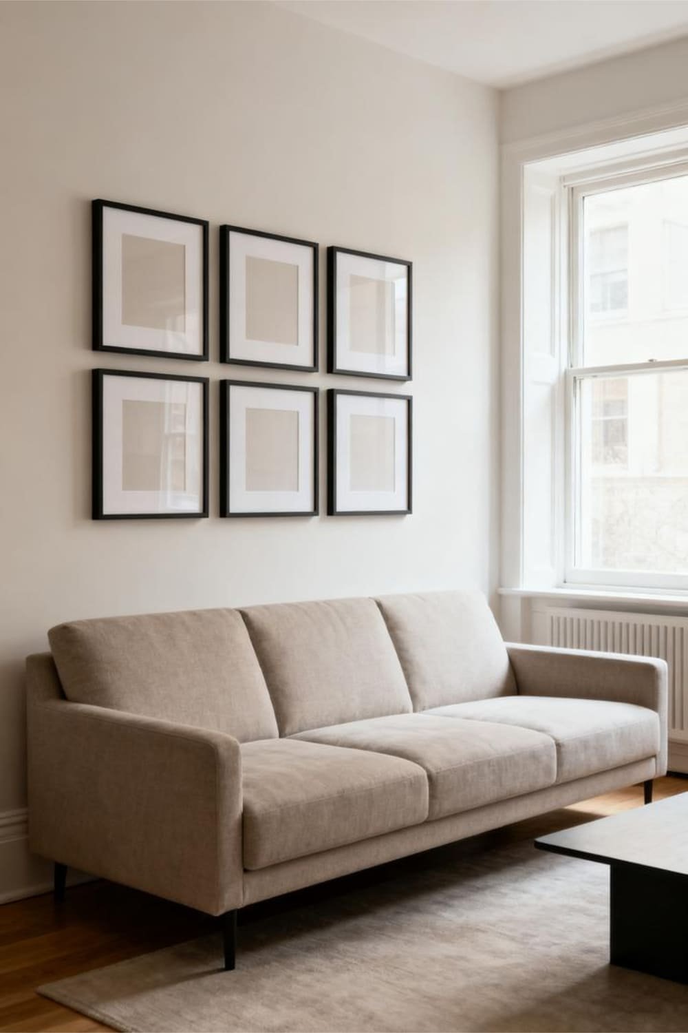
If you love structure—or if your brain melts at the idea of “random placement”—then the grid layout is your best friend.
Why It Works
This layout creates instant symmetry, which your eyes naturally love. Ever wondered why hotels always hang all their art in perfect formation? Because symmetrical layouts feel calm and intentional.
How to Pull It Off
Keep things crisp and aligned:
- Use identical frames for a clean, polished look.
- Stick to even numbers: 2×2, 3×3, or a long 3×2 grid.
- Maintain equal spacing—2 to 3 inches—between each frame.
I use this layout when the room already has a lot going on. If your sofa is patterned, or your rug is screaming for attention, the grid format keeps everything peaceful instead of visual chaos.
Best For
People who want an organized, modern vibe without overthinking every frame placement.
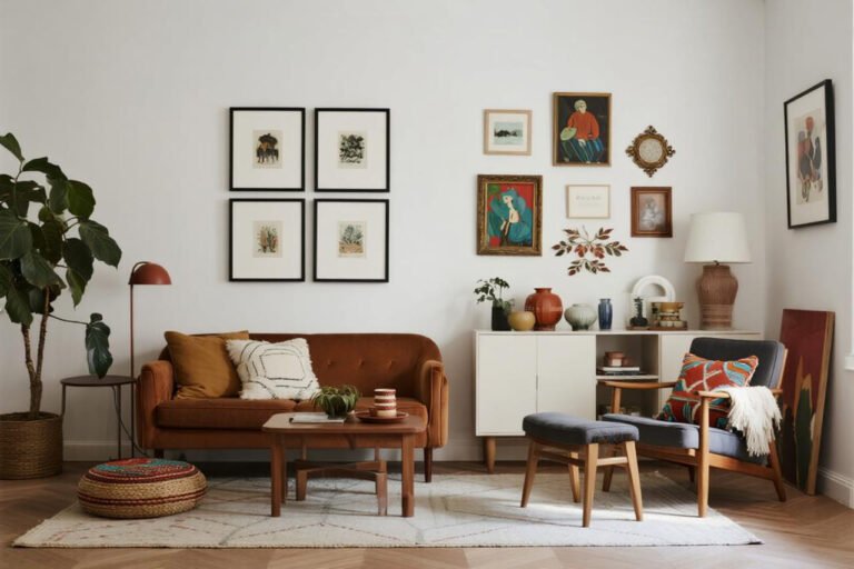
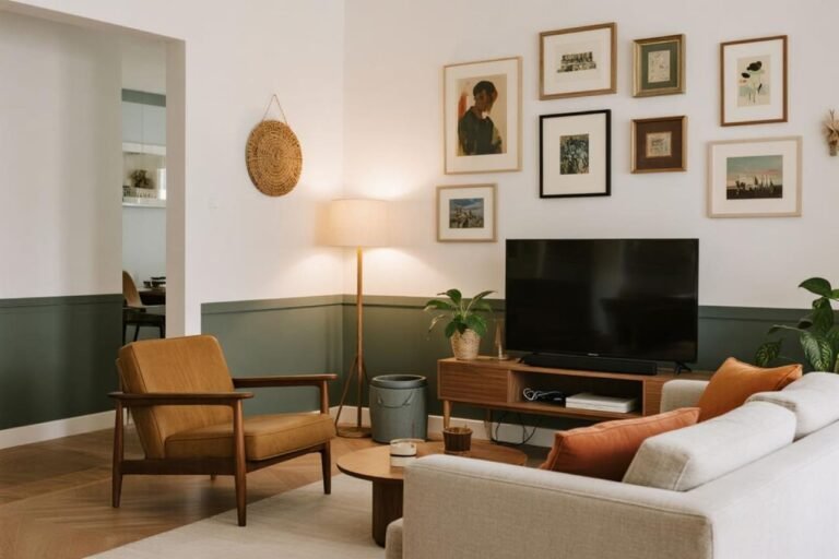
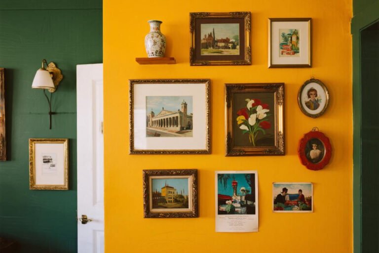
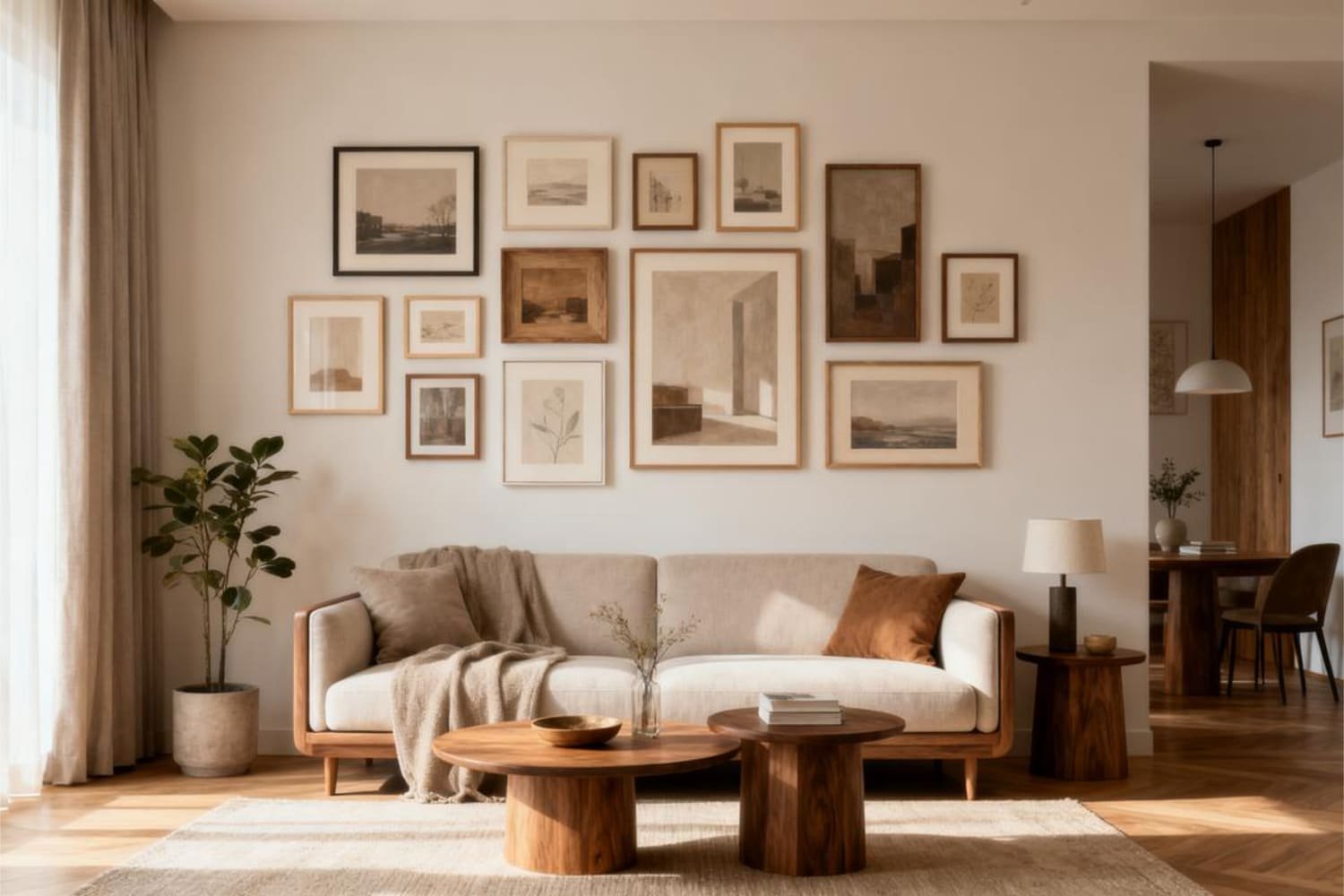
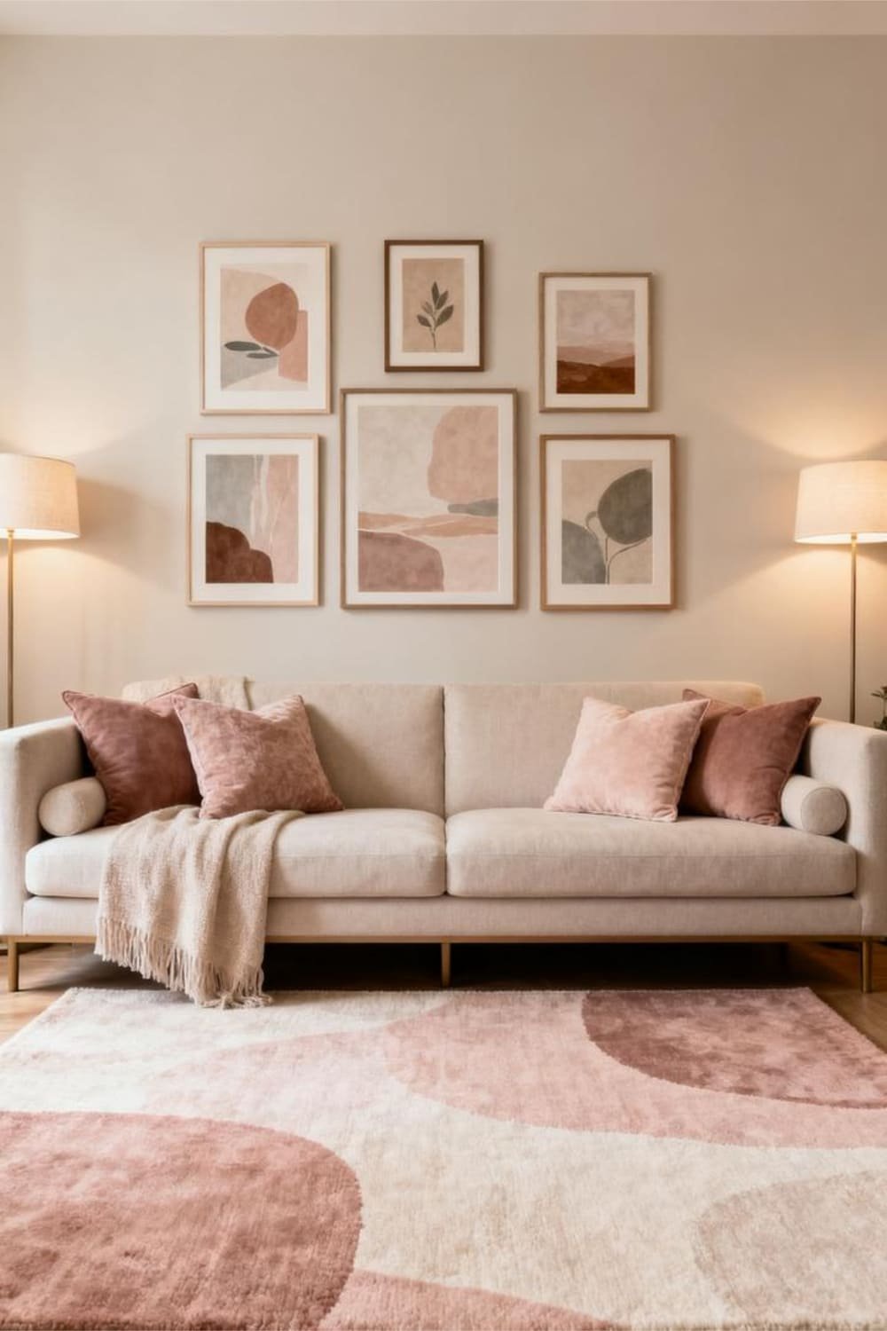
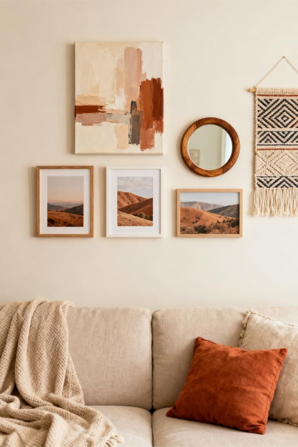
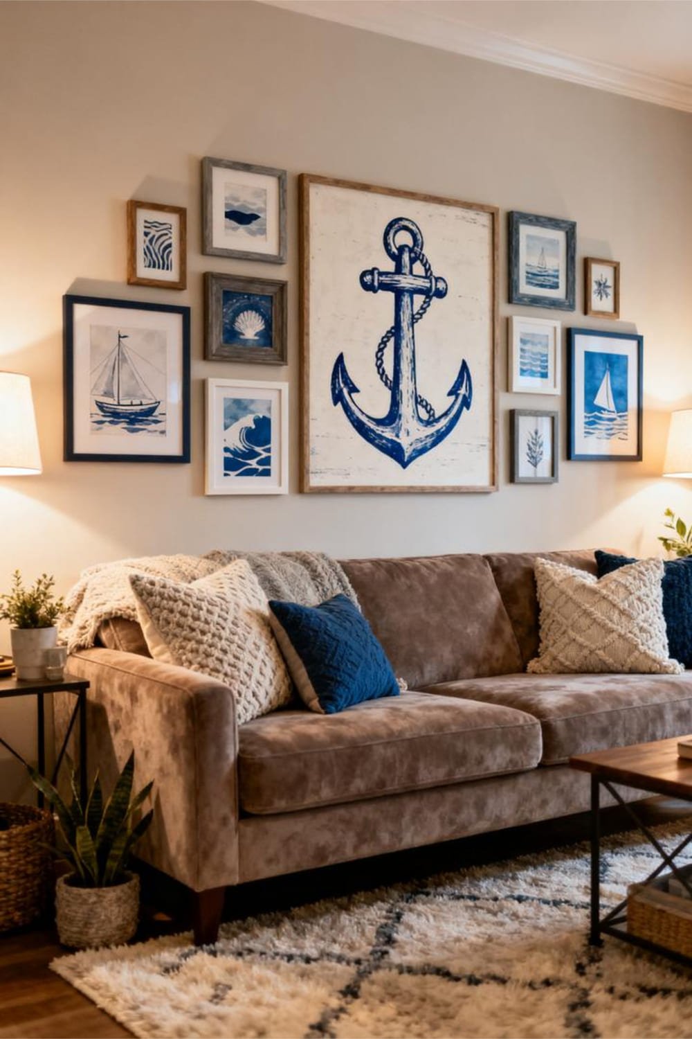
2. The Eclectic Organic Cluster
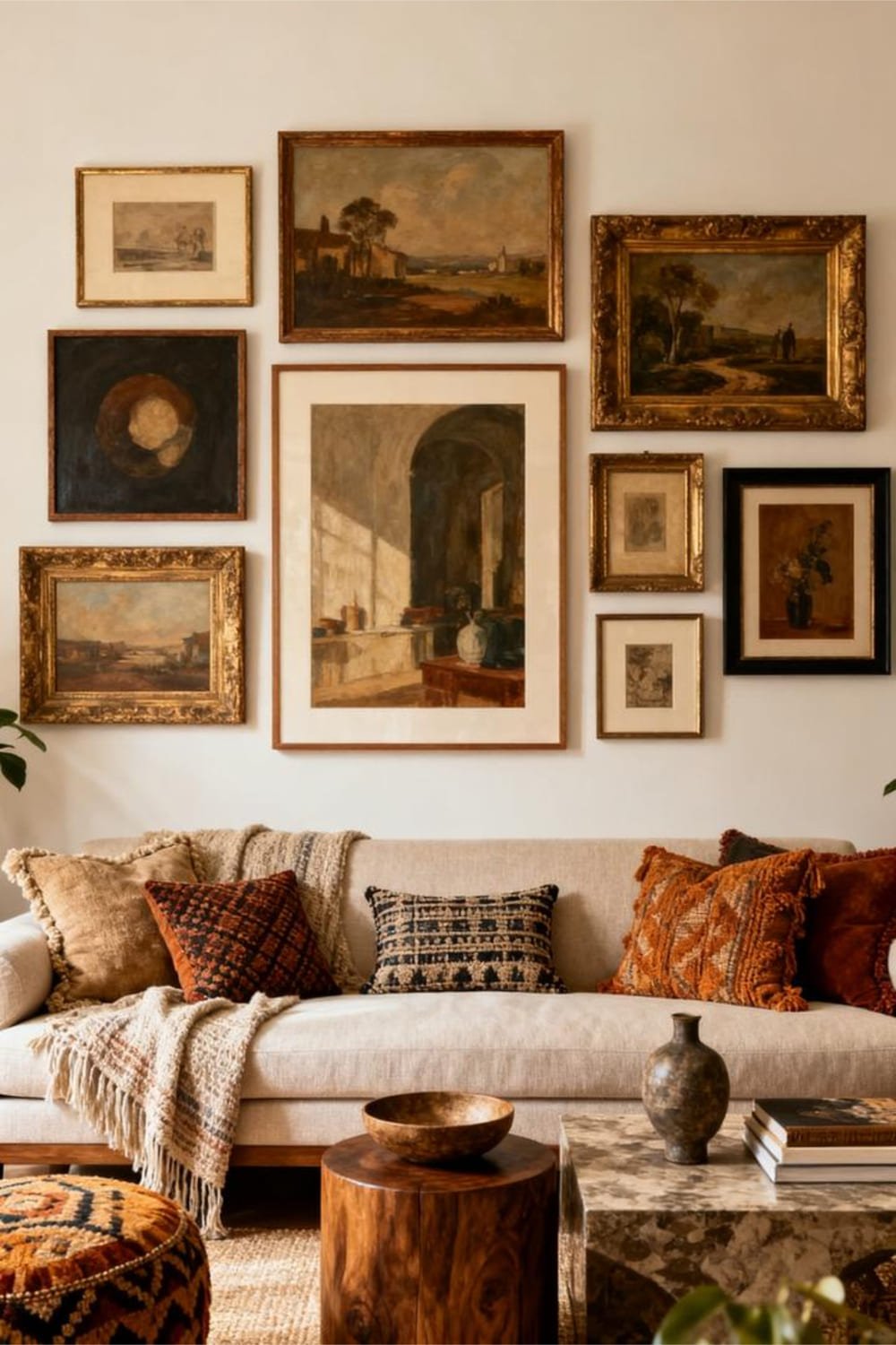
If the grid layout makes you feel trapped, go for something more fluid. The organic cluster lets you mix frame sizes, shapes, and art styles until everything feels naturally balanced.
Why It Works
This layout adds personality—like, actual personality—not the “I bought this set from HomeGoods and called it a day” kind. It feels curated and lived-in.
How to Keep It Balanced (Without Losing Your Mind)
Here’s where I follow my personal rule: one anchor piece + supporting cast.
Try this approach:
- Start with a large statement piece.
- Build around it with medium and small frames.
- Keep your outer edges slightly rounded or oval-ish for flow.
- Maintain a loose center axis so things don’t drift.
Yes, this layout looks spontaneous… but it’s very much planned. Don’t let Instagram fool you.
Best For
Art collectors, sentimental folks, or anyone who wants that “effortlessly stylish” look that’s definitely not effortless. 😉
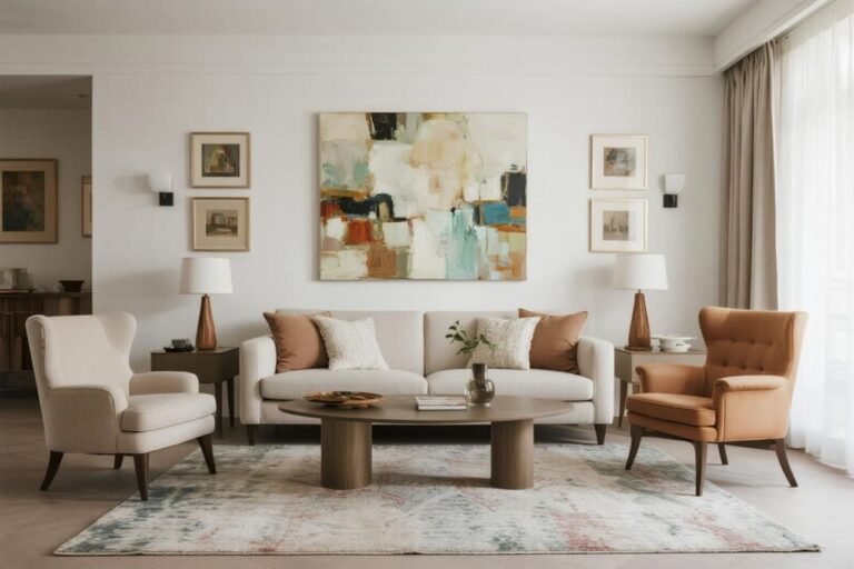
3. The Triptych (A.K.A. the Three-Piece Wonder)
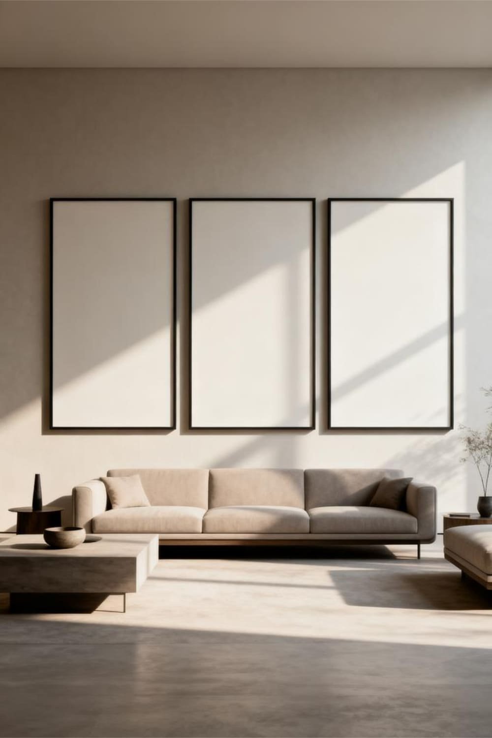
Three pieces. One sofa. Endless impact.
Why It Works
The triptych gives you drama without the commitment of hanging 15 frames. If you’ve ever wanted the living room to look unintentionally expensive, this layout does the job.
Tips to Nail It
- Choose three equal-size frames.
- Space them 2 to 4 inches apart.
- Align their centers at about 60 inches from the floor for that gallery vibe.
I personally love this layout when I want the room to breathe more. It’s clean, bold, and takes up space in the best possible way.
Best For
Minimalists, modern lovers, and anyone who doesn’t enjoy puzzling art pieces together.
4. The Linear Row
Want that effortlessly casual “I’m stylish but also not trying too hard” energy? The linear row hits that sweet spot.
Why It Works
It stretches your wall horizontally, which makes the room feel wider. And who doesn’t want extra width? (Looking at you, tiny apartments.)
How to Do It Right
- Use frames of the same height.
- Mix art styles to keep it interesting.
- Keep the bottom frame line aligned for clean structure.
Try hanging 4 to 5 pieces in one continuous line right above the sofa. It looks curated but chill, kind of like drinking wine from a can. Practical, but aesthetically pleasing.
Best For
Long sofas, narrow rooms, or anyone who wants maximum style with minimum effort.
5. The Shelf-Supported Hybrid Wall
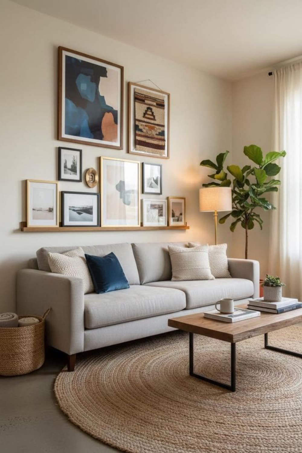
If you love switching things up—or you’re commitment-phobic with wall décor—this layout is your soulmate.
Why It Works
Using a picture ledge lets you layer, rotate, and rearrange your art anytime without new nail holes. It’s like gallery wall flexibility on “easy mode.”
Pro Tips
- Use at least two layers of frames for depth.
- Mix leaning frames with one or two that hang above the shelf.
- Play with heights so nothing lines up too perfectly.
Ever wanted to switch out a print every season without rehanging everything? Boom. This layout was made for you.
Best For
Renters, indecisive decorators, and anyone who likes a little creative chaos.
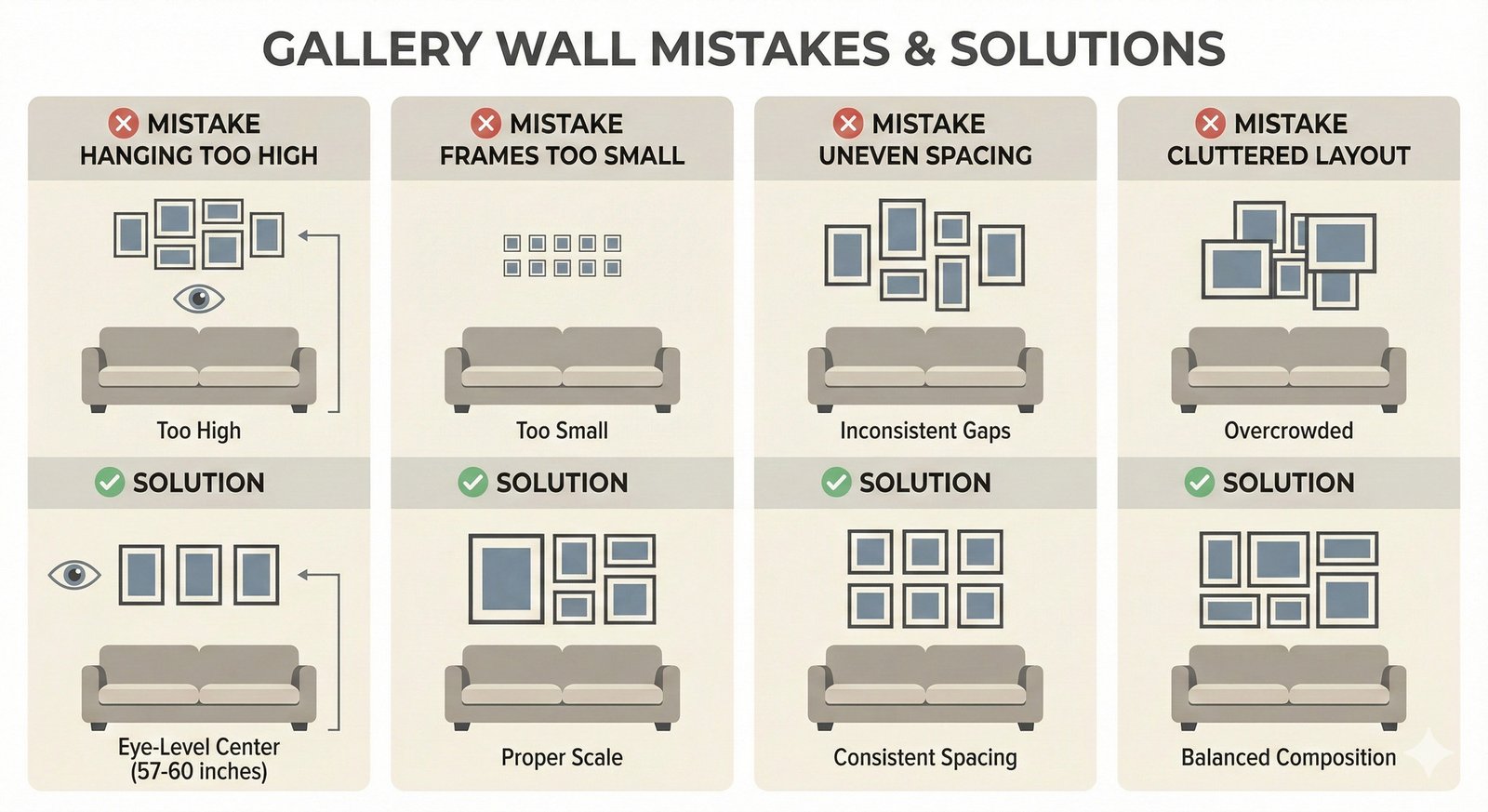
How High Should You Hang Your Gallery Wall?
This question gets people more stressed than it should. But I’ll keep it simple.
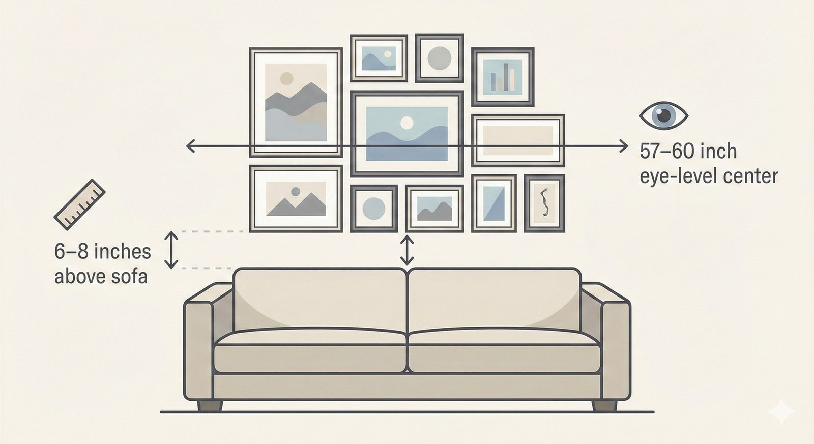
The Magic Number
Center your gallery wall at 57–60 inches from the floor.
That’s the average eye level, so everything stays comfortable to look at.
Above Sofa Rule
Keep the bottom of your gallery wall around 6–8 inches above the sofa back.
Anything higher will float awkwardly. Anything lower risks someone’s head colliding with a frame during a dramatic couch flop. (Not that I’ve done that… :/)
Choosing the Right Art for Above the Sofa
You can pick down the best layout in the world, but the art itself matters just as much.
1. Use a Consistent Color Story
Your sofa already introduces a major color element. So tie your gallery wall to:
- The sofa color
- Accent pillows
- Rug tones
- A consistent mood (warm, cool, bold, muted)
Consistency is your secret weapon. Even random art looks curated when the palette flows.
2. Mix Media for Visual Interest
A gallery wall doesn’t have to be all prints or all photos. Try mixing:
- Canvas pieces
- Framed posters
- Small mirrors
- Textile art
- Floating objects (keys, hats, letters)
When you mix textures, the whole wall comes alive. You get depth and dimension instead of a flat grid of rectangles.
3. Balance Sizes Like a Pro
Here’s my quick cheat sheet:
- Large pieces ground the wall
- Medium frames create transitions
- Small pieces fill gaps and add detail
Ever tried using all small frames above a big sofa? It ends up looking like a stamp collection. The sofa deserves something bolder.
Common Mistakes Everyone Makes (And How to Avoid Them)
Let me save you some drama—and a few unnecessary nail holes.
Mistake #1: Hanging Everything Too High
I don’t know why we all have this instinct, but trust me… bring it down.
Mistake #2: Using Frames Too Small for the Space
Above a sofa, go big or go home.
Aim to fill at least 2/3 the width of the sofa.
Mistake #3: Ignoring Spacing
Uneven spacing makes even good art look sloppy.
Use 2–3 inches between pieces so everything breathes.
Mistake #4: Overthinking the Layout
Yes, planning matters. But don’t let perfection paralysis keep your wall blank for a year.
Tape paper templates if you must. Or just start hanging and adjust—nobody checks your wall with a ruler.
My Personal Go-To Layout (And Why I Swear by It)
I’ve tried every layout you’ve read so far—sometimes in the same month. But my personal favorite is the organic cluster with a strong anchor piece. It feels personal, adaptable, and alive.
And honestly? It lets me add new art whenever I fall in love with something random on Etsy at 2 AM. Priorities.
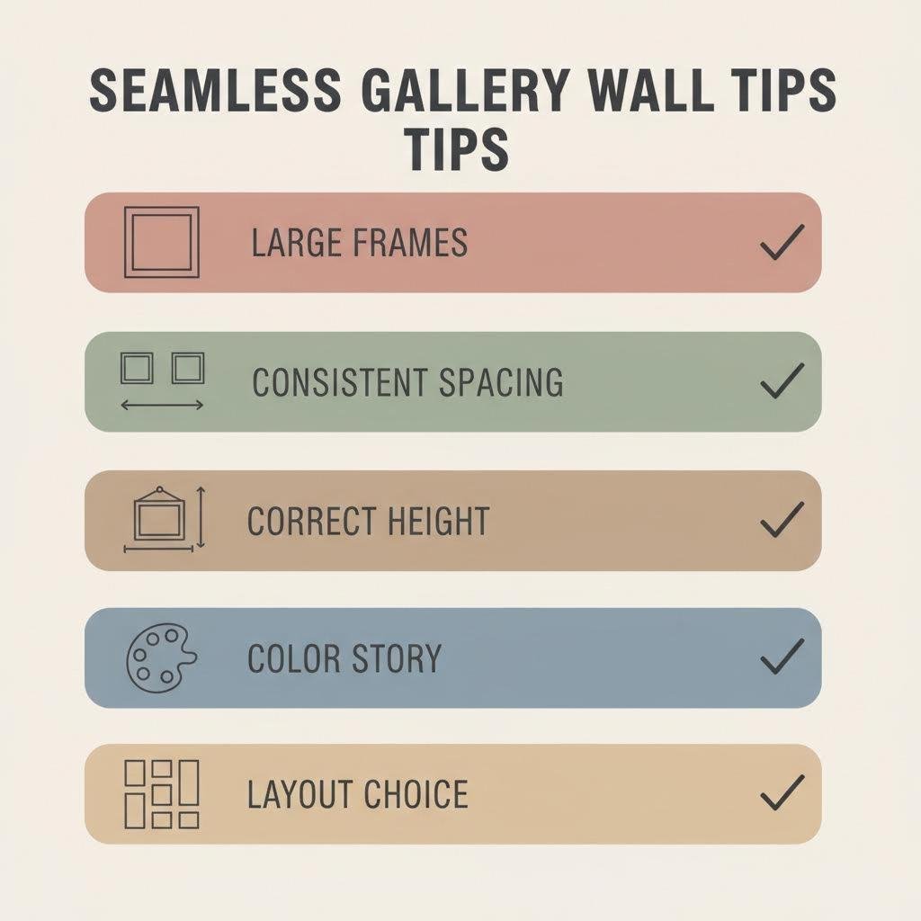
Final Tips for a Seamless Gallery Wall Above the Sofa
Here’s your quick success checklist:
- Use large frames to anchor your wall.
- Keep spacing consistent—it matters more than people think.
- Follow the 6–8 inch rule above the sofa.
- Choose a color story that connects with the room.
- Pick a layout that matches your personality (and patience level).
- Have fun with it, because rigid rules never made a room feel warm.
Conclusion: Your Sofa Wall Is About to Glow Up
Now you know exactly how to build a gallery wall above the sofa that looks intentional, stylish, and uniquely you.
Whether you’re a grid-lover, a cluster-creator, or a shelf-style chameleon, your wall can finally stop glaring at you in its blank emptiness.
So grab your frames, grab your art, and start creating something you’ll love staring at way more than your TV. And hey… if things get crooked on the first try, welcome to the club.