The Best Wallpaper Patterns for Low-Light Rooms (And Ones to Avoid)
Let’s be honest—decorating a low-light room feels like trying to take a selfie in a dim restaurant. You keep squinting, shifting around, and wondering why the lighting hates you.
I’ve been there too, and trust me, nothing saves a gloomy space faster than the right wallpaper pattern.
And nothing ruins it faster than the wrong one. Ever wondered why some wallpapers brighten a room instantly while others turn it into a cave? Let’s talk about it.
I’ve experimented with more wallpaper than I’d like to admit—some choices worked beautifully, and some made my living room look like a moody dungeon.
So think of this guide as us chatting over coffee about what actually works, what doesn’t, and how you can cheat the lighting system without installing a single extra bulb.
Why Wallpaper Matters So Much in Low-Light Rooms
You might think paint handles these issues just fine, but wallpaper adds texture, depth, and light-play that paint just can’t deliver.
Ever walked into a room with a bright, reflective wallpaper and thought, “Whoa, did the windows get bigger?” Exactly.
Wallpaper can:
- Reflect light and make a room feel brighter
- Add structure to walls that feel flat
- Bring personality without overwhelming the space
- Trick the eye into thinking there’s more depth
But it can also make your room feel like a dim cave where daylight goes to die. Let’s avoid that, shall we?
The Best Wallpaper Patterns for Low-Light Rooms
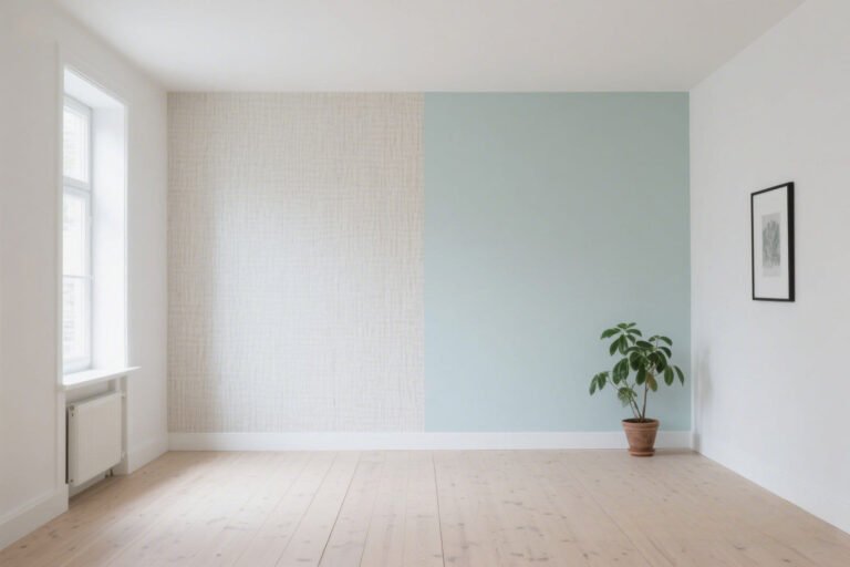
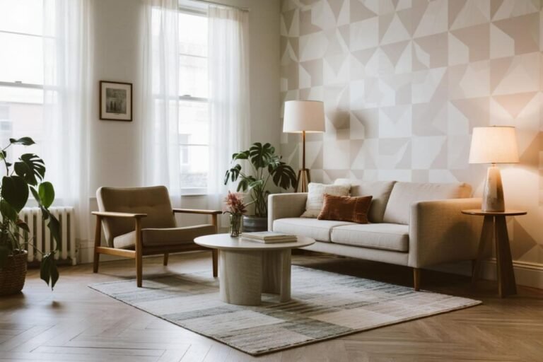
1. Light-Colored Patterns That Bounce Light
I know—it sounds obvious. But you’d be shocked at how often people reach for “moody neutrals” and end up living in permanent evening mode.
Light-colored wallpaper does two important things:
- It reflects whatever little light your room gets.
- It keeps the visual energy high.
Ever noticed how white kitchens always look bright even on gloomy days? Same idea.
Great options include:
- Soft whites with subtle geometric lines
- Pale beige or cream botanical prints
- Icy blue abstract washes
Bold Tip: Choose patterns with a slight sheen—not the disco-ball kind, but enough to catch window light. This instantly brightens the room.
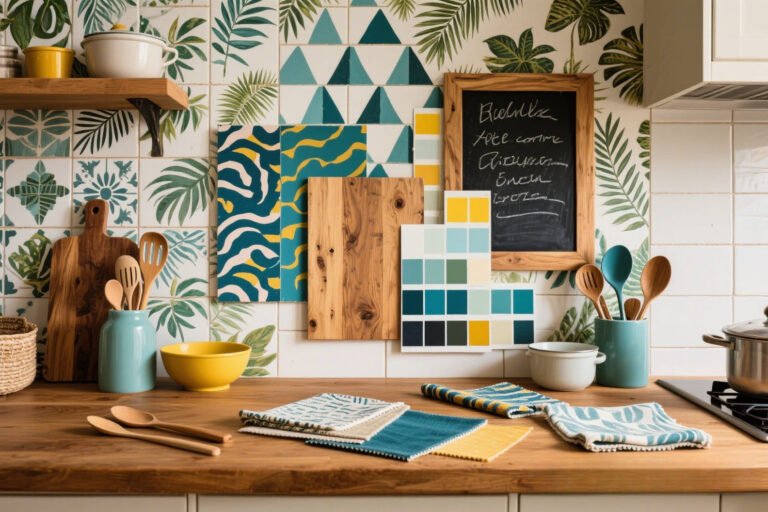
2. Micro-Prints That Don’t Overwhelm
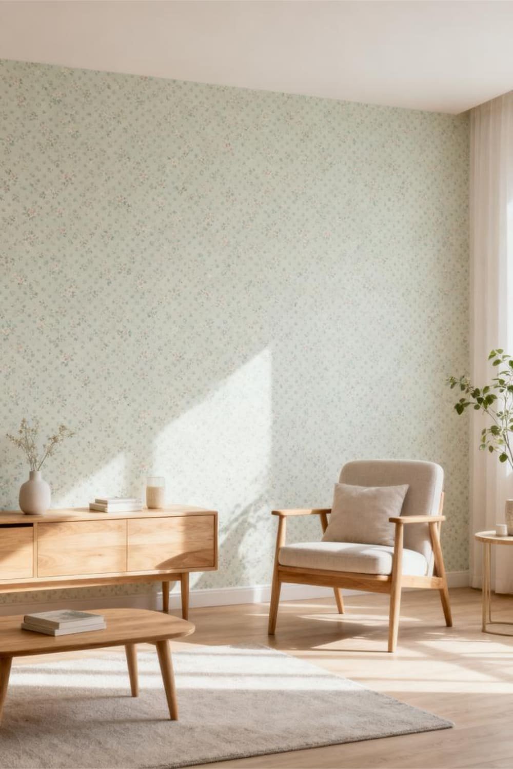
You know those wallpaper designs that look cute from a distance but up close you realize they’re tiny masterpieces?
Micro-prints absolutely slay in low-light rooms. Why? Because they add interest without overpowering the wall.
Smaller patterns:
- Keep the room feeling open
- Create visual texture
- Avoid heavy contrast, which can swallow light
Ever stood in front of a tiny floral print and thought, “Why does this make the room feel cozy, not claustrophobic?” That’s the magic.
Patterns to look for:
- Tiny florals
- Small polka dots
- Fine stripes
- Narrow latticework
FYI: Micro-prints are also great if you want pattern without looking like you live inside a graphic design experiment.
3. Vertical Stripes (The Underrated MVP)
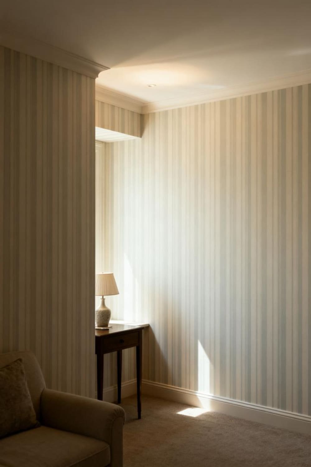
Vertical stripes can lift a low-light room like nothing else. I once used soft taupe vertical stripes in a north-facing bedroom, and suddenly the ceiling looked taller and the walls looked brighter.
Did I love that room more than my morning coffee for a week straight? Yes.
Vertical stripes:
- Create height
- Bring structure
- Distract from low natural light
The trick?
Stick to light backgrounds with soft-toned stripes. Sharp, high-contrast stripes look amazing in high-light rooms, but in low-light, they might feel a bit… circus tent. :/
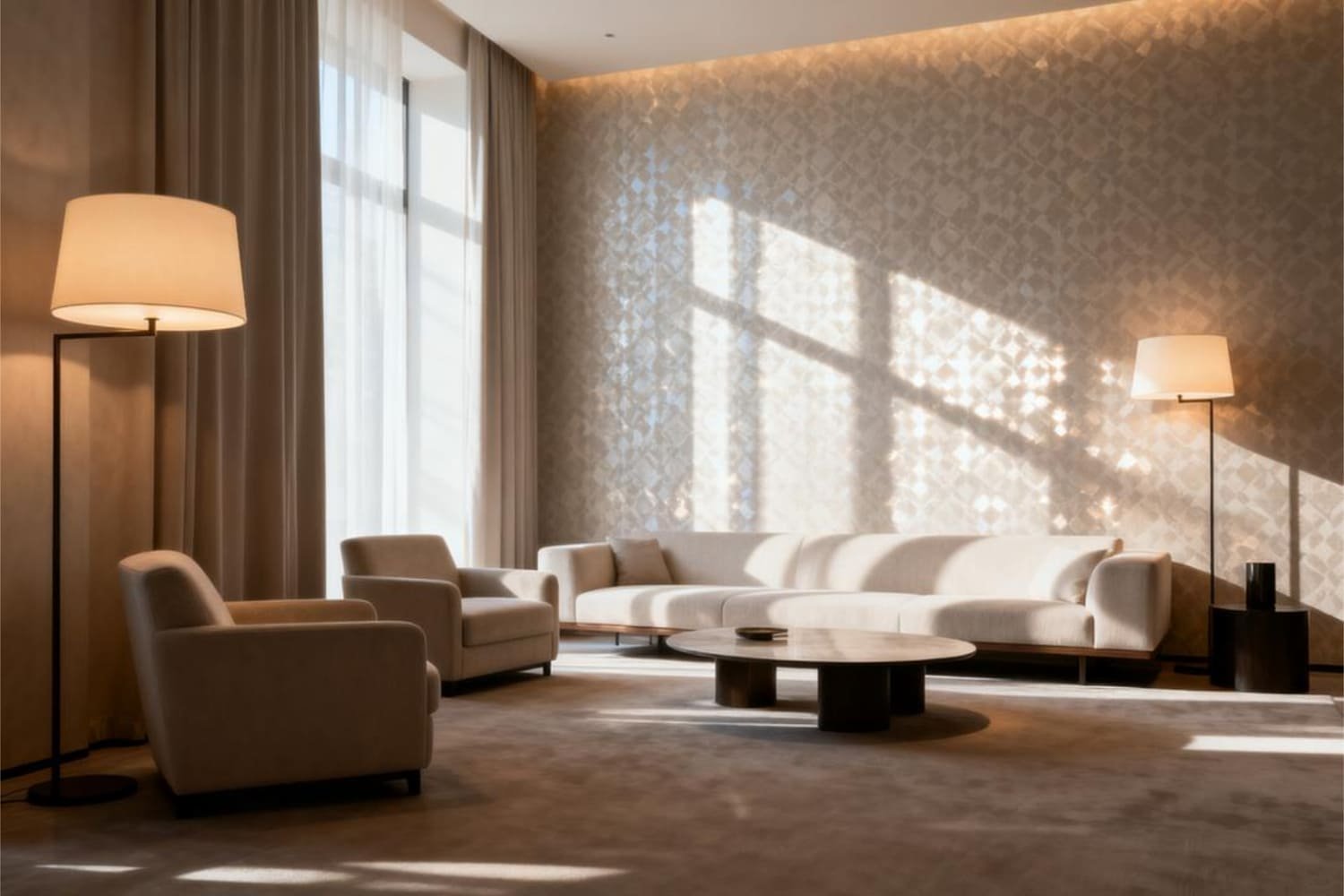
4. Subtle Metallics That Catch the Light
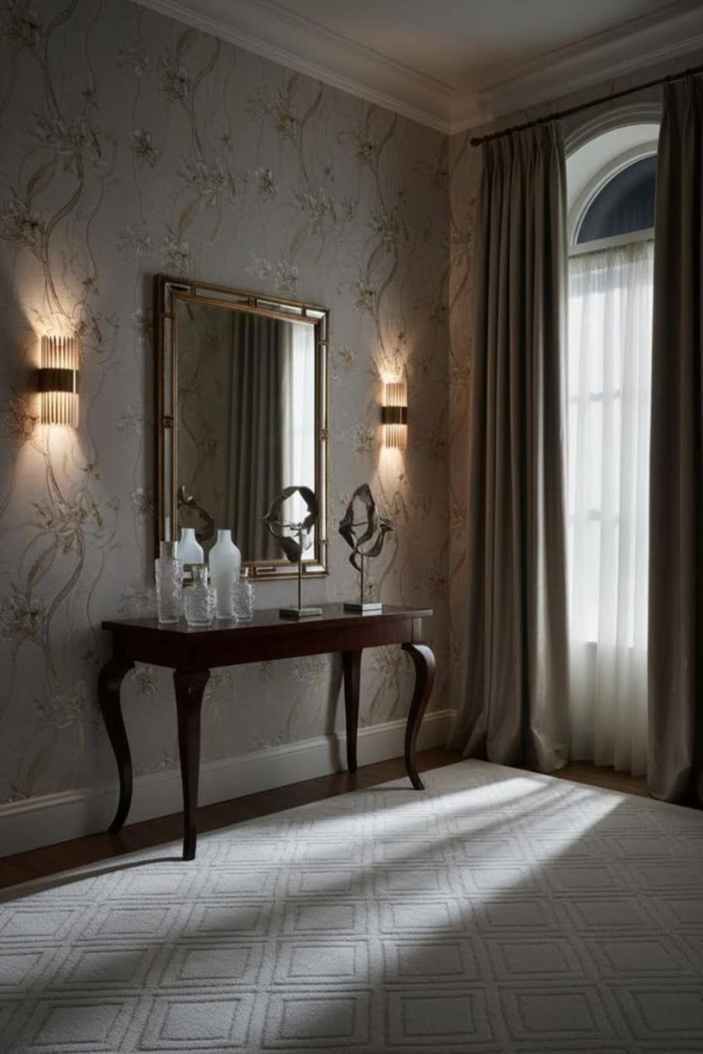
Okay, I don’t mean silver foil that blinds you—unless that’s your vibe, in which case, go off.
But subtle metallics like champagne gold, pearl, or soft copper can bounce light around a room like pure magic.
Metallic detailing:
- Creates a glow effect
- Adds luxury without heaviness
- Makes dim spaces feel purposeful
Ever noticed how candlelight looks extra romantic against a metallic surface? Same principle.
Great metallic styles include:
- Gold-accented botanicals
- Pearl-finish geometrics
- Soft shimmer abstract prints
IMO, metallic wallpaper is one of the easiest hacks to improve a dim room without replacing a single light fixture.
5. Watercolor & Wash Prints for Soft Diffusion
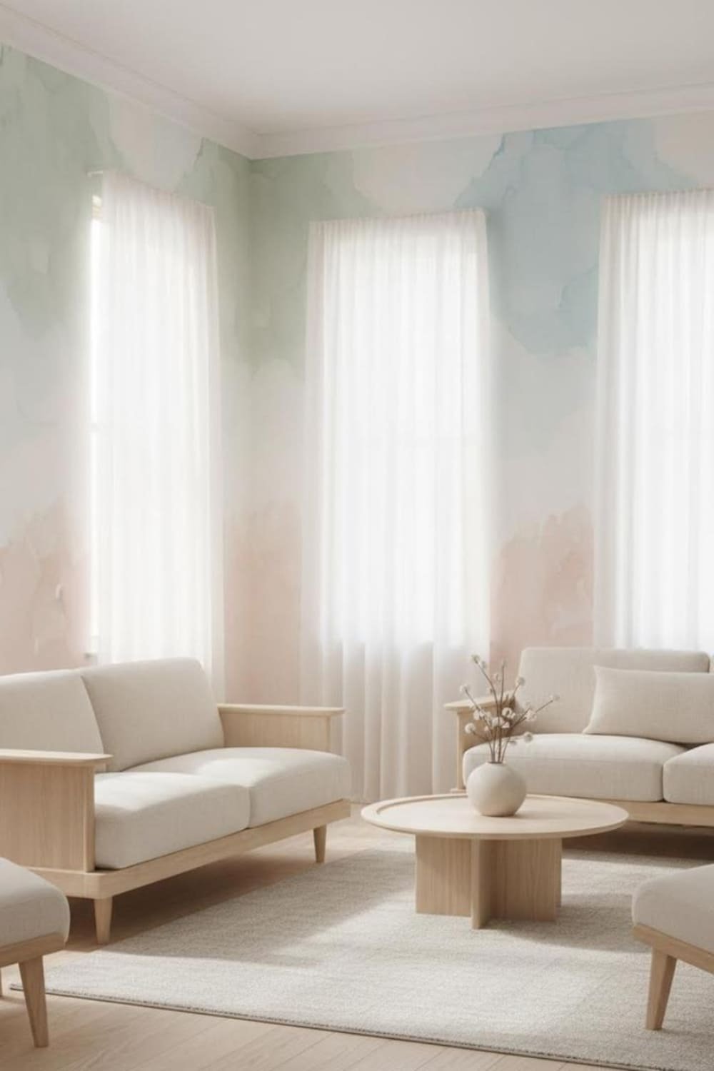
If you want a room to feel dreamy rather than dim, watercolor-style wallpapers work wonders. They add color without harsh edges, and in low light, they feel like a gentle glow.
Watercolor patterns:
- Diffuse light softly
- Create movement
- Never look heavy or cluttered
Think soothing gradients. Think breezy blends. Think “my walls just exhaled.”
Best choices:
- Soft blue washes
- Blush gradients
- Pale green watercolor botanicals
I used a watercolor sage wallpaper in a hallway once—suddenly it went from “tunnel” to “spa walkway.” Highly recommend.
Patterns to Avoid in Low-Light Rooms
Now, let’s talk about the styles that turn your space dark—faster than you can say “Where did the sunshine go?”
1. Dark, Heavy Backgrounds
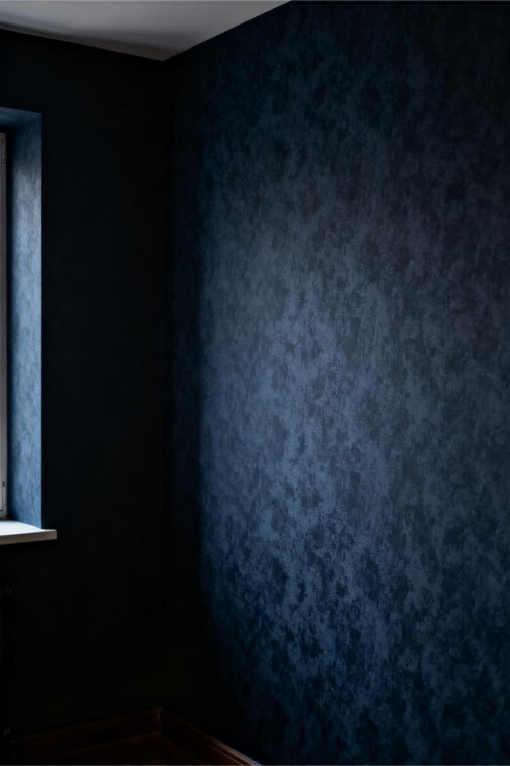
I know dark wallpaper looks moody and expensive on Pinterest, but in real life, it absorbs light like a black hole.
Dark backgrounds:
- Flatten the room
- Make walls feel closer
- Kill the chance of reflectiveness
Unless you’re intentionally designing a cave (no judgment), avoid it.
2. Large-Scale Prints That Dominate the Wall
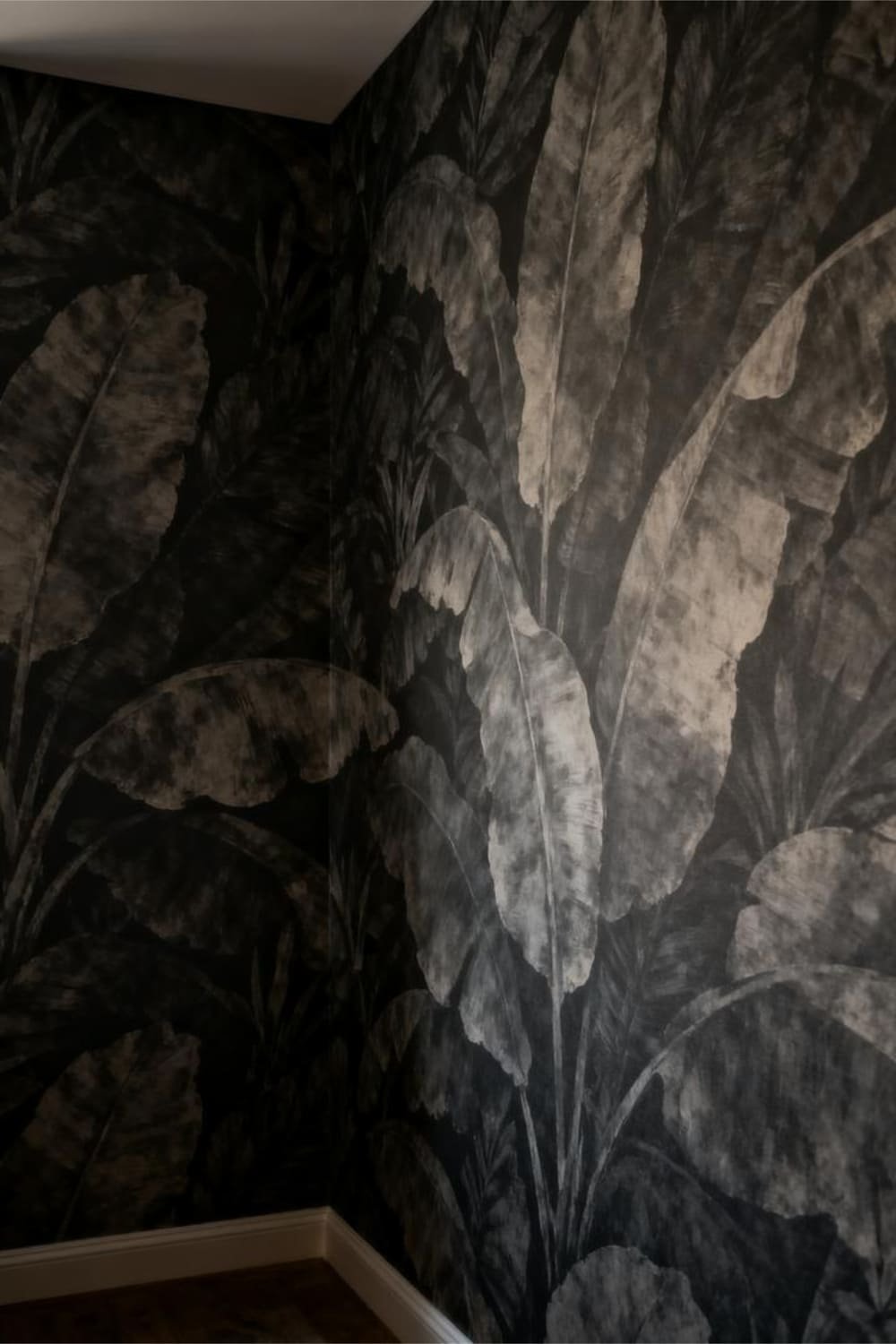
You know those oversized palm leaves or giant florals that look stunning in sunlit rooms? In low-light spaces, they feel like the wallpaper is about to fall on you.
Large-scale prints:
- Take up too much visual space
- Overwhelm dim rooms
- Make corners look extra dark
If you keep walking past your wall and thinking something’s staring at you, it’s probably the oversized pattern.
3. High-Contrast Patterns That “Buzz” in Dim Light
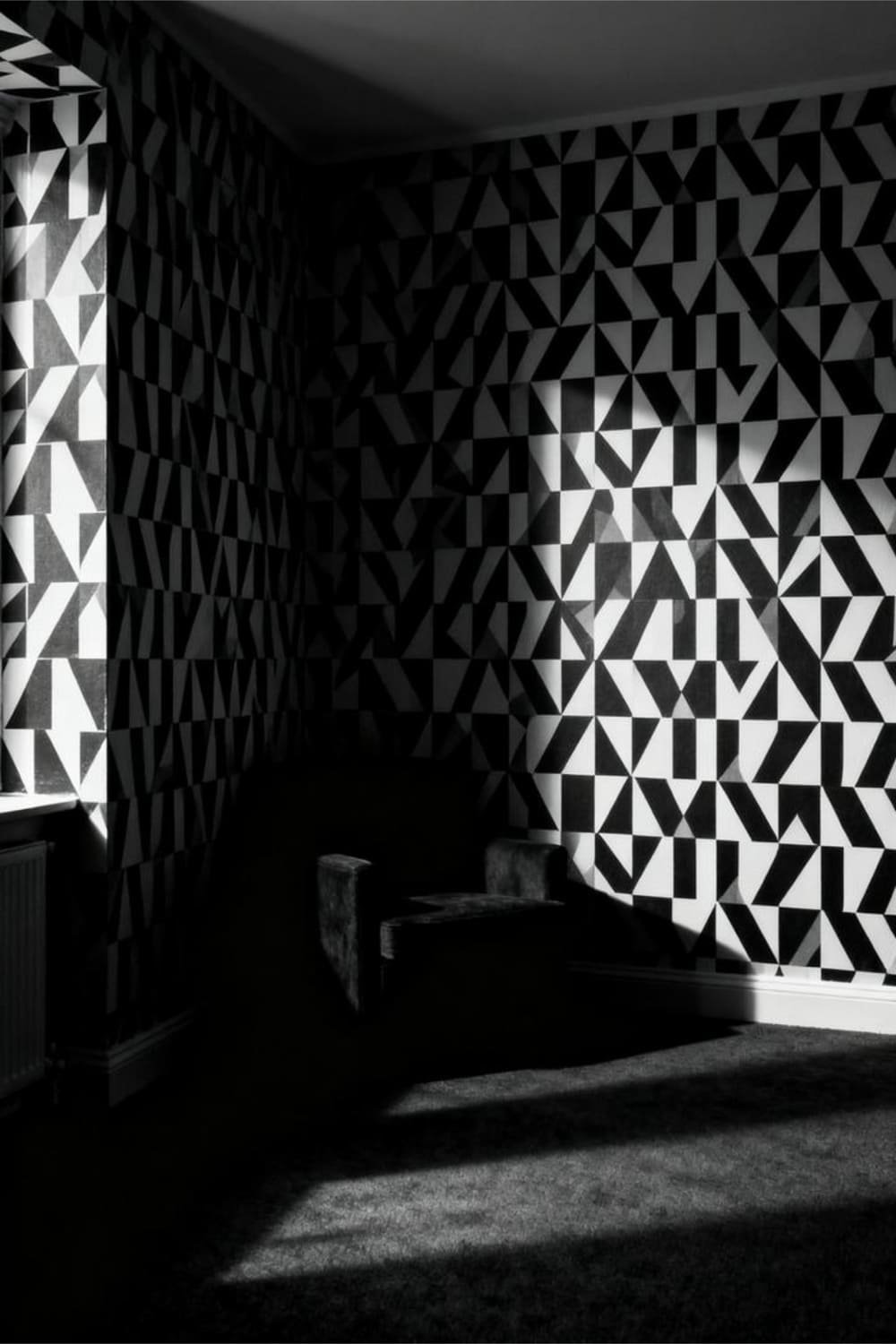
Bold contrasts, like black and white or navy and gold, look amazing when light hits them properly. But in low-light rooms, they create a weird visual tension.
These patterns:
- Make the room feel busy
- Create dark pockets
- Highlight shadows
Your eyes will work overtime, and not in a fun “look how artsy I am” way.
4. Heavy Textures That Absorb Light

Fabric wallpapers, deep embossing, or woven textures look luxurious, but they soak up light like a sponge. In already dim rooms, this makes the walls appear dull and muddy.
You might think texture adds depth—and it does—but only if the light can actually hit it.
How to Choose the Right Wallpaper When Light Is Limited
Let’s break it down like a quick cheat sheet you can take to the store. Or screenshot. Or tattoo on your arm. Your choice.
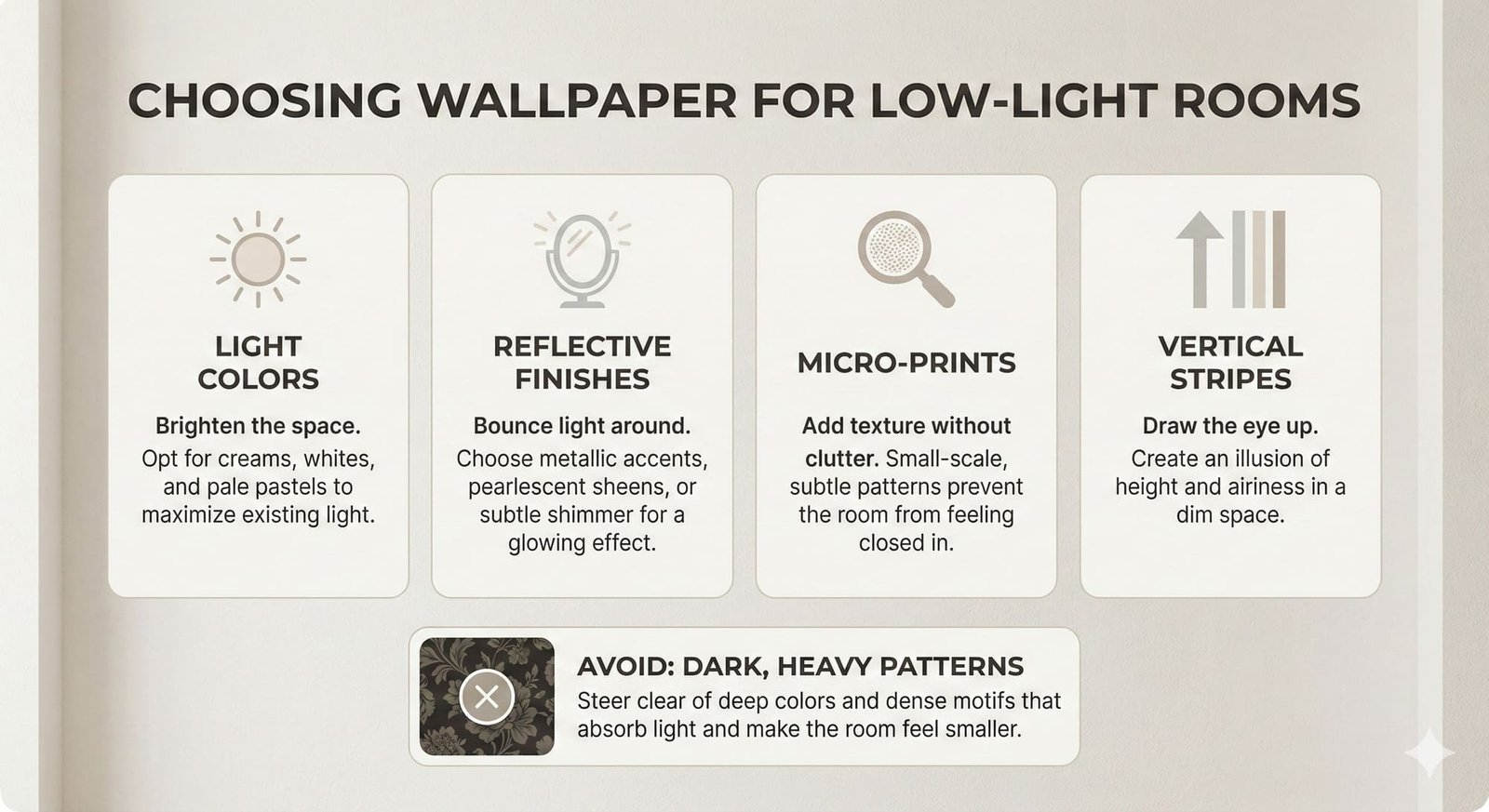
Choose wallpapers that are:
- Light-colored
- Slightly reflective
- Fine-patterned
- Softly colored
- Vertically oriented
Avoid wallpapers that are:
- Dark
- Oversized
- High contrast
- Heavily textured
Key Rule: If you put a sample up and the room suddenly feels smaller, run.
Extra Tips to Boost Light—Even If Your Room Doesn’t Have Any
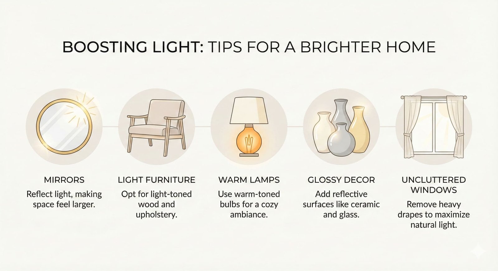
Wallpaper can do most of the heavy lifting, but here are a few hacks to help it along:
1. Pair with Light Furniture
White and natural wood furniture bounce light beautifully off patterned wallpaper.
2. Add Mirrors
A mirror opposite a wall with subtle metallic wallpaper? Instant glow-up.
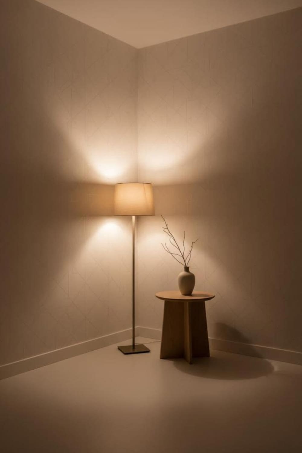
3. Choose Warm Lamps
Use warm bulbs to keep the room cozy. Cool light on pale wallpaper can feel harsh.
4. Keep Windows Uncluttered
If you have even one window, let it breathe. Don’t trap it behind heavy curtains.
5. Use Glossy Decor
Glass, ceramic, and metal accents reflect your wallpaper in soft, pretty ways.
Final Thoughts: Light Up Your Low-Light Room the Smart Way
Low-light rooms don’t have to be sad. They don’t have to feel like rainy-day caves.
With the right wallpaper pattern—the ones that reflect light, stay soft, and keep things airy—you can turn a dim space into your favorite corner of the house.
Remember:
- Light colors brighten.
- Micro-prints soothe.
- Metallics glow.
- Vertical stripes lift.
- Dark and heavy patterns stay far, far away.
So go ahead—grab a few samples, tape them up, and see how the room changes. Your walls are about to get a much-deserved glow-up.
And who knows? You might even start enjoying that “low-light aesthetic”—just the good version this time.