Bold Paint Colors That Add Drama Without Overwhelming
Ever stare at a paint swatch and think, “Wow… that’s gorgeous, but it might also attack me in my sleep”? Same. Bold paint colors bring magic, personality, and drama to a space, but they can also turn a room into a moody cave real fast if you don’t handle them right.
I’ve played with my fair share of gutsy hues—some turned out stunning, and some made my living room look like a Halloween-themed yogurt shop. So trust me when I say: you can absolutely rock bold colors without feeling swallowed by them.
Ready to add drama without the meltdown? Let’s get into it.
Why Bold Colors Work (Even When You Think They Might Not)
Bold shades get a bad rap because people imagine walls screaming at them 24/7. But the right bold color adds gorgeous contrast, highlights architectural elements, and creates depth you’ll never get from plain white walls.
Ever wonder why designers keep saying “Color adds dimension”? Because it actually does—and you can use it to your advantage.
Bold Doesn’t Mean Busy
When you pick your shade intentionally, you control the vibe. You can create:
- A cozy, cocoon-like feeling
- A high-end, dramatic backdrop
- A playful kick of energy
…without turning your home into a color circus.
The Trick? Balance.
Drama works when you balance it with:
- Neutrals
- Texture
- Light
- Negative space (aka, breathing room for your eyeballs)
Bold color ≠ visual chaos. Bold color + smart styling = interior magic.
The Best Bold Paint Colors That Add Drama Without Overwhelming
Let’s break down the shades that bring major personality without making you want to sleep with the lights on.
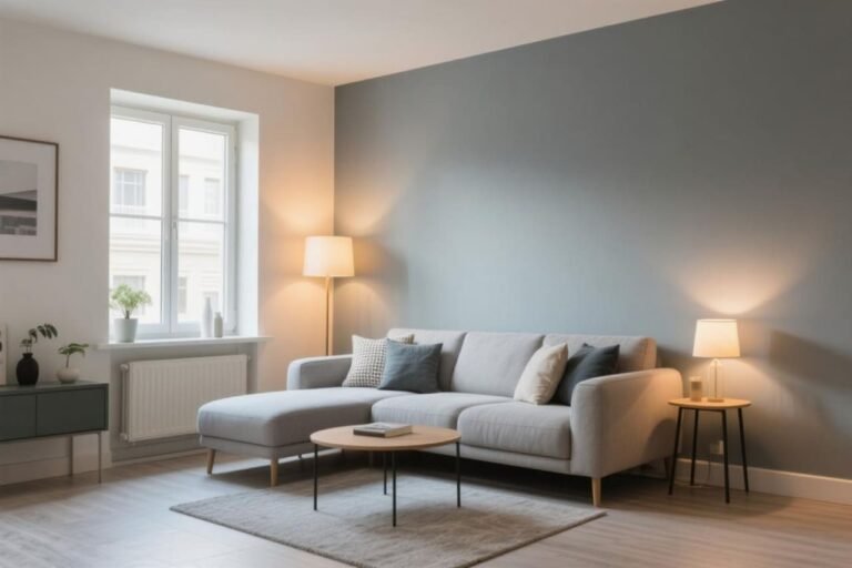
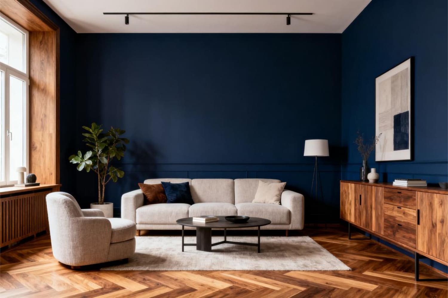
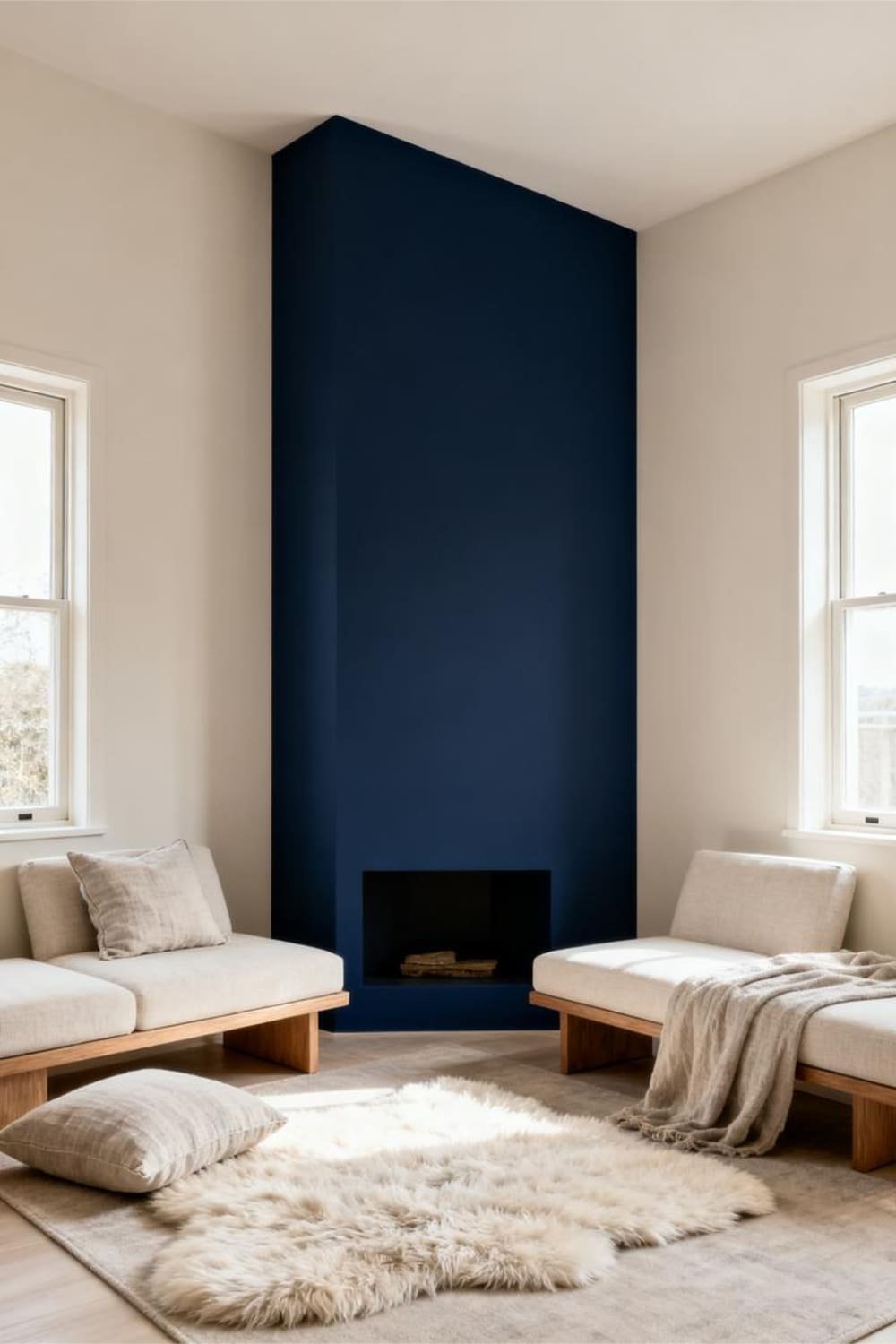
1. Deep Navy: The Unbothered Showstopper
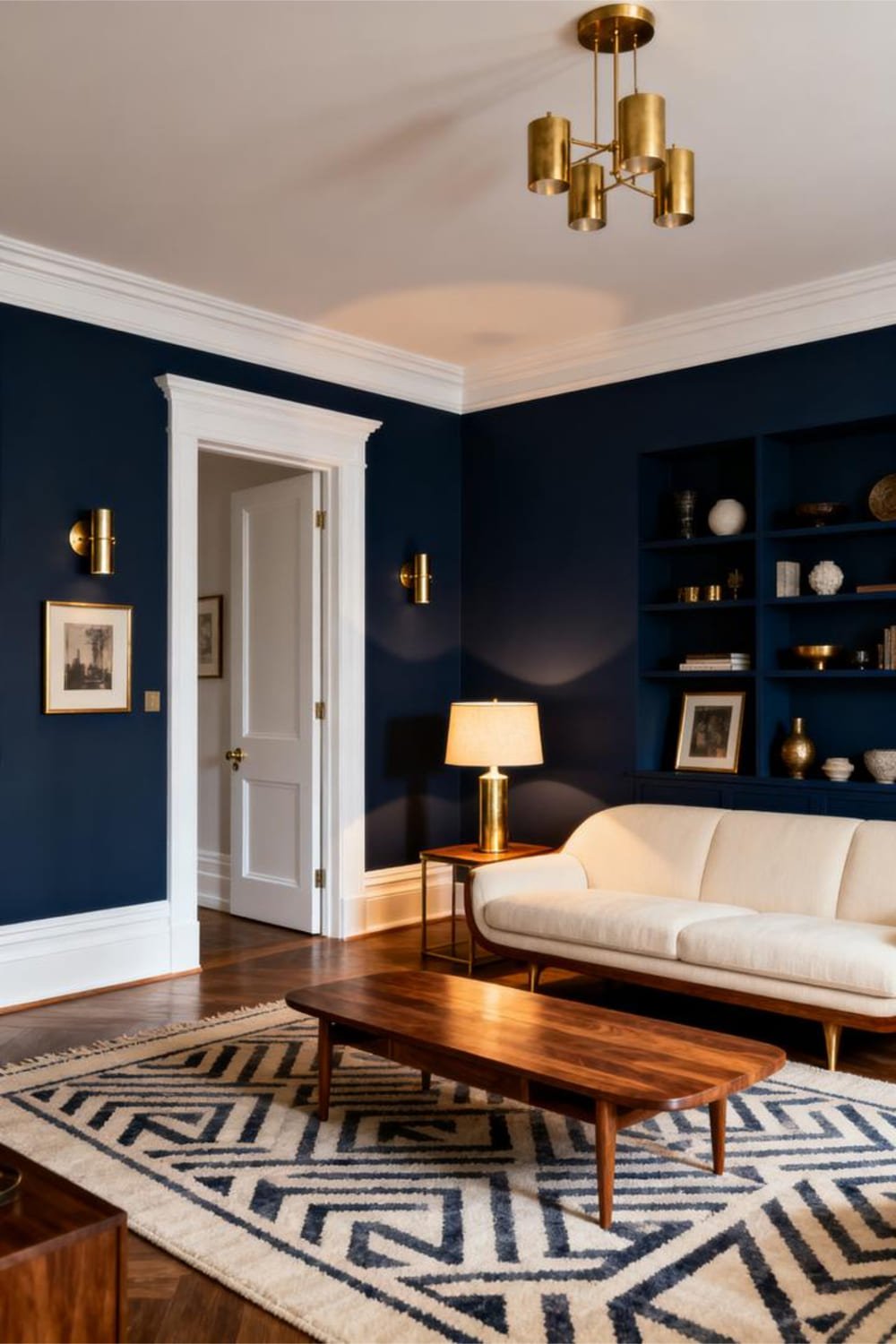
Navy stays effortlessly dramatic yet calm—kind of like the friend who always looks chic, even when they “just threw something on.”
I love using deep navy because it delivers mood without the heaviness of black.
Why Deep Navy Works
- Absorbs light just enough to feel luxurious.
- Pairs easily with brass, white, wood, or even bold art.
- Creates instant high-contrast drama.
Where Deep Navy Shines
- Living room accent walls
- Kitchen cabinets (so good OMG)
- Bedrooms for a cozy, hotel-like feel
Pro tip: Use plenty of warm bulbs, or it can lean cold.
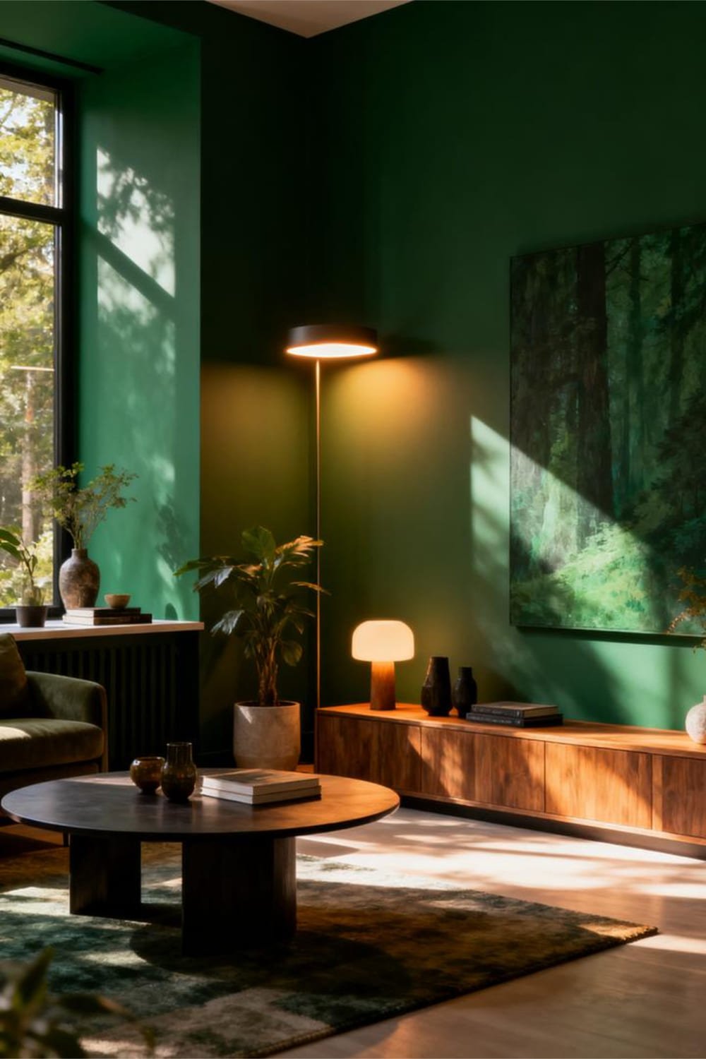
2. Forest Green: The “I-Go-To-Farmers-Markets” Color
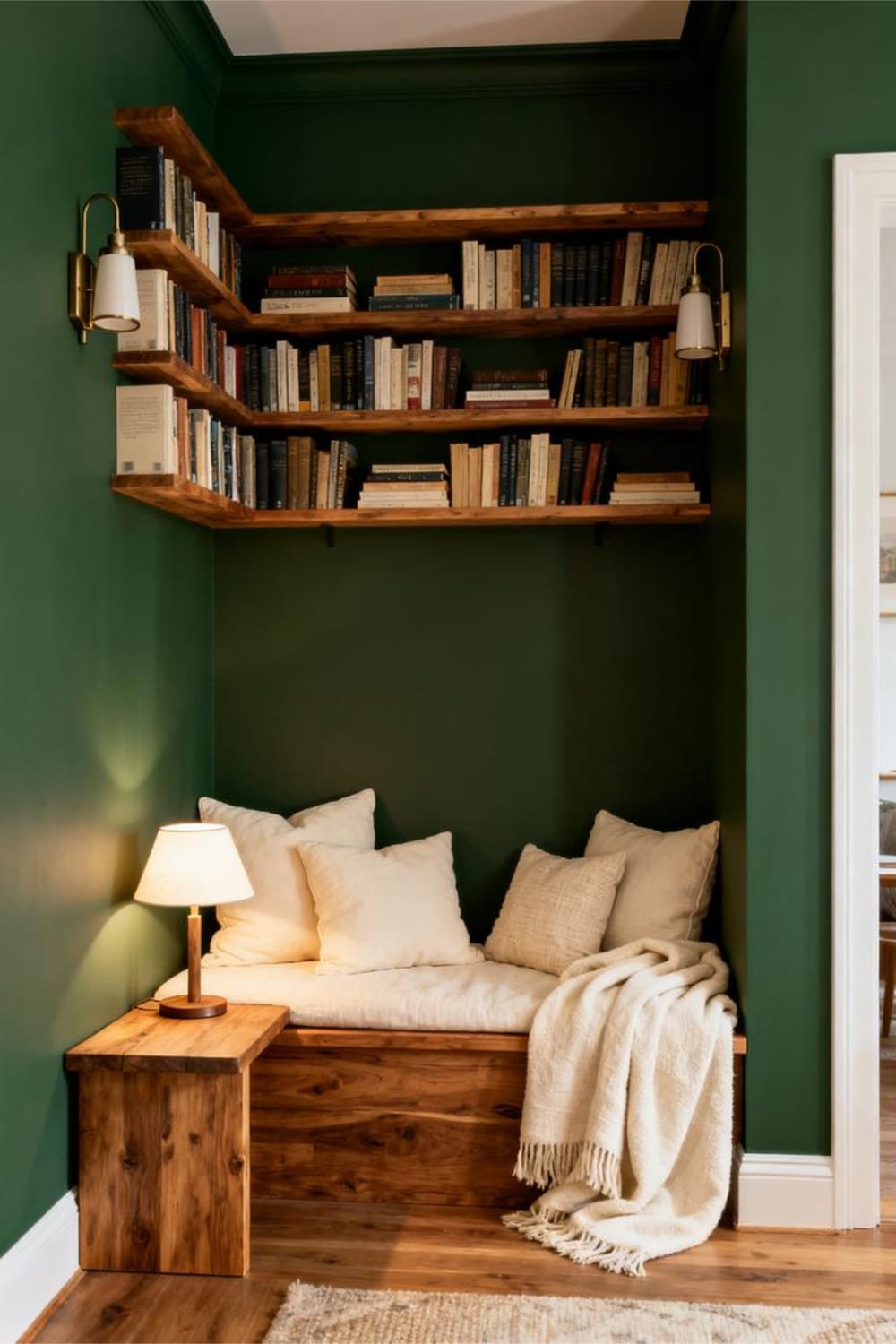
Forest green gives every space a grounded, earthy richness. It’s bold—but also weirdly soothing. Ever wonder why luxury hotels love it? Because it whispers, “I’m fancy, but not full of myself.”
Why Forest Green Works
- Adds organic warmth
- Balances beautifully with gold, wood, and creams
- Feels bold without shouting
Best Spots for Forest Green
- Dining rooms (very “dinner parties with candles” energy)
- Reading nooks
- Entryways
IMO, this shade makes any home feel more “designed.”
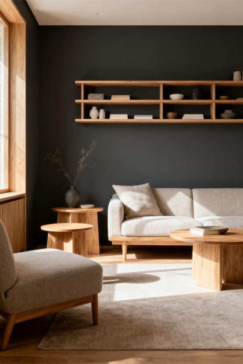
3. Charcoal Gray: The Moody Minimalist
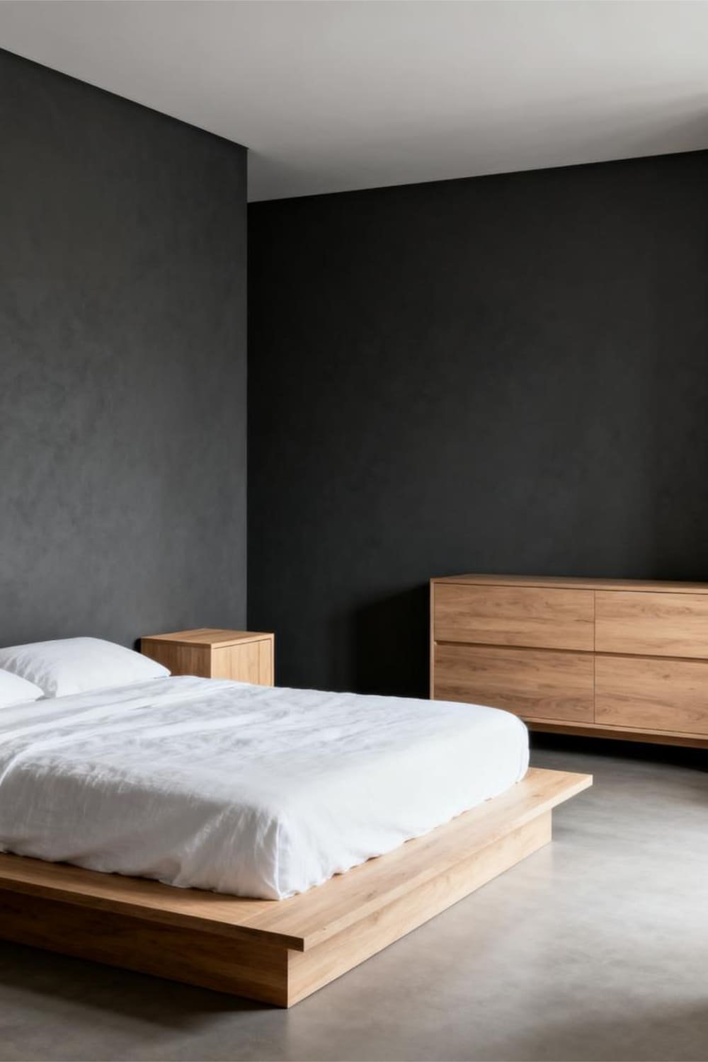
Charcoal gray sits right between bold and neutral—basically, the paint equivalent of wearing a black turtleneck and calling it a Look™.
Why Charcoal Gray Stays Under Control
- Provides strong contrast without overwhelming
- Looks amazing with white trim
- Works in both small and large rooms
Ever had a space that felt “meh”? Charcoal fixes that in about two seconds.
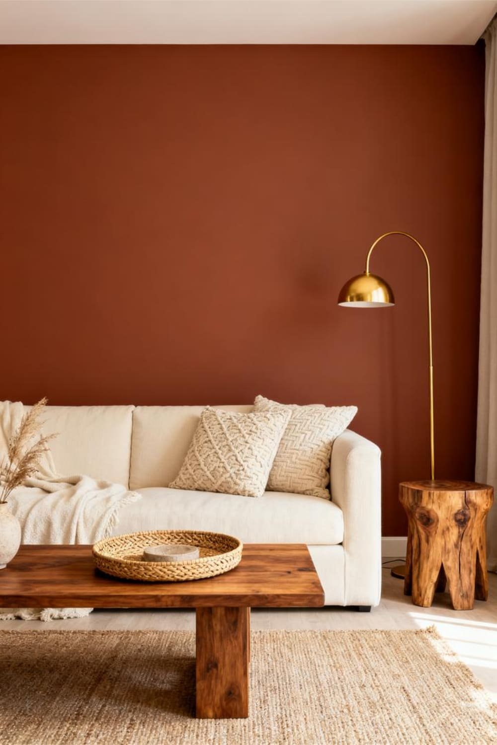
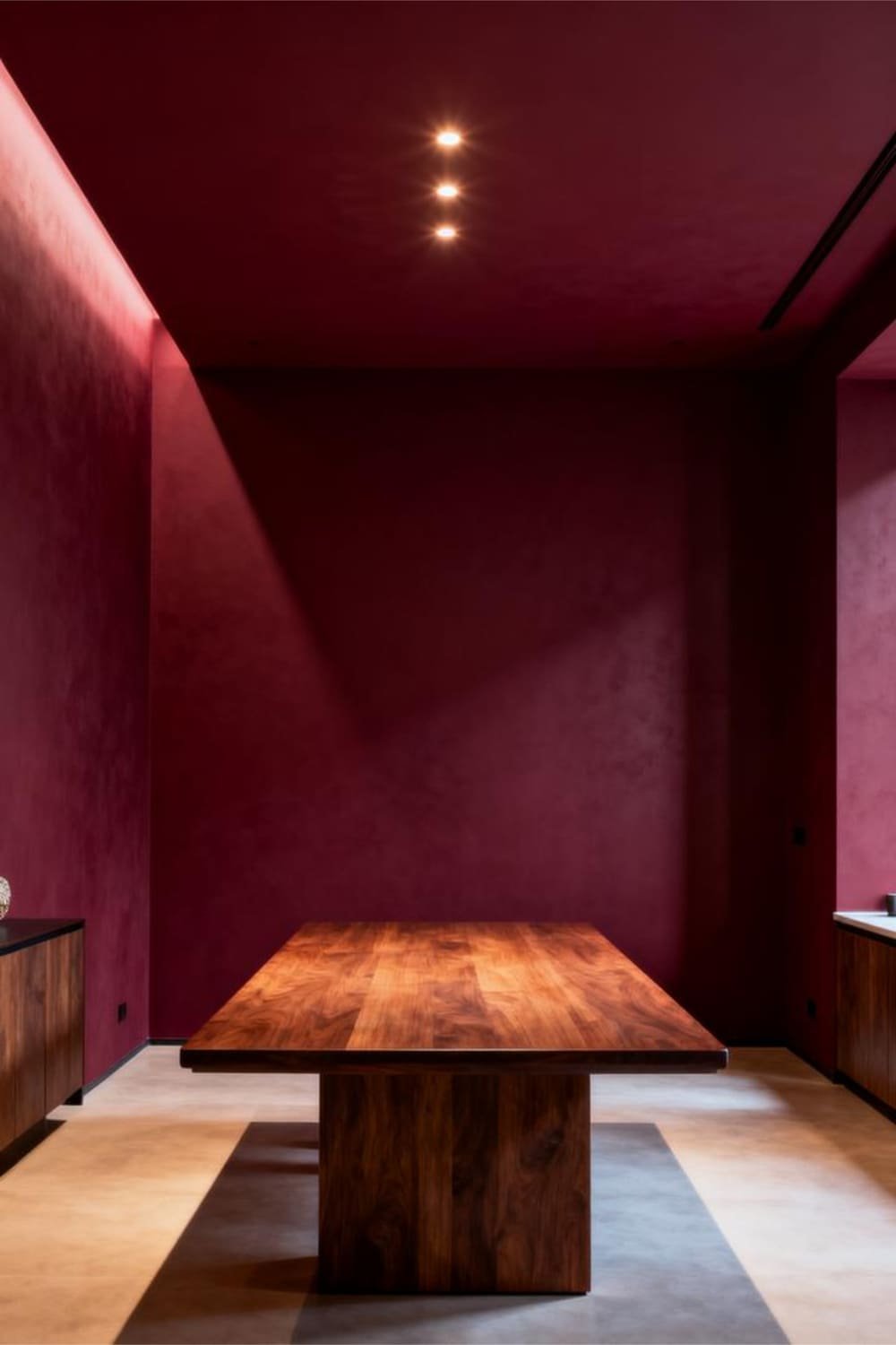
4. Burgundy: The Unexpected Sophisticate
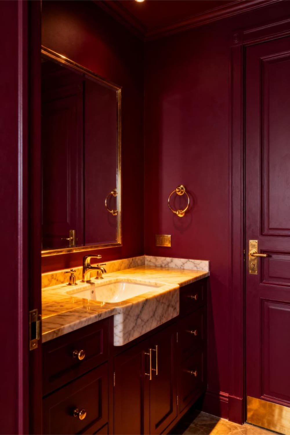
Burgundy gives drama with a side of elegance. People avoid it because they think it’ll make their home feel like a 1980s dining room—trust me, it won’t if you pick the right undertone.
Why Burgundy Works
- Adds romantic richness
- Plays well with warm neutrals
- Creates cozy depth
Where Burgundy Pops
- Powder rooms
- Dining rooms
- Bedrooms
It feels lush, grown-up, and moody in the best possible way.
5. Mustard Yellow: The Retro Rebel
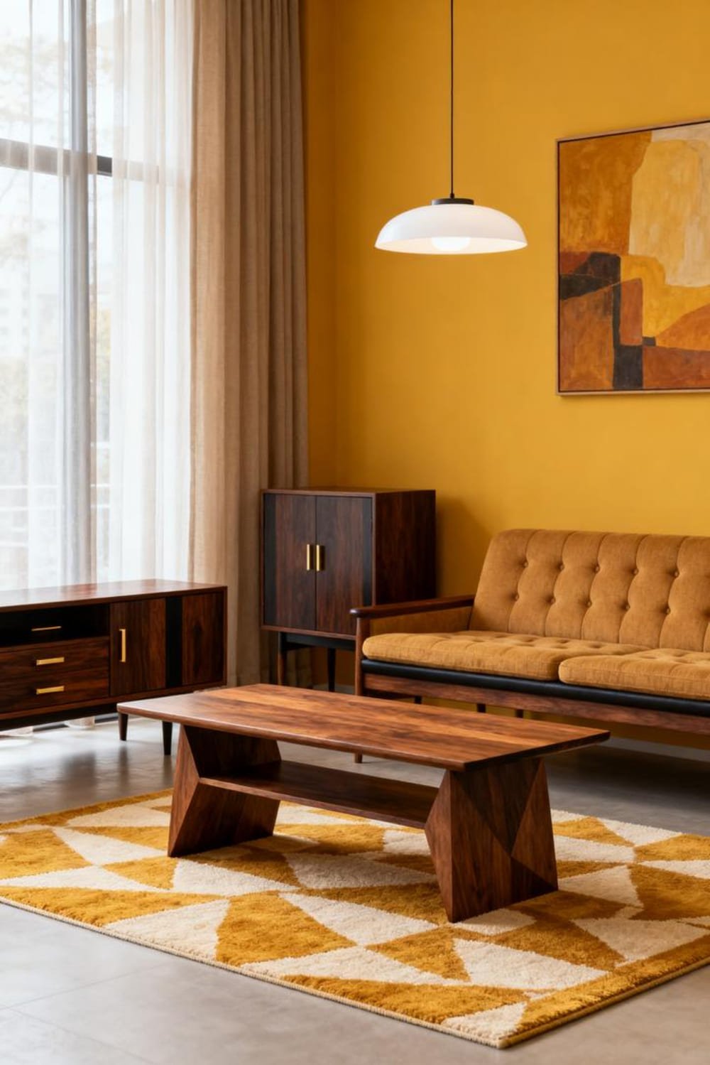
If you crave personality but don’t want an annoyingly bright yellow, mustard is your friend.
It’s bold, warm, and a little quirky—like that one aunt who collects vintage teapots but somehow pulls it off.
Why Mustard Works Without Overdoing It
- Adds sunny energy without the harsh glare
- Looks fantastic with dark wood and navy
- Warms up north-facing rooms
It’s bold, but in a “Oh hey, fun!” way—not a “Please get this off my walls” way.
6. Teal: Drama’s Best Friend
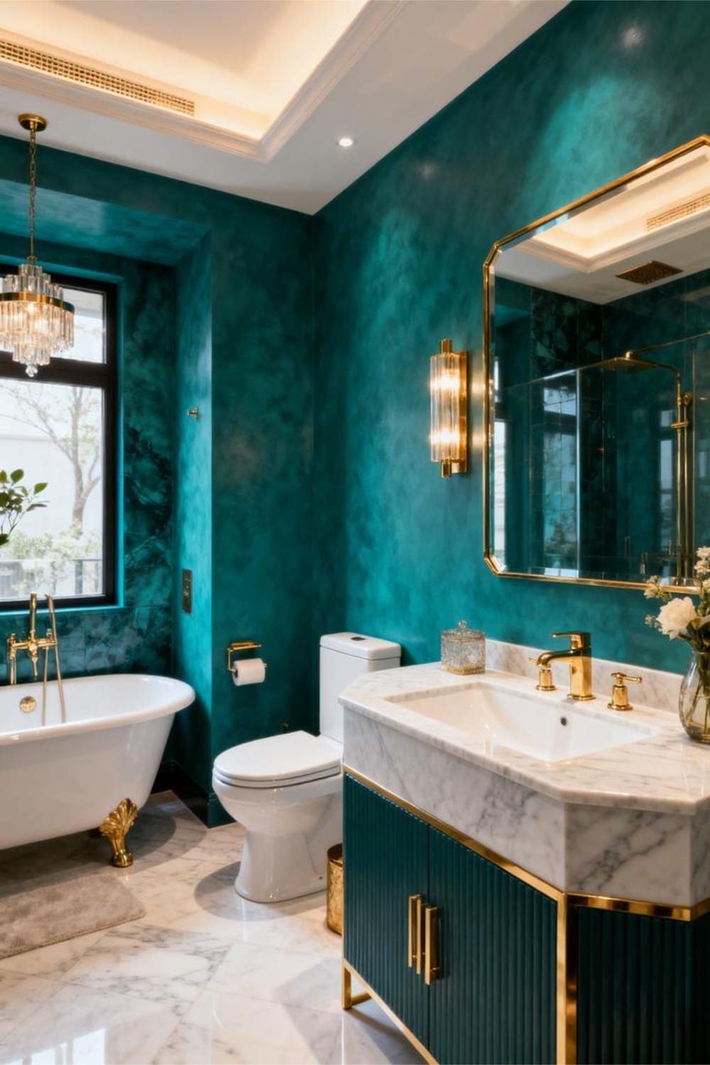
Teal brings both coolness and vibrancy. I once painted a bathroom teal on a whim (yes, a whim), and it turned out to be the best decision I made that year.
Ever wondered why teal feels so luxe? Because it balances blue and green into a perfect little jewel tone.
Why Teal Is Perfect
- Works with modern, boho, and traditional styles
- Adds instant richness
- Feels bold, but not aggressive
This color just gets it.
How to Use Bold Colors Without Feeling Overwhelmed
Let’s get real—color choice is only half of it. The application matters just as much.
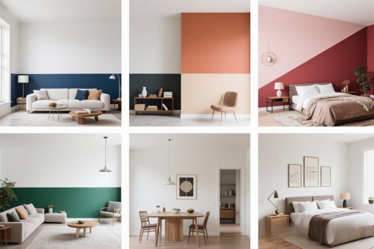
1. Use Bold Colors on Just One Wall
The classic accent wall is still a thing because it works.
When an Accent Wall Wins
- In small rooms you want to make cozy
- Behind a bed or sofa
- When you love a bold shade but fear commitment (same, lol)
Bold wall + light neutral walls = instant balance.
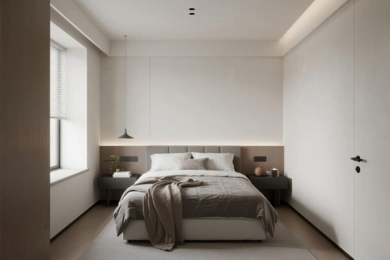
2. Pair Bold Walls With Light, Airy Furnishings
You can absolutely rock a bold wall and avoid the cave effect.
Try This Combo:
- Navy wall + white furniture
- Charcoal wall + light oak accents
- Forest green wall + cream curtains
Ever notice how balance shows off the bold color even more?
3. Use Bold Shades on Trim or Doors
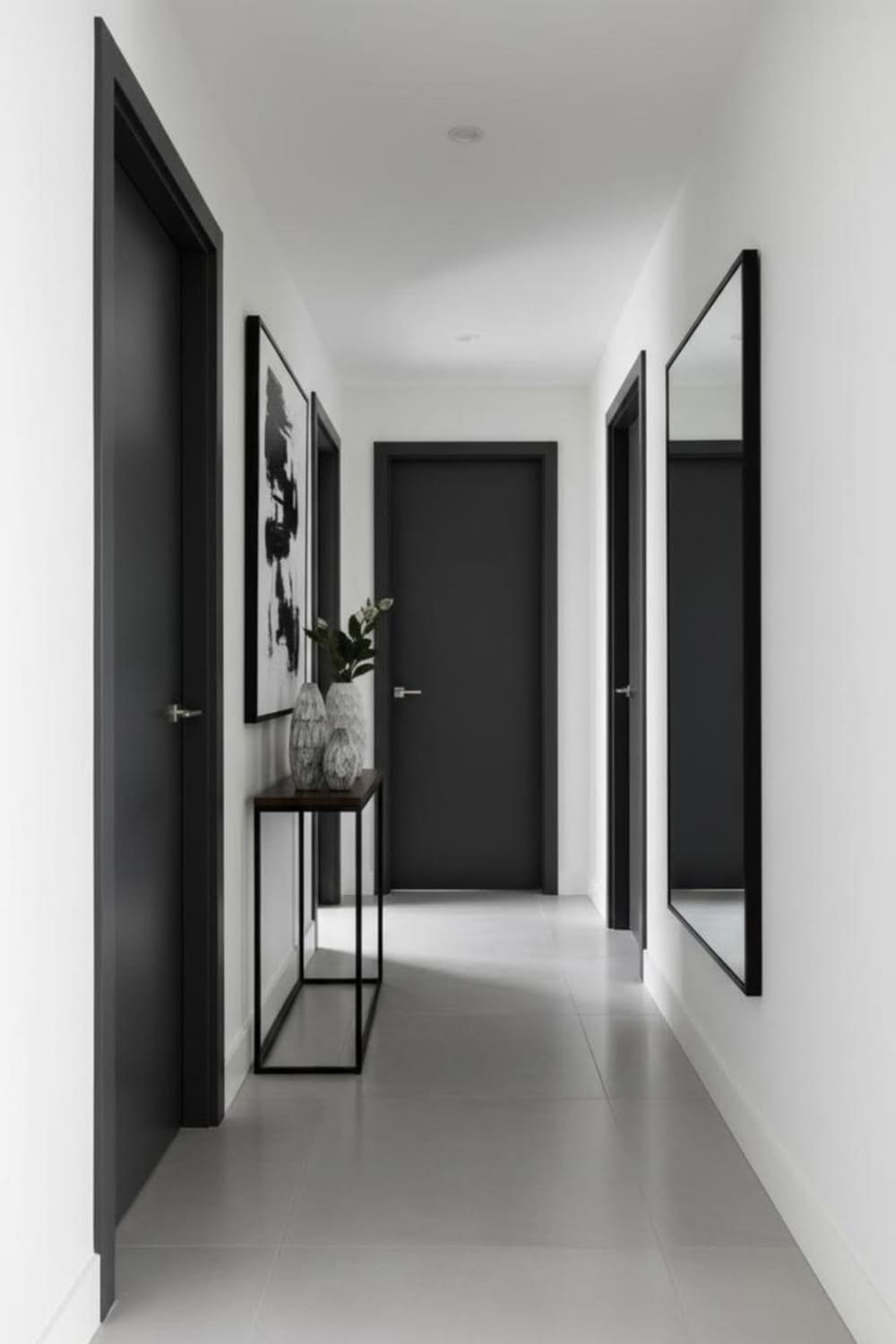
If you want drama in smaller doses, try bold on:
- Baseboards
- Window trim
- Interior doors
- Built-ins
It adds punch without dominating the space.
Bold trim is a cheat code for modern, expensive-looking interiors.
4. Keep Décor Minimal (But Stylish)

Bold walls deserve décor that doesn’t fight for attention.
Think:
- Simple frames
- Clean lines
- Soft neutrals
- Textured elements
When you let the color shine, the whole space relaxes.
5. Choose Bold Colors With the Right Undertones
Honestly, this is the real secret sauce. Undertones make or break a bold palette.
Look for These:
- Cool undertones for crisp, modern drama
- Warm undertones for cozy, enveloping vibes
- Muted undertones for subtlety
- Clean undertones for energy
Ever see a bold color that felt too loud? Usually a wrong undertone issue. FYI 🙂
6. Use Bold Colors With Good Lighting
Lighting transforms color faster than your mood changes when you’re hungry.
Types of Lighting That Help
- Warm LEDs for depth
- Natural light for clarity
- Accent lighting to highlight details
You don’t want to choose a bold shade in the store only to have it look like “sad soup” at home. Ask me how I know.
The Best Neutral Pairings for Bold Colors
To keep dramatic colors from feeling heavy, pair them with complementary neutrals.

Reliable Neutral Partners
- Crisp whites
- Warm beiges
- Soft grays
- Natural woods
- Muted taupes
These don’t compete—they support your bold shade like a good hype squad.
Where Bold Colors Make the Most Impact
Some spaces just love bold paint.
Top Spots for Drama
- Entryways – because first impressions matter
- Powder rooms – tiny spaces handle bold better than you think
- Dining rooms – instant sophistication
- Bedrooms – cozy, intimate vibe
- Reading nooks – yes please
Ever step into a bold-colored powder room and think “Wow, I suddenly respect these people”? Same.
Common Mistakes to Avoid (So You Don’t Regret Everything)
Even confident decorators make mistakes with bold hues.

Avoid These:
- Using bold colors in poorly lit rooms
- Choosing colors without sampling
- Mixing too many saturated colors in one space
- Ignoring undertones
- Forgetting about décor balance
If you fix these, you’re already ahead of 90% of DIYers :/
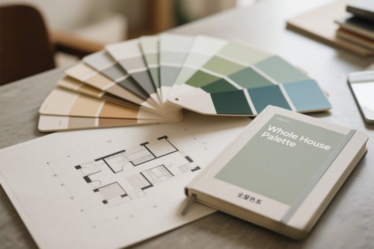
How to Test Bold Colors Like a Pro
Bold colors need a bit of extra testing.
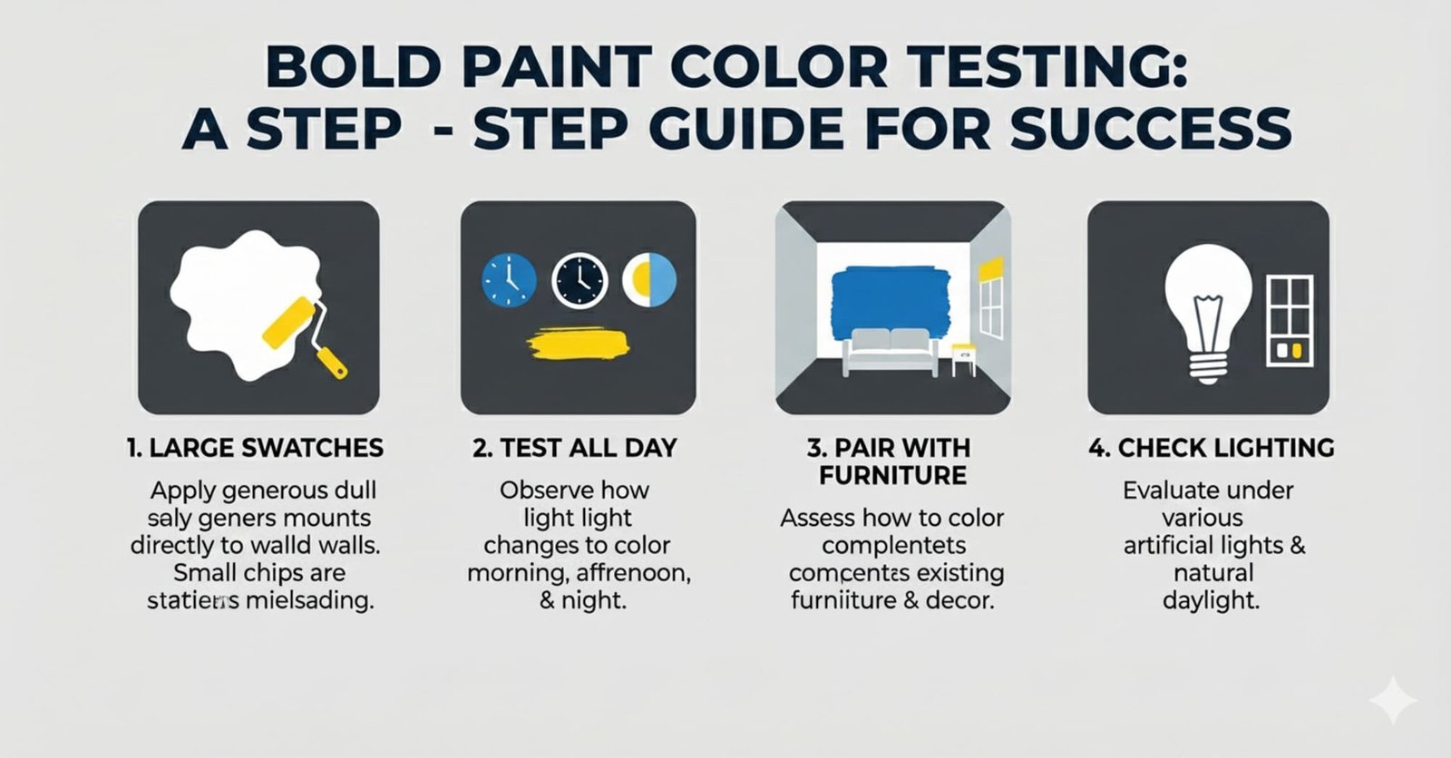
Do This Before Committing:
- Paint large swatches on multiple walls
- Check them morning, afternoon, and night
- Pair samples with your furniture
- Test with your actual lighting
It sounds dramatic, but you’re painting your home, not picking a phone case.
Final Thoughts: Bold Doesn’t Mean Scary
Bold paint colors add drama, character, and stunning depth—and you can rock them without feeling overwhelmed. You just need the right shade, good lighting, intentional placement, and a few balancing tricks.
So go ahead—grab that forest green, that navy, that moody charcoal. Try a sample. Live with it for a day. Then commit and enjoy your new dramatic space that still feels totally livable.
And honestly? Once you paint one bold wall, you might start eyeing your other rooms too. Don’t say I didn’t warn you