Bedroom Paint Ideas for Better Sleep (Color Psychology)
So, You Wanna Sleep Better? Maybe Start with Your Walls
Alright, let’s be real. You’ve tried everything to get better sleep—melatonin, meditation apps, chamomile tea that tastes like sadness—and still, you toss and turn like you’re starring in your own nighttime gymnastics routine.
But here’s something you probably haven’t tried yet: changing your bedroom paint color.
Yep, your wall color might be messing with your melatonin. Wild, right?
I used to think paint was just about aesthetics—until I painted my room electric blue (don’t judge) and found myself feeling more amped than a squirrel on espresso.
That’s when I stumbled into color psychology, and let me tell you—it actually makes a difference.
So, if you want your room to stop acting like an energy drink and start behaving like a sleep sanctuary, read on.
We’re diving into some snooze-approved colors that’ll help you finally get those 8 hours. Or at least fake it better.
Why Bedroom Paint Colors Actually Matter (No, It’s Not Just Woo-Woo Stuff)
Ever walked into a spa and just felt calmer? Or into a neon-lit diner and suddenly got a craving for pancakes at 2 AM? That’s color psychology doing its thing.
Colors affect how we feel, think, and yes—sleep. Studies show that certain hues trigger brain responses that can either calm your nervous system or wind it up like a jack-in-the-box. Not ideal before bed, right?
Here’s how color messes with your brain (in a good way or bad way):
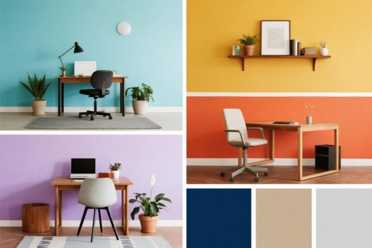
- Cool colors (think blues, greens, lavenders) = Relaxation Station
- Warm, intense colors (reds, oranges, neon anything) = Stress Party
- Neutral tones (grays, beiges) = Depends on the shade and lighting
FYI: It’s not just about the color itself—it’s about how your brain interprets it based on saturation, tone, and even lighting. Yeah, it’s more complex than picking a swatch and hoping for the best. Sorry!
Best Bedroom Paint Colors for Better Sleep (Science-Backed, Nap-Tested)
You don’t need to hire a sleep coach or invest in a $500 pillow to improve your bedtime game. Sometimes, all it takes is a paintbrush and the right color.
Below are some of the best bedroom paint colors backed by color psychology (and a few sleepy personal experiments) that can actually help your brain chill out when it’s time to hit the pillow.
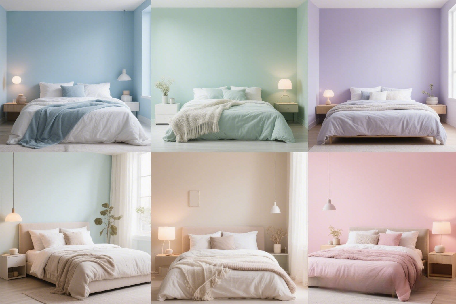
1. Soft Blue: The All-Star Snooze Color
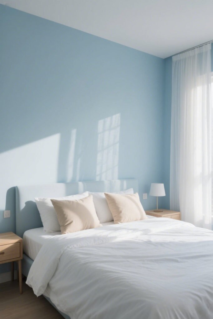
Okay, if colors had a sleep award, blue would take the crown. Specifically pale or dusty blues.
Why? Because they’re known to slow your heart rate and reduce anxiety. Basically, they tell your brain, “Hey, we’re chill. You can relax now.”
My experience?
I painted my room a muted sky blue and suddenly felt like I lived inside a cloud. Not kidding—it was a vibe.
Quick tips:
- Stick to cool-toned blues (nothing too bright or royal).
- Pair with white or beige accents for that calming, coastal look.
- Avoid pairing with red decor unless your idea of bedtime is an adrenaline rush.
2. Sage Green: Nature’s Sleeping Pill

You ever nap better in the woods? (No? Just me? Okay.) Green, especially muted tones like sage or moss, taps into that natural, grounding energy.
It’s like your walls are whispering, “You’ve got this. Now sleep, you beautiful disaster.”
Why it works:
- Reminds us of nature = calming
- Doesn’t overstimulate the eyes
- Pairs beautifully with wood tones and natural textures
Pro tip: Add a few real plants to complete the whole indoor jungle meets adulting look.
3. Lavender: Yes, It’s a Grandma Color—But Hear Me Out

Lavender isn’t just for soaps and grandmas anymore. Soft lavender walls can ease stress and promote sleep.
It’s still technically in the purple family, but unlike bold violets, this shade won’t keep you up pondering the mysteries of the universe at 3 AM.
IMO: Lavender is criminally underrated. It’s like the chamomile tea of paint colors—gentle, soothing, and kinda magical.
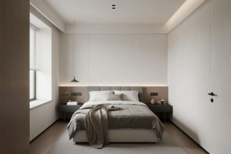
4. Warm Neutrals: Beige, Taupe, and the Other Sleepy Beasts
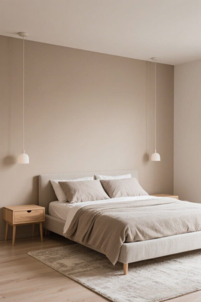
Neutrals get a bad rap for being “boring,” but beige, taupe, or even soft greige can totally create a warm, cozy cocoon for sleep.
The trick is to choose a tone that’s more muted and less yellow—unless you want your room to look like a banana (no shade).
Perfect for:
- People who hate color but love sleep
- Minimalist lovers
- Apartment dwellers who don’t want to repaint again when they move out next year.
5. Pale Pink or Blush: The Soothing Surprise
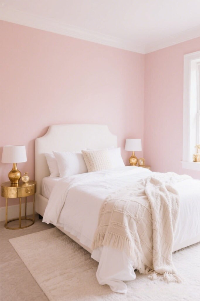
Wait, pink? For sleep? I know—it sounds sus. But soft blush tones (think millennial pink but even more chill) actually promote a sense of warmth and calm when paired with neutral décor.
It’s not Barbie pink—it’s more like your walls are gently hugging you.
Ideal pairings:
- White or cream bedding
- Gold or brass accents
- That plush rug you told yourself was “too much” (but secretly loved)
What Colors to Avoid Like That One Ex Who Texts at 1AM
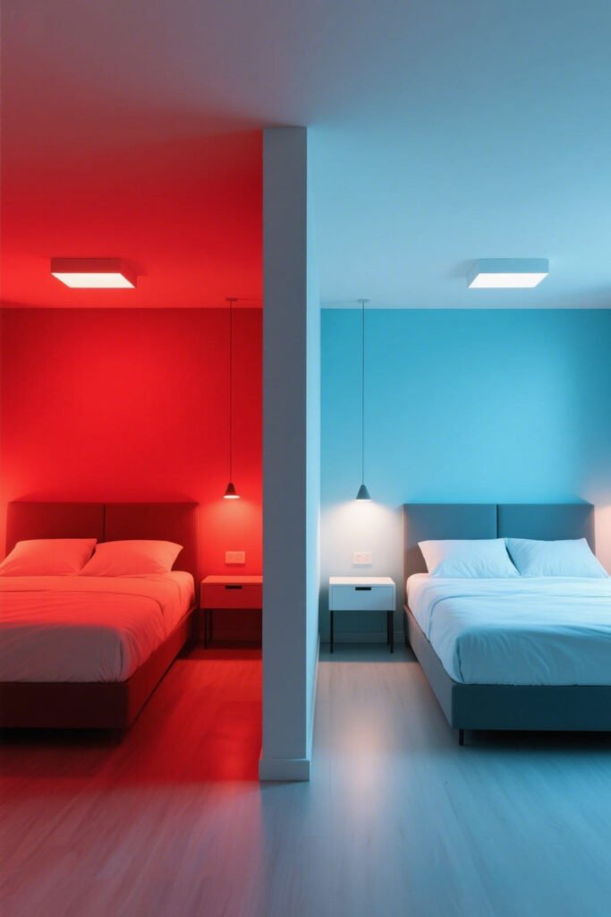
Not all colors are created equal when it comes to sleep. Some shades just scream insomnia, and we don’t want that kind of energy in our sacred sleeping space.

Red
Red = alert, passion, and excitement. Basically the opposite of “calm.” It raises your heart rate, triggers adrenaline, and might make you feel more like sprinting than snoozing.
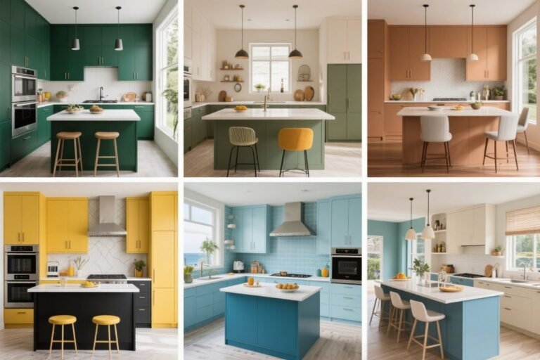
Bright Orange
Fun? Yes. Sleepy? Hard no. Orange is energizing and mentally stimulating. Keep it for your workout space—or your kitchen, if you wanna eat 24/7.
Yellow
Okay, I love yellow in small doses, but covering your walls in sunshine might not be the best sleep move. It’s just too stimulating for bedtime vibes.
How Lighting Affects Your Paint Color (AKA the Sneaky Saboteur)
You found the perfect color, painted the room, and now it looks… weird. Blame your lighting.

Here’s what you need to know:
- Natural light makes colors look true to tone. Great during the day, but check it at night too.
- Warm bulbs can turn cool colors muddy.
- LED or cool lights can make warm tones feel sterile.
Tip: Always test your paint swatches in both day and night light before committing. Or don’t—and live with your regret forever. Your choice!
Little Extras That Boost the Sleepy Vibes
Paint’s the foundation, but if you wanna go full spa-mode, don’t stop there. Here’s how to take your sleep haven to the next level:
- Add blackout curtains (because that streetlight doesn’t need to join your dreams)
- Use diffused lighting or Himalayan salt lamps for soft nighttime glow
- Keep your bedding in complementary colors—nothing too loud or jarring
- Throw in a few cozy textures like chunky knit throws or velvet pillows
Oh, and maybe ditch that clutter pile in the corner that stares at you every night… just sayin’.
Final Thoughts: Your Wall Color = Your Sleep Partner
Look, I’m not saying that painting your room sage green will suddenly turn you into Sleeping Beauty—but it sure doesn’t hurt.
The colors around us influence how we feel, whether we realize it or not. So if your current bedroom makes you feel like you’re stuck inside a fast-food joint, maybe it’s time for a little makeover.
And hey, even if your sleep doesn’t instantly improve, at least your room will look like it belongs on Pinterest. Win-win, right?
Now grab those paint swatches, channel your inner Zen, and create the kind of bedroom that practically tucks you in at night.
P.S. Already painted your room and feeling the difference? Or did you accidentally go with neon green and now regret everything? LMK—I’m always curious how these things pan out.