Best Paint Colors for Entryways and Hallways
Let’s be honest for a second: entryways and hallways don’t get enough love. They’re the first spaces you walk through, yet they somehow end up as the last spaces you bother decorating.
I’ve ignored mine for years and convinced myself it didn’t matter… until one day I realized guests walked through that hallway before seeing anything else. Oops.
So today, let’s fix that problem together and talk about the best paint colors for entryways and hallways—not in a boring, “Pinterest aesthetic” way (although yes, Pinterest absolutely influenced this list), but in a practical, stylish, and slightly opinionated way. 🙂
Why Your Entryway & Hallway Color Matters
Ever walked into someone’s home and thought, “Hmm… interesting vibe…”? Yeah. Paint does that.
Your hallway and entryway:
- Set the mood for the entire house
- Make a small space feel bigger or cozier
- Affect how natural and artificial light behave
- Tie your style together before people even reach the living room
So, no pressure or anything.
The Best Paint Colors for Entryways and Hallways
These paint colors work well because they’re versatile, timeless, and don’t make your guests stop and think, “Why is that wall shouting at me?”
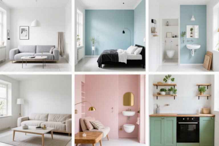
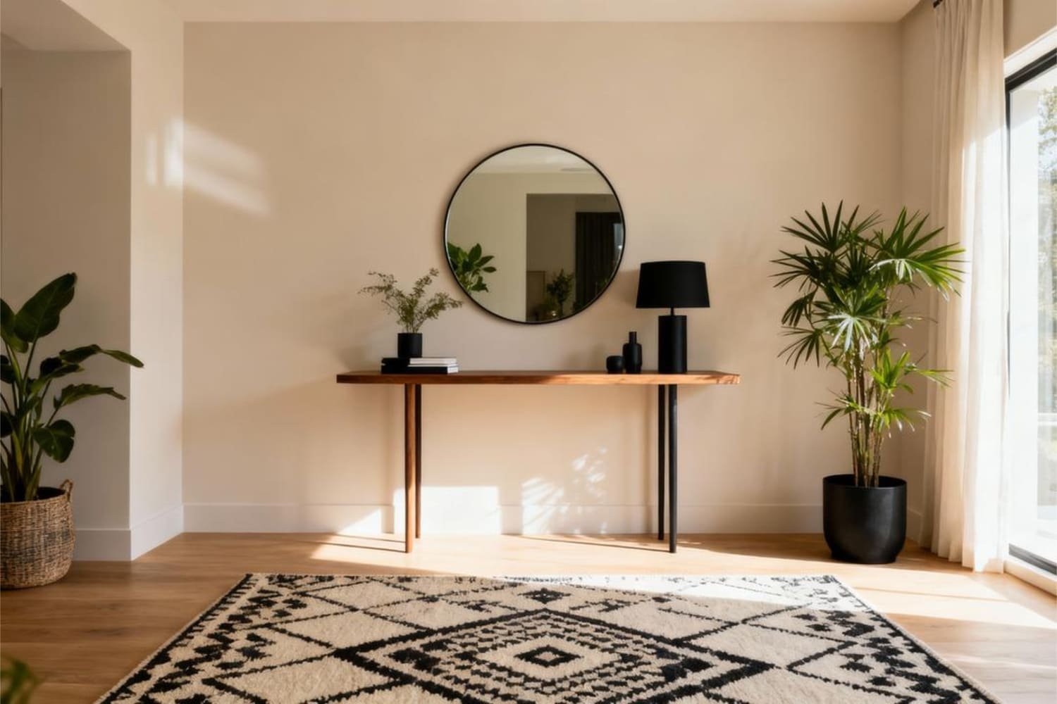
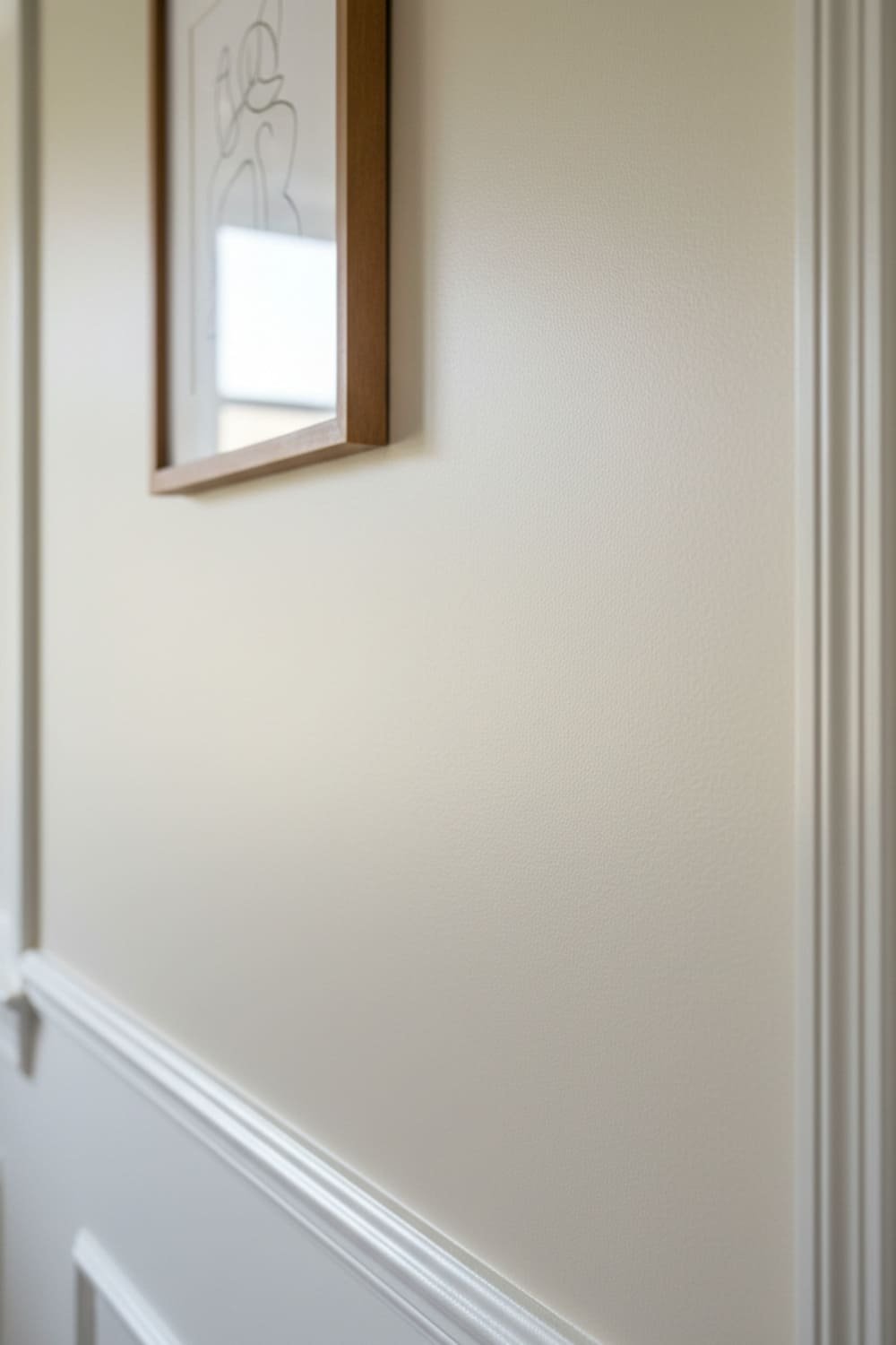
1. Soft Neutrals (AKA The Safe Choice You’ll Probably Love)
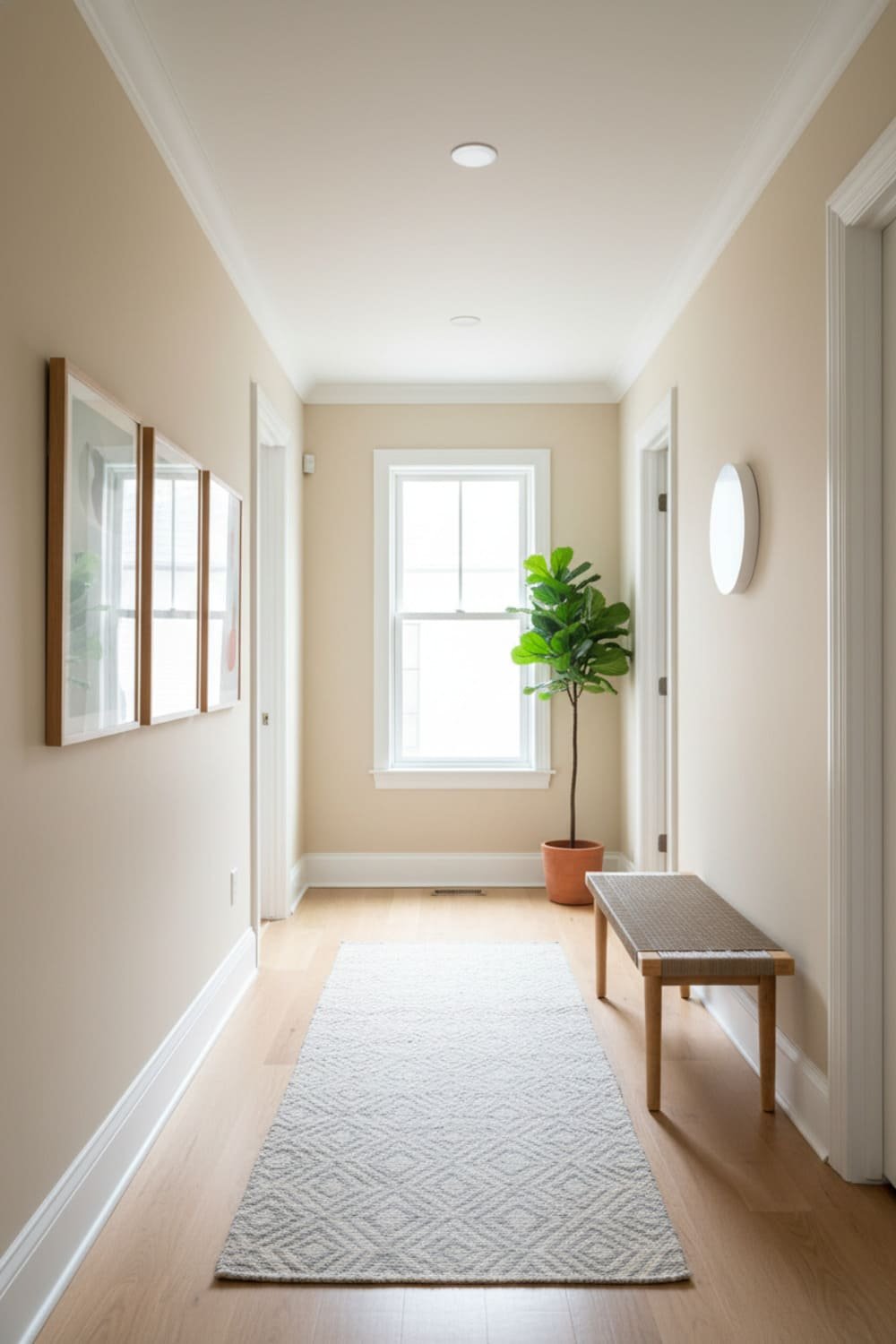
Neutrals work wonders in entryways and hallways because they’re clean, calming, and easy to pair with decor. If you want a non-regrettable decision, neutrals are the move.
Some favorites include:
- Warm beige
- Creamy off-white
- Greige
- Muted taupe
Why they work:
- They reflect light beautifully
- They make narrow spaces feel larger
- They work with literally any style (modern, farmhouse, Japandi—whatever vibe you woke up liking today)
Pro tip: Go with a warm undertone unless you want your hallway to feel like a doctor’s office.
2. Light Gray (Sophisticated Without Trying Too Hard)
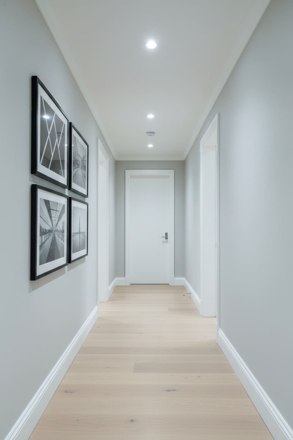
If beige feels too safe, light gray gives you a little more personality without entering “bold and risky” territory.
Try:
- Cool dove gray
- Warm greige-gray
- Misty gray-blue undertones
Ever notice how gray can look amazing in one house and blah in another? Lighting. Always test samples—lighting changes everything.
3. Soft Blues (Calm, Fresh, and Very Coastal-Chic)
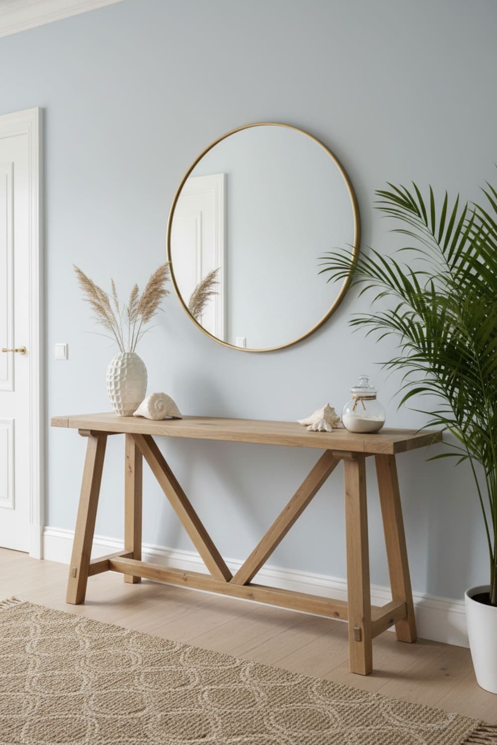
Soft blues look incredible in well-lit entryways and hallways. If you want a refreshing vibe that says, “I own houseplants and occasionally open windows,” this is your color.
Best shades:
- Powder blue
- Misty blue-gray
- Pale ocean blue
Blue pairs beautifully with:
- White trim
- Natural wood
- Black hardware
It feels crisp and peaceful without being boring. Honestly, I could paint my hallway blue and stare at it for hours—no shame.
4. Sage and Muted Greens (The Trendy-but-Not-Too-Trendy Choice)
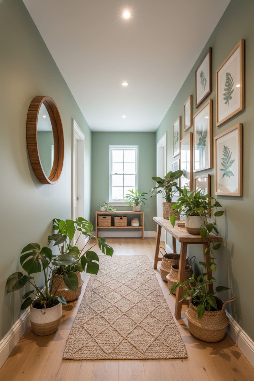
Sage green has been popping off in design trends, and I totally get why. It feels earthy, grounded, and cozy—but not overwhelming.
Go for:
- Sage
- Soft olive
- Muted eucalyptus green
These tones work especially well if you already have:
- Wooden floors
- Woven baskets
- Plants (real or fake—no judgment)
5. Warm Terracotta or Clay (Bold but Still Editor-Approved)
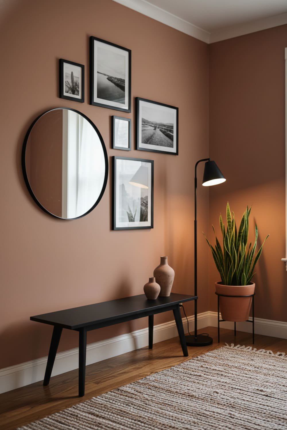
Okay, maybe you’re a little more adventurous. Maybe neutrals make you yawn. Maybe your hallway deserves a personality.
If that’s you, warm terracotta tones are 🔥 (FYI that’s slang #1). They add warmth, style, and a hint of Mediterranean charm.
Best for:
- Traditional homes
- Boho interiors
- Earthy color palettes
Just avoid pairing it with bright furniture unless chaos is the goal.
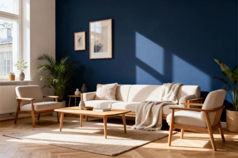
6. Deep Navy or Charcoal (A Moody Moment Done Right)

Yes, dark colors in small spaces can look amazing—controversial, I know. But hear me out: moody paint colors create drama in the best way.
Use navy or charcoal if:
- You want a bold entryway
- You have good lighting
- You want the space to look high-end
Bonus: These colors look incredible with brass and gold accents. It’s classy. It’s cinematic. It screams Pinterest goals.
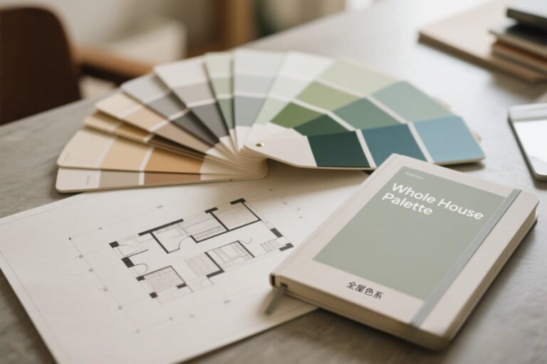
How to Choose the Right Color for YOUR Space
Paint isn’t one-size-fits-all. Some shades look stunning online and absolutely weird in real life. So here’s how to not regret your color.
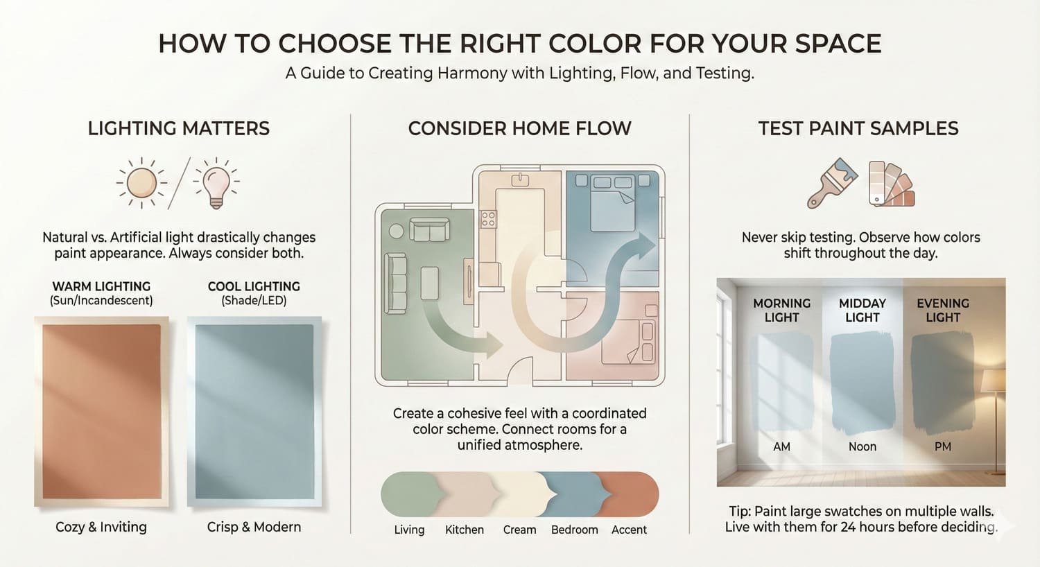
Lighting Matters More Than You Think
Natural vs. artificial lighting can change the entire mood.
North-facing rooms:
Go warmer to avoid a cold, dull tone.
South-facing rooms:
Cooler tones balance the natural warmth.
Low-light hallways:
Use soft neutrals or lighter shades.
Consider the Flow of Your Home
Ever walked into a home where every room screams a different theme? Please don’t do that. 🙂
Try to create color harmony:
- Pick a base undertone (warm or cool)
- Choose shades that play well together
- Repeat colors subtly across rooms
Test Before You Paint (Yes, You Should Seriously Do This)
Buy samples. Paint patches. Look at them in:
- Morning light
- Afternoon light
- Evening light
You’ll be shocked at the difference. Paint is sneaky like that.
Finishes That Work Best in Entryways and Hallways
Paint finish actually matters (annoying, but true). Choose the wrong one and fingerprints, scuffs, and mystery marks will haunt you.
Best finishes:
- Eggshell: soft sheen, hides imperfections
- Satin: durable and wipeable (great for kids or pets)
- Semi-gloss: best for trim and doors
Avoid flat or matte unless you want every touch to leave evidence.
Pairing Decor With Your Paint Color
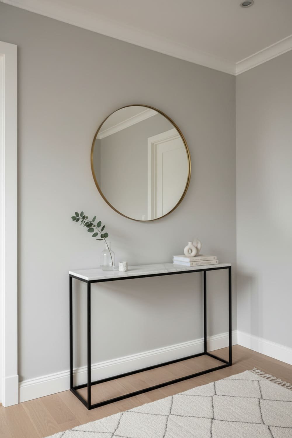
Even the best paint needs some styling help. Try:
- Mirrors to bounce light
- Artwork to add personality
- Slim console tables
- Hook racks or floating shelves
Think: functional + aesthetic = happy hallway life.
Quick Color Pairing Cheat Sheet
Want a shortcut? Here you go:
| Paint Color Tone | Best Pairing Decor |
|---|---|
| Soft neutrals | Black or wood accents |
| Light gray | Crisp white trim |
| Soft blue | Natural textures + gold |
| Sage green | Woven baskets + cream |
| Terracotta | Wood + matte black |
| Navy/charcoal | Brass or chrome |
Final Thoughts
Choosing the best paint colors for entryways and hallways feels intimidating at first, but once you look at lighting, style, and how you want the space to feel, it gets way easier.
Remember:
- Neutrals = safe and classy
- Blues and greens = calm and stylish
- Bold colors = drama and personality
Whatever you choose, make sure it reflects you, not just a trending color chart. IMO, your home should feel personal—not like a showroom.
Now go get paint samples, test them out, and create an entryway that finally matches your house personality. And yes, please send before and after photos because I live for transformation moments.