
Best Paint Colors for Small Rooms (Make Them Look Bigger)
Let’s be real—small rooms can feel a bit like a shoebox sometimes. You walk in, stub your toe on the coffee table, and wonder if maybe your room shrunk overnight. (Spoiler: it didn’t.)
But guess what? The right paint color can work literal magic. Not like Hogwarts magic, but close enough.
I’ve gone through the struggle of trying to make my too-tiny home office feel less like a closet and more like a vibe. So trust me—this isn’t just theory.
Below are my tried-and-true color picks and tips to make your small room look way bigger than it actually is.
Why Paint Color Matters (A Lot More Than You Think)
You’d be surprised how much a color can affect how a room feels. It’s not just about pretty walls—it’s about manipulating space with your eyeballs. Wild, right?
Ever wonder why some hotel rooms feel airy even though they’re basically glorified walk-in closets? It’s all in the paint, baby.
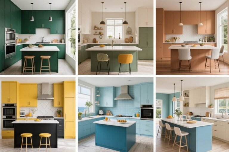
1. Classic White: The OG Space-Stretcher
Okay, I know—white walls? Groundbreaking. But hear me out.
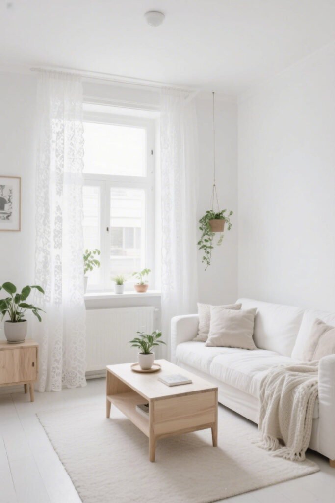
White reflects light like a champ, and light = space. It creates an open, airy feeling that tricks your brain into thinking you’re not boxed in.
Best Shades:
- Chantilly Lace by Benjamin Moore – crisp and clean, no weird undertones.
- Decorator’s White – softer, great for cozy vibes.
Pro tip: Stick to a true white or something with a cool undertone—warm whites can feel a little dingy in small spaces.
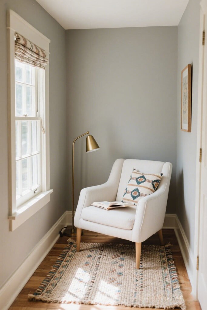
2. Soft Gray: The Chill Neutral That Doesn’t Scream ‘Try-Hard’
Not into white? Gray is your low-key bestie. It adds sophistication without shrinking the room.

Why it works: Cool grays bounce light around the room, but they add a bit more depth than white. Perfect if you want to look like you have your life together (even if your laundry pile says otherwise).
Best Picks:
- Repose Gray by Sherwin-Williams – super versatile.
- Gray Owl by Benjamin Moore – a light, airy cool-gray.
Ever feel like your space needs a mental reset? Gray tones help create a calm, decluttered energy. You might even finally meditate. Might.
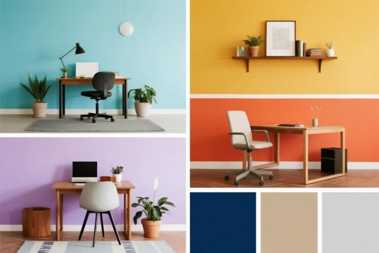
3. Pale Blue: Basically Sky in a Can
Pale blue is a total game-changer. It mimics the sky, which gives your brain that “open space” feeling.
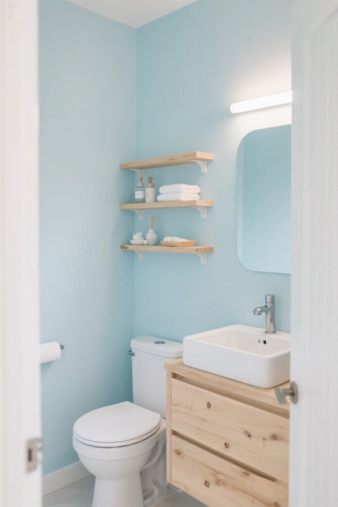
Bonus: It’s calming AF. Perfect for bedrooms or bathrooms that double as your escape-from-everyone zone.
My Go-To Picks:
- Blue Horizon by Benjamin Moore – a soft, dreamy vibe.
- Sea Salt by Sherwin-Williams – has a hint of green and totally coastal.
FYI: Avoid anything too saturated. Go too bold and suddenly your room feels like a giant blueberry.
4. Light Beige or Greige: The Neutral That’s Never Boring
Greige = gray + beige. Sounds meh, but it’s chef’s kiss when used right. It adds warmth without making your walls feel like they’re closing in on you.
Why it works: It offers that sweet spot between cozy and airy.
My Faves:
- Edgecomb Gray by Benjamin Moore – soft, warm, and timeless.
- Accessible Beige by Sherwin-Williams – doesn’t scream “builder-grade beige” (thankfully).
Ever walked into a room and instantly felt relaxed? Bet it was painted greige. Coincidence? I think not.
5. Blush Pink: Small Room, Big Personality
This one’s for the bold souls. A very light blush pink can totally open up a space while giving it personality.
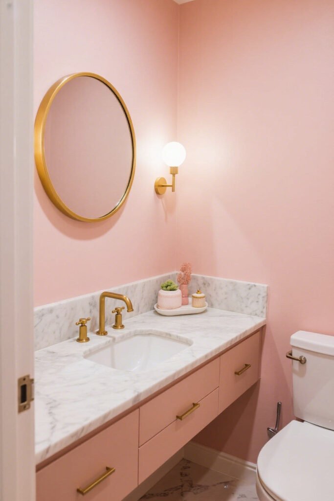
No, it doesn’t look like a toddler’s birthday party—when done right, it feels fresh and slightly sophisticated (yes, even for grown-ups).
Try These:
- First Light by Benjamin Moore – think pink without the Barbie.
- Pink Ground by Farrow & Ball – earthy, dusty pink.
IMO, pair it with white trim and gold accents. Boom—instant glow-up.
6. Soft Green: Nature’s Version of a Deep Breath
Green has been everywhere lately—and I’m here for it. A light sage or mint green makes your space feel grounded and fresh, like you live inside a Pinterest board.
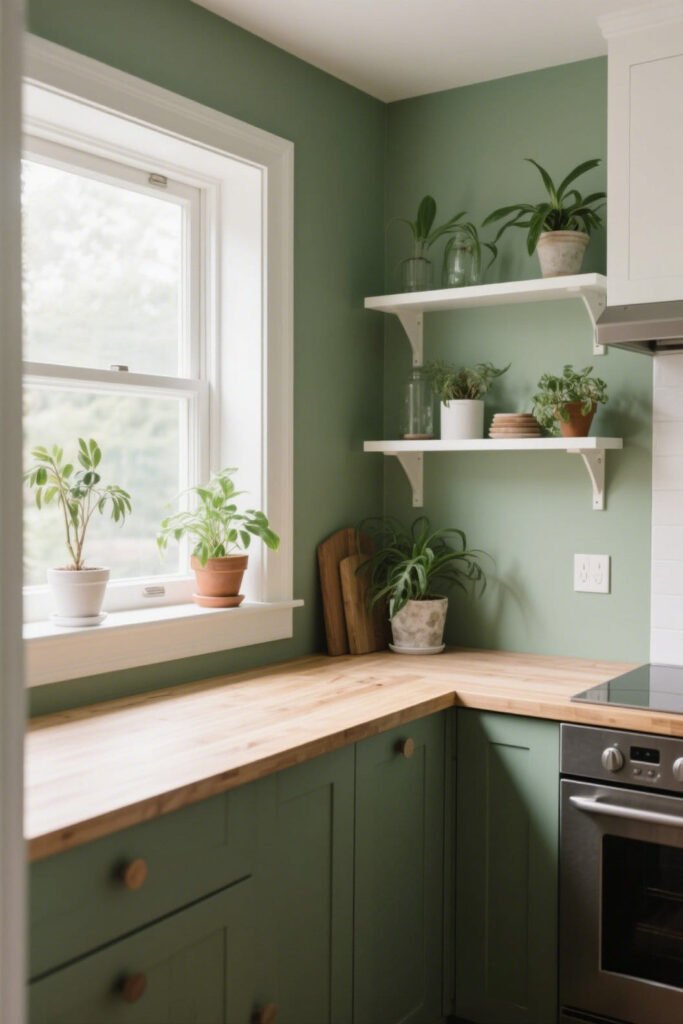
Why it works: It brings the outdoors in, which gives the illusion of more space. Plus, it’s calming, which your tiny room desperately needs.
Go For:
- Pale Oak by Benjamin Moore – green-beige hybrid, super subtle.
- Rainwashed by Sherwin-Williams – has a blue-green mix, spa-like vibes.
Bonus points if you add plants. Just try not to kill them this time.
7. Soft Lavender or Lilac: Whimsical but Not Wacky
Okay, hear me out—lavender in a small space can actually be super soothing.
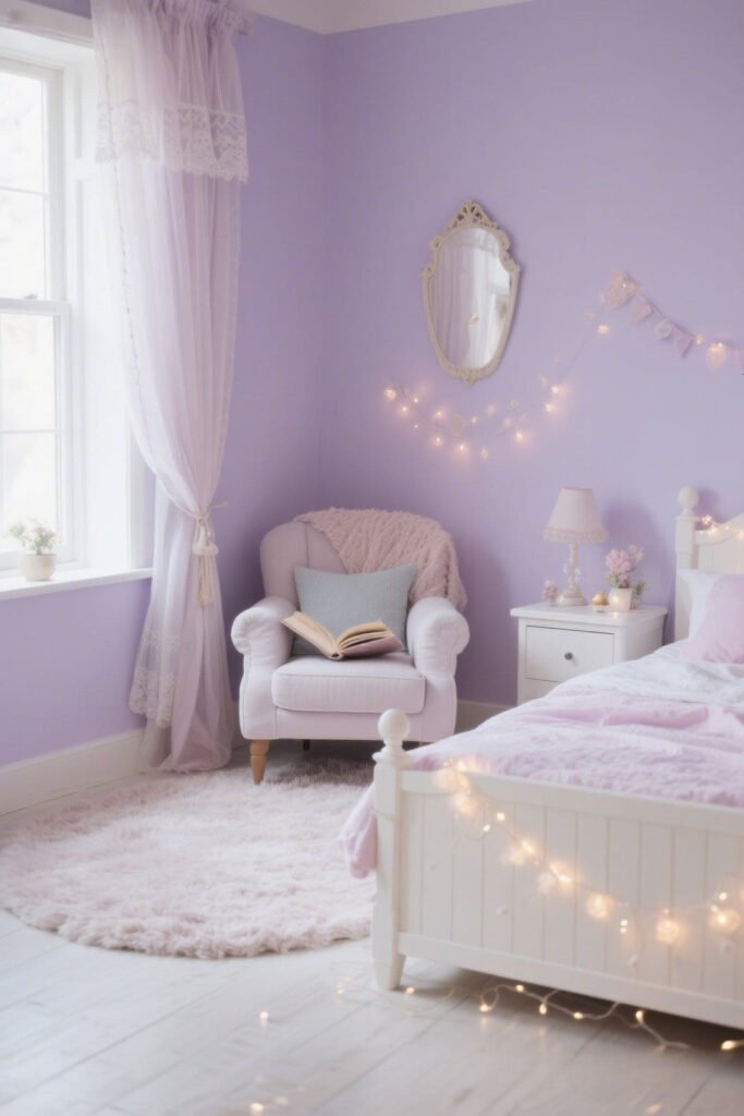
It’s not the overly perfumed version your grandma used. We’re talking about muted, chalky lavenders that almost act like a neutral.
Worth Trying:
- Ethereal Mood by Behr – soft, airy, magical.
- Violet Dusk by Valspar – whisper-soft purple.
Want to feel like you’re floating in a dreamy cloud? This is your color. (Unicorns not included.)
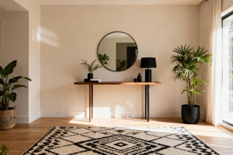
8. Creamy Neutrals: When You Want Warmth Without the Clutter
Sometimes white just feels too stark. That’s where warm neutrals come in. They bring softness without darkening the room.
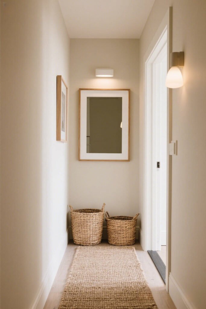
Good Options:
- Alabaster by Sherwin-Williams – not quite white, not quite beige.
- Swiss Coffee by Behr – don’t be fooled by the name; it’s not brown. It’s cozy perfection.
Ever heard of hygge? This is the paint version.
Pro Paint Tricks That Actually Make a Difference
Even the best color can’t save you from bad technique. (I’ve learned the hard way.)
Try These Moves:
- Paint the ceiling the same color as the walls (in small rooms). It erases harsh lines and makes the room feel taller.
- Use a satin or eggshell finish. These bounce more light than matte finishes.
- Paint trim the same color but in a different sheen. It keeps things seamless and modern.
TL;DR: Consistency = space illusion = happy brain.
Colors to Avoid Unless You Like Feeling Claustrophobic
Not every color is small-room friendly. I mean, if you want your room to feel like a cave, go for it. But if you’re trying to open things up:
Stay Away From:
- Dark reds – cozy in theory, chaotic in practice.
- Jewel tones – they absorb light like it’s their job.
- Bright neons – unless you’re living inside a rave (no judgment), pass.
And black? Unless you really know what you’re doing, it’s a gamble. One wrong move and you’re living in a very stylish void. :/
TL;DR: The Final Take
Choosing the best paint colors for small rooms isn’t just about what’s “in.” It’s about what works for your space, lighting, and vibe.
Let’s recap the winners:
- Crisp whites = clean and classic
- Soft grays = calm and cool
- Pale blues and greens = airy and natural
- Greige and beige = cozy without clutter
- Pastels (done right) = personality and space
At the end of the day, don’t let a small space box in your creativity. Play around. Sample paint. Slap some on the wall. Step back and see how it feels.
And hey, if you mess it up the first time? That’s what repainting is for. Been there. Done that. Still finding paint in my hair.
One Last Thing…
If your room’s been feeling more cramped than cozy, it’s probably not the furniture—it’s the color. So grab a brush, pick a shade that speaks to you, and watch your tiny space totally transform.
Now go forth and paint like the space-maximizing legend you are.
Let me know what color you’re thinking of trying—or send pics of your before-and-after glow-up!


One Comment