Living Room Paint Colors That Never Go Out of Style
Ever stared at your living room wall thinking, “Why does this color feel like a bad haircut from the early 2000s?”
Yeah… me too. Choosing the right paint color for your living room is like picking your go-to coffee order — it should feel right every single time.
And while trendy colors come and go (we’re looking at you, Millennial Pink), some shades are timeless. Like, they’ve-been-on-the-wall-since-1995-and-still-look-good timeless.
So, if you’re tired of repainting every time some influencer announces “the new neutral,” let’s chat about living room paint colors that actually never go out of style.
1. Classic White: The OG of Wall Colors
Let’s be real — white is the Beyoncé of paint colors.
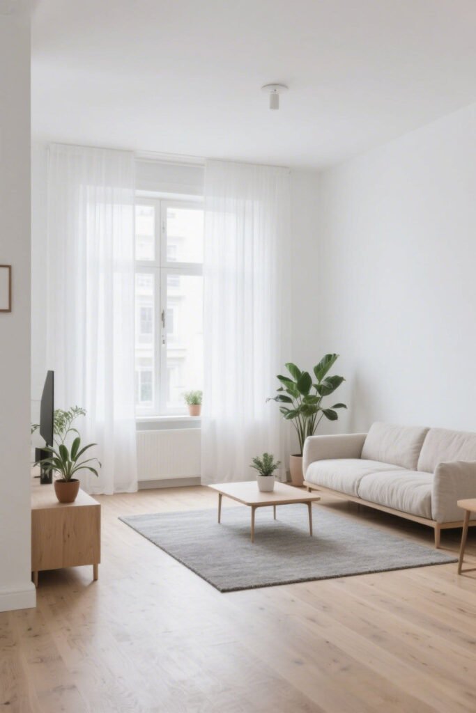
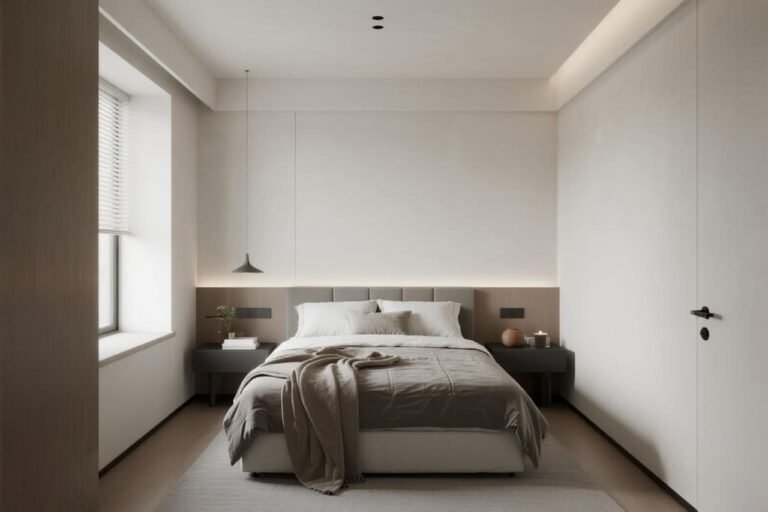
It goes with literally everything, never causes drama, and gives your space a clean, airy vibe.
If you want your living room to feel brighter, bigger, and like you actually know what you’re doing (even if you don’t), white’s your girl.
Why It Works:
- Reflects light like a pro (great for small spaces).
- Pairs beautifully with every decor style — modern, boho, traditional, you name it.
- Makes your artwork and furniture pop like they’re in a gallery.
Best Shades:
- Chantilly Lace by Benjamin Moore – Crisp and clean, like freshly laundered sheets.
- Simply White by Benjamin Moore – Warm undertones, aka “not hospital white.”
Pro tip: Go with a matte or eggshell finish to avoid that shiny, plastic-y look. You’re painting a wall, not wrapping a car.
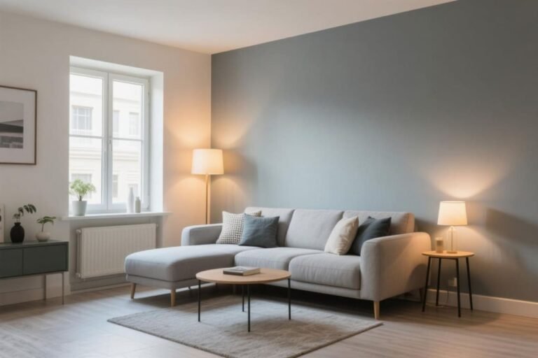
2. Soft Gray: Neutral, Not Boring
Gray is like that one friend who’s chill with everyone. It plays nice with bold colors, wood accents, metallics — basically, it’s the peacekeeper of paint.

Why It Works:
- Timeless and versatile.
- Adds just enough contrast without being dramatic.
- Works in both cool and warm color palettes.
Popular Choices:
- Repose Gray by Sherwin-Williams – A neutral fave for a reason.
- Classic Gray by Benjamin Moore – More of a soft greige, great if you want warmth.
Ever tried pairing gray with navy or mustard yellow? Chef’s kiss. Seriously, try it.
3. Greige: When Beige Met Gray and Made a Baby
IMO, greige is beige’s cooler cousin — you know, the one who lived abroad and drinks oat milk. It’s the perfect balance of warm and cool, and it never looks dated.

Why It Works:
- Adds warmth without looking yellow.
- Looks classy, cozy, and modern all at once.
- Ideal if you’re indecisive (no judgment here).
Go-To Greiges:
- Edgecomb Gray by Benjamin Moore – Subtle and sophisticated.
- Agreeable Gray by Sherwin-Williams – It’s literally in the name. Everyone agrees.
FYI: Greige plays well with plants, leather sofas, and Pinterest-worthy gallery walls. Not that I’ve spent hours curating mine or anything…
4. Navy Blue: The Bold Neutral
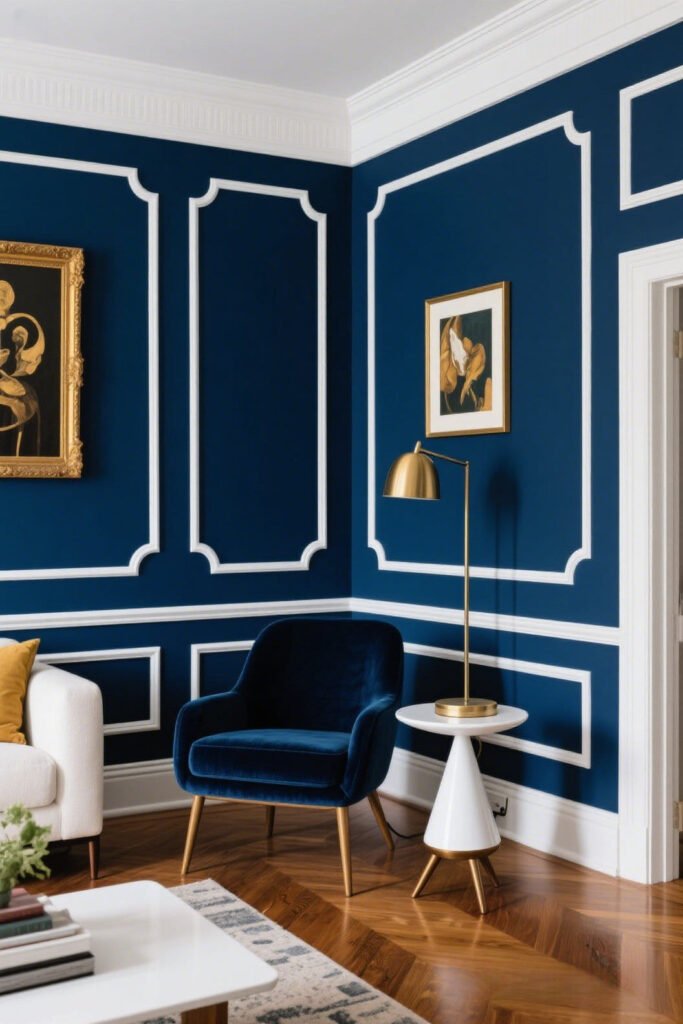
Wait, a bold neutral? Yep. Navy blue is moody in the best way. It’s like the little black dress of paint colors — always in style, always flattering.
Why It Works:
- Makes a statement without being obnoxious.
- Pairs beautifully with metallics like gold or brass.
- Adds depth, drama, and a touch of sophistication.
Tried-and-True Navy Tones:
- Hale Navy by Benjamin Moore – Dark, rich, and never too blue.
- Naval by Sherwin-Williams – Deep and dreamy.
Scared it’ll make your space feel too dark? Use it on an accent wall or pair with crisp white trim. Boom — instant elegance.
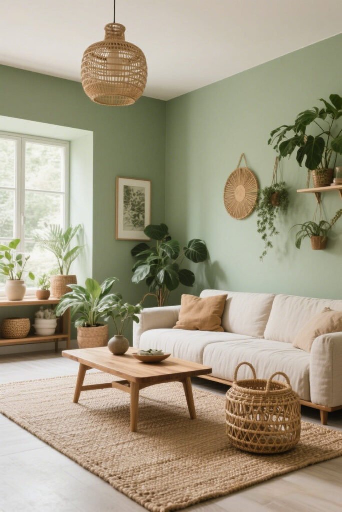
5. Earthy Greens: A Breath of Fresh Air
Sage, olive, moss — these greens are basically a spa day for your walls. They bring the outdoors in, and who doesn’t want to feel more grounded while binge-watching reality TV?
Why It Works:
- Creates a calm, serene vibe.
- Matches beautifully with natural elements (wood, jute, stone).
- Always in style, especially with the eco-everything movement.
Best Picks:
- Clary Sage by Sherwin-Williams – Soft and calming.
- October Mist by Benjamin Moore – Earthy but not muddy.
Bonus: Green doesn’t show dust or fingerprints like white or dark colors. That’s what we call a lazy decorator’s dream.
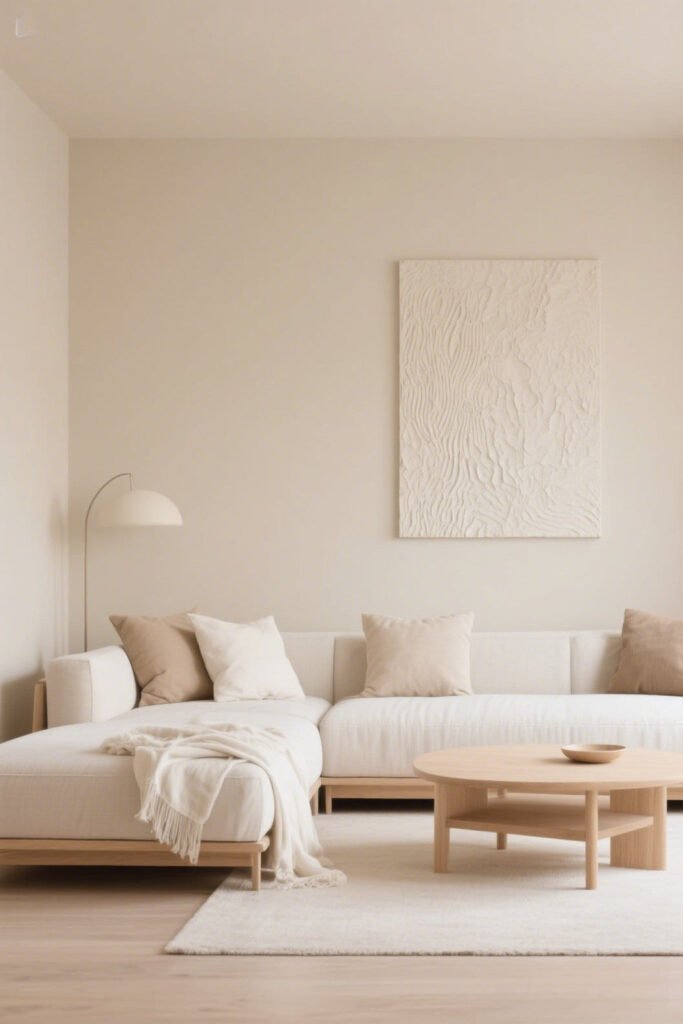
6. Beige, But Make It Modern
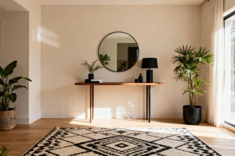
Before you roll your eyes, beige is back — and it’s not the soul-sucking builder beige of the early 2000s. Today’s beige is rich, warm, and cozy AF.
Why It Works:
- Complements almost every color scheme.
- Adds warmth without stealing the spotlight.
- Perfect if you love a cozy, neutral palette.
Fan-Faves:
- Accessible Beige by Sherwin-Williams – Soft and not too yellow.
- Natural Linen by Benjamin Moore – Warm, subtle, and classic.
Still not sold? Picture beige walls with crisp white trim and layered textures — a chunky knit throw, linen curtains, and a woven rug. Yeah, now we’re talkin’.
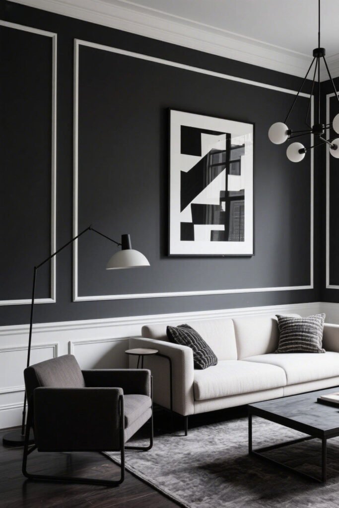
7. Charcoal: For That Moody, Modern Edge
If you want your living room to say “I’m dramatic, but also have my life together,” charcoal is the move.
Why It Works:
- Bold, but still neutral.
- Makes lighter furniture and art pop.
- Works surprisingly well in cozy spaces.
Top Picks:
- Peppercorn by Sherwin-Williams – The perfect deep charcoal.
- Wrought Iron by Benjamin Moore – Moody, with just a hint of navy.
Use it on one wall or go all in — either way, your space will instantly look way more expensive than it actually is.
How to Choose the Right “Forever” Color for Your Living Room
Okay, so you’ve got options. But how do you pick one that won’t make you cringe in 5 years?
Here’s how I usually decide:
- Lighting Check: Natural light makes a huge difference. Swatch during the day and at night.
- Furniture Vibe: What colors are you already working with? Don’t choose a wall color that clashes with your couch (unless you hate your couch — then, by all means…).
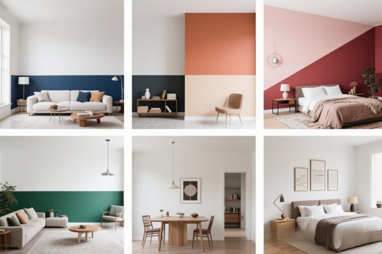
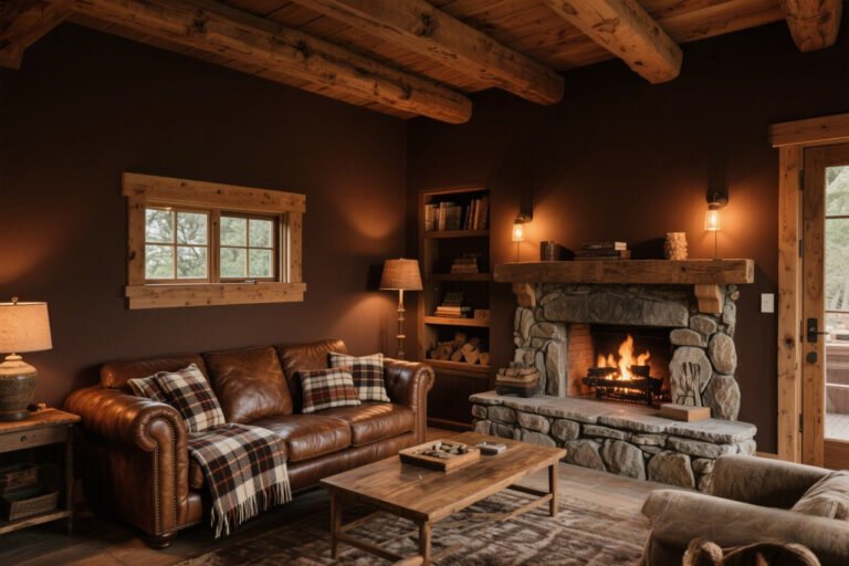
- Mood You Want: Cozy? Go warm. Airy? Try cool tones. Bold? Dark colors, baby.
- Samples, Samples, Samples: Get a few samples and live with them for a week. You’ll know which one feels right.
And remember: Even “timeless” doesn’t mean “boring.” Your home should reflect you. If that means painting your walls greige with neon art, I fully support it.
Final Thoughts: Stick with the Classics (with a Twist)
Trends are fun, but timeless paint colors will always have your back — no matter what year it is or how many design blogs try to convince you that mauve is suddenly cool again (spoiler: it’s not).
Whether you’re into airy whites, moody blues, or cozy greiges, the key is choosing a color that makes your space feel like home. That’s the real “never go out of style” secret, IMO.
So grab a brush, slap on a swatch (or three), and don’t be afraid to go classic. Your future self will thank you.
And hey — worst case? You repaint in five years when burnt orange makes a comeback. But let’s pray it doesn’t.
Now you tell me — which of these timeless shades is calling your name? Or do you already have a “ride or die” paint color that’s stood the test of time? Drop it in the comments below.


