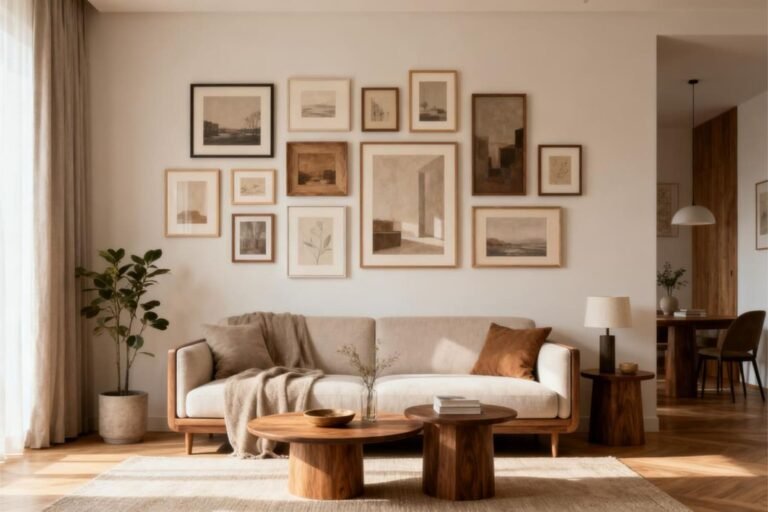
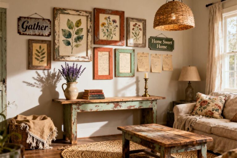
Minimalist Gallery Wall Ideas for a Clean Aesthetic
Ever stare at a blank wall and think, “I want something there… but not too much”? Yeah, same. I love art, but I hate clutter even more.
That’s exactly why minimalist gallery wall ideas for a clean aesthetic became my obsession. You get personality without visual noise, and honestly, that balance feels like magic.
I’ve tested layouts, swapped frames at midnight (don’t ask), and learned what actually works versus what looks cute only on Pinterest.
Let’s talk about how to build a minimalist gallery wall that feels calm, intentional, and not try-hard. Ready?
Why Minimalist Gallery Walls Just Work
Minimalism doesn’t mean boring. It means everything earns its place. A clean gallery wall gives your space character without screaming for attention.
Ever notice how some walls make you feel calmer the moment you look at them?
Calm Space, Clear Mind
I swear my brain relaxes when a wall looks balanced. Minimalist gallery walls:
- Reduce visual clutter
- Highlight each artwork
- Make small rooms feel bigger
Less chaos equals more breathing room, and I’ll die on that hill.
They Fit Almost Any Style
Minimalist gallery walls play nicely with:
- Modern interiors
- Scandinavian spaces
- Japandi or neutral homes
IMO, that versatility makes them unbeatable. Why limit yourself?
Choosing the Right Wall (Yes, It Matters)
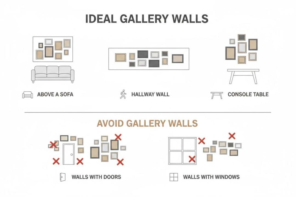
Not every wall deserves a gallery moment. Some walls need peace and quiet.
Best Spots for a Minimalist Gallery Wall
I always start with walls that already catch my eye:
- Above the sofa
- Along a hallway
- Over a console table
- Beside the dining area
High-traffic walls work best, because people actually see them. Crazy concept, right?
Walls to Skip (Trust Me)
Avoid walls with:
- Busy wallpaper
- Heavy shelving
- Too many doors or windows
Minimalism needs space to breathe. Let it breathe.
Pick a Consistent Color Palette
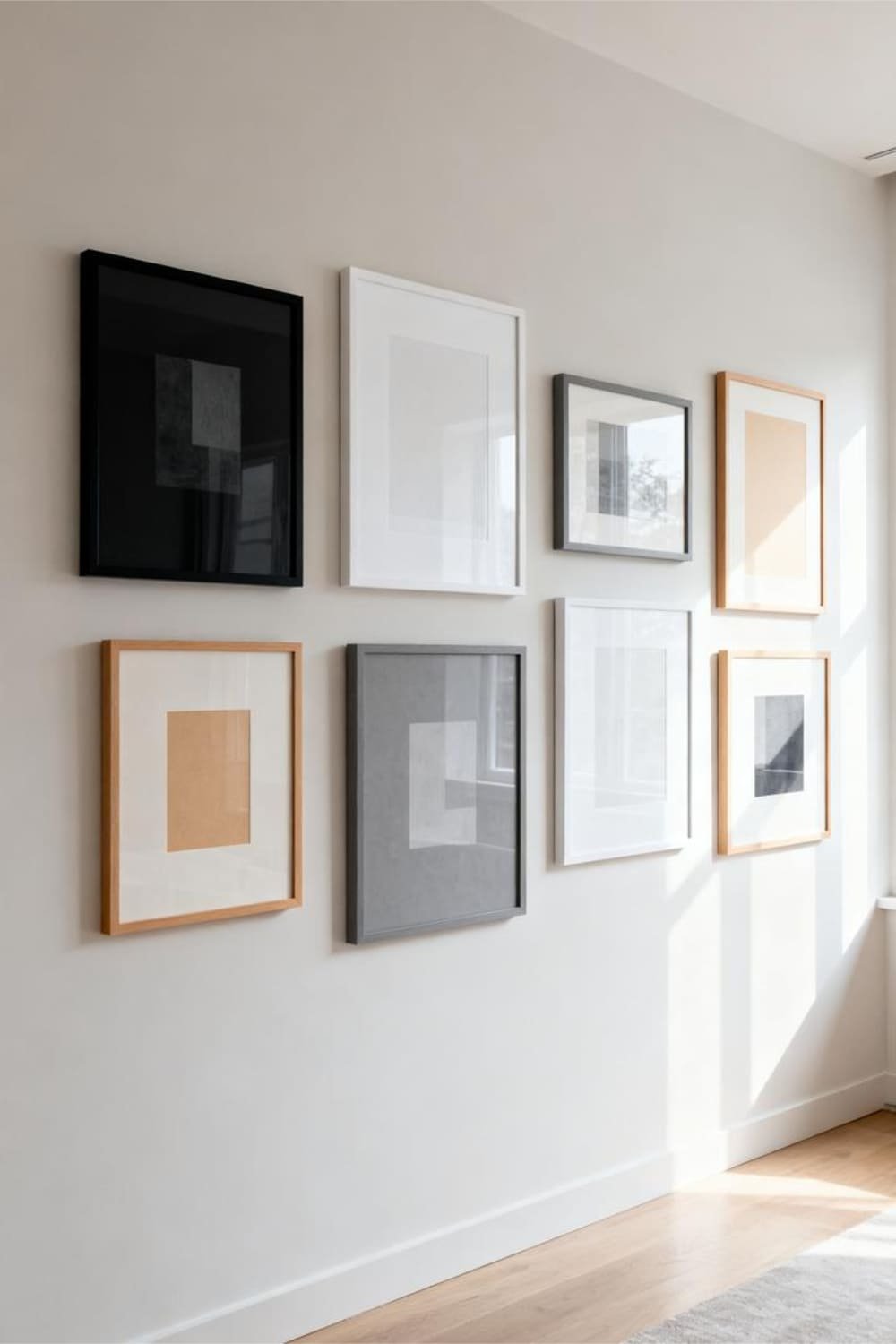
Color does the heavy lifting in minimalist gallery wall design. I learned this the hard way after mixing “almost the same” whites. Spoiler: they were not the same.
Safe, Clean Color Combos
Stick to palettes like:
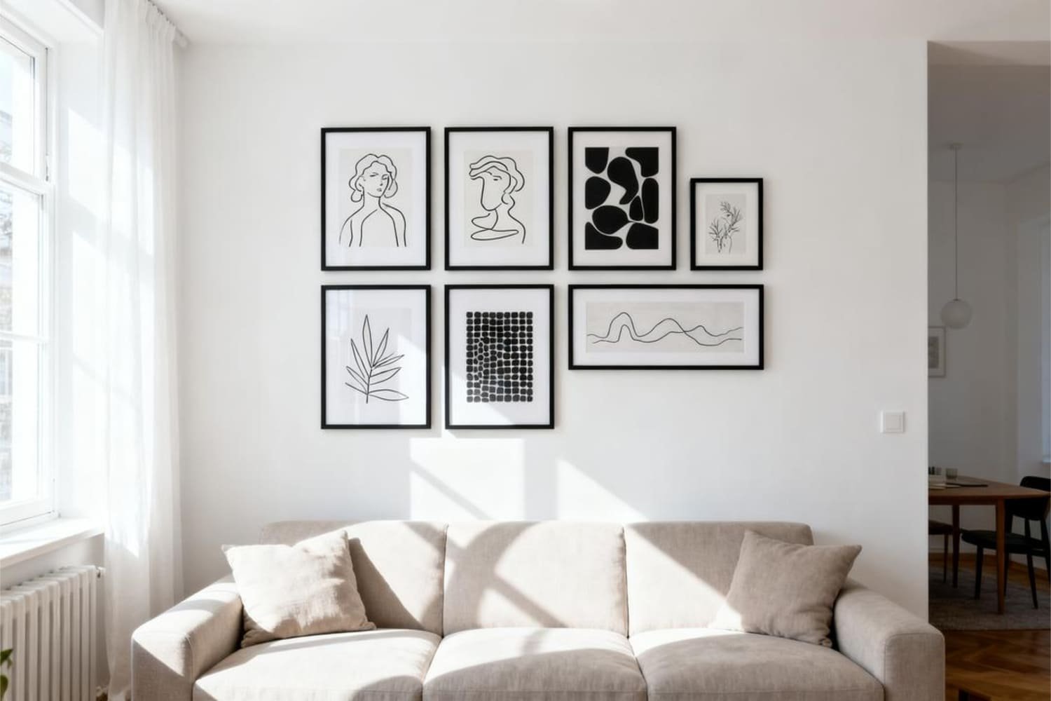
- Black, white, and soft gray
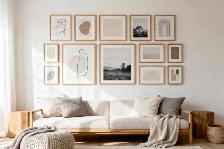
- Beige, taupe, and warm cream
- Muted earth tones
Consistency keeps the wall calm, even when you hang multiple pieces.
One Accent Color Is Enough
If you crave color, add just one accent shade. I like muted sage or dusty blue. Anything louder feels like it wants attention, and minimalist walls hate drama.
Frame Choices Make or Break the Look
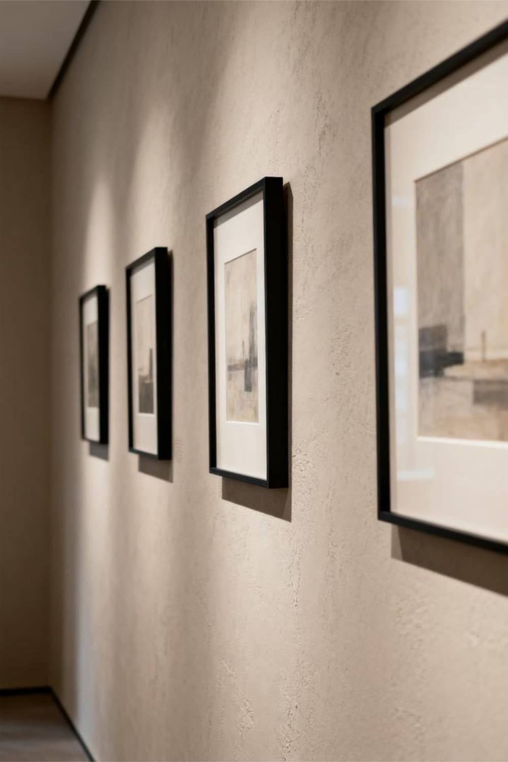
Frames deserve more respect than they get. They can ruin a clean aesthetic faster than crooked spacing.
Stick to One Frame Style
I usually choose:
- Thin black metal frames
- Light oak wood frames
- Simple white frames
Matching frames instantly simplify the wall, even with different artwork inside.
Matte Over Gloss (Always)
Glossy frames reflect light like crazy. Matte finishes keep everything soft and understated. FYI, your eyes will thank you 🙂
Artwork That Actually Feels Minimal
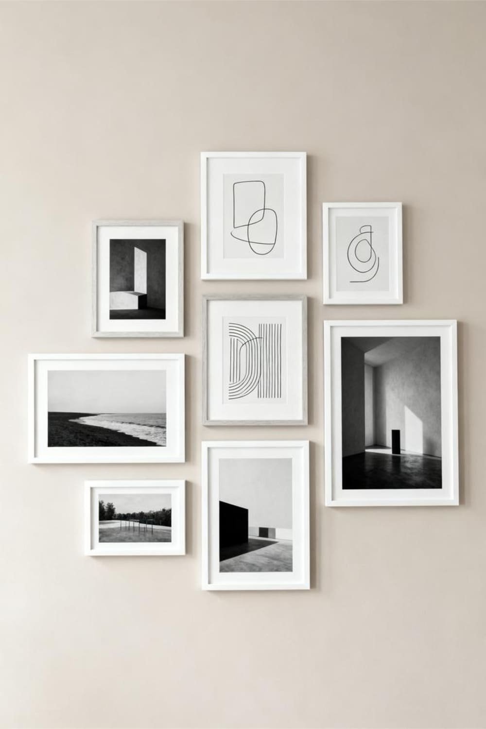
Minimalist gallery wall ideas for a clean aesthetic depend on what you hang, not just how you hang it.
Art Styles That Work Best
I gravitate toward:
- Line drawings
- Abstract shapes
- Black-and-white photography
- Simple typography
Each piece should feel intentional, not decorative filler.
Avoid Overly Detailed Art
If I need to squint to understand it, I skip it. Minimal art communicates fast. That’s the whole point.
Layout Ideas That Stay Clean and Balanced
Layout gives structure to your gallery wall. Without it, things spiral quickly.
Grid Layout: The Minimalist Favorite
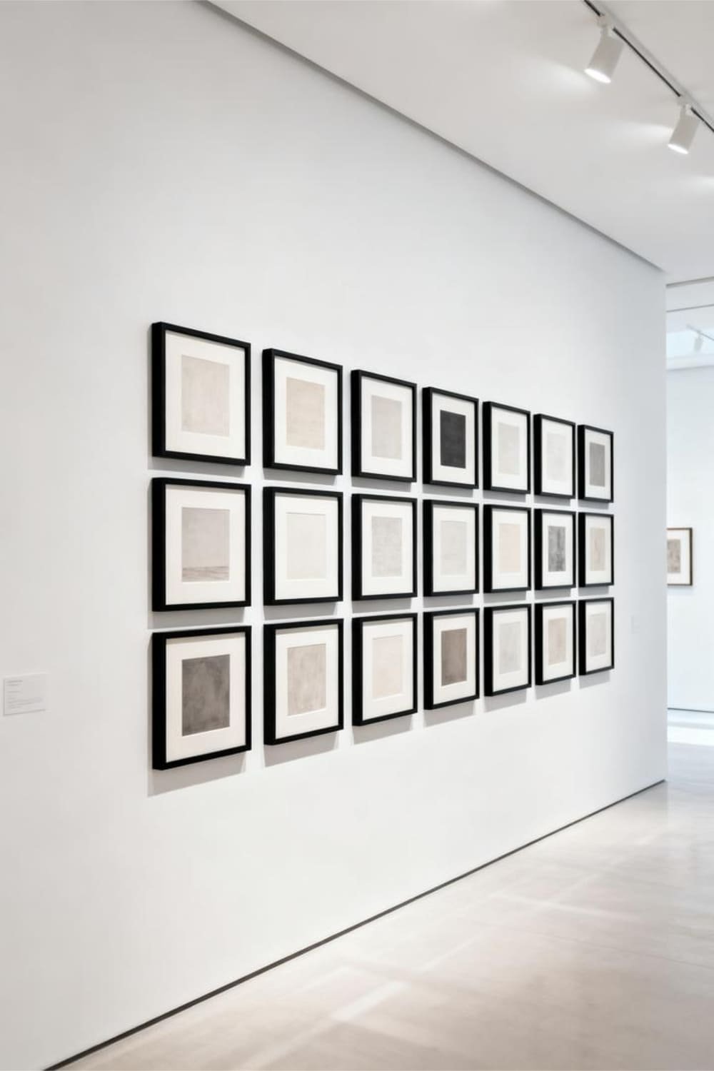
I love a clean grid because:
- Spacing stays even
- The wall looks organized
- The result feels polished
Measure twice, hang once. Trust me.
Linear Layout for Small Spaces
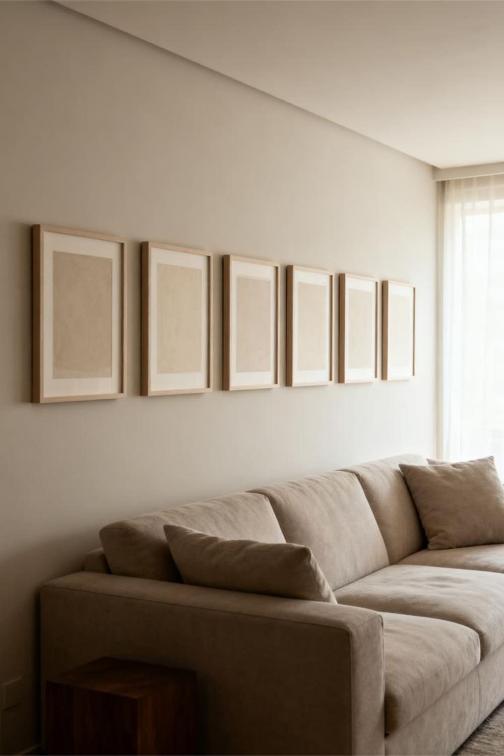
Hang frames in a straight horizontal or vertical line. This works beautifully above sofas or narrow hallways. Simple lines equal instant calm.
Loose but Intentional Layout
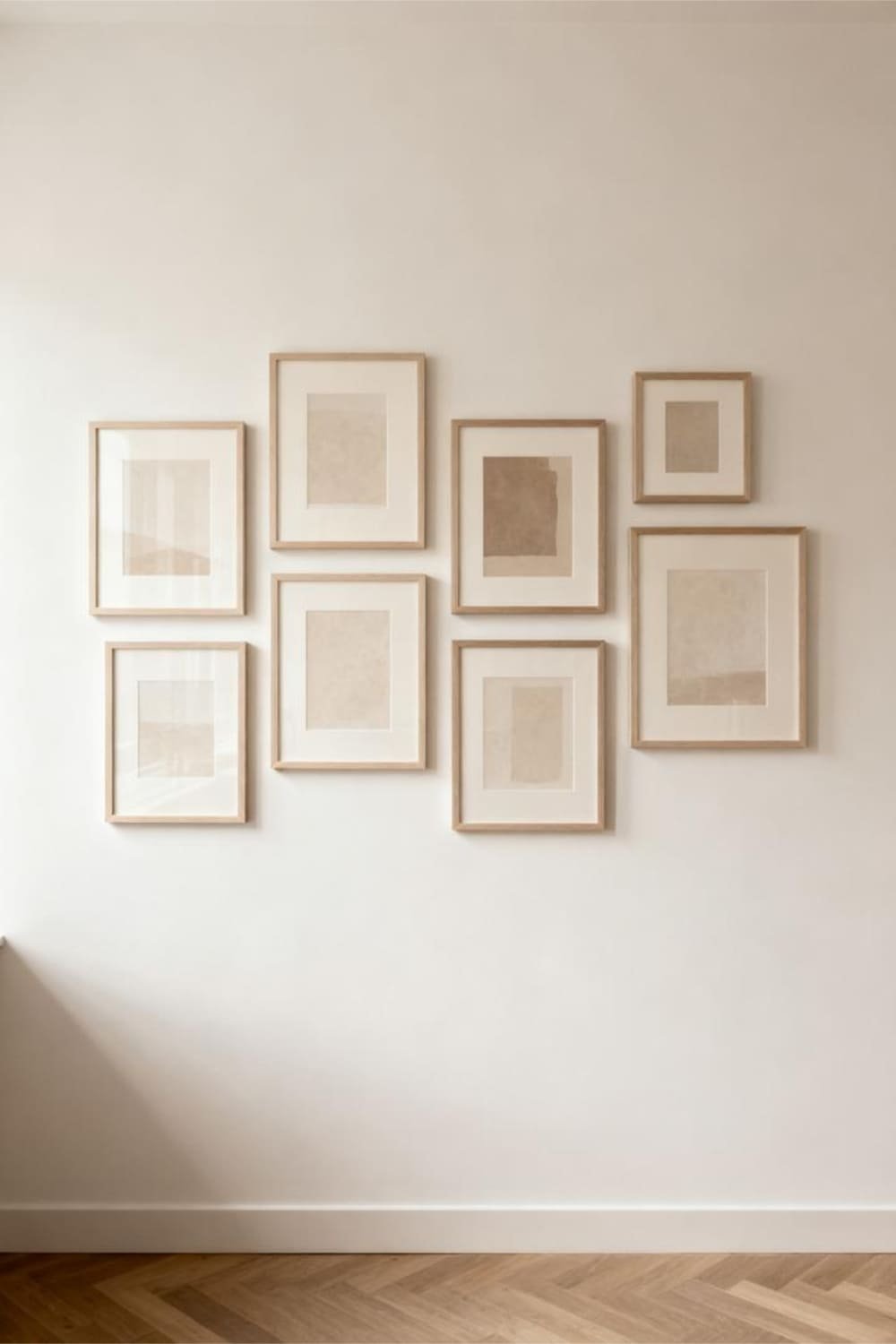
If grids feel too strict, try a soft structure:
- Same frame size
- Equal spacing
- Slight variation in placement
Ever notice how “effortless” things actually take effort?
Spacing: The Unsung Hero
Spacing matters more than most people think. Too close feels cramped. Too far feels awkward.
Ideal Spacing Rule
I stick to:
- 2–3 inches between frames
That sweet spot keeps everything connected without crowding.
Use Painter’s Tape First
Before committing, I tape outlines on the wall. It saves holes, stress, and regret. Who enjoys patching drywall anyway?
Mixing Sizes Without Making a Mess
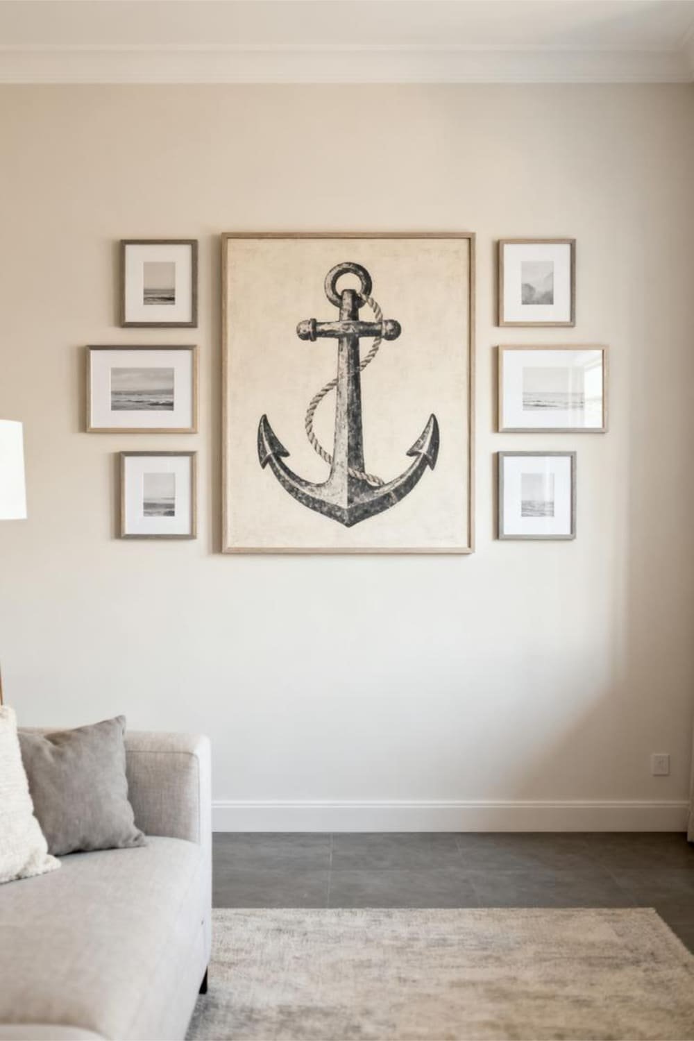
Yes, you can mix sizes and still keep a minimalist aesthetic. You just need restraint.
Keep One Size Dominant
I usually choose:
- One large anchor piece
- Several smaller supporting pieces
Hierarchy creates balance, even in minimal designs.
Align Something, Always
Align the tops, centers, or bottoms. Alignment gives the eye a reference point. Without it, chaos creeps in quietly.
Minimalist Gallery Walls for Different Rooms
Not every room wants the same vibe. Let’s break it down.
Living Room Gallery Walls
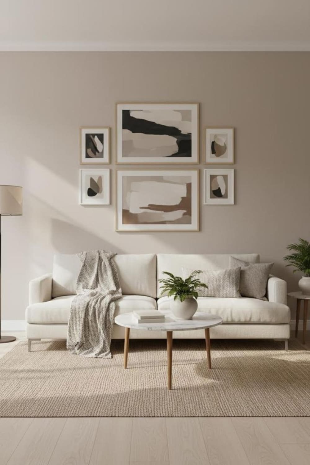
In living rooms, I aim for:
- Larger pieces
- Neutral tones
- Strong symmetry
This wall usually anchors the entire space.
Bedroom Gallery Walls
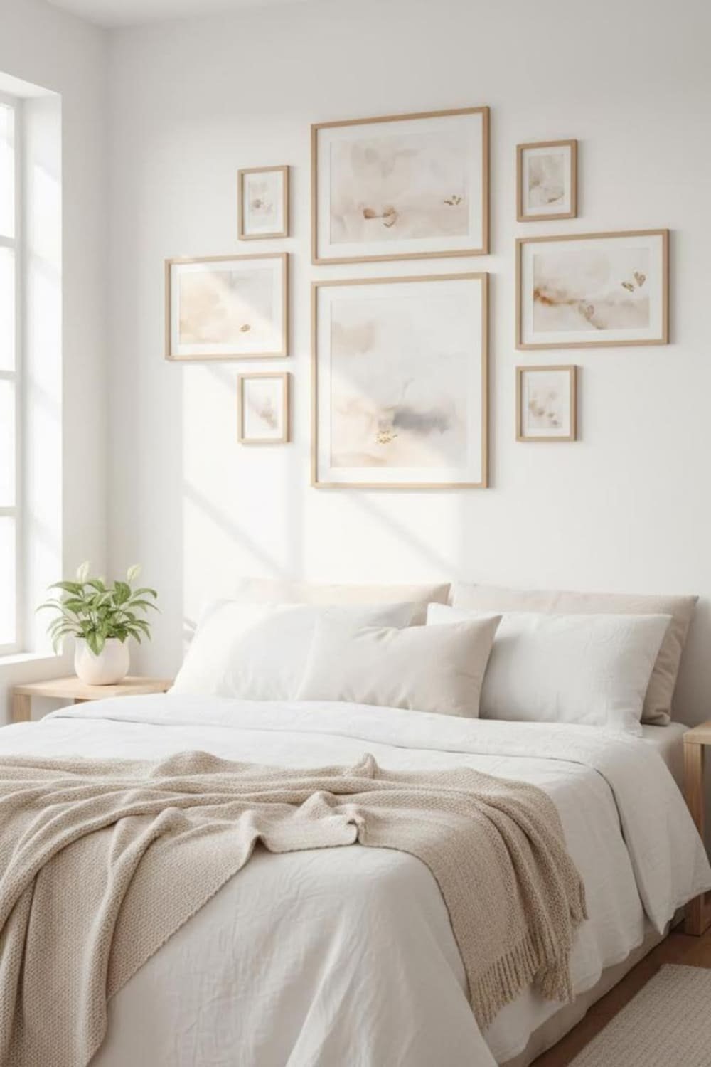
Bedrooms need calm energy:
- Soft colors
- Fewer frames
- Gentle layouts
Nothing kills sleep vibes faster than visual noise.
Hallway Gallery Walls
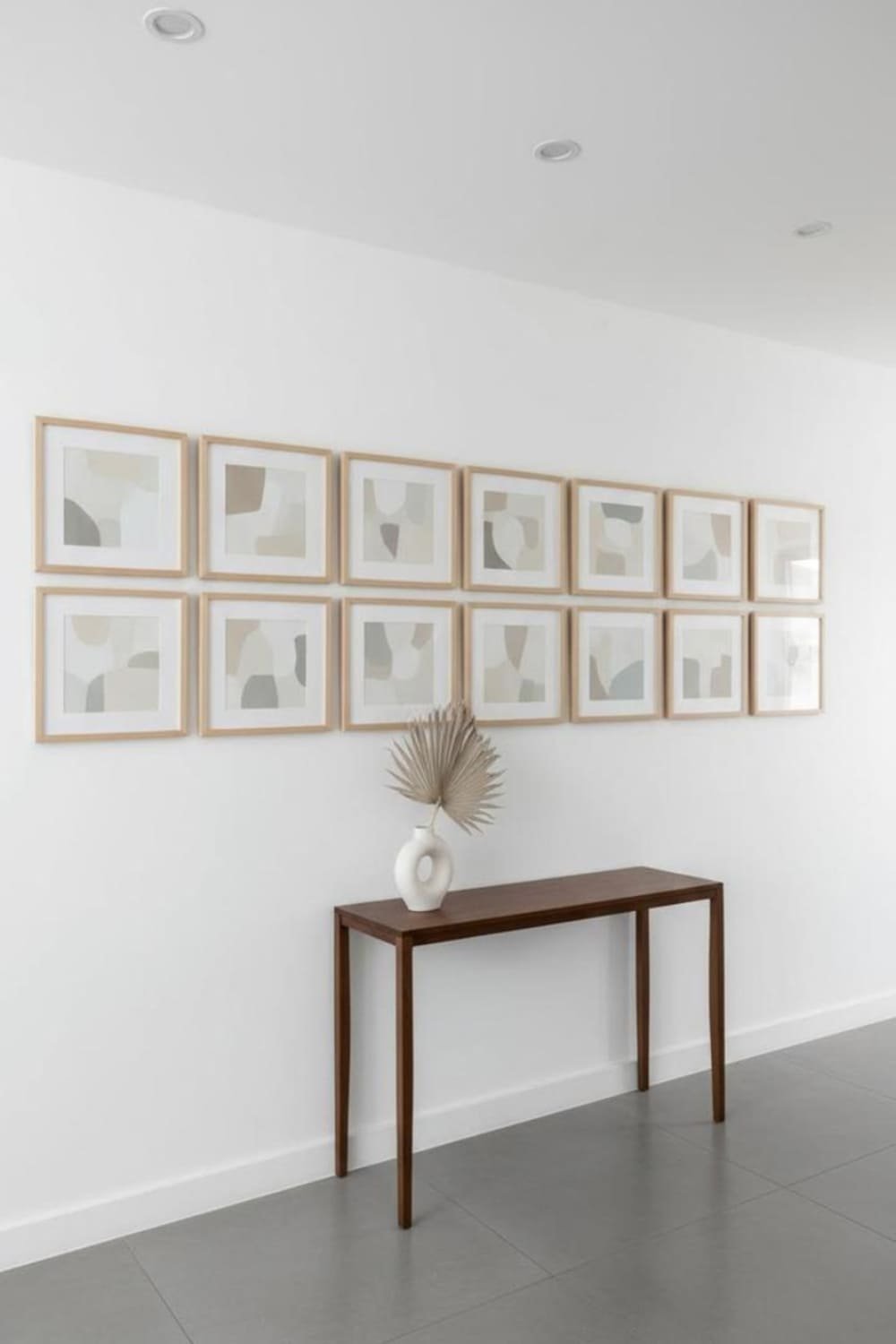
Hallways love repetition:
- Same frame size
- Same spacing
- Same color palette
Walking past should feel rhythmic, not overwhelming.
Common Mistakes That Ruin the Clean Look
I’ve made these mistakes so you don’t have to. You’re welcome.
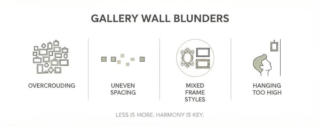
Too Many Frames
More frames don’t equal more style. Minimalist gallery walls thrive on restraint.
Mixing Too Many Styles
Abstract plus quotes plus family photos plus color? That’s a no. Pick one lane.
Hanging Too High
Art should sit around eye level. If people need neck exercises to see it, you hung it too high.
How to Keep It Minimal Long-Term
Minimalist gallery walls need maintenance, not just installation.
Edit Regularly
I remove pieces once they stop feeling right. Walls evolve, and that’s okay.
Resist the Urge to Add
When in doubt, don’t add. Minimalism rewards patience. Ever regret not adding clutter? Exactly.
Budget-Friendly Minimalist Gallery Wall Tips
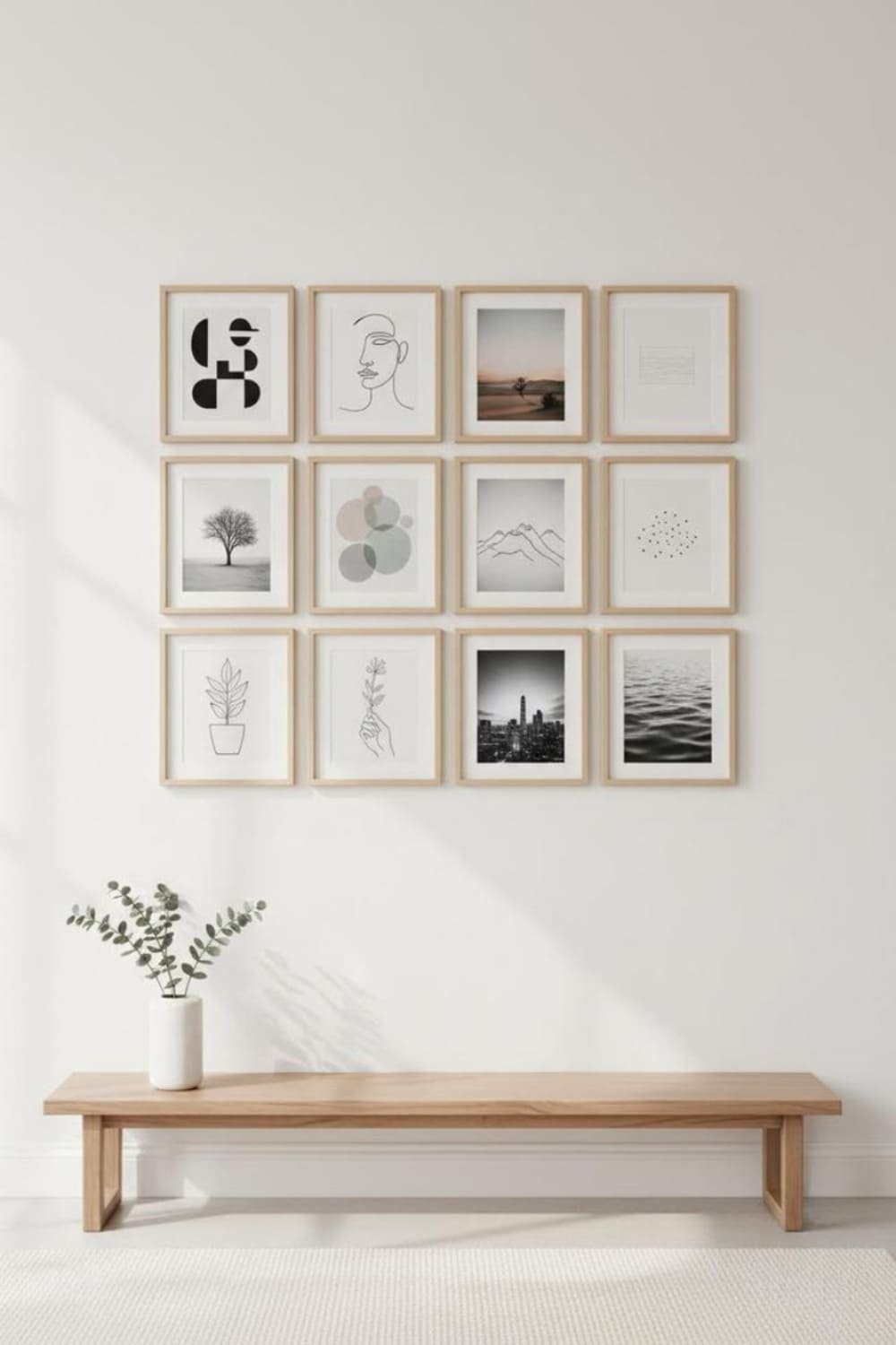
Clean aesthetics don’t require expensive art. I promise.
Affordable Art Sources
I often use:
- Digital prints
- Museum downloads
- My own photography
Simple frames elevate everything.
DIY Art Counts
Line drawings, brush strokes, or textured paper look amazing when framed. Minimalism celebrates simplicity, not price tags.
Why Minimalist Gallery Walls Feel So Timeless
Trends come and go, but clean design sticks around. Minimalist gallery wall ideas for a clean aesthetic don’t chase attention. They age gracefully.
I still love walls I styled years ago because they don’t scream a specific era. That’s the power of simplicity.
Final Thoughts: Keep It Simple, Keep It You
Minimalist gallery walls work best when they feel intentional, calm, and personal. Choose a clear palette, consistent frames, and layouts that breathe.
Edit often, space carefully, and resist the urge to overdo it.
If your wall feels peaceful when you walk past it, you nailed it.
And if you ever feel tempted to add “just one more frame,” step back and ask yourself—does it really need it? Sometimes the cleanest choice feels like the boldest one.

