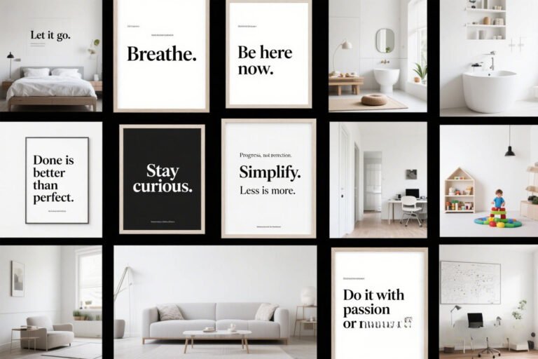
Monochrome vs. Vibrant: Choosing the Right Printables for Your Style
Ever stare at a wall, printable in hand, and think, “Why does this look… wrong?” Yeah, same. I’ve printed gorgeous artwork—like seriously Pinterest-worthy—and somehow it still looked off once I hung it. Spoiler: it wasn’t the paper. It wasn’t the frame. It was the style mismatch.
Some of us love that minimal black-and-white aesthetic (aka Monochrome squad). Others crave bold, juicy, expressive colors (hello Vibrant crew). And some of us? We’re chaotic neutrals who jump between both depending on mood, season, or caffeine intake.
So if you’re trying to figure out whether monochrome or vibrant printables fit your vibe, your space, and your personality, let’s chat about it like friends (because honestly, this topic is way more fun than it sounds).
Why Printables Even Matter
Okay real talk: printables are the easiest way to refresh a space fast without selling a kidney. You can swap them out with seasons, trends, moods—or when you impulsively rearrange furniture at 2AM (no judgment).
The cool thing? They let you express your style without commitment. So choosing the right printable aesthetic actually matters, especially if you want your space to feel intentional instead of “I panic-decorated.”
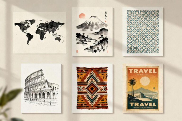
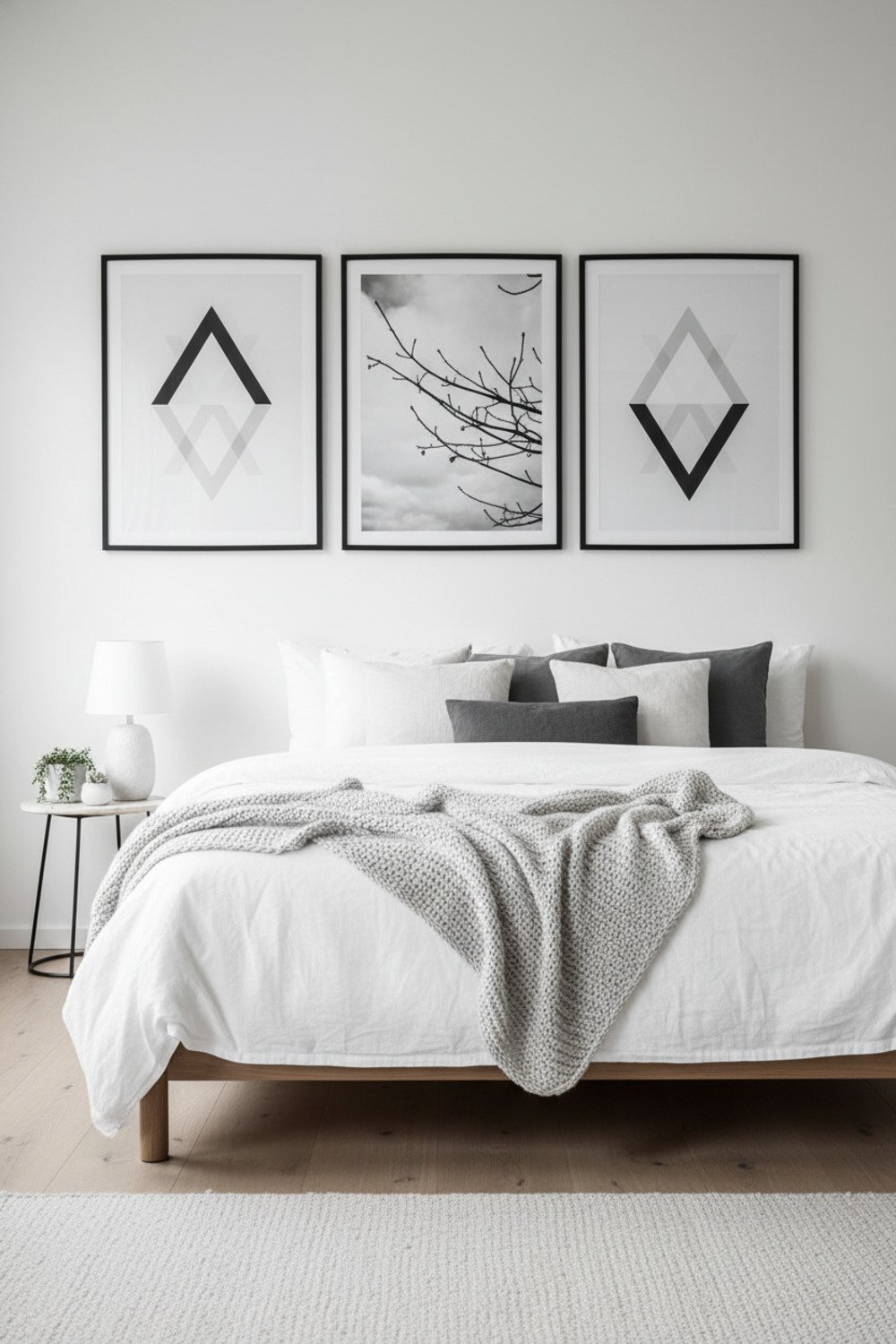
Monochrome Printables: The Case for Keeping It Simple
Monochrome printables speak a certain language. The language of I look effortlessly curated even if I decorated this wall while eating snacks in sweatpants.
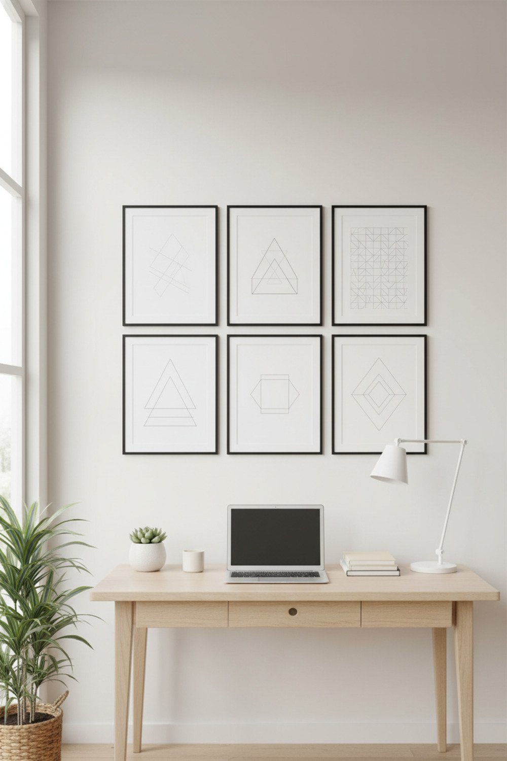
What Makes Monochrome Appealing?
Monochrome designs usually feature black, white, and subtle grayscale. No distractions. No drama. Just clean visual harmony.
Why do so many people love them?
- They look timeless
- They work in almost any interior style
- They’re ridiculously easy to pair with other decor
- You don’t get tired of them as fast as bold prints
Seriously—monochrome works from Scandinavian to industrial to boho to modern chic. It’s like the printable version of a plain white T-shirt: simple, always stylish, never trying too hard.
Best Rooms for Monochrome Printable Art
Some spaces naturally love a minimalist vibe:
- Home offices → Keeps your brain focused
- Bedrooms → Calm, soft aesthetics help you relax
- Entryways → Clean introductions to your style
I used monochrome line art in my office, and my productivity instantly felt upgraded. Coincidence? Maybe. But I’ll take the win.
When Monochrome Doesn’t Work
Ever looked at black-and-white art in a room full of bold throw pillows and neon decor? Yeah… it sometimes feels like someone showed up to a costume party in a tux :/
Monochrome fails when the entire room screams color and energy. It becomes awkward instead of elegant.
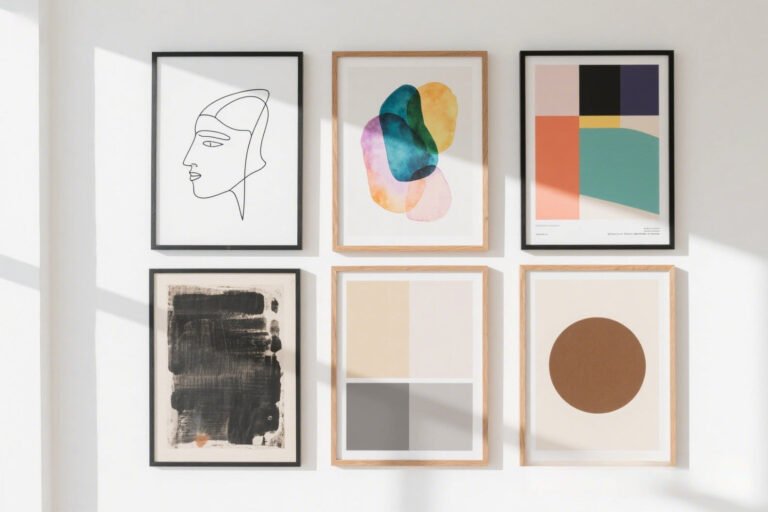
Vibrant Printables: For the Bold, the Creative, and the Slightly Dramatic
Now let’s talk color—the kind that brings life, personality, and spice.
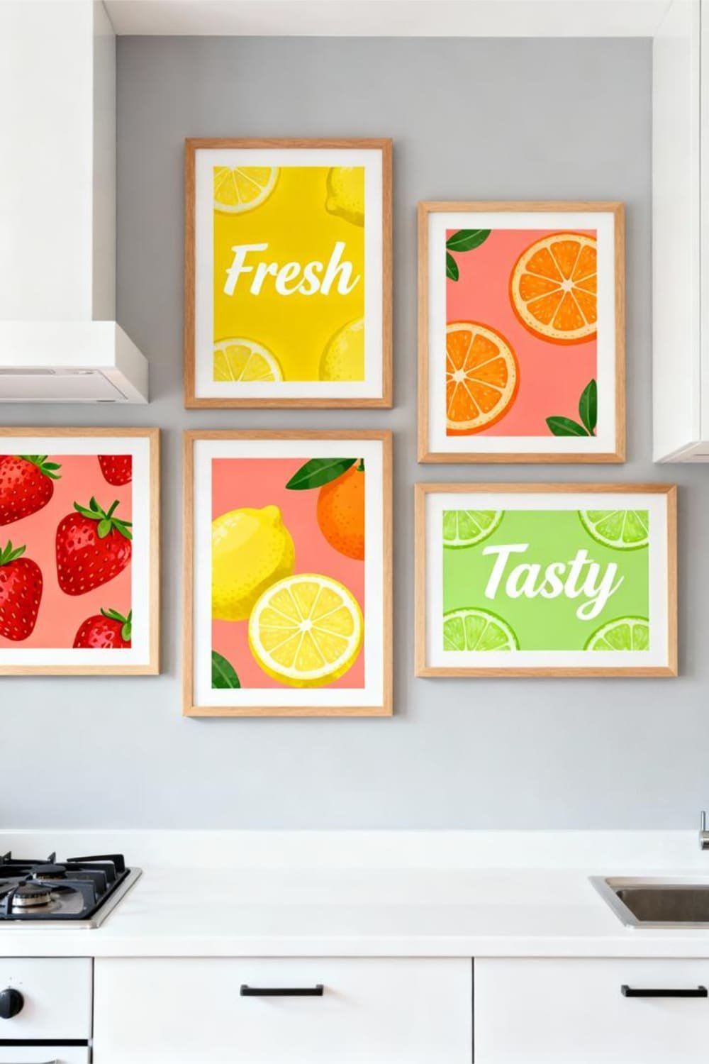
Why Choose Vibrant Art?
Vibrant printables pack energy. They make a space feel fun, expressive, and full of personality. If monochrome whispers, vibrant printables yell (in the best way).
People choose bright, colorful printables because they:
- Create instant focal points
- Boost mood (seriously, color psychology is wild)
- Showcase personality
- Transform a neutral space fast
Ever walk into a room with colorful art and just feel good? That’s intentional design magic.
Where Vibrant Prints Shine
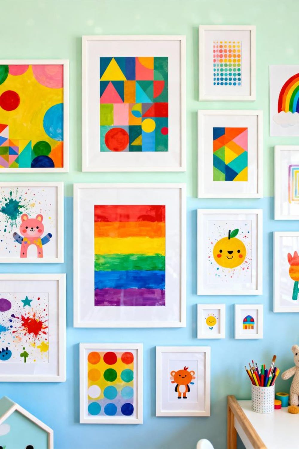
Color thrives in playful or social spaces, like:
- Living rooms → Color sparks conversation
- Kitchens → Bright prints make the space feel lively
- Kids’ rooms or creative studios → Encourages imagination
I added a colorful abstract printable above my coffee cart once, and suddenly the whole corner felt like a trendy cafe. That’s when I realized: color changes mood.
When Vibrant Prints Don’t Fit
If your space already has 14 colors competing for attention, adding more might make it look like a clown exploded.
Color needs balance.
Monochrome vs. Vibrant: The Real Side-by-Side Comparison
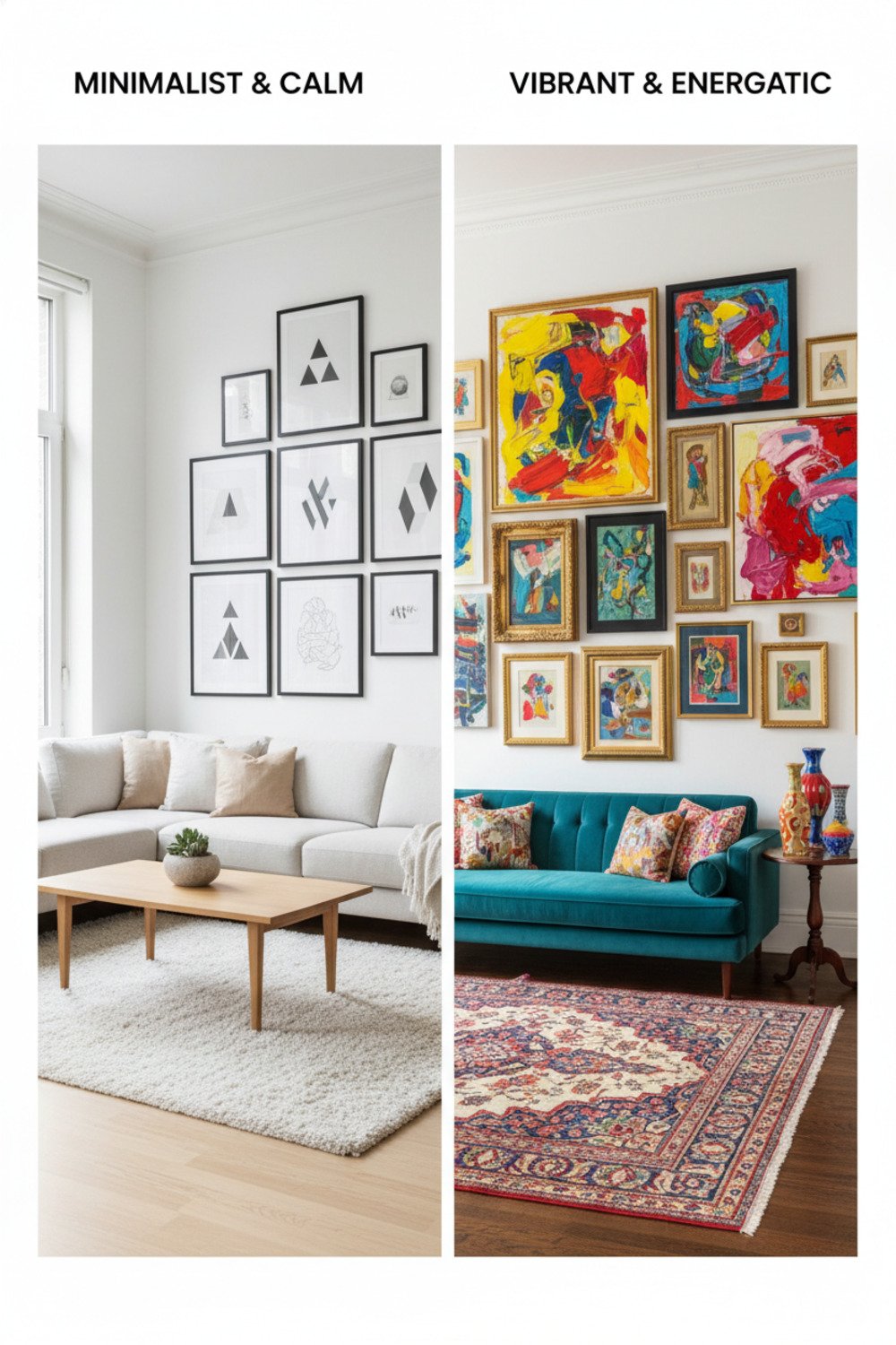
Let’s compare the two styles without sugarcoating anything:
| Feature | Monochrome Printables | Vibrant Printables |
|---|---|---|
| Mood | Calm, minimalist, elegant | Energetic, expressive, fun |
| Matchability | Easy to match anything | Requires intentional palette |
| Best For | Neutral or modern interiors | Playful, eclectic or colorful spaces |
| Longevity | You’ll keep them for years | You may rotate them seasonally |
| Vibe | Sophisticated | Bold + personality-driven |
Neither is better. It’s about what makes your space feel like YOU.
How to Decide Which Style Fits Your Personality
Let’s do a quick (totally not scientific but scarily accurate) test:
If you answer “yes” to most of these, you’re a MONOCHROME person:
- You love order, calmness, and minimal clutter
- You gravitate toward black, white, neutrals or soft tones
- You prefer classic fashion over trend-based style
- You appreciate clean lines and simplicity
If these sound like you, you’re VIBRANT energy:
- You love creativity, bold choices, and expressive spaces
- You gravitate toward color palettes with personality
- You enjoy playful or uniquely designed interiors
- You treat decor like a personal mood message
Some people fall right in the middle—and that’s honestly the most fun zone.
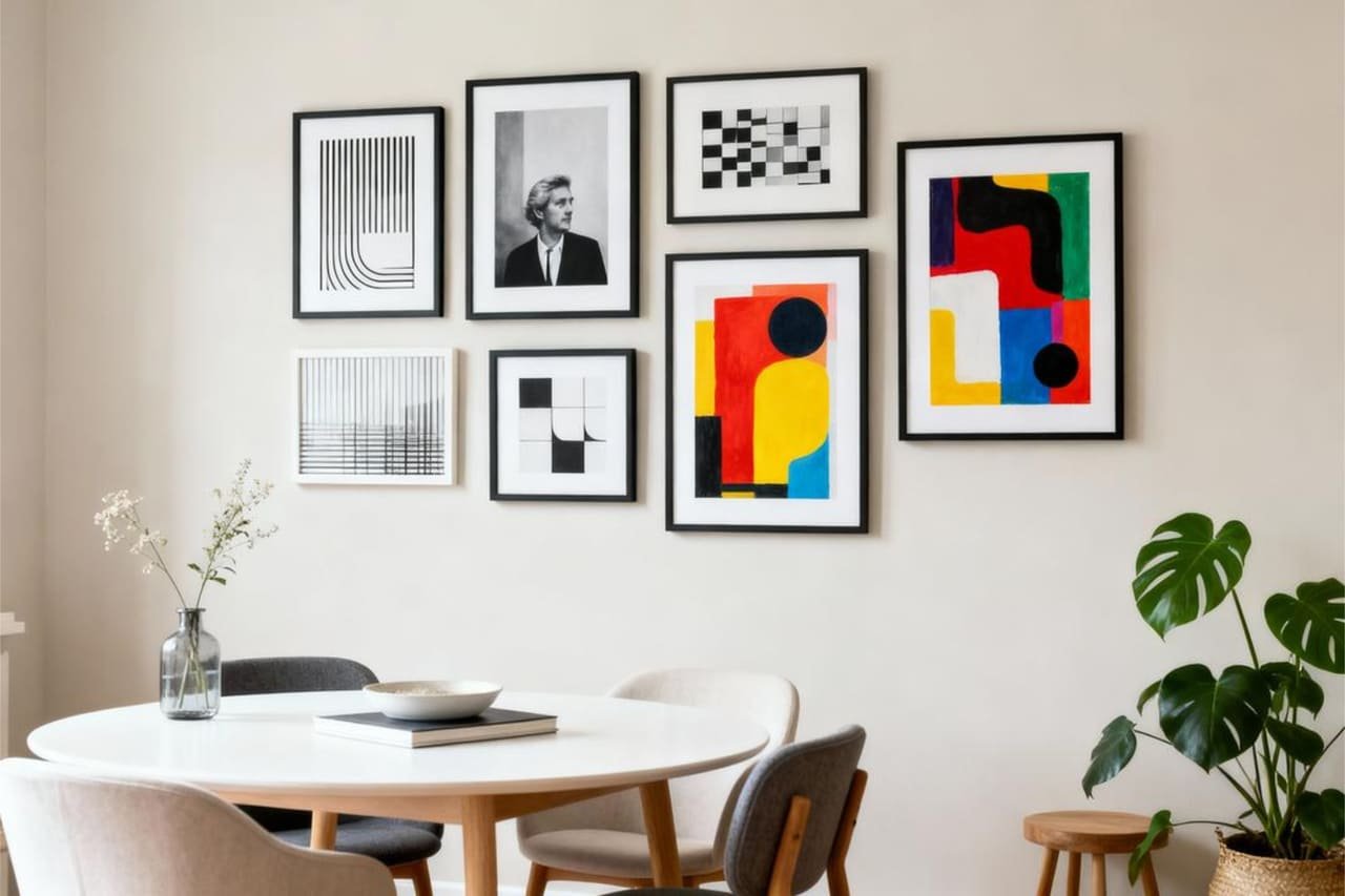
Can You Mix Monochrome and Vibrant?
Short answer: YES—if you do it with intention.
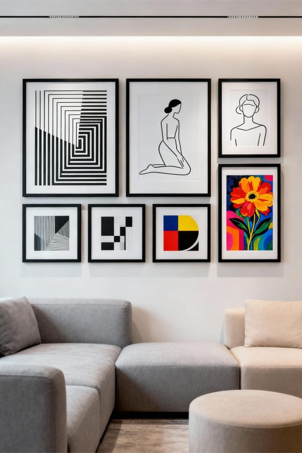
Mixed aesthetics can look amazing if you create balance. Here’s how to avoid chaos:
✔ Stick to a Color Palette
Use monochrome pieces as a foundation, and let vibrant ones be accents.
✔ Maintain Consistent Style Themes
For example:
- Line art + colorful abstract? Beautiful.
- Bold typography + colorful botanical? Works.
- Random cartoons + baroque monochrome sketches? Hard nope.
✔ Use Grouping or Zones
Cluster colorful prints together and keep monochrome pieces separate. This looks intentional instead of accidental.
IMO, when you mix both right, the room feels layered—not loud.
Common Mistakes People Make With Printable Art
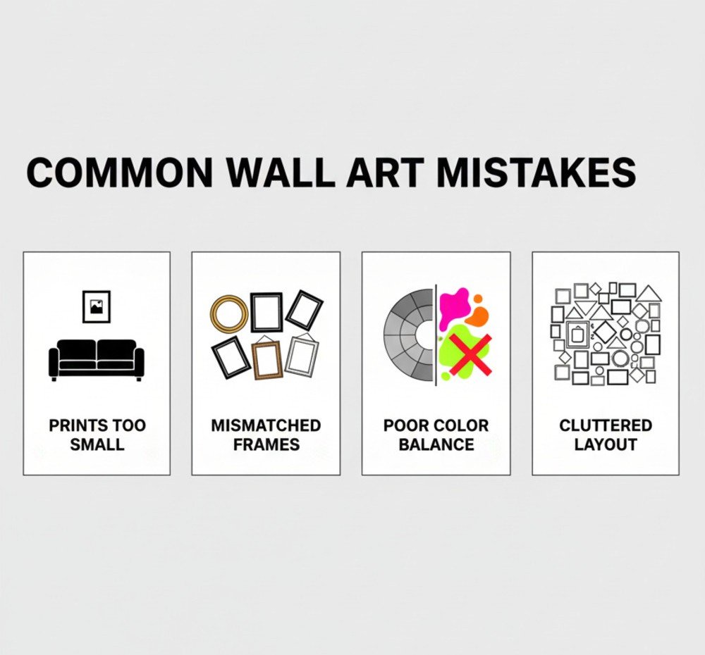
Let’s save you some headaches.
❌ Hanging prints too small
❌ Not considering wall paint color (beige behind beige prints = yawn)
❌ Using different frame styles in the same gallery wall with no theme
If you remember nothing else from this article, remember this:
➡ The right printable doesn’t just decorate a wall—it completes the space.
Final Thoughts: So Which Should You Choose?
If you’re still reading, you’re either:
- Procrastinating decorating
- Or genuinely trying to figure out your style
Either way, here’s the simple takeaway:
- Choose monochrome if you want calm, timeless, versatile, effortless design
- Choose vibrant if you want bold, playful, expressive energy that shows personality
And if you’re still unsure?
Start with one monochrome printable and one vibrant printable and see which one makes you smile more when you walk past it. Your instinct never lies.
FYI: decorating should feel fun—not stressful 🙂
So go print, play, swap, adjust, and most importantly—make your walls feel like YOU.