Stunning Gallery Wall Ideas for Entryways and Hallways
So, let’s be real for a second—entryways and hallways are usually the most ignored spots in a home.
You walk through them every single day, your guests do too, and yet somehow these poor walls end up being blank, boring, and screaming “Please, give me some personality!” Well, guess what? That’s where gallery walls come to the rescue.
I’ve personally had a love-hate relationship with my hallway. For years, it looked like a sad, beige tunnel with zero charm.
Then one day, I decided to go all-in on a gallery wall, and wow… now people actually stop mid-walk to check it out.
It’s like giving your house a personality upgrade without even touching the rest of your rooms.
If you’re itching to do the same, I’ve got you covered with these gallery wall ideas for entryways and hallways.
Whether you’re into minimal vibes, bold statements, or quirky collections, there’s something here that’ll make those forgotten walls shine.
Why a Gallery Wall in Your Entryway or Hallway?
Let’s start with the obvious question: why bother?
- First impressions matter. Your entryway sets the tone for your home. A gallery wall instantly says, “Hey, I care about design and I’ve got style.”
- Hallways = free real estate. Long, narrow walls are basically begging for some decoration. Why waste that space?
- Personal expression. You can show off your personality, hobbies, or even family history in a way that feels intentional.
Honestly, it’s way cheaper than buying a giant, overpriced statement artwork that you’ll probably regret six months later.
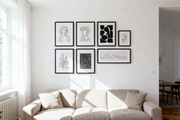
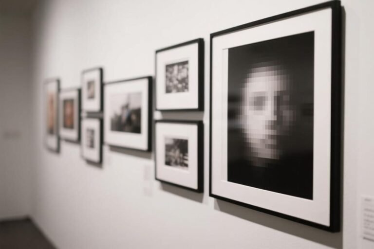
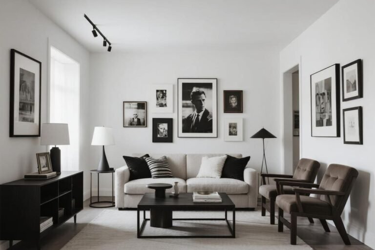
Classic Black and White Gallery Walls
You literally cannot go wrong with a black-and-white theme. It’s sleek, timeless, and works in almost any style of home.
Why it works:
- It creates a cohesive look without feeling too busy.
- Perfect for narrow hallways where color overload might feel overwhelming.
- You can mix different frame styles, and it’ll still look pulled together.
Pro tip: Mix family photos with black-and-white sketches or typography prints. That way, it looks curated, not like you just printed every selfie you’ve ever taken.
Bold Color Pop Walls
Okay, maybe monochrome isn’t your vibe. No worries! Try a color pop gallery wall.
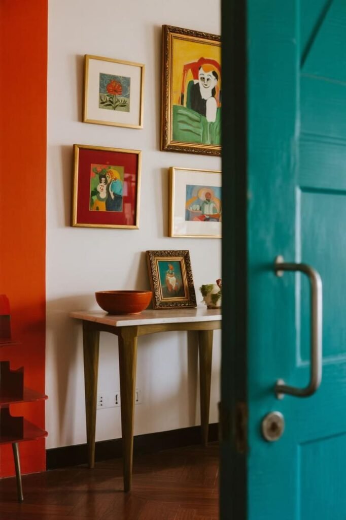
Pick a color scheme—like shades of blue, earthy tones, or bright jewel colors—and let it guide your frame and art choices.
- Use matching frames in bold shades for a clean look.
- Or go totally eclectic with mismatched frames that scream personality.
- Add small accessories (like a colorful console table beneath) to tie it all together.
Ever walked into someone’s house and immediately felt their energy? That’s the magic of a colorful gallery wall. 🙂
Minimalist Grid Layouts
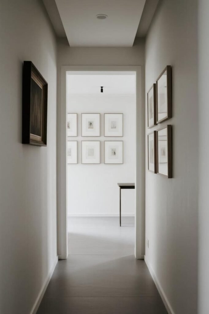
If you’re a fan of order (or just can’t deal with chaos), the grid layout might be your soulmate.
Picture this: a row of perfectly aligned frames, equal spacing, and a uniform look. Clean, modern, and oh-so-satisfying.
Why grids are great:
- They’re perfect for hallways with high ceilings—you can go vertical.
- They suit modern or Scandinavian interiors.
- They let the artwork shine without overwhelming the space.
Tip: Use a laser level when hanging. Trust me, eyeballing it = disaster. (Learned that the hard way. My “grid” looked more like a drunk snake.)
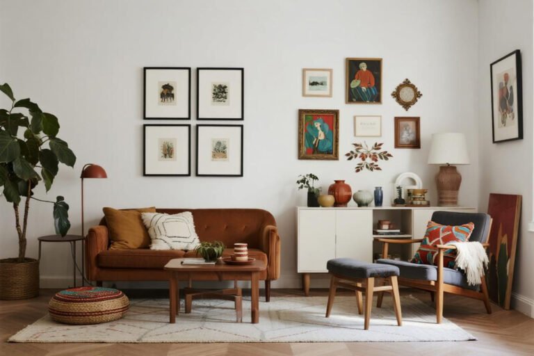
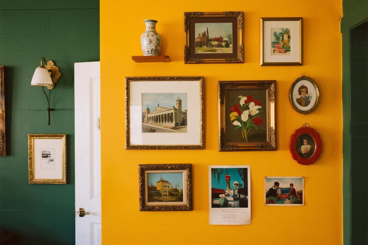
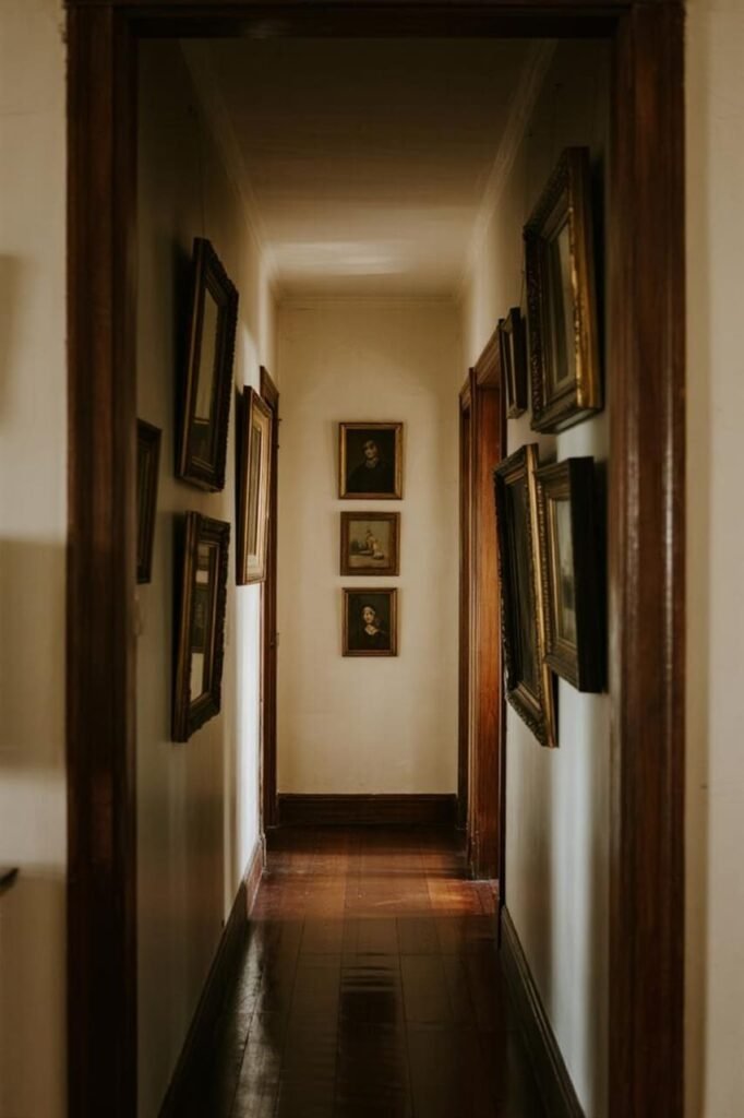
Mix & Match: Eclectic Vibes

Now, for my free-spirited folks. Eclectic gallery walls are basically “organized chaos.” You can throw in family photos, random art prints, postcards, mirrors, and even that funky wall plate your aunt gave you.
How to pull it off:
- Choose one unifying element (like all gold frames, or a similar color palette).
- Play with different sizes and shapes—rectangles, circles, even hexagons if you’re feeling wild.
- Add 3D pieces like small shelves or wall sculptures for extra dimension.
IMO, eclectic walls feel the most “lived in.” They tell a story, and guests usually end up asking about at least one item.
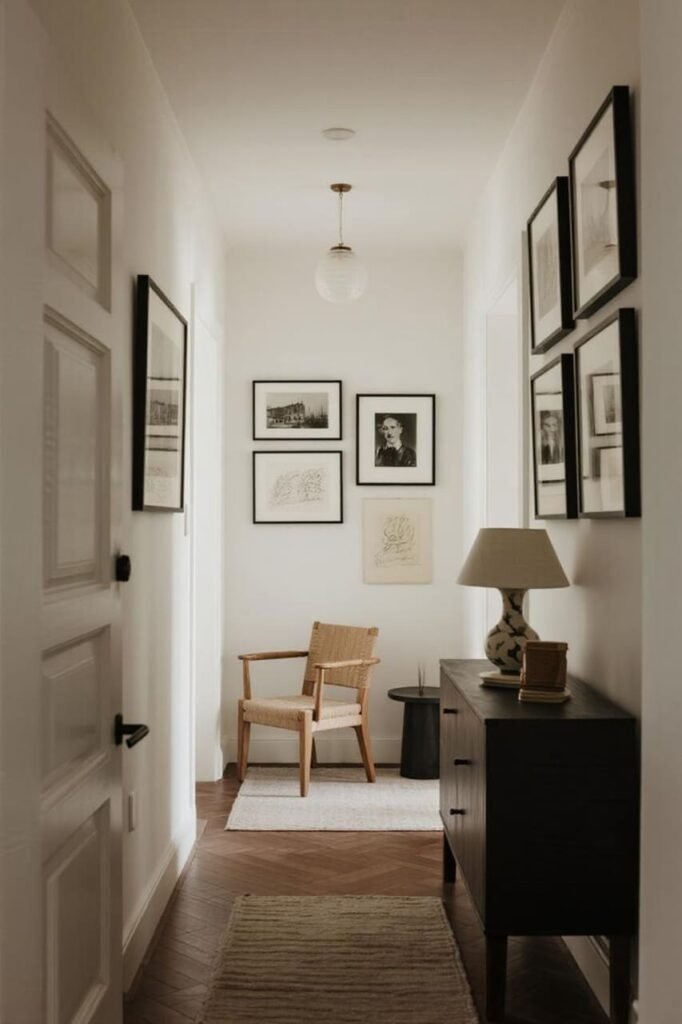
Small Hallways? Go Vertical
Got a teeny-tiny hallway? Don’t panic. Instead of trying to fill the whole wall, focus on a vertical arrangement.
- Stack 3–4 larger frames on top of each other.
- Use narrow, elongated frames to emphasize height.
- Mix in mirrors (bonus: makes your hallway look bigger).
Ever heard the saying “work with what you’ve got”? This is exactly that.
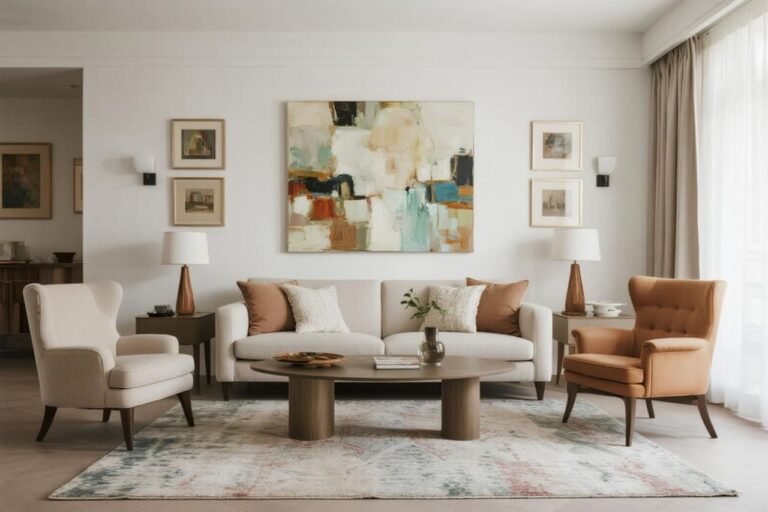
Entryway Statement Walls
If your entryway is more spacious, treat your gallery wall like a statement piece.
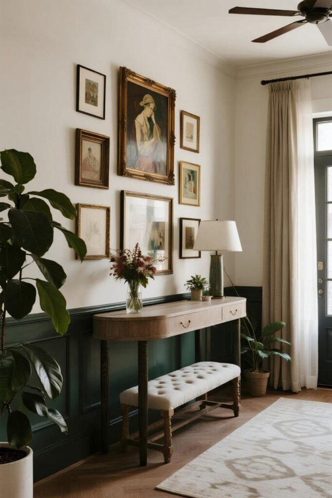
Ideas to try:
- Oversized art mixed with smaller frames. This creates drama right as you step in.
- Add a console table or bench below. Layer some plants or lamps for a cozy, styled look.
- Play with symmetry. Two identical rows of frames look polished and intentional.
Think of it as your home’s handshake—bold, confident, and welcoming.
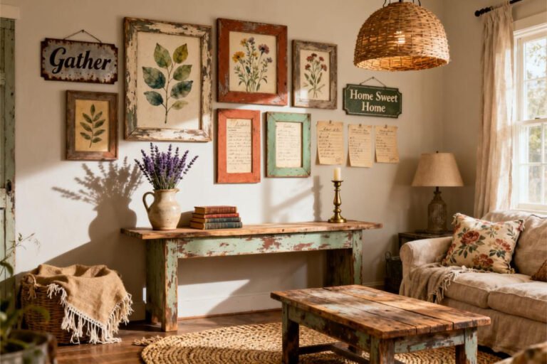
Themed Gallery Walls

Why not take your gallery wall to the next level with a theme?
- Travel-themed. Map prints, postcards, and your favorite vacation photos.
- Botanical. Watercolor plant prints, pressed leaves, or even framed seed packets (cute, right?).
- Family story. Mix old black-and-white family portraits with newer snapshots.
This way, your gallery wall feels less random and more like a curated exhibition.
Mix Art with Objects

Who says gallery walls are just about frames? Throw in some unexpected objects to make it stand out.
- Decorative mirrors
- Woven baskets
- Vintage clocks
- Floating shelves with tiny plants
- Wall-mounted sculptures
The combo of 2D and 3D elements gives your wall depth and character. Plus, it’s way more fun to look at.
Lighting: The Secret Weapon
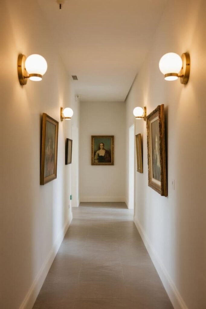
You could have the most amazing gallery wall ever, but if it’s stuck in the shadows, it’ll feel flat.
Quick lighting tips:
- Use picture lights above key frames for that museum vibe.
- Install LED strip lighting along the ceiling edge for subtle glow.
- Add a nearby lamp or sconce to highlight the wall.
Seriously, lighting is like Instagram filters for your gallery wall—it makes everything look better.
Common Mistakes to Avoid
Before you go all hammer-and-nail happy, here’s what NOT to do:
- Don’t overcrowd. Negative space is your friend.
- Don’t go frame shopping without a plan. (You’ll end up with 12 mismatched frames that don’t fit together.)
- Don’t hang too high. Keep the center of your gallery at eye level.
- Don’t forget balance. A huge frame next to a bunch of teeny-tiny ones looks awkward unless done carefully.
Learn from my mistakes—yes, I once hung an entire gallery wall two inches from the ceiling. Guests were craning their necks. Not cute.
Step-by-Step: How to Plan Your Gallery Wall
Feeling overwhelmed? Here’s a simple roadmap:
- Pick your vibe. Minimal, bold, eclectic—what’s your style?
- Gather your art. Mix photos, prints, and objects.
- Choose your frames. Keep them consistent or intentionally varied.
- Lay it out on the floor. Arrange everything before committing.
- Measure and mark. Use painter’s tape to map it on the wall.
- Start from the center. Work outward for balance.
- Adjust as needed. Perfection isn’t required—it’s supposed to feel personal.
Wrapping It Up
Entryways and hallways don’t need to be boring passageways. With a little creativity, they can be some of the most stylish and personal parts of your home.
Whether you go for a classic black-and-white setup, a colorful explosion, or a quirky mix of frames and objects, the key is to make it feel you.
Remember: gallery walls aren’t about perfection, they’re about personality. Don’t stress too much over symmetry or rules. Play around, experiment, and most importantly—have fun with it.
So, are you ready to rescue those neglected walls? Grab your frames, a hammer, and maybe a glass of wine (trust me, it helps). Your hallway’s about to glow up in a big way.