Two-Tone Wall Paint Ideas for Modern Homes
Let’s be real—sometimes painting your walls one solid color feels like wearing the same shirt every day.
Sure, it’s fine… but does it wow anyone? Nope. That’s where two-tone wall paint comes in to save the day. It’s like giving your room a double shot of espresso—visually speaking.
I’ve experimented with two-tone walls more than I’d like to admit (read: my friends stopped asking for painting help because I kept “experimenting” on their living rooms).
But honestly, nothing makes a space look more modern, stylish, and intentional than the right color pairing. And the best part? It’s not rocket science—you can totally nail this in a weekend.
So grab your painter’s tape, your favorite playlist, and maybe a snack or two (painting burns calories, IMO), because I’m about to share my favorite two-tone wall paint ideas for modern homes.
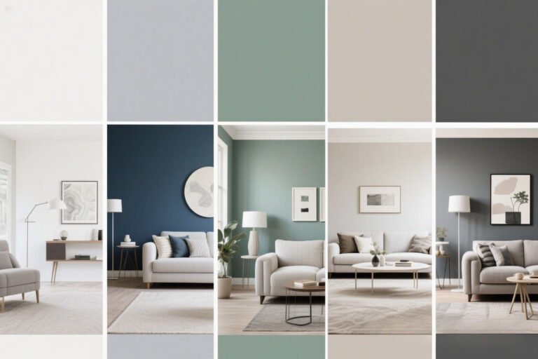
Why Two-Tone Walls Just Work
Ever walked into a room and thought, Whoa, this place looks expensive? Chances are, the walls had some kind of visual trickery going on—like two-tone paint.
Here’s why it works so well:
- Adds depth – Two colors create dimension without needing wallpaper or expensive decor.
- Defines spaces – Perfect for open floor plans or multipurpose rooms.
- Plays with perception – Dark colors on the bottom can make ceilings look higher, while light colors on top can make a space feel airy.
- Budget-friendly style – You can completely change a room’s vibe for the cost of a few paint cans.
And no, you don’t have to be an art major to pull this off. A little tape and a good eye for color will do.
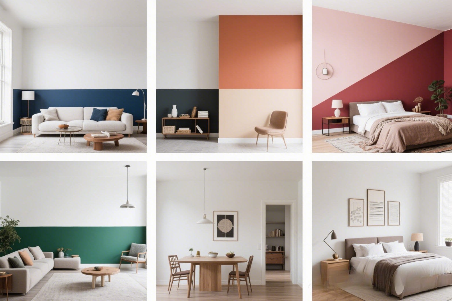
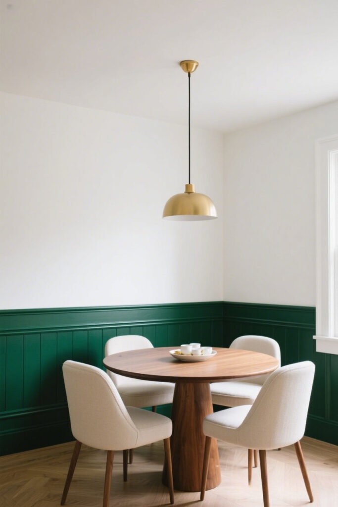
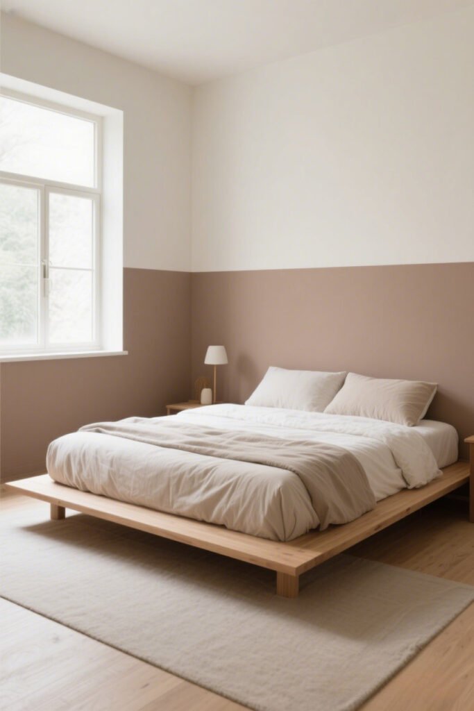
Horizontal Split: The Classic (and Foolproof) Look
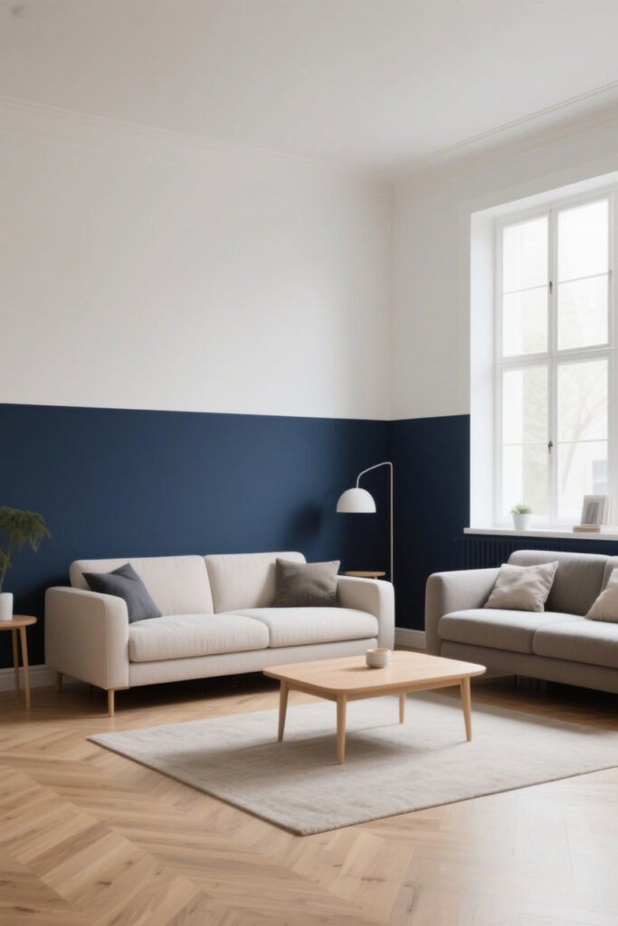
How It Works
This is the “starter pack” of two-tone painting: one color on the top half of the wall, another on the bottom. Simple, clean, timeless.
Pro Tips:
- Darker shade on bottom, lighter on top – Keeps the room feeling balanced.
- Go bold below – Navy, charcoal, or deep green add drama without overwhelming.
- Use a crisp tape line – Nothing screams “DIY fail” like a wobbly border.
My Go-To Combos:
- Navy + Warm White
- Olive Green + Beige
- Charcoal Gray + Soft Blush
Ever seen this in a modern dining room? It’s chef’s-kiss perfect for making your table the star without stealing focus.
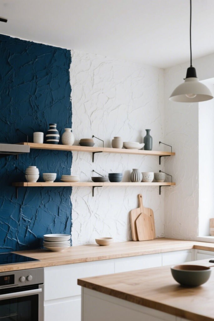
Vertical Split: Bold and Modern
If the horizontal split is a calm Sunday morning, the vertical split is Friday night in the city.
Why I Love It:
Vertical color blocking works especially well behind headboards, desks, or statement furniture. It feels artsy without trying too hard.
Pro tips for verticals:
- Use contrasting colors for maximum drama.
- Keep the split off-center for a more dynamic, modern vibe.
- Pair with minimal decor to let the wall be the showstopper.
Imagine a black-and-terracotta split in a home office… yep, suddenly you’re in a design magazine.
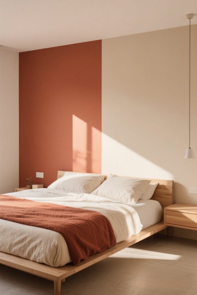
The Diagonal Statement: For the Brave at Heart
Okay, this one’s not for the faint of heart (or shaky-handed painters). A diagonal two-tone can transform a wall into pure visual energy.
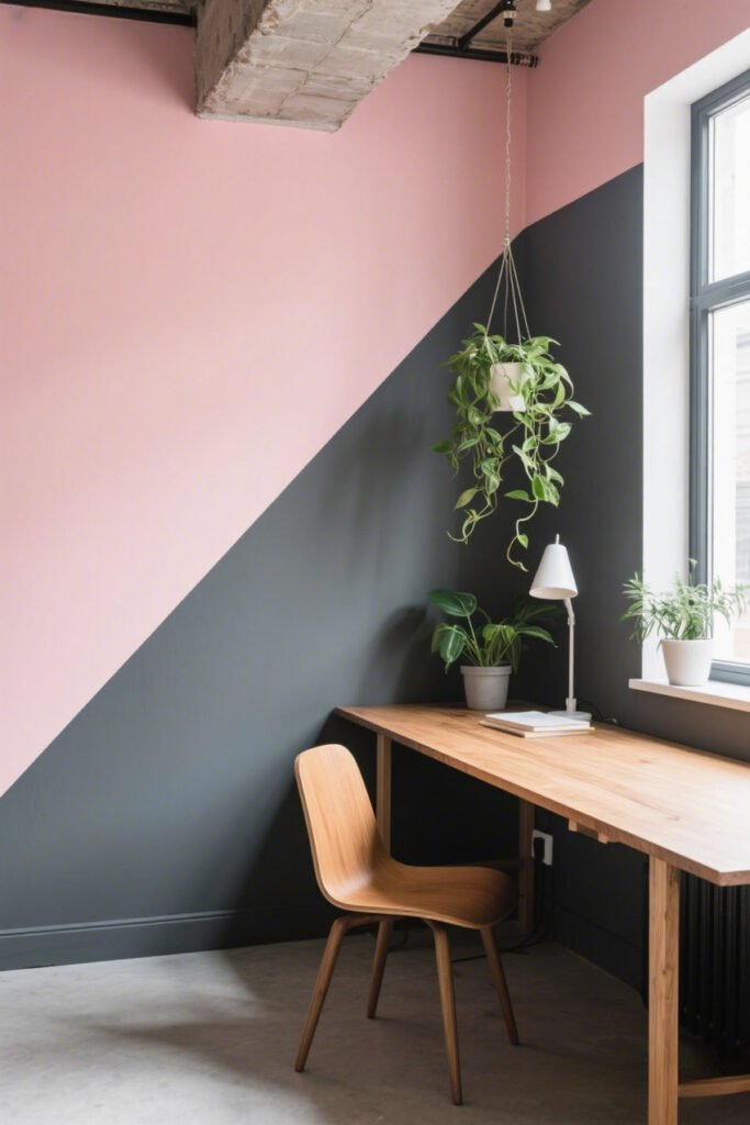
Best Spots for a Diagonal:
- Kids’ playrooms (instant fun factor)
- Creative studios
- Modern lofts
Color Ideas:
- Coral + Teal
- Mustard + Navy
- Blush + Charcoal
Just remember—measure twice, tape once. Unless you like repainting at 11 PM. :/
Ombre Fade: The Instagram Darling
If you want a wall that screams “I’m extra,” an ombre two-tone is your BFF.
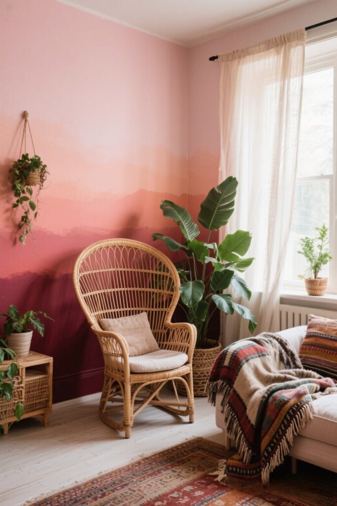
Why It’s Gorgeous:
The gradient effect softens the transition between colors and makes your wall look like modern art.
How to Nail It:
- Choose colors within the same family (light blue to navy, blush to wine red).
- Use a dry brush or sponge to blend the middle.
- Practice on a spare board before committing.
Yes, it takes more effort than a straight split, but the “OMG where’d you get that done?” reactions will be worth it.
Accent Wall with a Twist
Who said your accent wall had to be one solid color? Paint the bottom third a bold hue, keep the rest neutral, and watch the compliments roll in.
Why this works:
- Gives you the drama of an accent wall without overpowering the room.
- Pairs beautifully with wainscoting or paneling.
- Perfect for small rooms where you still want personality.
Two-Tone with Texture
Paint is fun, but why stop there? Mix color + texture for next-level style.
Some winning combos:
- Matte navy on top + satin white on bottom.
- Textured plaster in cream + flat taupe.
- Chalkboard paint in black + soft gray (great for kitchens).
Texture not only changes the look but also the way light plays in your space. Bonus: slightly hides imperfections in older walls.
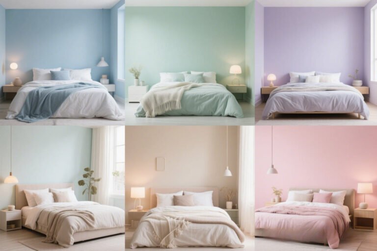
Playing with Neutrals (Yes, It’s Still Two-Tone)
Two-tone doesn’t mean you have to go neon. Some of the chicest modern homes stick to two shades of the same neutral.
Example: Warm taupe on the bottom, soft ivory on top—instant sophistication. This style works beautifully in minimalist or Japandi-inspired interiors.
And FYI, it’s also resale-friendly since neutral palettes appeal to almost everyone.
Ceiling Involvement: The Third Player
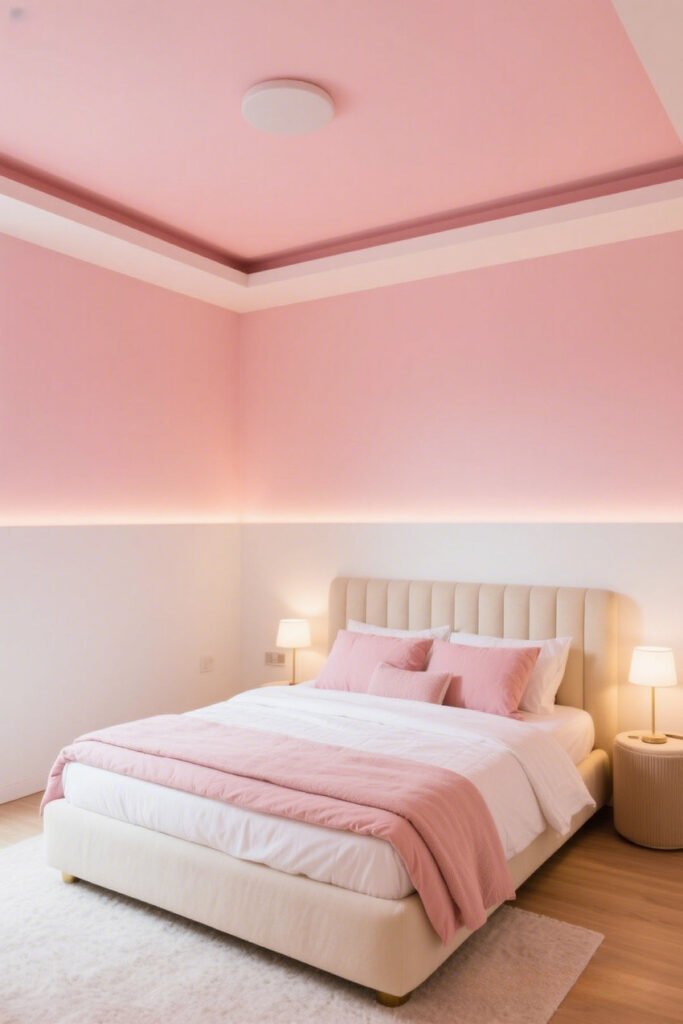
Want to get fancy? Extend one of your wall colors onto the ceiling.
It makes the space feel more cohesive and can even trick the eye into thinking the room is larger (or cozier, depending on the shade).
Example: Soft blush walls + white top half + blush ceiling = Pinterest-worthy bedroom.
Common Mistakes to Avoid
Let’s save you from a few “oops” moments I’ve definitely made:
- Skipping primer – Dark colors over light (or vice versa) can look patchy without it.
- Bad color pairing – Test swatches in day and night light. Trust me, that “perfect” gray might look blue after sunset.
- Uneven tape lines – Use a level for precision. Your eyes can trick you.
- Over-accessorizing – Let the wall be the hero; too much decor can ruin the effect.
How to Choose the Perfect Color Pair
This is where people freeze up, but it’s not that deep. Here’s my simple formula:
- Go high contrast for bold, modern energy. (Think black + white, navy + gold.)
- Go tonal for calm, cohesive vibes. (Think sage + soft gray.)
- Consider your furniture—your wall colors should complement, not compete.
And remember: paint is the cheapest design experiment out there. If you hate it, you can change it in a weekend.
Conclusion: Your Walls Deserve More Than One Color
Two-tone wall paint is the secret weapon of modern home design. It’s affordable, flexible, and seriously impactful.
Whether you play it safe with neutrals, get wild with a diagonal split, or embrace a soft ombre, your walls will thank you for the glow-up.
So, grab that painter’s tape and channel your inner designer. Worst case? You repaint. Best case? Your friends walk in and say, “Wow, your place looks amazing!” And really… isn’t that the dream? 🙂