Watercolor Printable Wall Art for a Soft and Artistic Touch
Because Blank Walls Deserve Better
Ever stared at your wall and thought, “Wow, this beige expanse is giving serious ‘dentist office’ vibes”? Yeah, same. That’s exactly how I fell in love with watercolor printable wall art.
It’s affordable, instantly downloadable, and—bonus—it makes your space feel like you hired a designer without actually emptying your wallet.
I’ve been obsessed with printable art for years. It started with a rainy Sunday, a cheap printer, and a Pinterest rabbit hole.
One watercolor cactus print later, my living room transformed from “meh” to “hello, cozy art studio.” So, if you’re craving a soft, artistic touch for your walls, watercolor printables might just be your new favorite décor hack.
Let’s chat about why they’re awesome, how to style them, and a few pro tips I learned the hard way (you’re welcome).
Why Watercolor Printable Wall Art Totally Works
Affordable Doesn’t Have to Mean Boring
Ever looked at framed gallery art and thought, “Yeah… but my bank account says no”? Same. That’s where printable wall art shines.
Instead of spending hundreds on one piece, you download a high-resolution file for a fraction of the price.
- Instant downloads mean no shipping drama.
- Multiple sizes let you match frames you already own.
- Unlimited prints (FYI, legally personal use only) let you create a matching set.
I once printed a watercolor monstera leaf in three different sizes and lined them up on my hallway wall. Instant “art gallery” vibes without the high price tag.
Soft, Dreamy Colors Create a Mood
Watercolors naturally blend soft hues, so even bold subjects—like tropical leaves or abstract shapes—feel calming. That’s a huge plus if your space tends to look cluttered or dark.
Ever noticed how a pop of color can shift your whole mood? A watercolor print can make a room feel airy, fresh, and even a little romantic. IMO, they’re like the visual version of a lo-fi playlist.
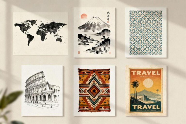
Choosing the Right Watercolor Prints for Your Space
Match Your Personality (Not Just Your Couch)
Your art should reflect you, not just your furniture. Ask yourself: “Do I want a minimalist vibe, or am I feeling a maximalist color explosion?”
Here’s my cheat sheet:
- Nature-inspired: Think leaves, flowers, ocean waves. Perfect for a spa-like feel.
- Abstract watercolors: Great for modern or eclectic spaces.
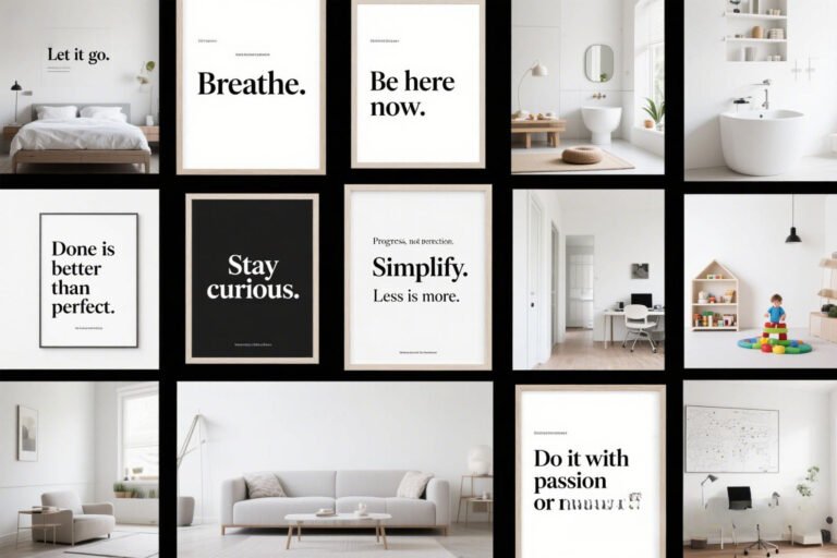
- Quote overlays: If you love typography + art (hello, inspirational bathroom art).
I once tried pairing a bold neon couch with soft pastel prints. It looked like a unicorn threw up on my living room.
Lesson learned: pick one focal point—your art or your furniture—and let the other complement it.
Consider Scale and Balance
Size matters (we’re still talking about art here, folks). A tiny 5×7 print on a giant wall will look lonely. Go big for statement pieces or cluster several small ones in a gallery wall.
Pro tip: Use painter’s tape to outline frame sizes on your wall before you print or buy frames. It saves you from the dreaded “oops, too small” moment.
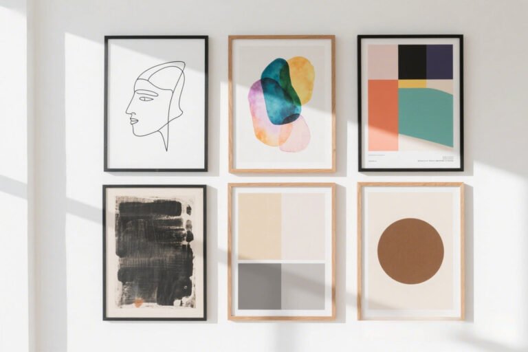
Styling Ideas to Make Your Watercolor Prints Pop
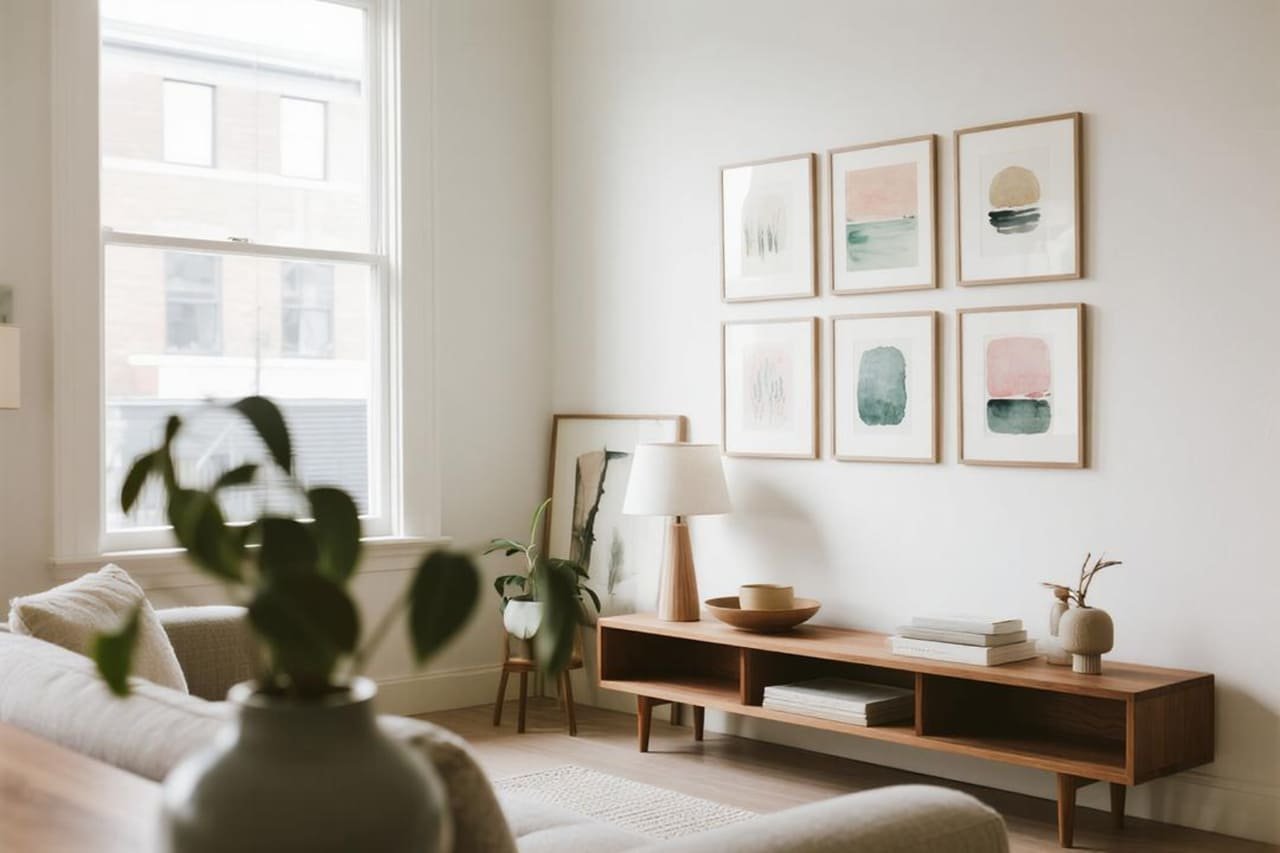
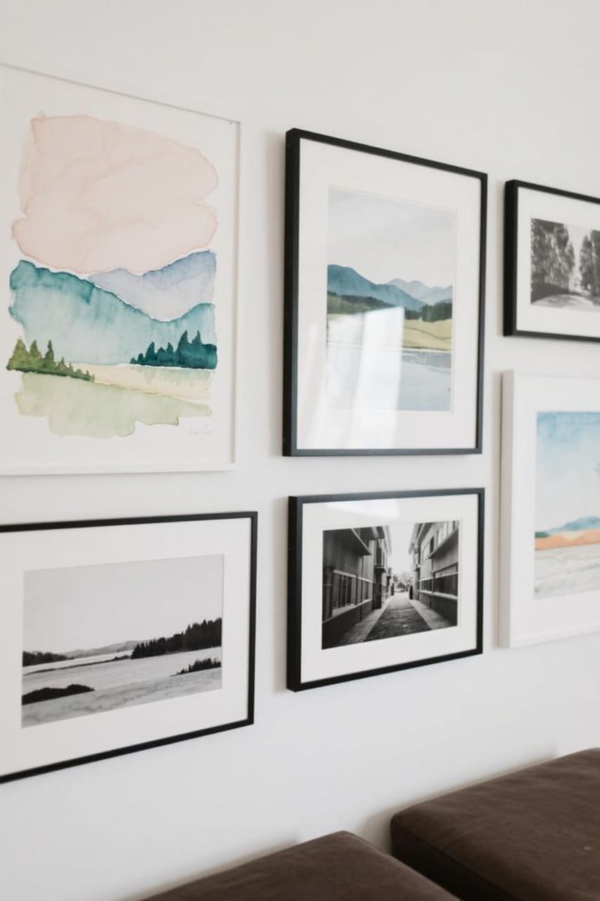
Go for a Gallery Wall
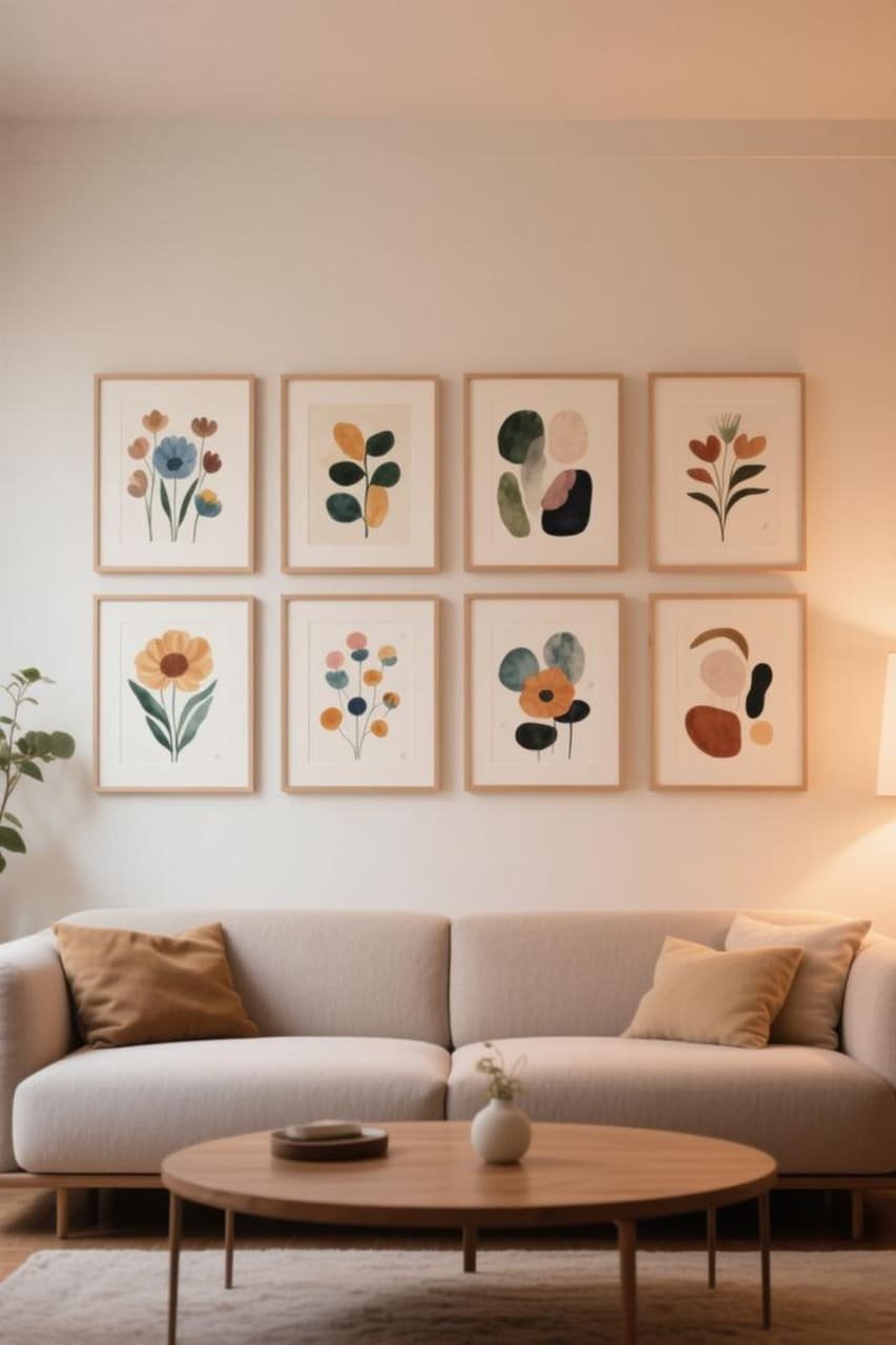
Nothing screams “I have my life together” like a well-curated gallery wall. Mix and match watercolor florals, landscapes, and abstracts in a grid or freeform layout.
- Stick to a consistent color palette for a cohesive look.
- Use identical frames for a modern feel or mix frame styles for a boho vibe.
- Play with symmetry vs. asymmetry depending on your room’s style.
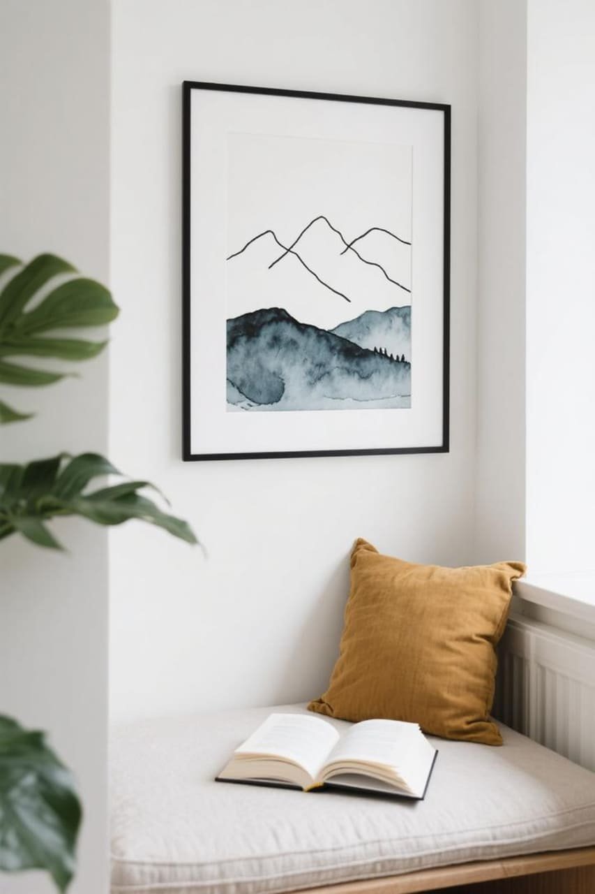
Pair with Natural Textures
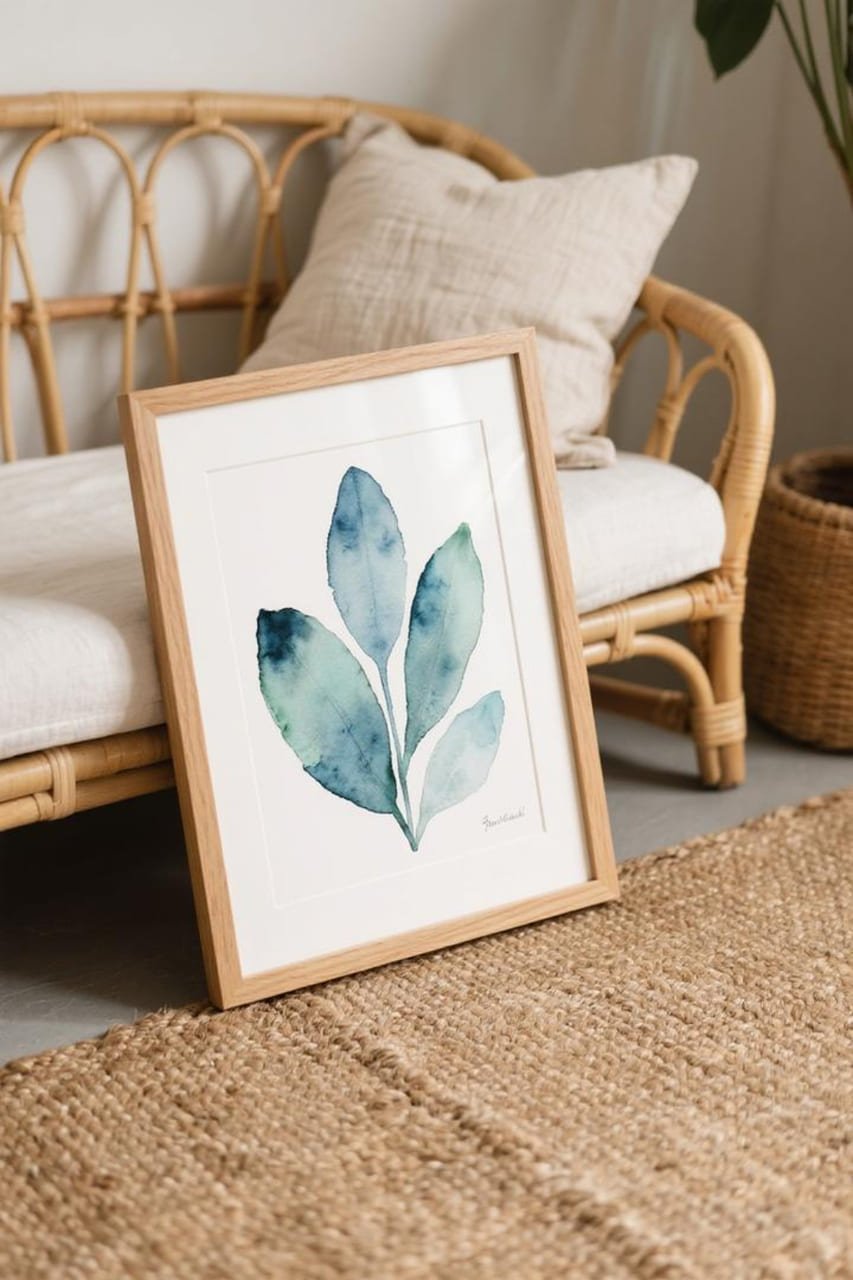
Watercolor art pairs beautifully with natural textures. Think rattan, wood, linen, and jute rugs. The softness of watercolor + earthy textures = chef’s kiss.
Ever notice how a wooden frame instantly upgrades a print? It’s like the difference between store-brand cereal and the name-brand stuff—both work, but one just hits better.
Layer Prints for a Studio Look
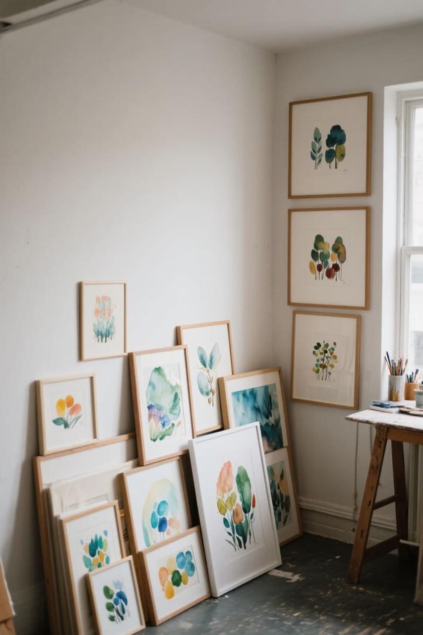
Leaning art against the wall instead of hanging it gives a casual, artsy vibe. Stack a large watercolor print behind a smaller framed one for depth. Bonus: no nails needed.
Color Palettes That Work Best with Watercolor Printables
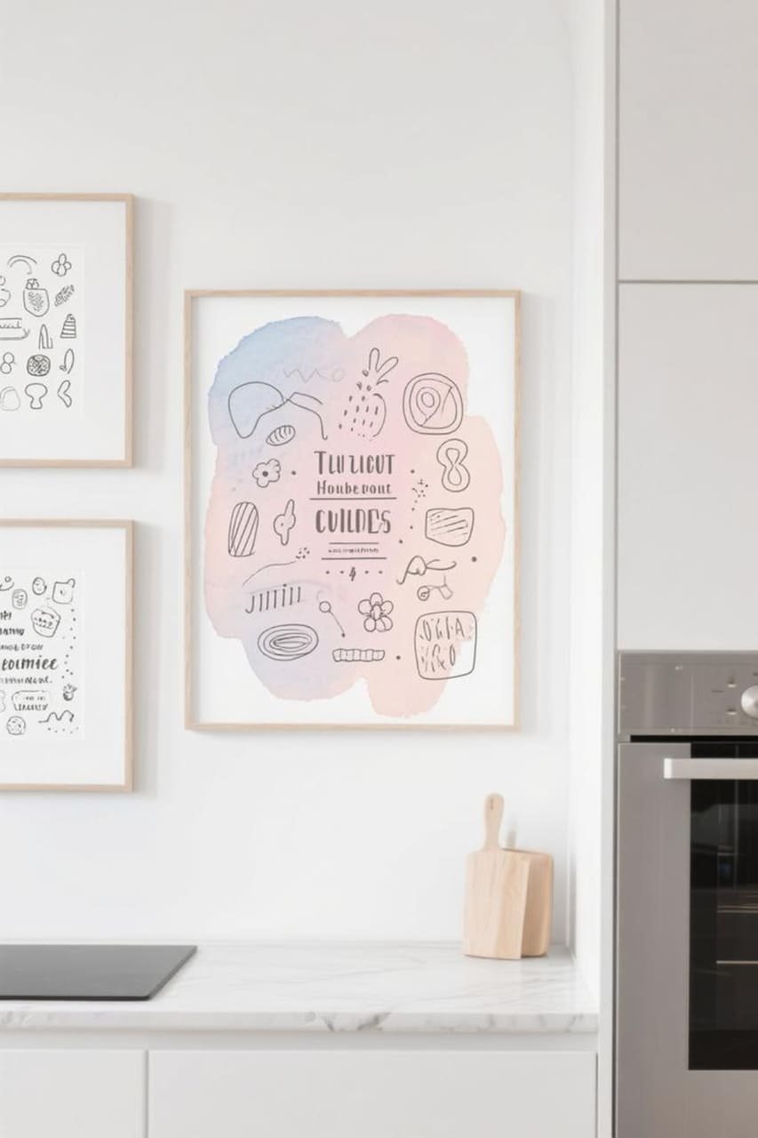
Soft Neutrals for a Minimalist Mood
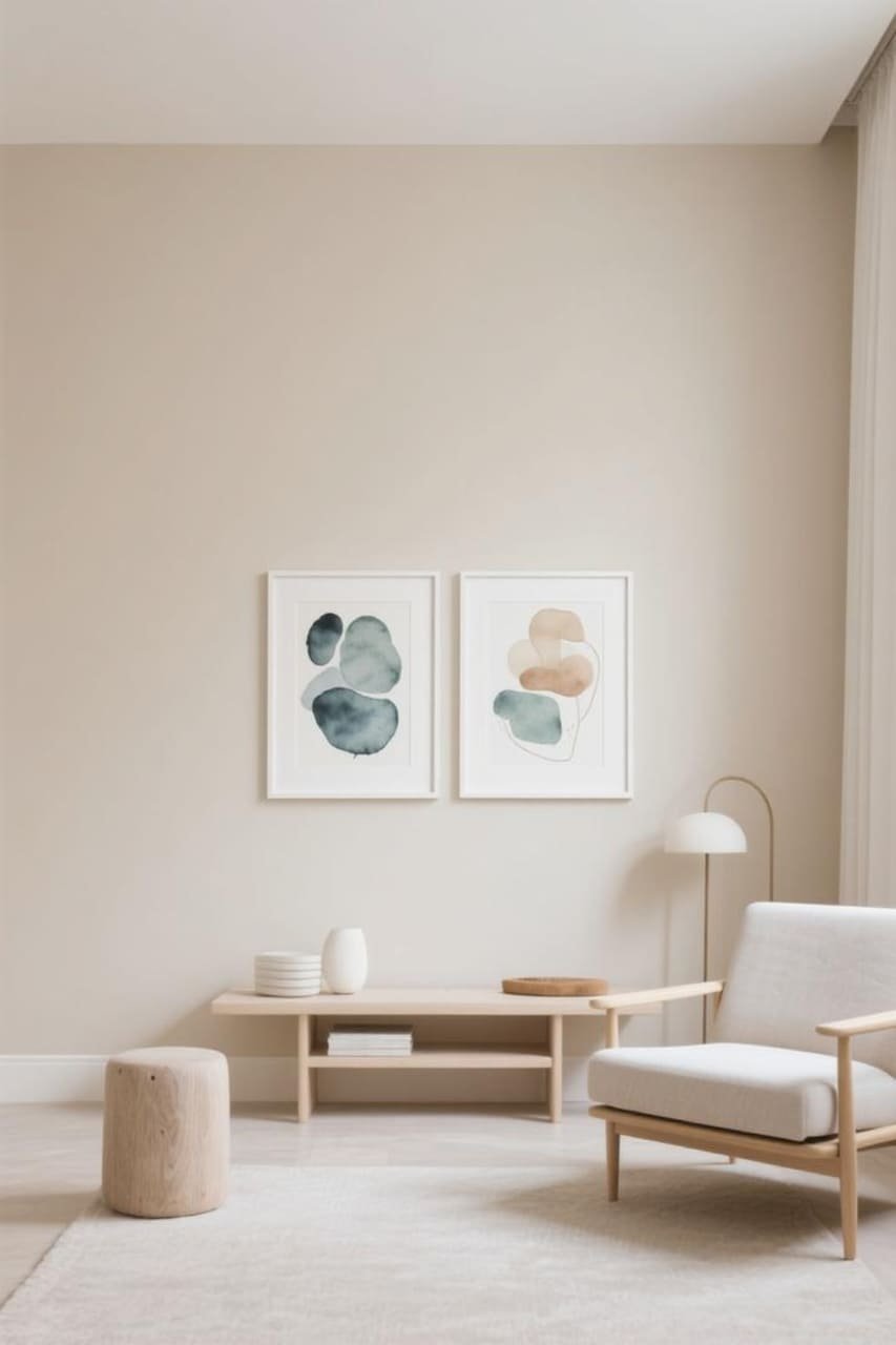
If your space screams “Scandi chic,” soft neutrals like beige, gray, and muted taupe make the watercolor textures shine. Pair with crisp white frames for that Instagram-ready look.
Pastels for a Romantic Feel
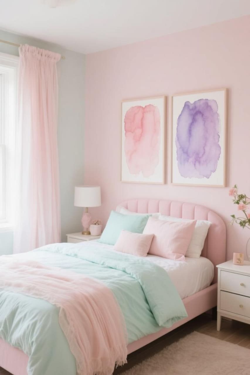
Pastels like blush pink, lavender, and mint green make your room feel airy and dreamy. IMO, they’re the ultimate hack for making small rooms feel bigger.
Bold Accents for Drama
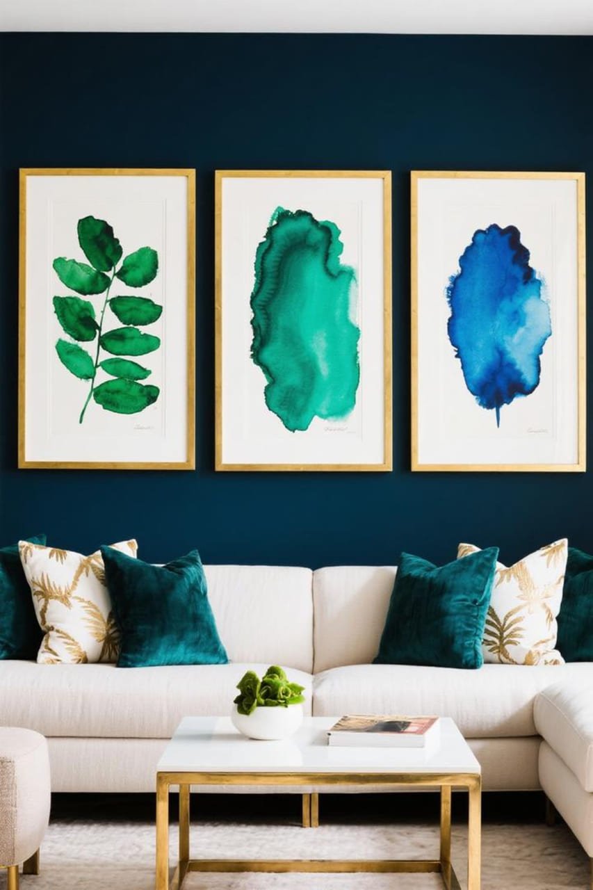
Who says watercolor can’t be bold? Jewel tones like emerald, sapphire, and deep magenta bring a touch of luxury without overwhelming the space. Pair with metallic frames for maximum impact.
Printing and Framing Tips (Learn from My Mistakes)
High-Resolution Files Only
Always check the file’s resolution before printing. Anything less than 300 DPI? Hard pass. Low-res prints look fuzzy and scream “DIY gone wrong.”
Pick the Right Paper
Regular printer paper? Just no. Go for:
- Matte photo paper for rich, soft tones.
- Textured watercolor paper to mimic real paintings.
I once printed a gorgeous abstract on regular copy paper. It curled like a potato chip. Don’t be me.
Frame Smart
Frames can make or break your art. Here’s my go-to checklist:
- Neutral frames let the art shine.
- Matting creates a high-end gallery feel.
- Consistent frame styles unify a mixed set of prints.
Scale for Impact
Print larger than you think you need. Big art = big statement. Even if your space is small, one large print often beats a bunch of tiny ones.
Why Watercolor Printables Beat Mass-Produced Posters
Unique & Customizable
Printable artists often release limited collections or let you customize colors and text. That means your living room doesn’t look like everyone else’s.
Eco-Friendly Bonus
No shipping + no packaging = fewer environmental headaches. You also save yourself from waiting weeks for delivery only to find your poster creased.
Instant Gratification
Impulse decorating? Totally fine here. You see it, you download it, you print it, and boom—new art on your wall in under an hour. 🙂
Mixing Watercolor Art with Other Styles
Blend with Photography
Pair a soft watercolor landscape with black-and-white photography. The contrast between painterly textures and crisp photos creates a dynamic look.
Combine with Line Art
Minimalist line art + watercolor backgrounds = Pinterest-worthy combo. Try framing a bold black line drawing over a soft pastel wash.
Layer Styles in One Frame
Print a watercolor background and overlay your own digital doodles or quotes. This DIY hack lets you create totally custom pieces without starting from scratch.
Common Mistakes to Avoid
- Going overboard with color. Too many palettes = chaos. Stick to 2–3 main hues.
- Ignoring print sizes. Always match the file’s size to your frame dimensions.
- Skipping test prints. Print a small section first to check colors. Your screen and printer don’t always agree.
- Cheap ink. Faded prints ruin the whole vibe. Invest in decent cartridges.
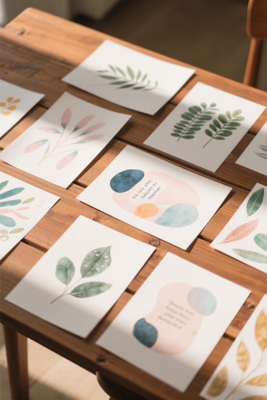
My Personal Favorite Shops for Watercolor Printables
(Okay, no paid plugs here, just genuine faves.)
- Etsy artists: Hundreds of independent sellers with unique styles.
- Creative Market: Great for high-quality bundles.
- Design Bundles: Budget-friendly sets for gallery walls.
I once scored a bundle of ten watercolor animal prints for under $20. Framed them in thrift-store frames. Guests always assume they’re expensive originals.
Final Thoughts: Your Walls, Your Rules
Decorating should feel fun, not stressful. Watercolor printable wall art gives you freedom to experiment, swap pieces, and play with color—all without going broke.
So go ahead, grab that downloadable print you’ve been eyeing. Try a bold color or a soft pastel.
Test a gallery wall or just lean one big print on your dresser. The best part? If you get bored, you can print something new next week.
IMO, blank walls are just invitations waiting for your personality. So let’s stop scrolling Pinterest and start printing. Your future self will thank you. 😉
Quick Recap (Because We Covered A Lot!)
- Watercolor printable art = affordable + customizable.
- Soft colors create mood; bold hues add drama.
- Frame smart and choose the right paper.
- Experiment with gallery walls, textures, and mixed styles.
Decorating your home doesn’t need to feel like a luxury marathon. With watercolor printables, it feels more like a creative sprint—with a latte in hand.